Dezeen's top four collections from this year's Westminster fashion design graduates
Graduate shows 2015: tailoring influenced by Scandinavian furniture and colours plucked from 1960s supermarket packaging featured among the collections at the 2015 University of Westminster graduate fashion show. Dezeen's Dan Howarth selects his four favourites from the catwalk.
This year's crop of graduates from the BA Fashion Design course at London's University of Westminster showcased their final menswear and womenswear collections at the campus in Marylebone earlier this week.
Bold primary colours were a recurring feature on this year's runway – a response to a "bland and dull" couple of seasons in fashion, according to course director Andrew Groves.
Groves said that it wasn't evident how bright the combination of collections would be until watching the show.
"It didn't seem so noticeable in the studio over the last couple of months, but seeing it on the runway you get a sense of renewed reinvigoration that its use brings to their collections," he told Dezeen. "I think it's a reaction to a couple of seasons where fashion in general has been quite bland and dull."
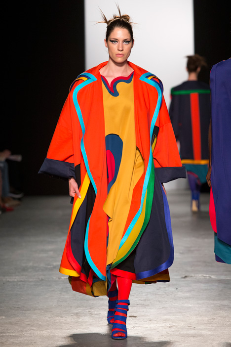
Many of the students experimented with techniques that led to collaged effects on garments. "There was a lot of transformation of cloth through embellishment, slicing, painting and print," explained Groves. "That said, most of the use of print was knowingly primitive, mainly using open screens or placed by hand."
Here are our top four picks from the 2015 show:
Matthew Witcombe
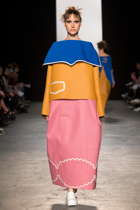
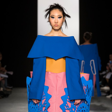
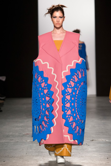
Matthew Witcombe cites Flemish paintings and Braun's vacuum-formed products by Dieter Rams as influences for his collection, created using a "no sew" approach that involved gluing decorative 3D elements between matt rubberised nylon layers with a heat press.
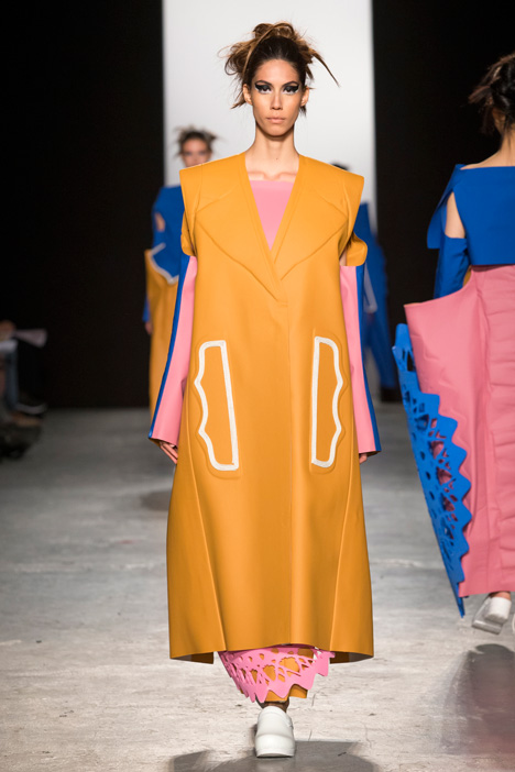
"Instead of decorating garments in a traditional way, as seen within Flemish and historical clothing, I bonded laser-cut foam lace and ruffles within the layers of fabric to create a subtle impression of traditional decoration," he told Dezeen.
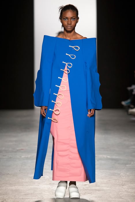
The exaggerated rectangular and angled apparel is executed in a colour palette based on supermarket packaging, with shades of blue, yellow and pink that Witcombe describes as "garish and brave".
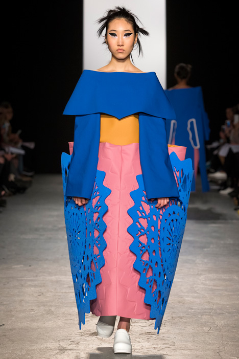
"I chose the colour palette as I love the uncompromising and jarring colour mix within the Sainsbury's product packaging during the 1960s and 1970s," he said. "I love the oddness of them."
Charlotte Scott
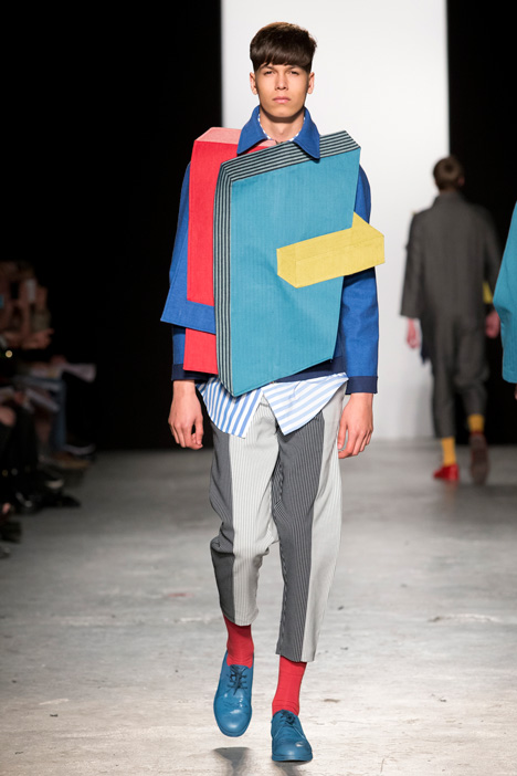
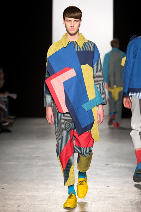
Influenced by Constructivist Russian artists including El Lissitsky, Alexander Rodchenko and Vladimir Tatlin, Charlotte Scott formed her menswear collection from abstract shapes of fabrics in a range of weights and colours.
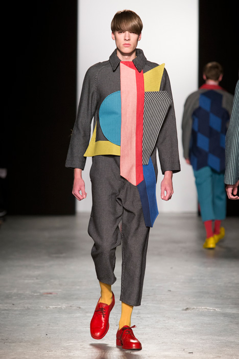
"Looking at Lissitsky's Proun paintings I was interested in his use of 3D shapes and cubes, so I experimented with stripes and shadow to create the illusion of the shapes appearing 3D yet actually being completely flat pieces," she told Dezeen.
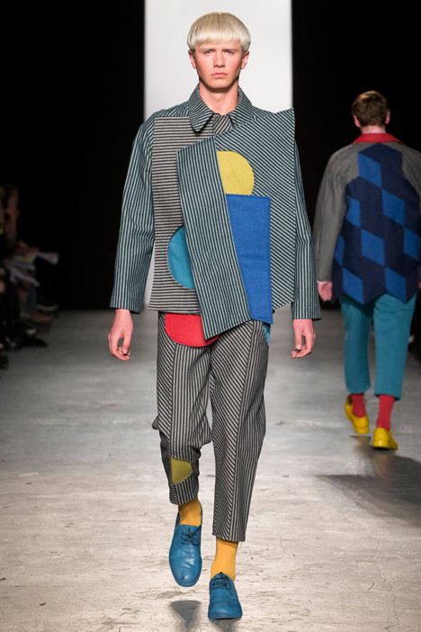
Aiming to create a utilitarian look with workwear materials such as denim and twill, Scott used paler hues than her colleagues and mixed them with grey stripes across the range of collared jackets and trousers.
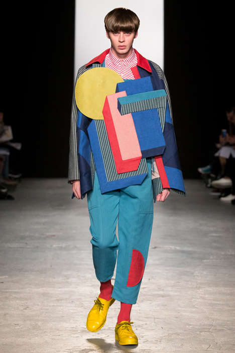
"I chose to use muted-down primary colours because these are the colours that are often used in the graphic design work of Rodchenko, and many other artists during this time," said Scott. "I wanted the collection to be playful but being careful for it not to appear childish."
Kate Brittain
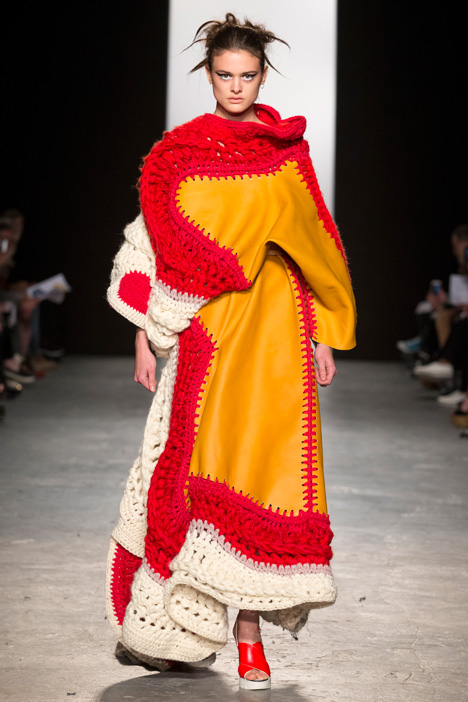
Kate Brittain was also influenced by an artist – this time the cutouts of Henri Mattisse.
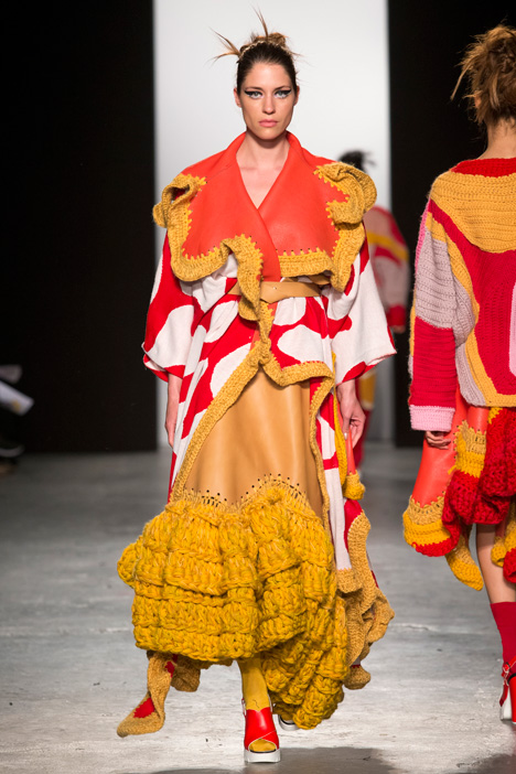
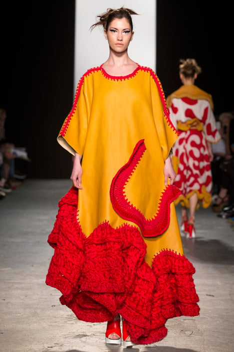
"Initially I was drawn to the colour palette but it developed into a story of Mattisse dressing his muse," said Brittain, who based her entire collection's colours and shapes on the French artist's 1947 work White Alga on Orange and Red Background.
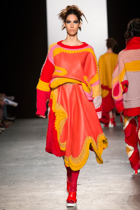
Brittain specialises in knit and crochet, and used up to eight strands of wool yarn at a time to create thick oversized trims for her leather dresses and a roll neck for a sweater. Over three kilograms of yarn were used in some of the garments.
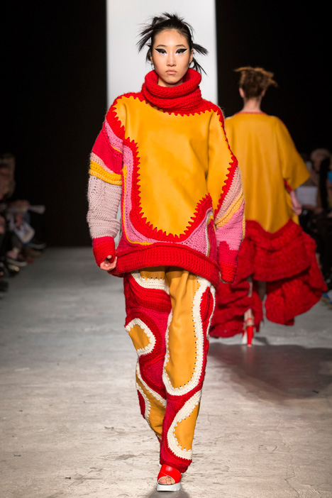
"I sampled so many different techniques – for instance machine, hand and digital knit – but crochet gave me the ability to be more sporadic and free with shapes and colour," she said. "I just worked with the shape of the leather so the crochet was never predictable; some areas had huge wealths of volume and weight whilst others were much finer."
Chloe McGeehan
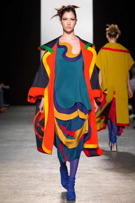
The curved forms of furniture by mid-century Scandinavian designers Arne Jacobsen and Eero Saarinen provided the starting point for Chloe McGeehan, who produced a range of layered dresses and coats.
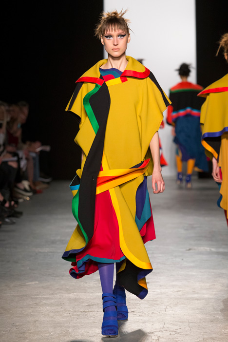
Materials including Scuba jersey were used to create weighted lapels and cut-away panels that moved as the models walked, revealing further coloured layers beneath.
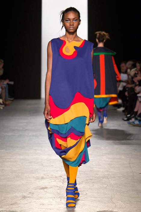
"Scuba jersey is perfect for the draped dresses as it gives a very fluid drape and smooth curves when cut," McGeehan told Dezeen. "Double-faced fabric was used for the coats so when walking down the runway another colour would be revealed on the underside."
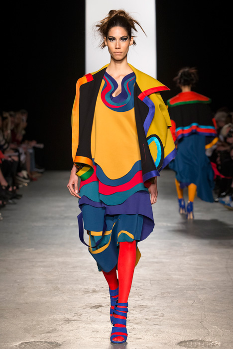
The colour images of architectural photographer Julius Shulman, who shot the work of designers like Pierre Koenig and Charles and Ray Eames, provided the bright palette. "The bold contrasting colours also assist to accentuate the different layers of construction," said the designer.
Photography is by Simon Armstrong.