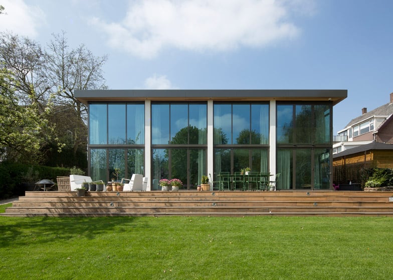
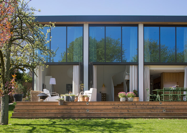
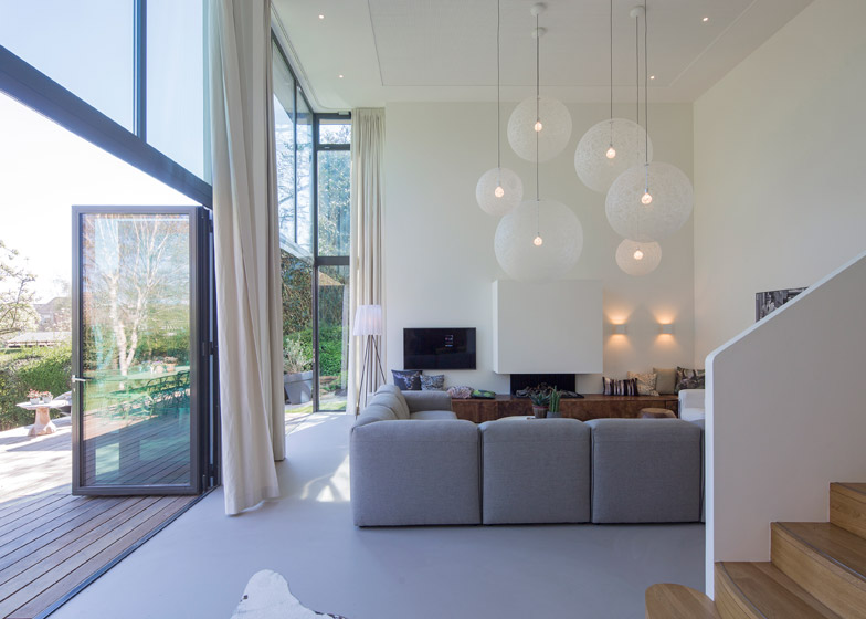
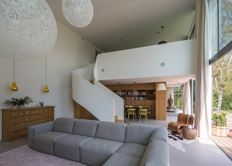
Rotterdam architect Antonia Reif has renovated and extended a modest 1960s bungalow, creating a two-storey living room and a generous bedroom that both open out to the garden (+ slideshow).
Situated next to a dyke on the outskirts of the city, the residence was originally built to accommodate a couple with no children. It is now home to a larger family, so Antonia Reif was tasked with doubling its floor area.
"The new owners have two children and the house was too small for them," she told Dezeen.
The existing property's main orientation was towards the street and the rear facade was predominantly closed, which meant the connection with the large garden at the rear was not optimised.
Because of its position on top of the dyke, the back of the house already dropped down to a lower storey at the level of the garden, so minimal excavations were required to extend it.
This means that, despite its size, the extension is not at all visible from the front of the building.
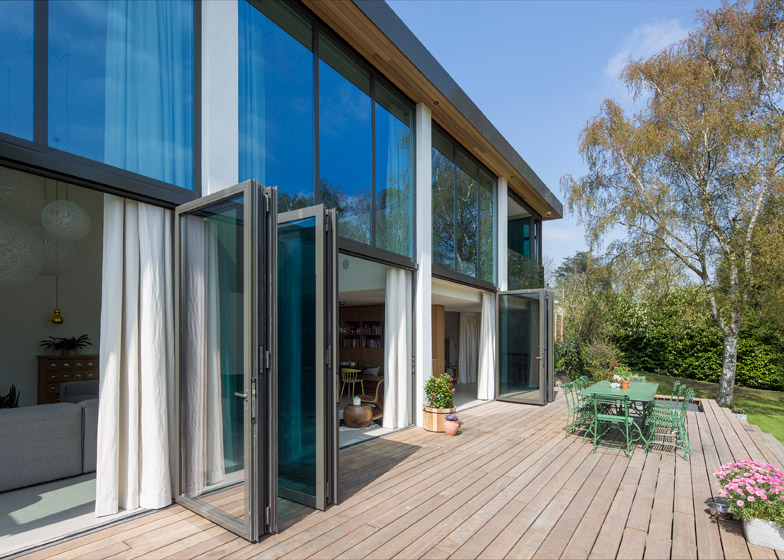
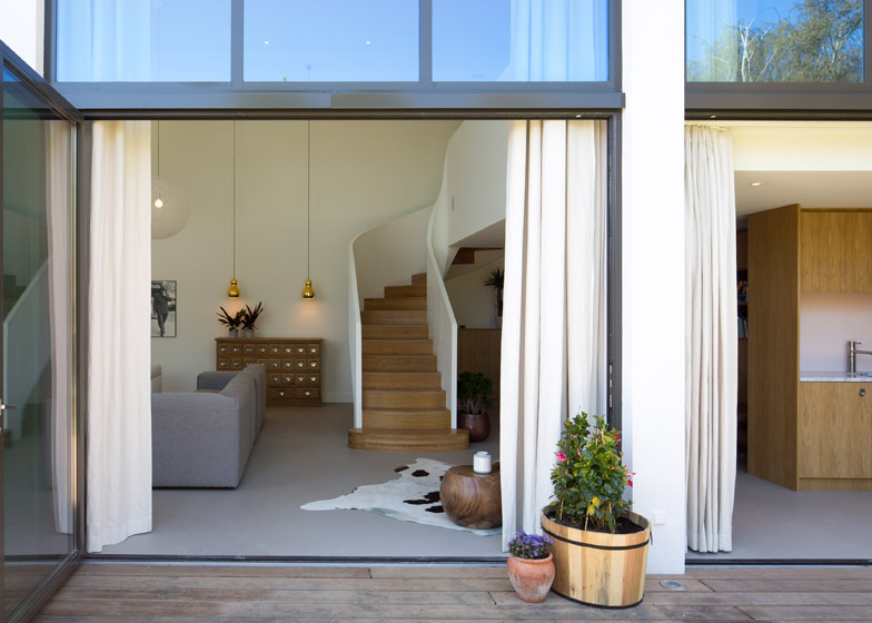
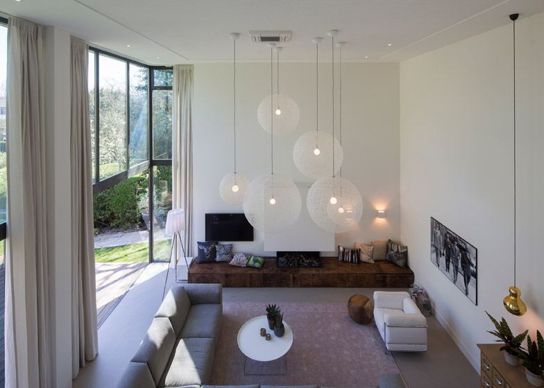
The main aim of the addition was to improve the feeling of spaciousness within the house and provide a connection between indoors and outdoors, which was accomplished by introducing large folding doors that link the new living room with a decked terrace.
"By opening the folding doors towards the terrace it becomes part of the living room and vice versa," Reif said.
"This gives a very royal and generous atmosphere to the house. Even if the doors are closed, one experiences generosity by feeling the open and green garden space behind the house," she added.
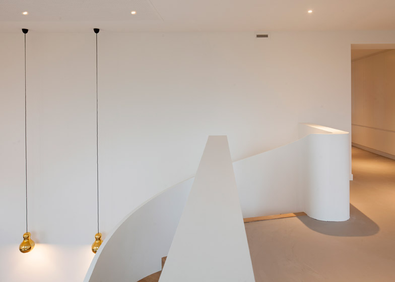
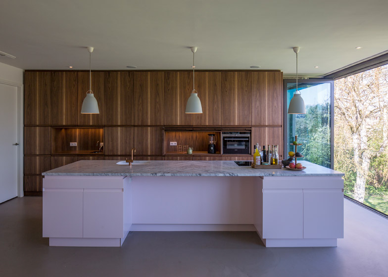
A new entrance on the upper floor opens onto a hallway that extends towards a kitchen at the rear. A glazed wall provides views of the garden immediately upon entering the house.
"The former narrow entrance area became a generous light space that connects old and new parts of the building to each other," Reif added. "In the inside one would not feel a separation line between the old part and the new one."
The rest of the upper level now accommodates three bedrooms and a bathroom for the children, as well as an office at the front of the house for the parents.
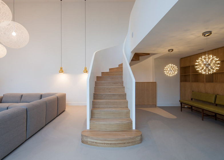
A twisting staircase connects the kitchen and dining area with a double-height living room featuring huge windows and large pendant lamps suspended from the tall ceiling.
The master bedroom is separated from this space by a partition containing storage and bench seating. A small pantry and food preparation area on the end of the partition can be used to serve drinks and food on the terrace.
The bedroom is connected to a bathroom, sauna and closet located in the old part of the house. A second staircase links this area with the upper floor, while a hallway leads to storage spaces and the garage.
Minimal interventions were made to the exterior of the existing bungalow to improve its visual unity with the new addition. The roof was extended, the brick facade rendered and wooden details introduced to reference the timber terrace.
"The roof edges kept the same height but stick out now about half a metre, giving more elegance to the building and connecting the old and new parts with each other," Reif said.
Old window frames were painted dark grey to tie in with the new windows, while dark and heavy materials found throughout the interior were replaced to continue the bright and modern feel of the rest of the house.
Photography is by Luuk Kramer.
Project credits:
Architect: Antonia Reif
Structural engineer: Pieters Bouwtechniek
Contractor: Batenburg
Furniture: Woodwave, Groeneveld&Poirot
Installations: Barth Installatietechniek

