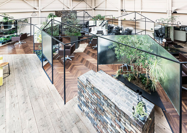
A matrix of disorientating translucent and mirrored partitions frame the individual booths of this hairdressing salon in Japan by Takehiko Nez Architects (+ slideshow).
Japanese architect Takehiko Nez was asked to revisit the interior of Vision Atelier, a salon in a suburban area of Yamanashi Prefecture. Back in 2003, his studio converted the space from a jewellery shop, and he also extended it in 2010.
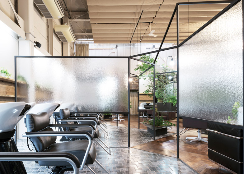
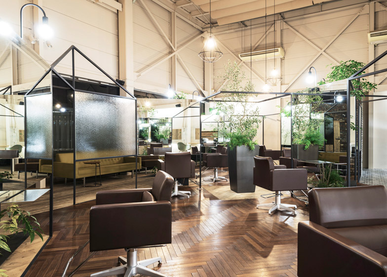
The latest renovation involved installing a black steel structure, creating a framework for a series of textured plastic and mirrored partitions. These separate the space into areas for hair washing, cutting and waiting, affording clients a degree of privacy.
"The polycarbonate separates the upper floor space to control the air conditioning and the mirror is for hairdressing and making up," explained architect Takehiko Nez.
"But also I wanted to use those materials to expand the limited space and design open-air scenery, like a fantasy," he told Dezeen.
The design is intended to mimic the feeling of being outdoors, giving customers a more relaxed ambience that harks back to times when haircutting was done on the porches of private houses, or by roadside hairdressers.
"Rather than just simply designing objects, it has become desirable to integrate into the design newly created relations in response to the existing site conditions," said Nez.
"We designed such relations by creating a space that regains the forgotten comfort of the time when we had our hair cut in the open air – like on the roadside, the storefront, and the porch."
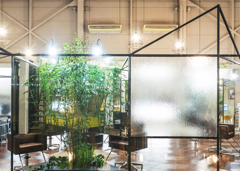
Mirror panels affixed to the back of a series of V-shaped polycarbonate screens reflect the architecture and patches of planting, producing a disorientating effect.
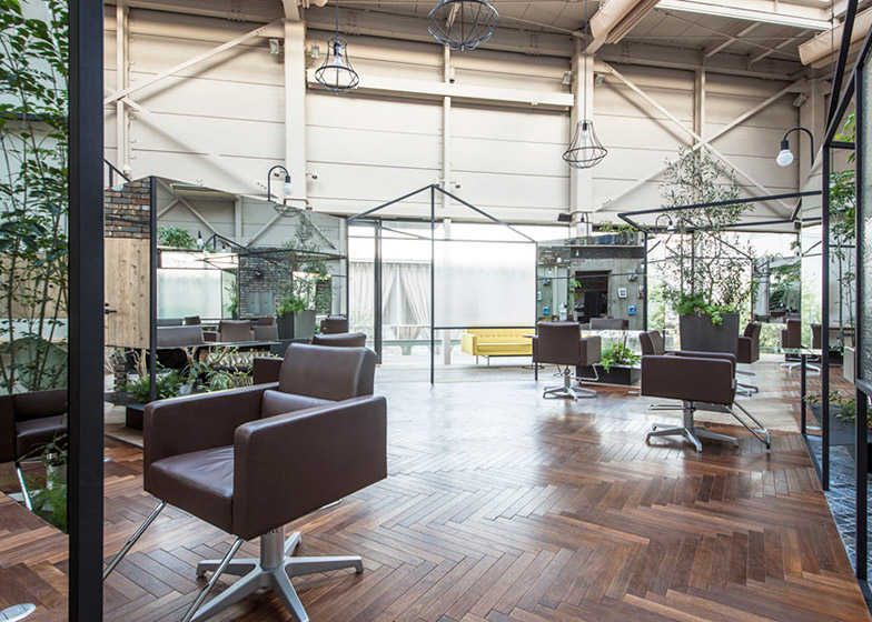
Individual lamps loop over the top of each mirror, while wire-framed light fittings hang from the high ceiling. Leather chairs provide seating within the treatment booths.
The screens and supporting framework are much lower than the ceilings in the building, helping to give the double-height space a more human scale.
Above the partitions, the ceiling and walls have an unfinished appearance, with structural trusses and air-conditioning units left exposed.
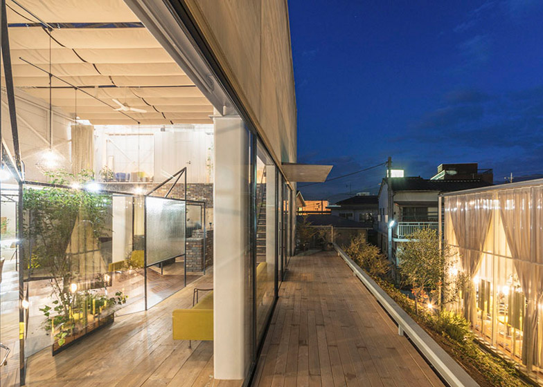
Zigzag-patterned parquet covers the centre of the salon floor, while areas of planting are tiled. Pale timber floorboards were used to differentiate a waiting area by the entrance, which is accessed via a narrow decked walkway that runs along the top of a bank.
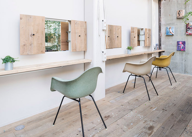
In the waiting area, pastel-coloured chairs are positioned along a pale timber bench in front of a series of small shuttered windows where glass is replaced with mirror. Magazines are displayed on plinths on an exposed-concrete wall to one side of this space.
Photography is by Tomohiro Saruyama.
Project credits:
Architect: Takehiko Nez Architects
Contractor: M's-A

