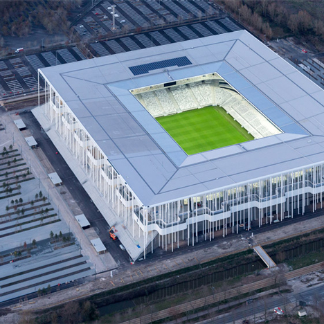
Comments update: this week readers have been discussing the merits of Herzog & de Meuron's newly completed football stadium in Bordeaux – a key venue for the Euro 2016 football championships. Read on for more on this and other most-commented Dezeen stories this week.
Beautiful game: the Nouveau Stade de Bordeaux is framed by 900 slim white columns, and will host five matches during the UEFA Euro 2016 tournament. Commenters flocked to praise the project's design.
"This is just gorgeous," wrote In Menso, while Lorenzo Ciancarini described it as "pure, simple and masterful".
"The design reminds me of the [Herzog & de Meuron-designed] Pérez Art Museum Miami," added Nagore. "The columns and stairs draw visitors into the stadium without looking or feeling like there's a strict boundary between its exterior and interior."
"The elegance of the international style reborn," wrote Joseph Strawbridge, describing the building as a perfect update to one of the 20th century's most influential architecture movements.
"This just might be the prettiest football-related thing since Beckham in shorts," concluded James. Read the comments on this story »
Size matters: a three-dimensional modelling system for architects – which has been hailed as "posh Lego" – got commenters hot under the collar due to its noncompliance with the metric system of measurement.
"1:48 scale? Why not 1:50?" asked The Angry Architect. "This is the kind of thing that keeps me up at night."
"Most of the world lives in the metric sphere," agreed one unimpressed reader. "I for one am sick of trying to do the conversions in my head."
Not everyone was as angry. "I guess the designer has made the rather shrewd decision to be able to market his product in America," replied JayCee.
The creators of Arckit also responded by saying "it can be used at any scale you envisage it to be, particularly when you integrate it with other model products of a certain scale". Read the comments on this story »
Beached: the seaside setting of this library in China featuring board-marked concrete walls left some readers bemused.
"This appears to be a library with no books in a location with no readers," said Balzac Oslo.
"Absolutely beautiful," added The Idle Architect, "but I'm just wondering about the fate of the ground floor in the event of a storm surge?"
Others wondered about the motivation behind the project.
"Would it be safe to assume that the Chinese authorities are building these places not necessarily out of need, but out of a desire to showcase their architects' talent?" asked Bradley. Read the comments on this story »
Starsky and clutch: BMW unveiled a 1970's-inspired concept car with an entirely carbon-fibre chassis at this year's Concorso d'Eleganza, but readers didn't take to the design.
"One situation in which modern and retro designs certainly don't mix well," wrote one commenter. Others jumped in, describing the concept vehicle as "complex", "hideous" and "cheesy".
"Reaching complexity is easy, but to reach simplicity is the real challenge," added Chris B. "This car is so complex that all its solutions seem incredibly arbitrary." Read the comments on this story »

