Erik Spiekermann's first fashion accessories are printed like wearable graph paper
German typographer Erik Spiekermann has designed his first accessories collection – a range of scarves and pocket squares with a gridded design based on printed systems of measurement (+ slideshow).
Spiekermann was invited to design a range for German concept label Unamono, which aims to produce "wearable fine art".
"I'd never designed a fabric before, which is the main reason I was so drawn to Unamono's request," said Spiekermann.
"I wasn't used to dealing in metres – millimetres are more usual for me, or at most I might work on book formats or posters. So lengths of 150 centimetres or 190 centimetres were something out of the ordinary, and I was very excited."
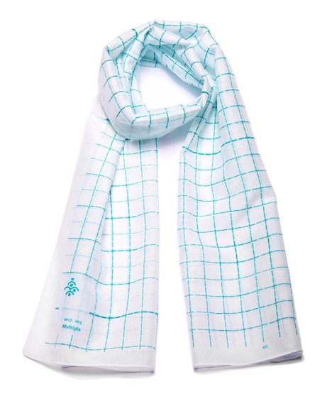
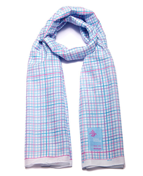
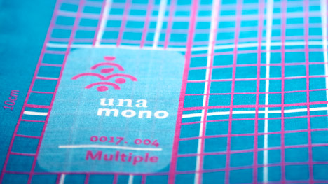
Called The Measure of Things, Spiekerman's range comprises different colour variations of two gridded designs based on graph paper and other forms of printed measurement.
"The idea behind the designs was to make the syntax of the work visible," explained Spiekermann in a movie released to accompany the collection.
"When I see an image by a Constructivist, I know how it has come about. In this case, the same applies: the unusual format naturally inspires you to make something of it. That's why I decided simply to measure the thing out."
"The scarf is 180 centimetres wide, so I drew out 180 centimetres worth of space," he said.
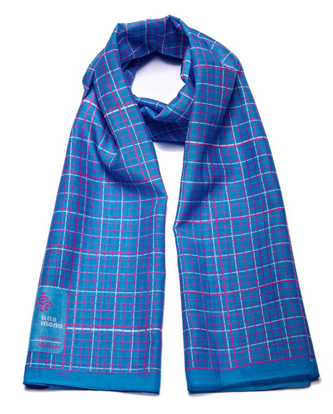
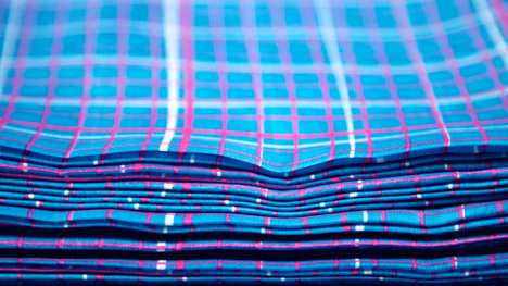
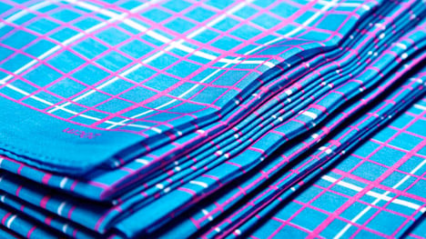
Printed on a silk and cotton blend fabric, the range includes a 160 by 40 centimetre medium scarf, a 190 by 60 centimetre slim scarf created specifically for women, and a 30 by 30 centimetre handkerchief designed to be worn as a pocket square.
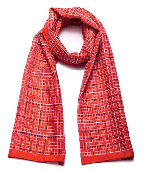
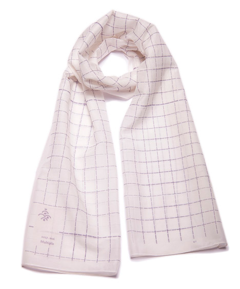
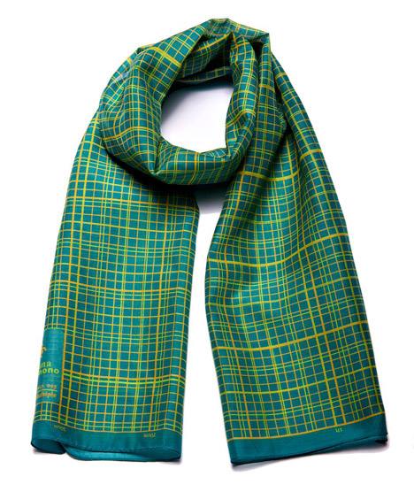
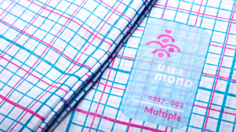
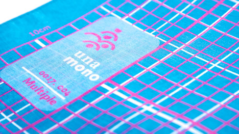
Grids of different colours are overlaid on top of each other to create varying effects, with some appearing closer to a tartan and others looking more like paper from a school maths book.
Colour combinations available for the first variation include cyan and magenta lines on a white background, black and white lines on a bright red background, yellow and orange on emerald green, and magenta and white on bright blue.
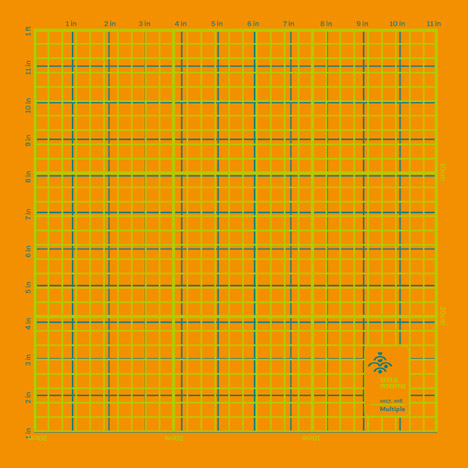
Pocket squares come in yellow and green on orange, or black and white on grey.
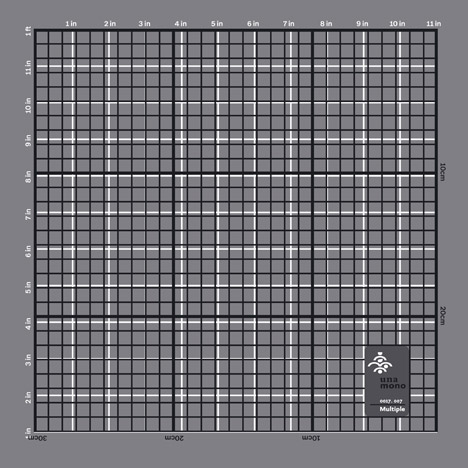
"I selected from the classic colours, I suppose that many of us still recognise the old graph paper cyan, which is light blue – a colour chosen so that the guide lines would not show up on black and white film when a copy was made," said Spiekermann.
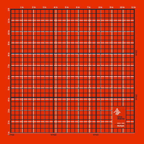
"The next natural choice was magenta, one of the four colours in the CMYK colour model. It was all entirely rational – divided like graph paper. The scarf is a giant piece of graph paper."
The other variation, with dashed instead of solid lines and a less dense grid, comes in two colour variations – dark grey and white on lilac, and green and white on pale dove-grey base.
The pieces are available to purchase via the Unamono online store as well as a small number of shops.
Spiekermann is one of the world's most successful typographers, with offices in Berlin, Amsterdam, Stuttgart and San Francisco. Among his best-known works are the redesign of The Economist magazine in 2001, the Offocina San and Serif typefaces, and Nokia Sans, the official typeface of the mobile phone company until 2011.
"The thing I've always loved most about my profession is that people encounter the products of my work without ever knowing they came from me," said Spiekermann.
"When someone sits on the train and reads something set in one of my fonts, I find it fantastically enjoyable that no one knows about it. But I know, and I amuse myself with the fact, just like Rumplestiltskin did: 'It's good no one knowns that Spiekermann is behind it all.'"
"With the scarf, it's the same thing: If I see someone on the street, I know that they're wearing one of my scarves. This makes me incredibly happy," he added.