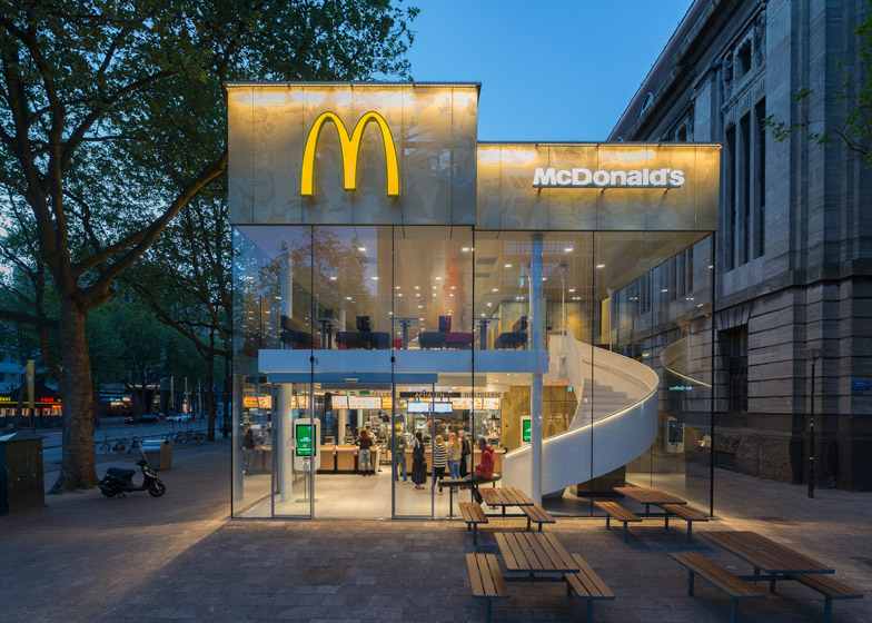
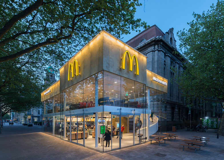
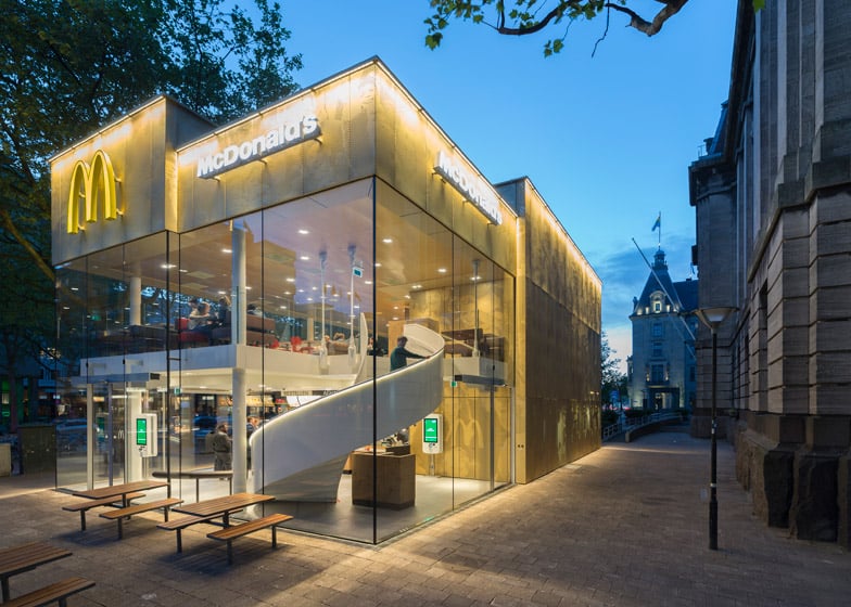
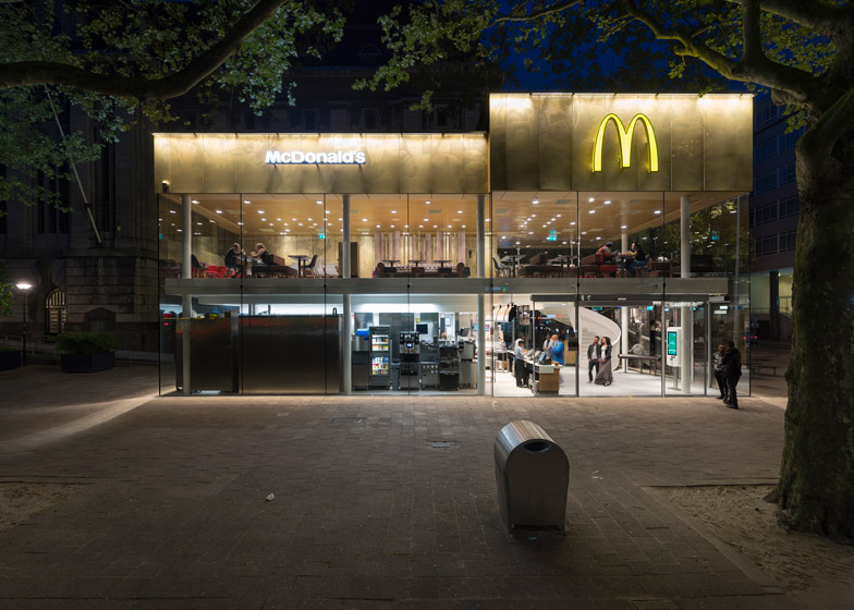
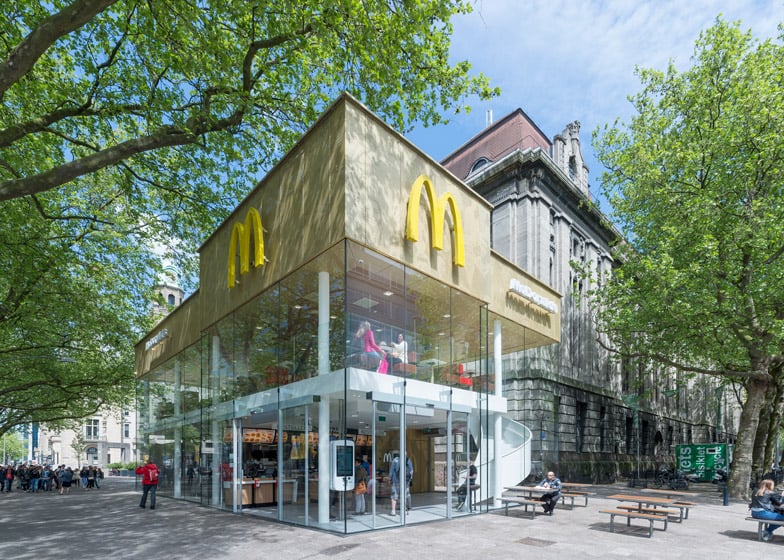
This McDonald's restaurant featuring a perforated golden facade and a grand spiral staircase was designed by Dutch firm Mei Architects to replace "the ugliest building in Rotterdam" (+ slideshow).
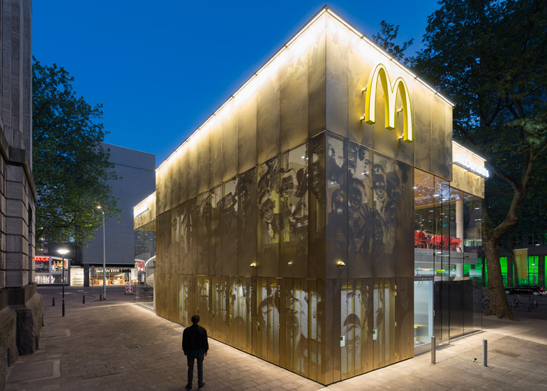
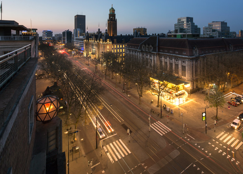
Located on Coolsingel, one of the city's most popular shopping streets, the two-storey structure was conceived by Rotterdam-based Mei Architects as a golden pavilion with a facade of pixillated imagery.
McDonald's had already occupied the site for 45 years, but until now the restaurant had been housed within a glass structure originally built in the 1960s as a cigar shop.
Rotterdam's residents previously voted the building the ugliest in the city, so the council was keen to demolish it. But McDonald's still had 40 years on the lease, so it was decided that a new building would be constructed in its place.
"Our task was to redesign the McDonald's and make it blend into its surroundings," explained studio founder Robert Winkel.
"Since the 1970s the McDonald's pavilion has been altered frequently. Its quality suffered as a result, with its mostly closed facades. This makes the space anonymous. We want to activate this space again."
Unlike the old building, which was built against the wall of a historic post office building, the new fast-food restaurant stands in the centre of the pavement to make it look more like a pavilion.
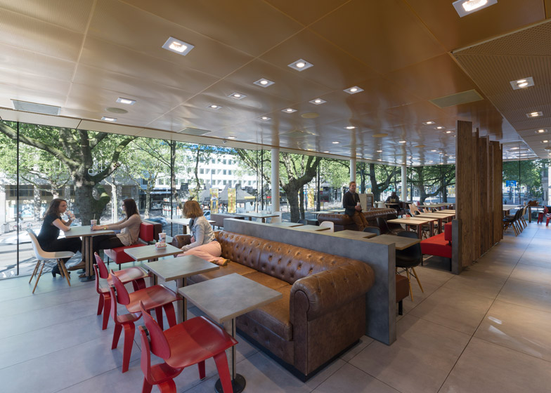
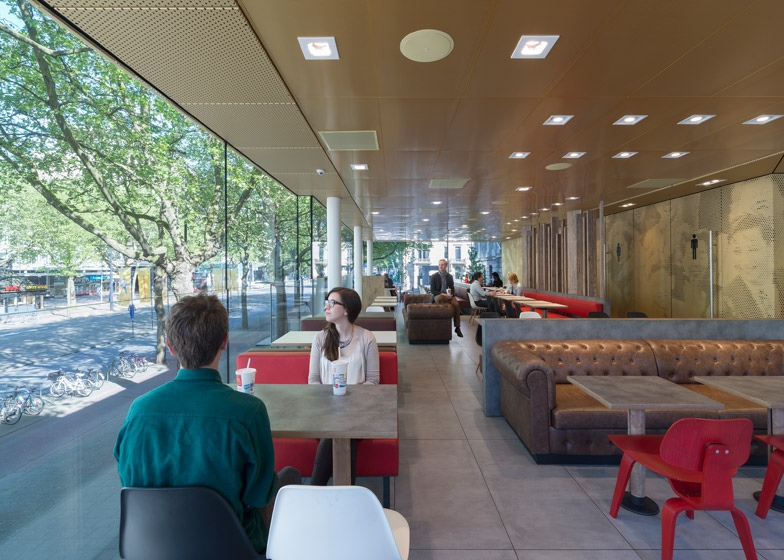
The majority of its exterior is glazed, providing views through the building. This allows passersby to catch a glimpse of the white steel staircase that spirals up from the service area on the ground floor to the dining room upstairs.
"The new building volume has been carefully detailed and articulated to open up views of the monumental post office behind it," said the team.
"As a result, the pavilion has the most compact possible core, with glazed facades all around," the architects added. "A fully transparent lobby, with entrances on three sides, makes it seem as though the public space flows through the building."
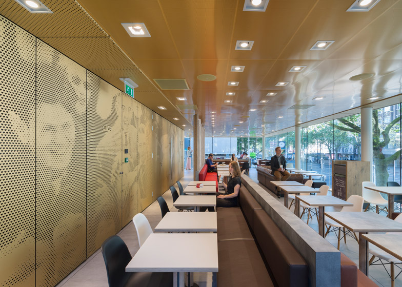
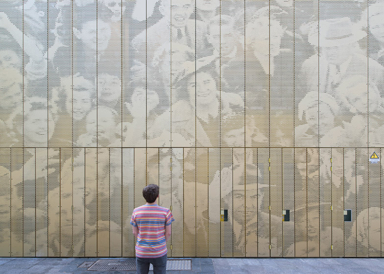
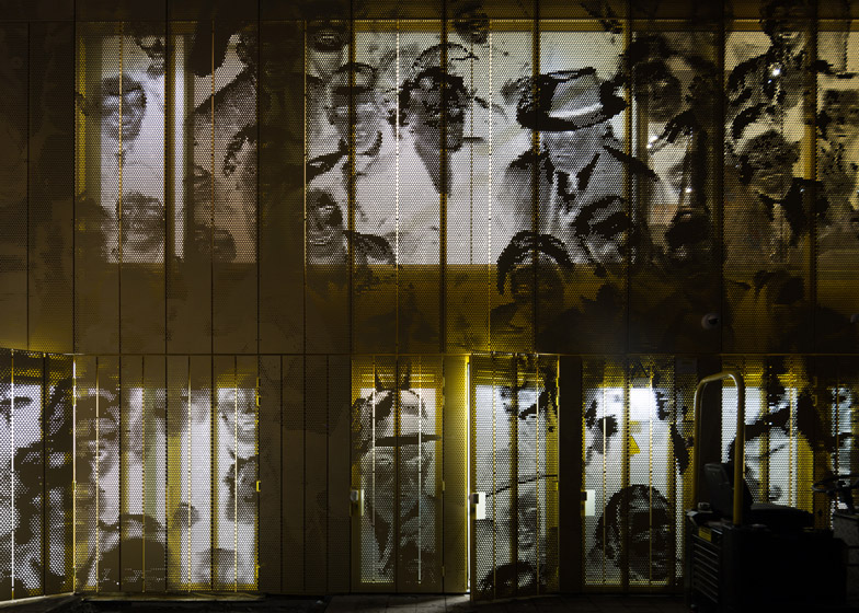
Other parts of the facade were clad in panels of gold-anodised aluminium, dotted with small heart-shaped perforations. Together, these form a pixellated image showing a crowd of people, which also continues on the inside walls.
"As McDonald's is open day and night, 24/7, its appearance after dark is important," explained the team. "By day the building is inviting to shoppers, while in the evening it glows to attract the nightlife crowd."
Mei Architects was also tasked with improving the environment around the building. The office's main intervention was to relocate the power boxes for utilities and traffic regulation from the street to the restaurant's rooftop.
The team also created fixed outdoor seating so that diners can eat outdoors, using the same street furniture already used in some of Rotterdam's existing public spaces.
Photography is by Jeroen Musch, apart from where otherwise indicated.
Project credits:
Team Mei: Robert Winkel, Menno van der Woude, Michiel van Loon, Robert Platje, Ruben Aalbersberg
Contractor: BVR Groep
Structural engineer: Adviesbureau Roelen
MEP: Sweegers & de Bruijn
Facade: Glasimpex, VPT Versteeg
Stairs: WV trappen
Fire safety: Grontmij
Interior design: NivOO3

