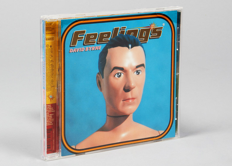
Interview: maverick graphic designer Stefan Sagmeister explains why he thinks that record cover designs will always be superior to film posters in this exclusive interview (+ transcript + slideshow).
Sagmeister, 53, has become one of the world's best-known graphic designers – creating brand identities for household-name corporations, high-profile advertising campaigns and iconic album artworks for famous rock bands.
The New York-based designer pointed to the Star Wars film posters as examples of bad graphic design compared to record sleeves during an interview at Amsterdam's What Design Can Do conference.
"The history of the album cover is so much richer and so superior to the history of the film poster," Sagmeister told Dezeen. "The average film poster basically takes its strengths from being attached to some cultural phenomenon."
"People like the Star Wars poster because they like the film," he continued. "But the poster itself is ultimately a piece of shit. It's a realistic illustration with some typeface on it related to what's happening in the film."
"It's a reduction of something that's inherently visual into a single image and that process is inherently uninteresting. It's a very straightforward graphic design thing – you might as well design a logo."
Born in Austria in 1962, Sagmeister found his interest in design while working at a magazine and then creating album covers for bands he liked.
"I was always in terrible progressive rock bands and through that got interested in vinyl album covers," he said.
He studied graphic design at the University of Applied Arts in Vienna, then worked on a number of commercial projects in New York and at advertising executive Leo Burnett's Hong Kong Design Group.
Finally, he moved back to New York to work for his "hero" – Hungarian designer Tibor Kalman – before setting up his own studio shortly afterwards.
"We remembered the reason I got into this was the album cover, which of course at that point didn't really exist anymore and it was a CD cover," Sagmeister said. "We really pursued that and for the first seven or so years we really did design for the music industry."
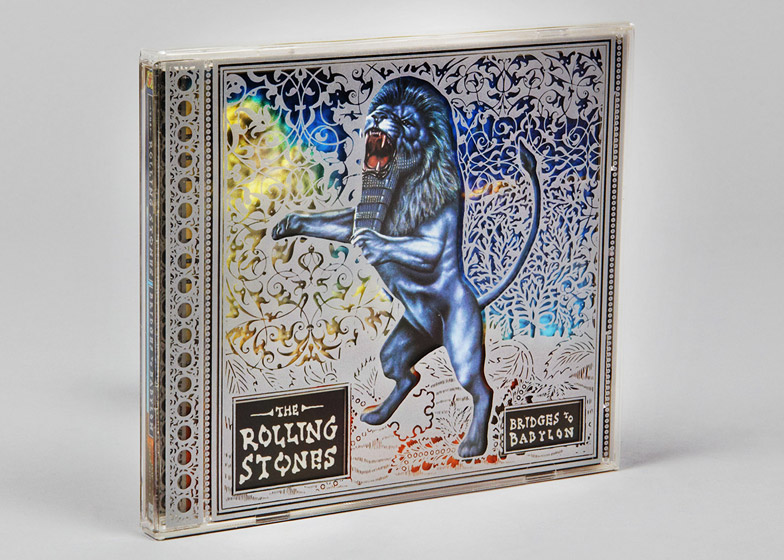
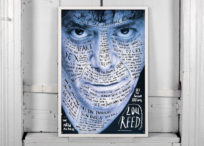
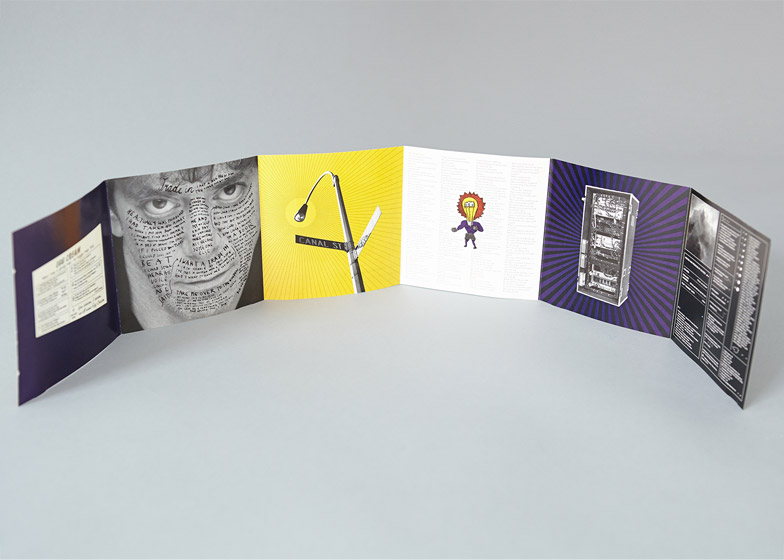
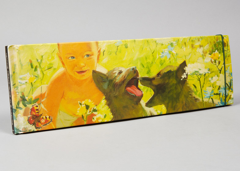
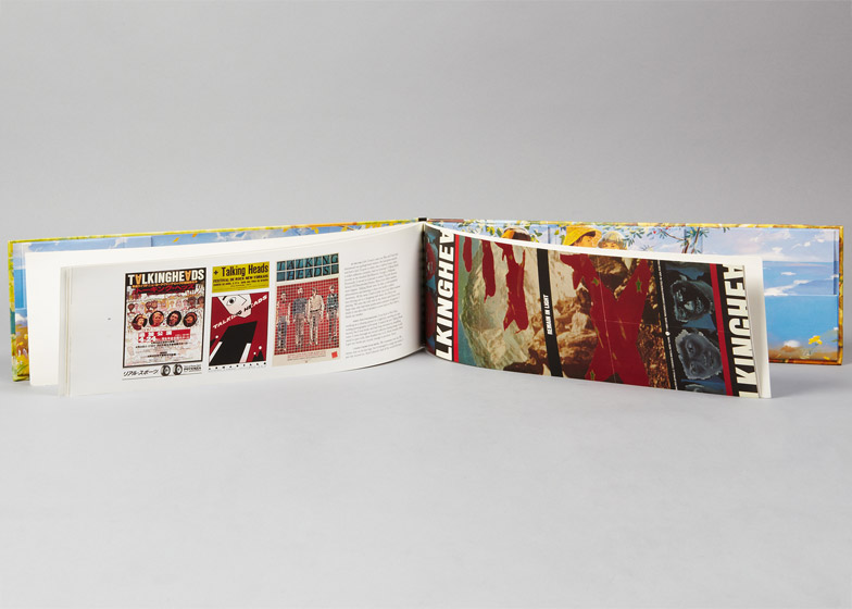
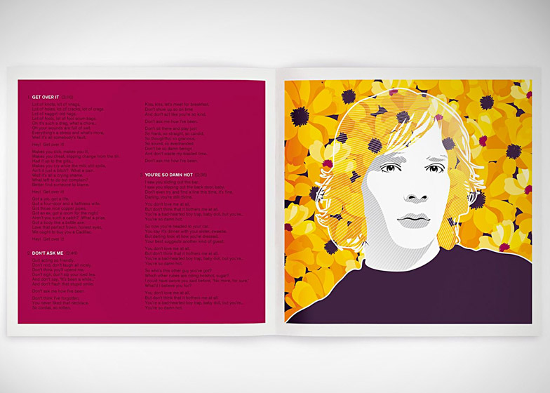
However, after working on covers for artists including Aerosmith, The Rolling Stones, Lou Reed and Talking Heads, Sagmeister branched out to work on other types of graphic design projects.
"I wouldn't say it became boring, but the 29th cover wasn't as much fun as the first," he said.
Since setting up in 1993, his studio has completed graphics projects for companies including HBO, the Guggenheim Museum and Time Warner.
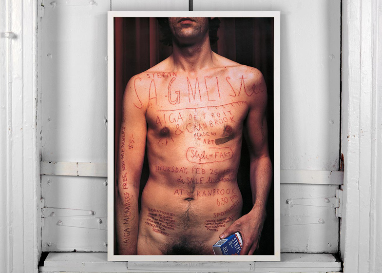
Sagmeister is perhaps best known for the poster advertising his 1999 AIGA lecture, for which he posed naked covered in text that was cut into his skin.
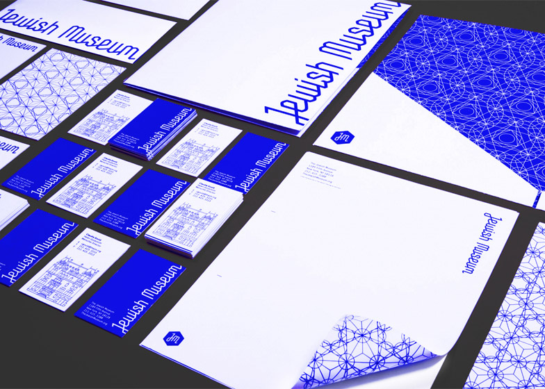
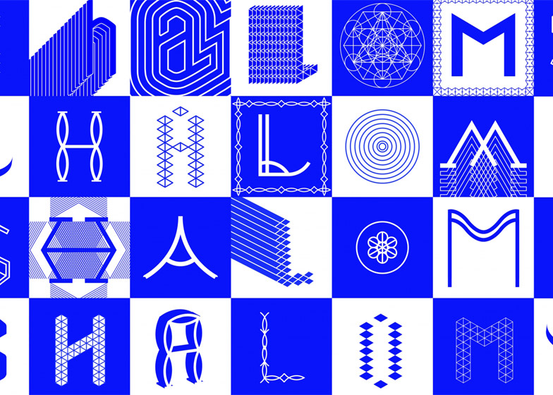
American designer Jessica Walsh joined the firm in 2010 and was made partner two years later, when it was renamed Sagmeister & Walsh. The duo has overseen projects including a new brand identity for New York's Jewish Museum and an animated visual identity for cloud software management brand Fugue that moves to music.
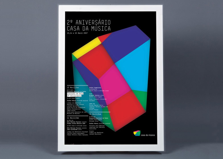
"As a graphic problem, I still find that visualisation for music is one of the most juiciest for all," Sagmeister said. "I do believe that music is ultimately the most emotional of all the arts. To be able to create the visual that comes out of that emotion and attach it to something that is inherently non-visual is an incredibly interesting endeavour."
Sagmeister spoke to Dezeen during an interview at the What Design Can Do conference, which took place in Amsterdam 21-22 May 2015.
Read an edited version of the transcript from our interview below:
Dan Howarth: Could you please explain a bit about your background and how you came to do what you're doing now?
Stefan Sagmeister: I'm an Austrian designer who lives and works in New York. I've been involved in design in some sort of fashion for an extremely long time. Probably since I was 14 when I wrote for a little magazine and I realised that I actually enjoyed doing the layout a lot more than I enjoyed doing the writing.
From then on I was always in terrible progressive rock bands and through that got interested in vinyl album covers. Then ultimately I started design in Vienna, then in New York. At design school in Vienna, I got sidetracked and got to know these other pals who were not into album design and ultimately after art school did all sort of jobs, very commercial.
I ran a design studio for an ad agency in Hong Kong and then returned back to New York to work for my hero Tibor Kalman and then ultimately six months into that opened my own little studio. We remembered the reason I got into this was the album cover, which of course at that point didn't really exist anymore and it was a CD cover. We really pursued that and for the first seven or so years we really did design for the music industry.
Dan Howarth: Why did you decide to focus on that?
Stefan Sagmeister: It was only because of a desire to combine my two loves, which were music and designing things for bands you've never heard of, and then some for who you have – Talking Heads, The Rolling Stones, Errol Smith and Lou Read and so on. Ultimately like pretty much everything else in my life, I wouldn't say it became boring but the 29th cover wasn't as much fun as the first. So we went into different directions.
Right now the mix of projects is always slightly changing the roles that we have. Roughly it is some commercial work – what you think that a design company would do – and some of it is cultural, both designing for museums and curating the exhibitions that are shown within in the museums.
And a third of it would be personal. Using the language that we do know how to speak, graphics, and using that for a much more personal expression, in the same way that musicians or filmmakers do.
Dan Howarth: How do you think graphic design has changed since you started working?
Stefan Sagmeister: Significantly. Mostly, as always throughout its history, the change has been driven by technology. When I went to school somebody who did graphics had the advantage that there was a wide variety of tools that were incompatible with each other so on a daily basis you had to change rooms in order to be a graphic designer and all these tools require a different setup.
And some of them you have to do in special places. Which had its own set of problems and it was a much slower profession, which in some cases led to a bigger reflection to if you should do it or not because the execution of these ideas is very complex and time intensive.
All of these tools are now doable in one single machine, which I think decreased some of the excitement of the profession because we tend to sit in front of a screen all day long, in many of our cases. At the same time, because a lot of tools are available in that same screen, it makes the profession a lot wider.
Dan Howarth: Do you solely work on graphic design?
Stefan Sagmeister: I would still call myself a graphic designer but if people just ask I would leave out the "graphic" part, because we do furniture and we do film. Not just a little piece but we are also doing a feature length film. But we also do sites and branding, all the way down to business cards. I've also found myself choreographing dancers, seriously commissioning music – luckily I don't have to do the music myself, I've learnt too much from bad rock bands.
But the profession has become unbelievably wide and I never knew that that was going to happen when I was a young designer, and it was never one of the reasons I got into it. But I'm extremely thankful that it is so, because it's so much easier to keep engaged in it for such long time because there are always new pockets to be involved in then.
I'm somewhere in the middle when it comes to how much newness do I want in my life and work, and how much consistency. I've known people that want that newness all the time and I think that I'm not that radical. But I think if I was to still do CD covers – I'd be out of business for one thing, because there is no business anymore, but even if the music industry change wouldn't have happened I just couldn't.
Dan Howarth: What was it about designing for music that you enjoy so much?
Stefan Sagmeister: As a graphic problem, I still find the visualisation for music is one of the most juiciest for all because I do believe that music is ultimately the most emotional of all the arts. To be able to create the visual that comes out of that emotion and attach it to something that is inherently non-visual is an incredibly interesting endeavour.
The history of the album cover is so much richer and so superior to let's say the history of the film poster. The average film poster basically takes its strengths from being attached to some cultural phenomenon. People like the Star Wars poster because they like the film. But the poster itself is ultimately a piece of shit. It's a realistic illustration with some typeface on it related to what's happening in the film. It's a reduction of something that's inherently visual into a single image and that process is an inherently uninteresting process. It's a very straightforward graphic design thing – you might as well design a logo.
But to take something that's non-visual like a piece of music and marry an image to it is a much more interesting thing. And I think the quality of the history of an album cover, which looked for a while like it's going to be a very defined area of human endeavour.
Basically the album cover was invented in the 1930s but it had its heyday from 1975 to 2000. And who knows, it might stay that way. But it looks right now that it will stay. I just bought a record player again and I'm buying albums purely on their cover merit.
Dan Howarth: A lot of companies now seem to be asking for branding and logos that are responsive. How is that changing the profession?
Stefan Sagmeister: It used to be super important that the logo could be reduced down to two millimetres and look good when heat stamped on a pencil. For one thing, people don't really use pencils anymore and for the second thing the significance of a logo and a pencil is minimal on a logo while the significance of a logo on a website is gigantic. The possibilities that the reproductive qualities of that identity are offered in the digital realm than they were in the print realm.
Hopefully and luckily, designers will react to that change to the environment. It's very, very clear that the still image, the single that the still image, will continue to lose its importance. It will be replaced by either some sort of visual language, like an infrastructure that talks in a particular visual vocabulary, that's constantly changing and adapting.
Or in its simplest form, animation. The logo really, in most of its iteration, is some sort of animated thing. In its very simplest form, what used to be important was printability but is it now animatability. How does this thing perform when its on a small phone screen or on a gigantic screen in a stadium?
Dan Howarth: What are the big projects that you're working on at the moment?
Stefan Sagmeister: We just finished a big branding job for the Jewish Museum in New York – it's the biggest, foremost arts museum in the Jewish world in the United states. We are currently working on the woman empowerment project for Saudi Arabia, which I'm very excited about, and we're continuing to do a department store in the Middle East.
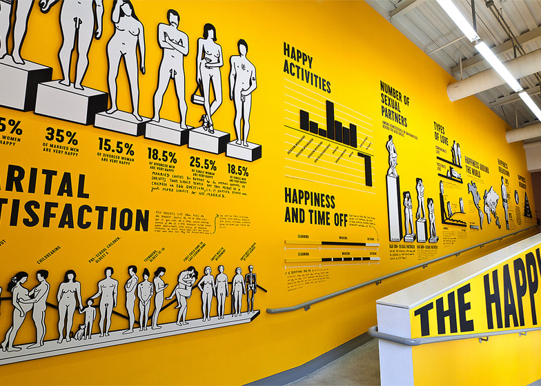
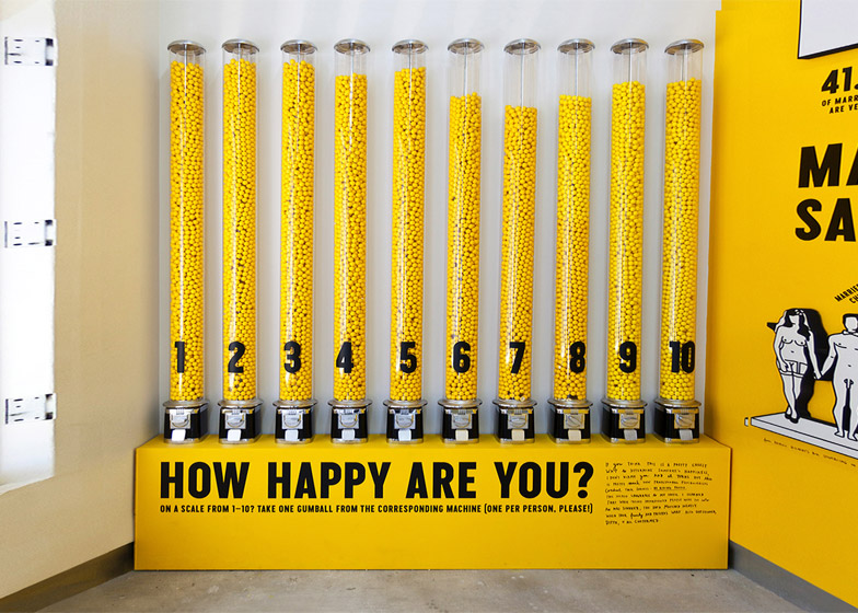
On a personal front, we are finishing The Happy Film – a documentary about happiness which has been very long in the making and very difficult to do, and has at times become the biggest source of misery and discontent in my life. Which I suppose is very fitting as it's called The Happy Film.
I'll be doing a sustainability project that makes people change from paper builds to electronic builds. It's almost as if we're just trying to start growing our hospitality workspace project. It's extremely comfortable because New York is booming and we were always in the situation to pick and choose but not quite to the level its going on right now. We're not really growing, as we feel we can do the best work in small groups so just continuing there.
Dan Howarth: Where do you think graphic design is going to go next?
Stefan Sagmeister: I'm probably terrible as a predictor, but there's some easy predictions. I think it's going to go where technology goes. So I think a couple of things are very easy and foreseeable.
Anything that's possible to be animated will be animated. I think that the printing technology in the 3D world will play a bigger role, or will introduce and make it much easier for graphic designers to do products because again it's that same space. Or I would say that that printing technology will continue to play a big role as far as individual execution, because inkjet will take over more and more spaces. It means that you can do something that's much smaller in run and much more individual in their outlook.
So my assumption would be that custom-made, low-run, high-end projects will play a bigger role considering specifically that only very specialised things will have the desire and the need to be a physical object.
Those would be my three key predictions. These are fairly safe predictions because I see them already happening to some extent. We now do sometimes extremely elaborate projects and we do them in an edition of 10.
That thing didn't exist as a client project 20 years ago. It would have been impossible to print 10 of something, but now that's very regular and basically only 10 people will own it but maybe hundreds of thousands will see it on social media, so there is a different kind of multiplier going on.

