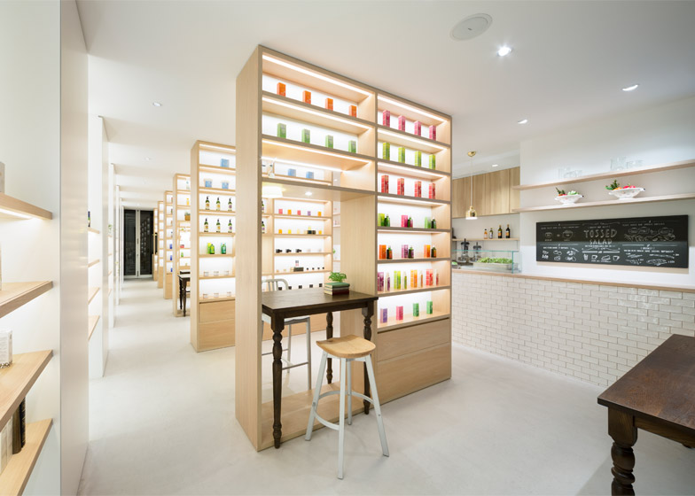
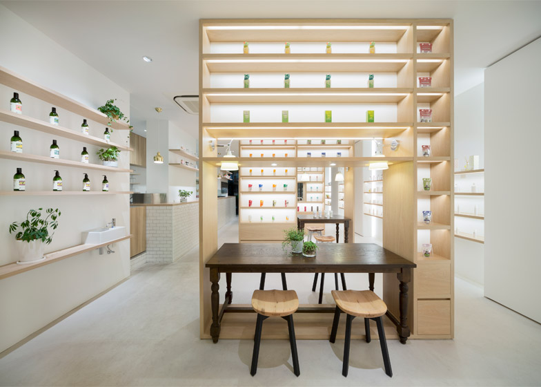
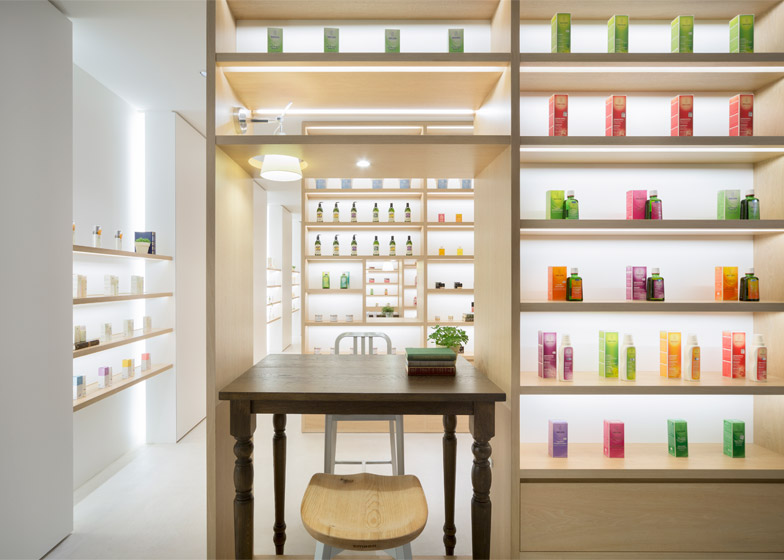
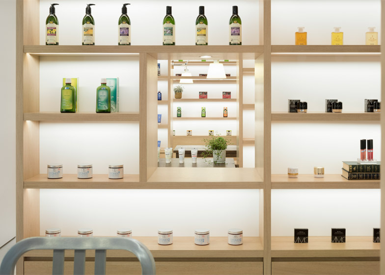
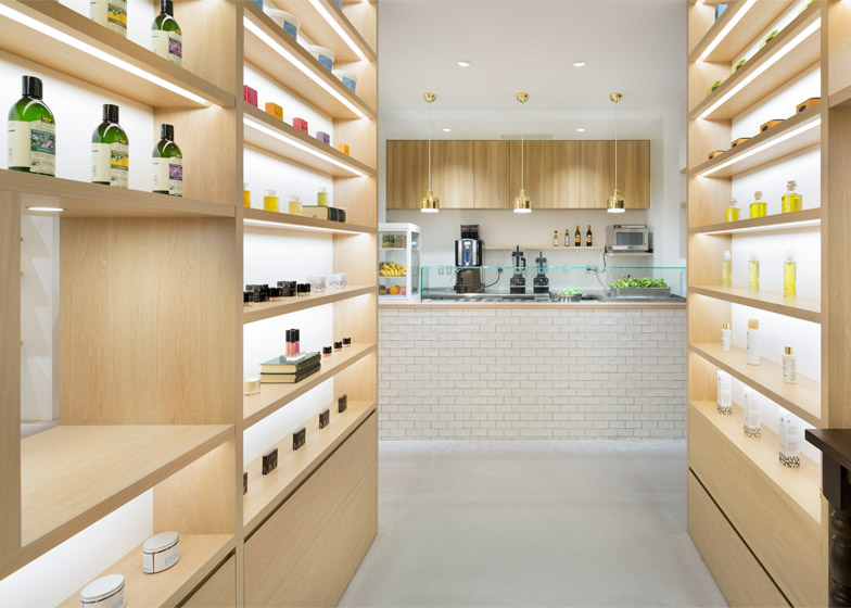
Beauty products are displayed on rows of shelves arranged like a library inside this Tokyo cosmetics store by Japanese design studio Nendo (+ slideshow).
The studio, led by designer Oki Sato, created the minimal interior for organic cosmetics company Nature's Way.
The store is located on an alley behind Aoyama Street – Tokyo's premier shopping destination, where some of the world's most famous architects have designed flagship stores for luxury fashion brands.
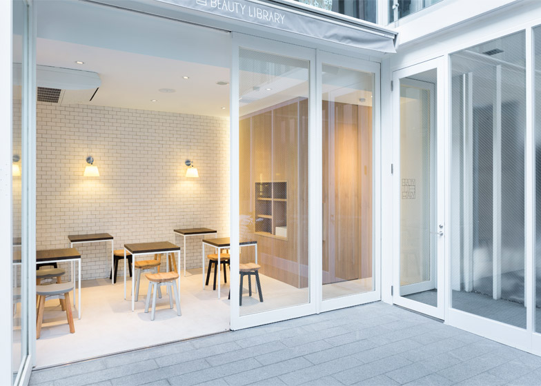
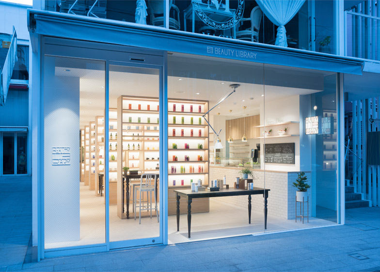
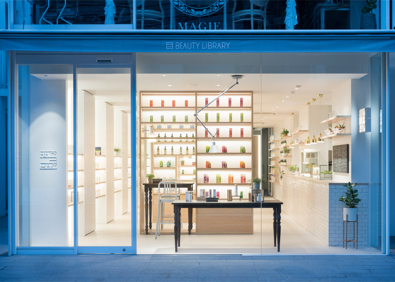
The comparatively small Beauty Library boutique occupies the ground floor of an unassuming building and has a fully glazed shopfront.
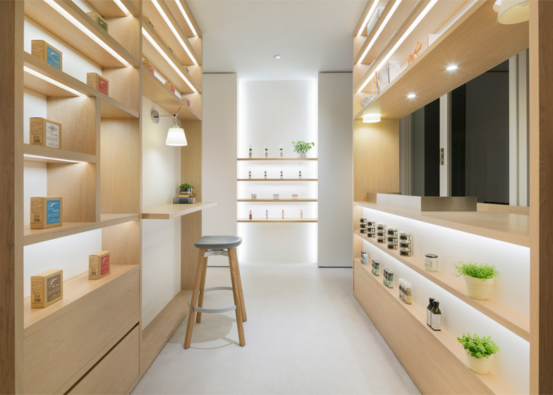
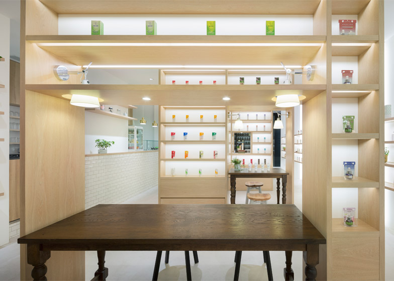
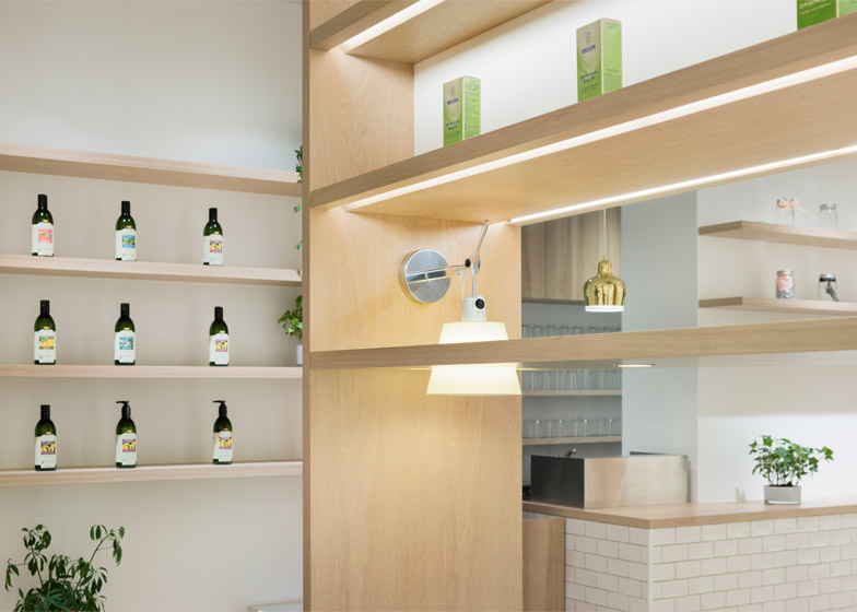
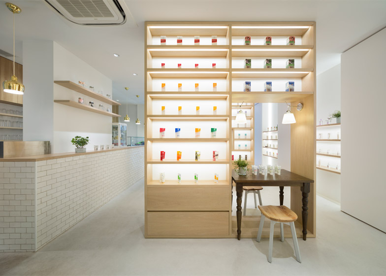
Colourfully packaged products are arranged on floor-to-ceiling wooden shelving units, which are positioned in a line down the middle of the space – like book stacks in a library.
Nendo's stools for American brand Emeco provide seating at dark wooden tables designed to look like individual study desks, which slot into the shelving units to provide spaces for testing the products.
QR codes placed beside each item allow shoppers to retrieve more information about the products using a smartphone or tablet, and allow them to purchase products online after they have left the store.
"In this way, the store not only sells cosmetic products, but is also a place where knowledge relating to them can be obtained," said Nendo. "Therefore it can be described as a library-like space with well-organised wooden shelves."
The archive-like design of the Beauty Library is similar to a chocolate shop that Nendo created in the city.
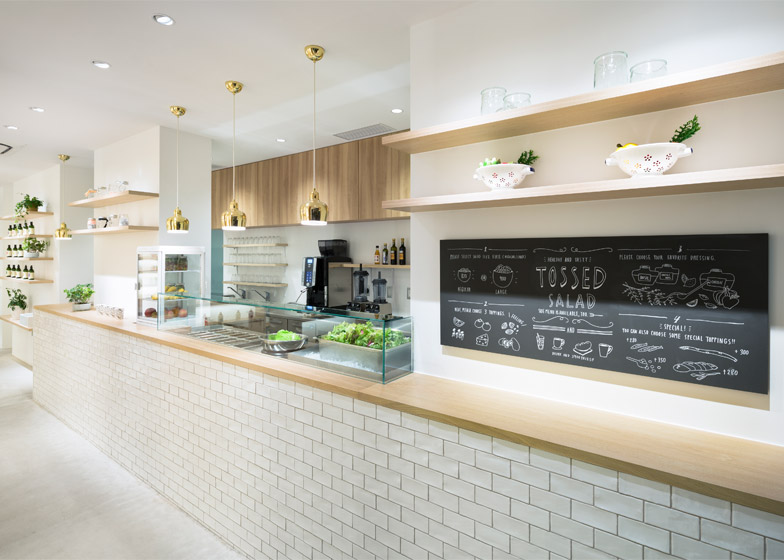
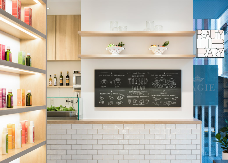
This cosmetics store also incorporates a cafe, where food and drinks are prepared behind a long service counter that runs down one side of the shop.
"For a woman to enhance her beauty, a close linkage between inner and outer body care is required," said the studio. "We therefore designed a service and space based on a concept that fuses to the maximum the features of cosmetics with food and drink."
The cafe's service bar is clad with white tiles and topped with a wood surface. Ingredients are presented within a glass case in the centre, while wall-mounted shelves that match the counter are used for storing condiments, utensils and vessels.
Dezeen Book of Interviews: Nendo founder Oki Sato features in our new book, which is on sale now
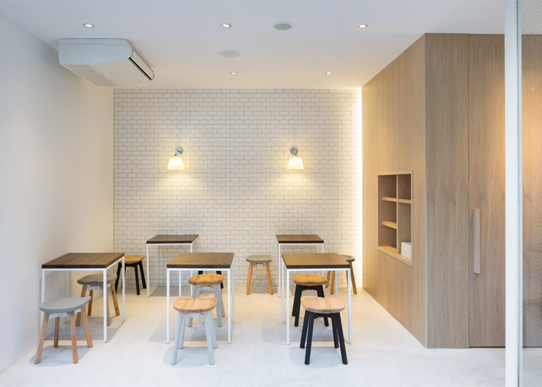
An additional room located across a small courtyard at the back of the main space provides an eating area.
Furnished with small tables and more stools, the "hidden annex" also functions as an area to host events and workshops.
Nendo created the visual identity for the store, with a logo designed as an image of a square bookshelf filled with letters.
During an interview with Dezeen earlier this year, Sato said that the studio is focusing more on architecture and interiors projects – following projects such as a fashion boutique with suspended bookshelves and a store interior for shoe brand Camper.
However its output of products, furniture and accessories still remains high. Recent examples include a bag designed specifically for architects, and chairs formed by layering, rolling and cutting sheets of artificial suede.

