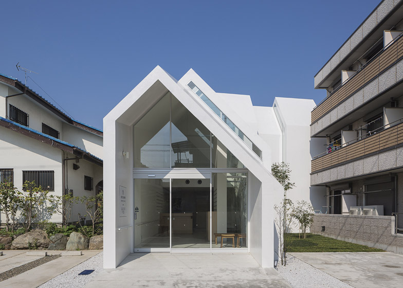
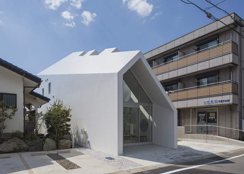
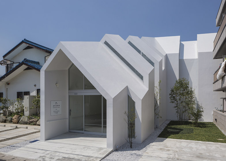
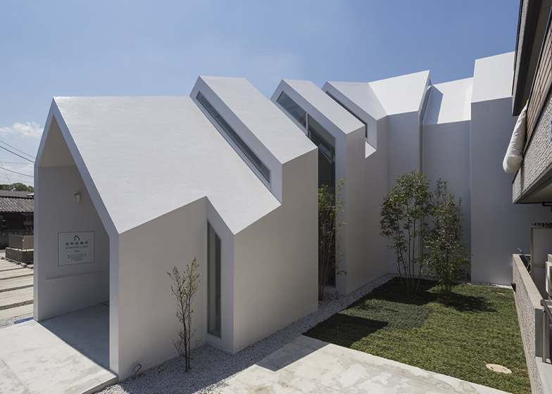
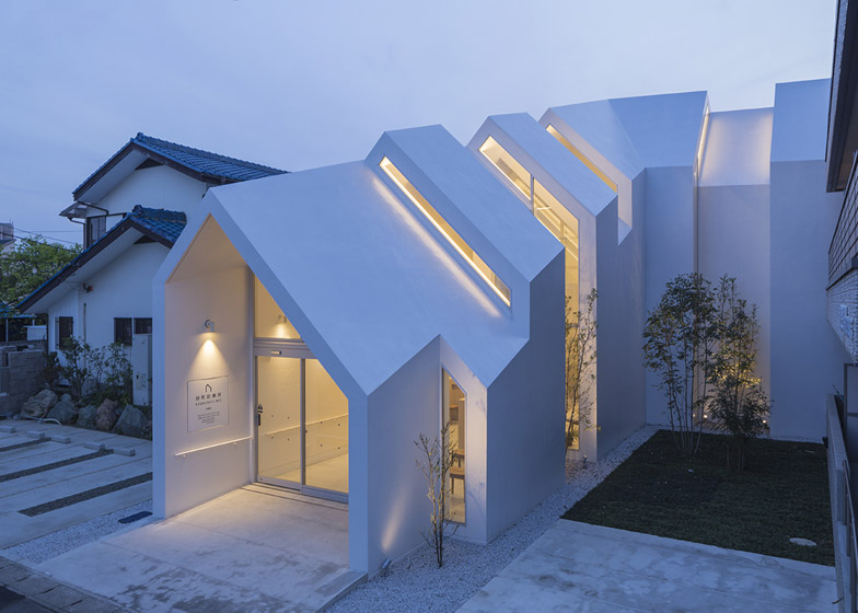
A sequence of house-shaped volumes make up the form of this medical centre, designed by Hkl Studio to blend in with neighbouring homes on the outskirts of Chiba, Japan (+ slideshow).
The Asahicho Clinic provides medical care for elderly patients residing in the suburbs of the coastal city, which is located 30 miles outside Tokyo on the Bōsō Peninsula.
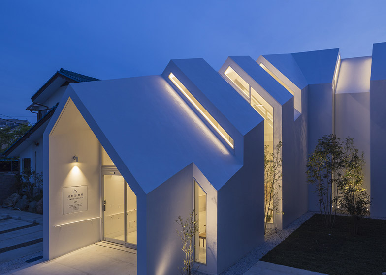
Tokyo-based architect Hikalu Tanabe of Hkl Studio devised a series of triangular arches that mimic the gable of a house to help mask the scale and purpose of the building.
It is a technique that has been used frequently for medical buildings, with examples including a cancer-care centre in Denmark and a hospice in London.
"To give a more familiar image of the building to the visitors we chose a typical house-shape as facade," said Hikalu Tanabe.
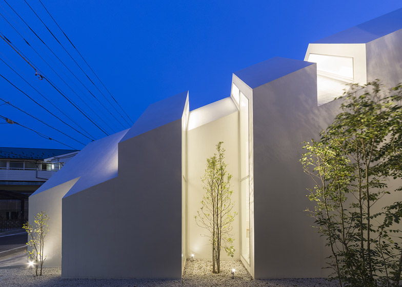
The concrete arches increase in scale towards the centre of the L-shaped building, but taper off towards the back of the site, where the clinic angles behind a neighbouring housing block.
Slivers of glass set between the irregularly shaped arches allow light to penetrate the building while restricting views through to the interior.
To ensure accessibility for elderly and disabled patients, patient rooms are located on the ground floor of the clinic, while staff areas are situated on the first floor.
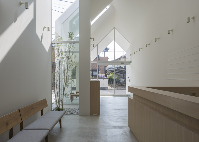
A double-height reception area occupies the wing of the building that is perpendicular to the street, while the examination rooms are placed along the back of the site in the arm parallel with the street, to provide more privacy.
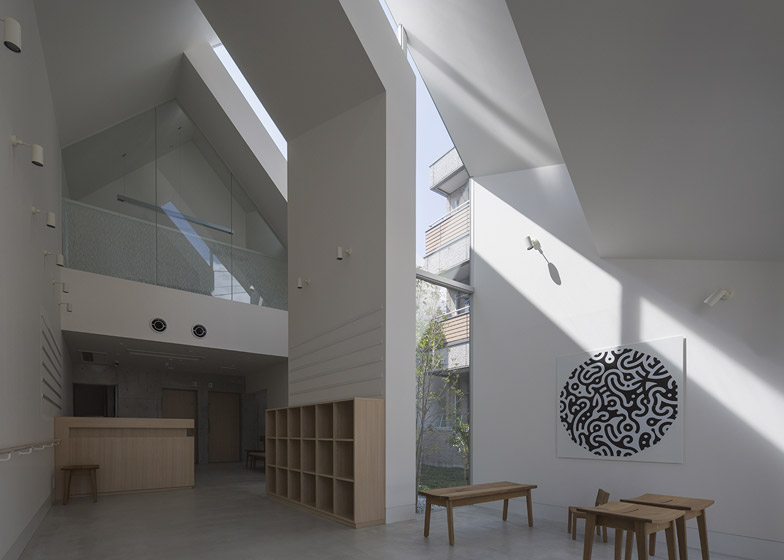
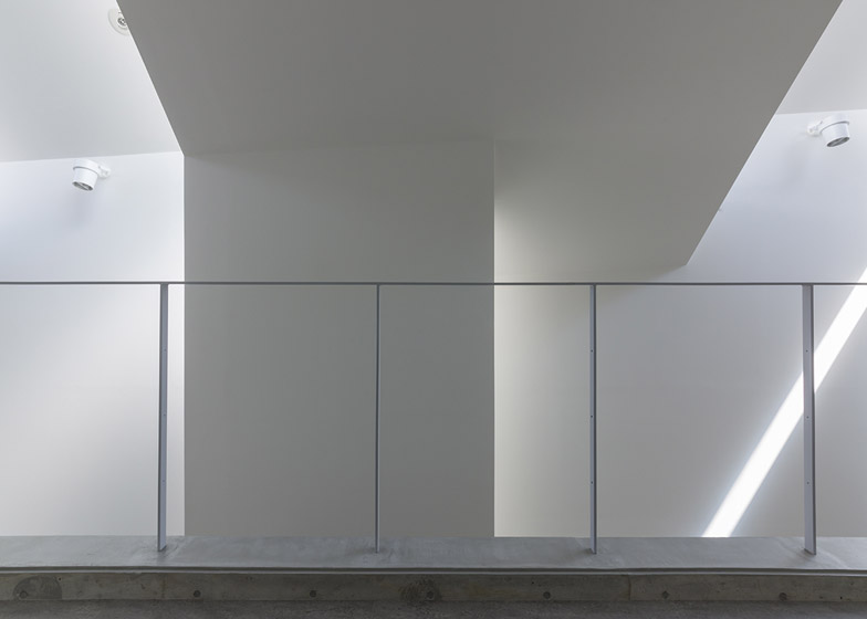
The upper floor is slotted beneath the pitched roofline in the highest part of the building. It is set back from the structure's glazed gable, leaving space for the double-height waiting room by the entrance.
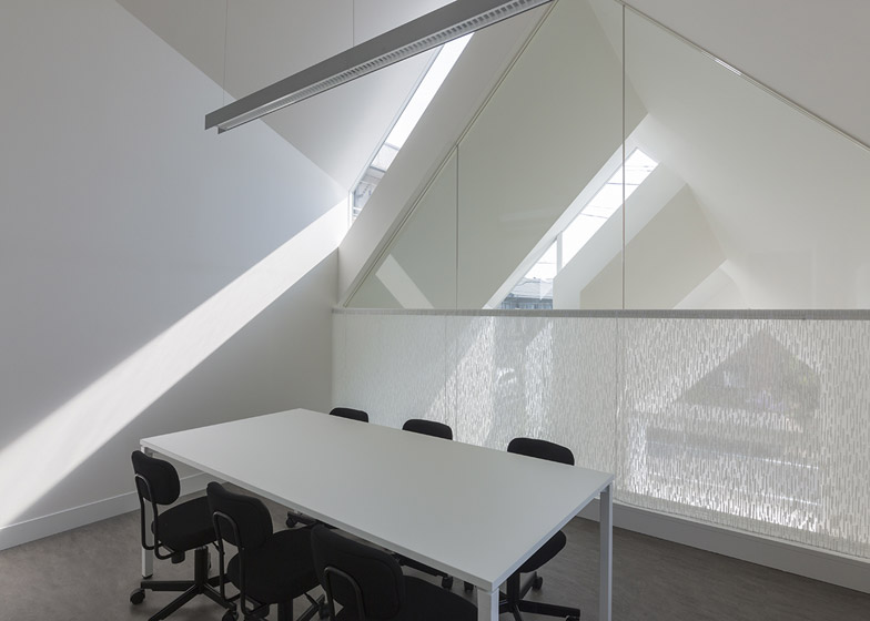
A narrow staircase leads from the back of the waiting room to a glazed meeting room suspended above the reception desk and a row of staff rooms.
"The roof gets gradually higher until the centre of the building," said the architect.
"This transition produces spaces with right proportions, from a cozy entrance to a double-height space for waiting, which reduce the feeling of pressure for the surrounding environment."
Related content: see more architecture and design for elderly people
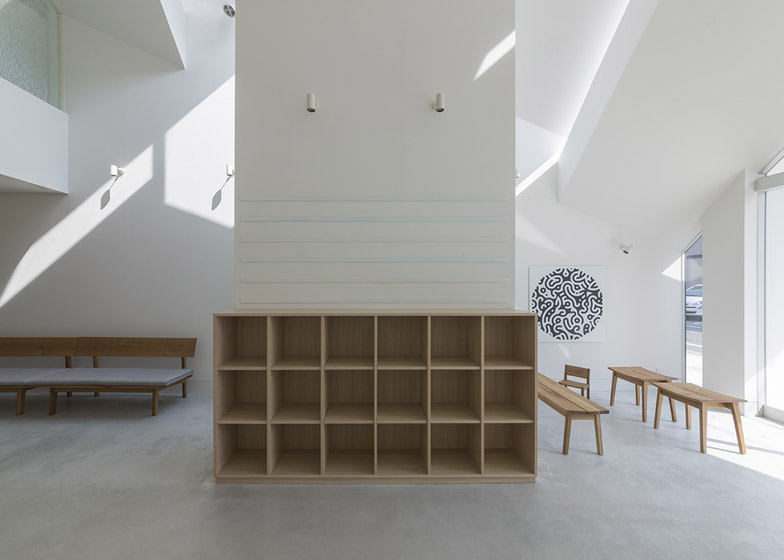
Nooks created by the shape of the structure provide more secluded seating areas within the spacious waiting room, and outside a row of examination rooms.
"This concept of recesses creates a strong relation between the external natural environment and the interior space," explained the architect.
"That, at the same time, creates a variety of niches that give the patient the possibility to choose their favourite one."
The tall strips of glazing that run up the walls and over the pitched roof of the structure frame views of trees planted in a gravel bed.
Pale wooden furnishings and planting help to offset the harshness of the building's concrete core and floors, while the outer walls are painted a bright white.
Photography is by Shinkenchiku-sha, unless specified otherwise.
Project credits:
Architect: hkl Studio
Collaborating architect: Michio Kinoshita / Workshop
Collaborating facade design: Kenichi Shikata
Structural engineer: Structural Design Office Plus One Co.,Ltd.
M&E engineer: Sakamaki Environmental Engineering office
Signage designer: Asao Tokolo, Banana Design/Takafumi Miki
Artwork: Asao Tokolo
Curtain: Nuno
Contractor: Shin Corporation

