"Can Heatherwick produce architecture that is more than a gimmick or a gadget?"
Opinion: as Thomas Heatherwick's Provocations exhibition opens in New York, Alexandra Lange questions whether the British designer has done enough yet to prove he can also produce well-built permanent architecture.
Let Thomas Heatherwick tell you a bedtime story. "Can a bus be better and use 40 percent less fuel?" "Can you make a park out of the desert?" "Can a building express on the outside what goes on inside?" If you are Heatherwick, the multi-disciplinary, 40-something, British designer who is co-creating Google's new headquarters with that other multi-disciplinary 40-something, Danish architect Bjarke Ingels, the answer to all of these questions is YES. And why not? When you are writing the questions and the answers, it's easy to succeed every time.
In the exhibition Provocations – which just opened at New York's Cooper Hewitt, National Design Museum, after stops in Dallas and Los Angeles – and his revised and expanded monograph Making, Heatherwick posits the design process as a fairytale, in which no matter how many twists and turns the path takes (he would use the tech jargon "iterate") you know it will come out happily ever after in the end.
It might take the form of a smoothed-out hybrid London bus with Op-Art seats, a park for Abu Dhabi where a dry landscape becomes a perforated shade for recreation, or a community centre that looks like a pile of rock crystal. That architects have been asking the latter question for centuries goes unaddressed.
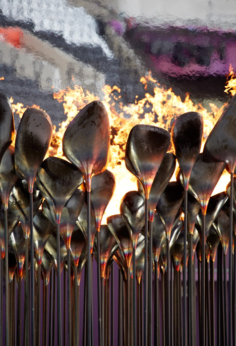
Sometimes Heatherwick's call-and-response technique works wonders. For the Olympic Cauldron, Heatherwick managed to make the human spectacle of the Olympic opening ceremonies into an object – an elegant, organic one at that. A video in the exhibition shows the process of making the cauldron, as well as the moment of truth on 27 July 2012, when the whole thing came together for an international Wow Moment.
Looking at the Olympic Cauldron model at the museum, I was reminded of the Modernist metalwork of Harry Bertoia, also interested in branching forms and sculpture at an architectural scale. The copper top of the cauldron, made of many petals, looked like an Art Nouveau vessel, while the spindly stainless steel poles, grouped together, are more reminiscent of the mushroom-like columns Heatherwick has proposed for parks in London, New York and Abu Dhabi.
When you make an exhibition of a lot of unbuilt work, it tends to show off a designer's formal obsessions. For Heatherwick, that means mushrooms, hairy buildings, and stacking. It is hard to imagine a more elegant static version than the mixed metals in London in either its lotus start position or its bowl ending.
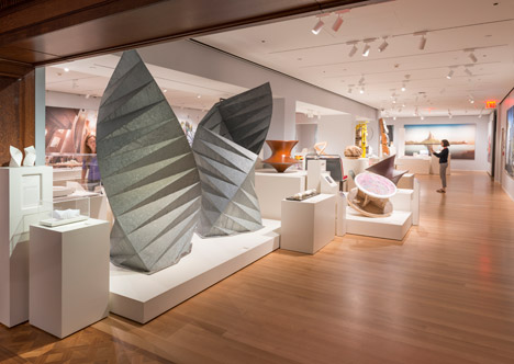
Also effective, and far less complicated, is Heatherwick's cladding of a pair of electricity substation vents outside St Paul's Cathedral in origami-pleated steel. The Paternoster Vents (2000) rise toward the sky like a pair of angel wings, the facets in the steel reflecting the light as if alternating dark and bright. I haven't been to Paternoster Square so I can't speak to the quality of the space around the vents, but the design certainly succeeds in making art out of a necessity.
Heatherwick's question for this project is: "How can energy infrastructure be integrated into a public space?" But this seems to be making more of it after the fact, linking the vents conceptually to a fanciful, unbuilt 2009 scheme for Teesside Power Station, reimagined as a triumvirate of golden stacks banked with earth to create a sloping public park. I prefer to see the vents as cousins to the studio's prodigious experiments with paper for its annual Christmas card: working within rigorous parameters, turning two dimensions into three, getting it in the mail on schedule.
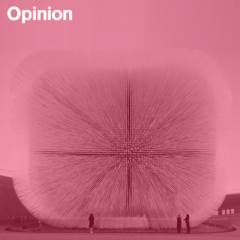
But the star of the show and of Heatherwick's career is the Seed Cathedral – his design for the UK Pavilion for the 2010 World Expo. The pavilion is the fullest realisation of the "hairy building" idea, rendered in Shanghai in 66,000 acrylic rods, which widened at the tip to hold 250,000 seeds from the Millennium Seed Bank. It was to be a proper English conservatory turned inside-out, the plants shown as potentialities waiting to be blown away like the spores of the dandelion the pavilion resembled. The acrylic rods are beautiful objects just set in a grid in a case; in situ they channeled light from the outside into the pavilion's centre, and at night each was lit by its own fibre-optic glow.
In the exhibit the pavilion is modelled in copper, which only increases its resemblance to Bertoia's mid-century tabletop dandelions in gilded stainless steel. "How can a building represent a nation?" Here you want to wave away the question: the result requires no justification.

Like most monographic museum shows, Provocations is relentlessly positive. Although the exhibition was curated by Cooper Hewitt deputy director Brooke Hodge, I found it unsettling that all of the "provocative" questions were taken directly from Heatherwick's book, without curatorial commentary. An exhibition of a living designer, especially one for whom his best designs are likely ahead, seems an ideal occasion to start asking questions and writing a narrative from an outside perspective. But here, the subject is allowed to control the story.
As a survey of Heatherwick's work, Provocations is remarkably thorough: the main gallery includes models, videos, glamorous photos and renderings dating back to 2001. A separate gallery, off to the side, includes early "archival" work, down to those wonderful Christmas cards. It is in this retrospective gallery that we get the hints of failure necessary to all of those YES answers in the unbuilt, the temporary, the spatial experiments in cardboard and zippers.
B of the Bang, the three-dimensional sculpture of a starter pistol's explosion, was designed by Heatherwick Studio for the Commonwealth Games in Manchester in 2002, and intended to commemorate the dynamism of sport. The last sentence of its label reads: "A recent technical problem led the city to dismantle the project." That technical problem in 2009 – structural and material – seems worth more than a one-sentence throwaway for a designer whose practice is based on innovative engineering, use of materials, and problem-solving. Every career has its setbacks; the exhibition could have been an opportunity to reflect on what happened between question, answer, and dismantling.
Heatherwick's best-known works to date have been temporary structures. Both the Cauldron and the UK Pavilion look, in model, like exquisite objects. In reality, they were architecture made of highly refined individual pieces, assemblages of the kind of industrial design in which Heatherwick received his training.
To create larger-scale landscape urbanism like that of New York's Pier55, London's Garden Bridge, and Abu Dhabi's Al Fayah Park the studio assembles a set of parts, the same approach used for the Cauldron and the Seed Cathedral. But these parts have to dazzle for more than a season or more than an opening ceremony. They have to look good in real life, not just on video, and they can't break down, or be replaced, or require constant care and feeding. At the museum, Heatherwick's career since 2001 goes from success to success, with the models and the projects growing ever-larger until they culminate, in the final gallery, with Pier55.
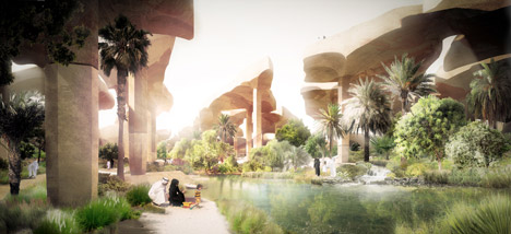
Surveying his oeuvre, I wonder if Heatherwick Studio can produce architecture – static, permanent, well-built architecture – that is more than a gimmick or a gadget. Describing his Pier55 design in April, I wrote: "Underneath the lawn, the plaza, and the pre-ruined staircases must be a theatres-worth of lights, wiring, speakers, electronics veiled in a skim-coat of plant life." The critique of the Garden Bridge has been far more scathing at the level of urbanism, architecture and landscape design, but the same question can be asked of both: "Who needs it?" Just because you can "make a new pier that is also a park and a world-class performance space," should you?
If you think of architecture as an agglomeration of specially designed parts, it may seem easy to add another program on another mushroom or two. But successful public space tends to have more room for serendipity, for public input and indeed, long-term success requires less technology rather than more.
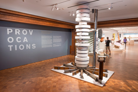
Could Heatherwick's architecture – so unusual, so delightful – actually be pushy and mechanical? He says he has no interest in style, but few designers can help returning to familiar patterns. The Nanyang Technological University Learning Hub, a 2015 building which "stacks" round classrooms of various circumferences atop each other, is intended to "make students and teachers bump into each other as much as possible". On its interior, bulging balconies lurch toward one another as if saying: Hello! Hello! Is this pleasant or, for the introvert, nightmarish? We all need to hear the answer from a Heatherwick user, after the happily ever after.
Alexandra Lange is a New York-based architecture and design critic. She was a Loeb Fellow at Harvard's Graduate School of Design for academic year 2013-2014 and is the author of Writing About Architecture: Mastering the Language of Buildings and Cities as well as the e-book The Dot-Com City: Silicon Valley Urbanism.