Textured stone and wood surfaces are oriented both horizontally and vertically to emphasise spaces within this house for two doctors in Belgium (+ slideshow).
Local studio Contekst was responsible for designing the interior of the detached property, which is located in a small village called Pulle – not far from Antwerp, where the "world's largest pivoting window" was recently added to a townhouse.
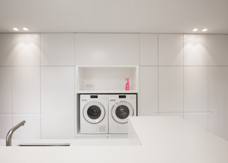
The clients don't spend much time at home but, befitting their profession, they wanted a simple and calm interior that can be cleaned easily with minimal hassle.
Another key aspect of the brief for Project Pulle was to include interconnected spaces that enhance the character of the layout and its relationship with the surrounding garden.
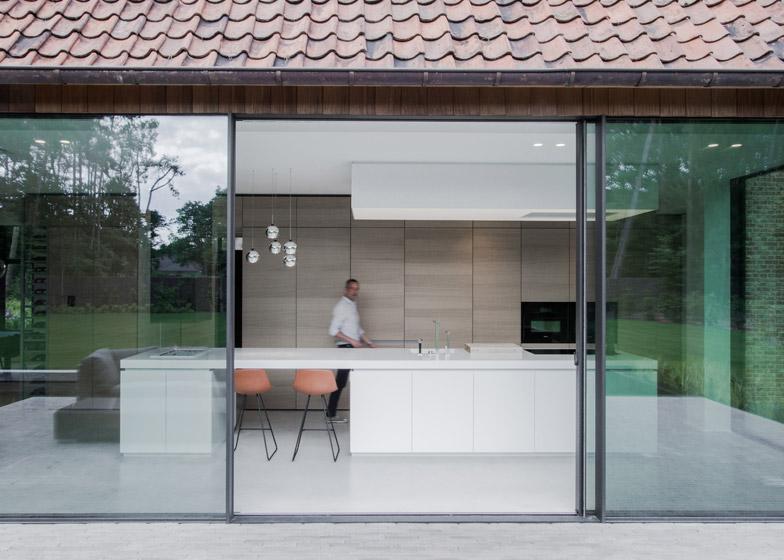
"The clients asked for everything to be connected with lines and open spaces," designer Sam Peeters told Dezeen. "The kitchen is aligned with the fireplace and all the passages are aligned so everything feels connected."
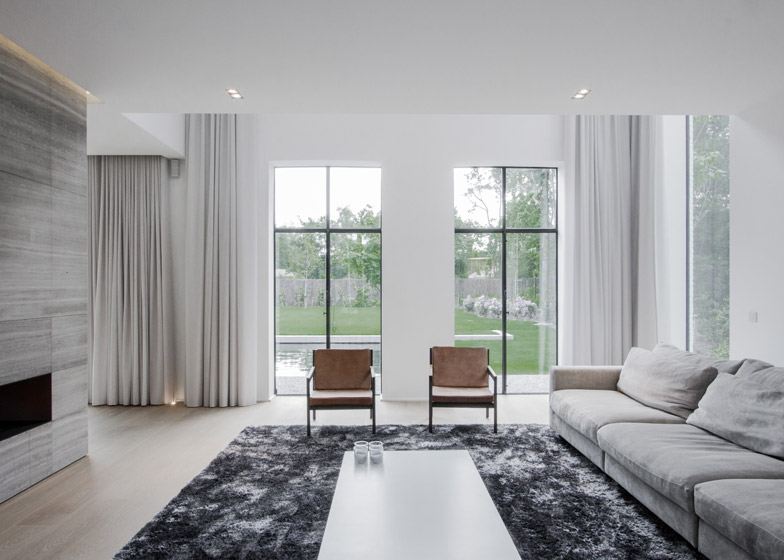
Natural materials with linear textures are used on the ground floor to emphasise the continuity between the spaces and to draw the eye towards openings that look out onto the garden.
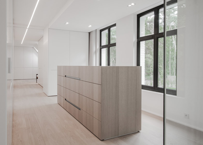
On the upper storey, the grain of the oak veneer and the veining of the stone are oriented vertically to create a greater feeling of height.
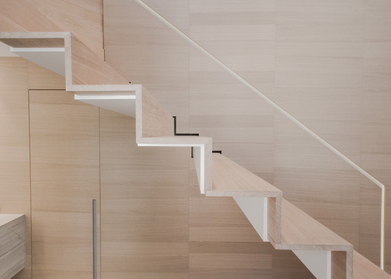
Within the double-height reception area, a staircase that appears to slide out from a veneer-clad wall extends up towards the first-floor landing.
"The space was so large it felt like it needed something different to a classical stair," Peeters explained. "So we came up with the idea of creating a single fluid line that you pull out from the wall and it turns onto the landing."
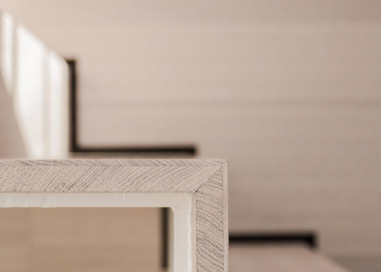
The wooden stairs have a slender profile that is supported underneath by a white-painted steel structure, which cantilevers from a beam hidden behind the veneered wall.
A handrail for the stair is integrated into the adjacent wall as a narrow slit, while the other side is left completely open.
As the clients have no children and don't plan to have any, they decided to leave out the handrail to enhance the staircase's minimal aesthetic.
With a width of over 1.5 metres, the stair is wide enough to ascend and descend without stepping close to the edge.
The interior was developed alongside the design for the house, which provided opportunities to incorporate details that would have been impossible otherwise.
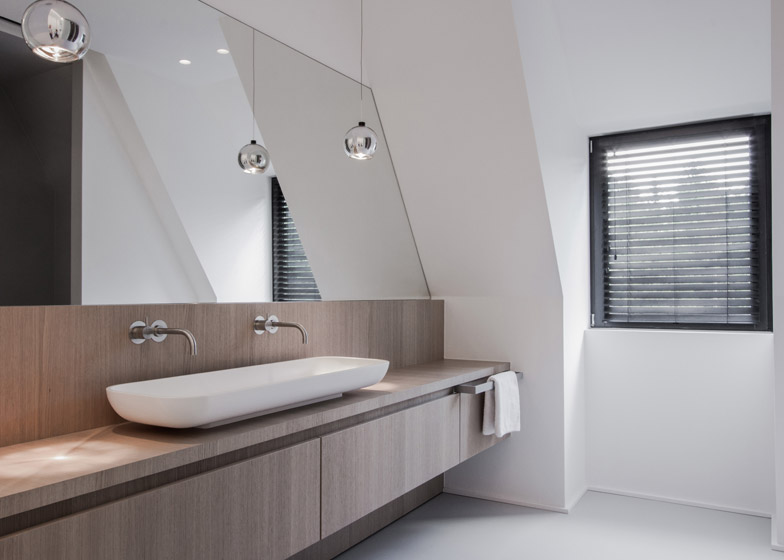
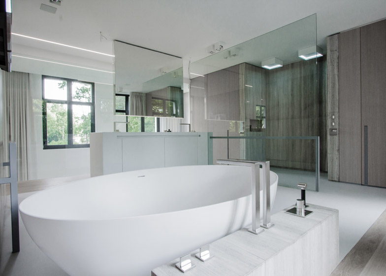
A huge sheet of glass screening the shower area in the bathroom was manoeuvred through an opening in one of the external walls before it was sealed off with a window.
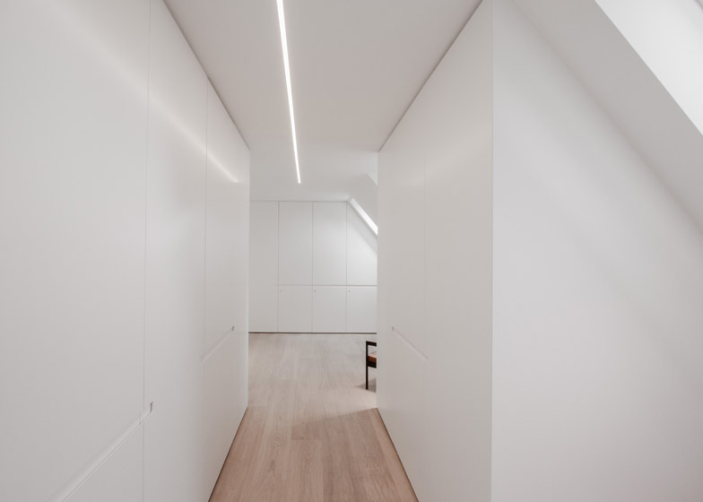
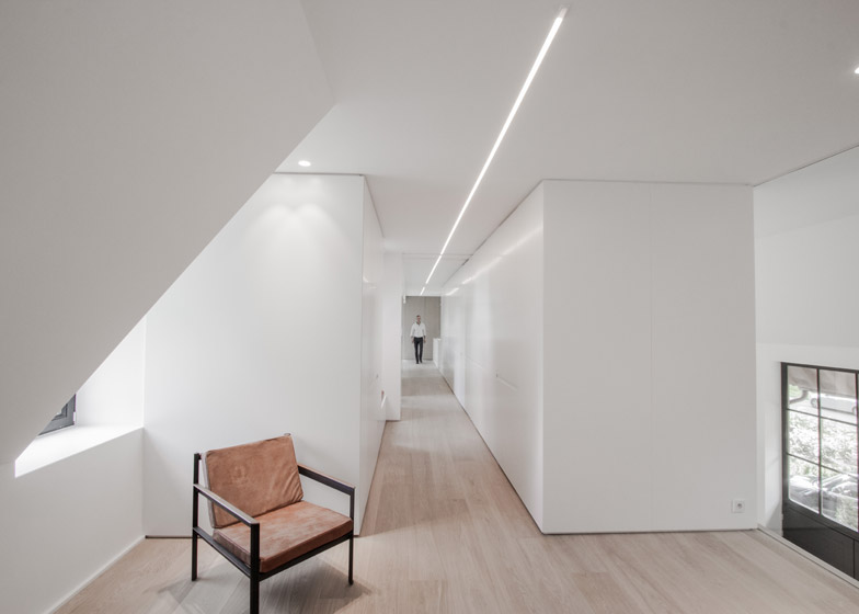
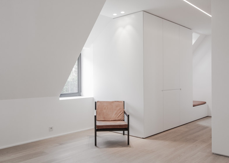
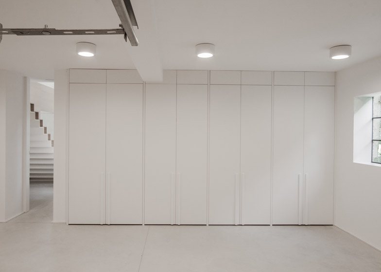
Smooth white surfaces provide a neutral backdrop for the natural textures and details applied to prominent surfaces and fitted furniture.
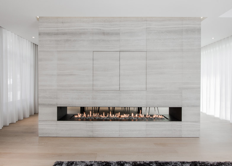
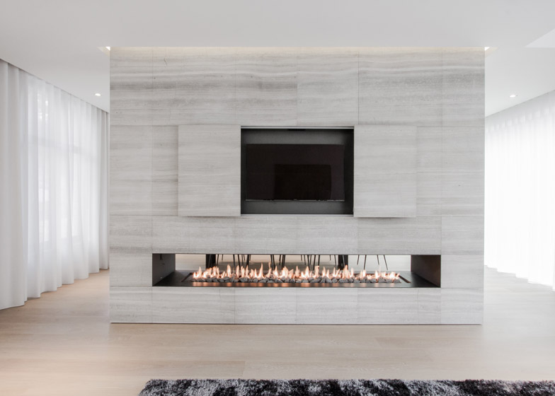
A monolithic stone unit separating the living room and dining area contains a fireplace and a hidden television, while all the kitchen utilities are concealed behind fitted oak cabinetry.
Lighting is carefully integrated into the ceilings, including as a continuous strip running the length of the first floor hallway.
Photography is by Nils Van Brabant.

