Photoluminescent stripes allow Ibiza's Can Misses Hospital to glow by night
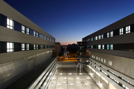
Luis Vidal + Architects has added stripes of photoluminescent paint to the facades of Ibiza's only public hospital, so it faintly glows after dark (+ slideshow).
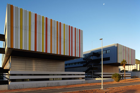
Can Misses Hospital was refurbished and extended by Madrid-based Luis Vidal + Architects to provide new patient wings and medical facilities, as well as clearer circulation routes across the sprawling site.
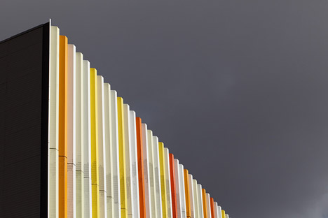
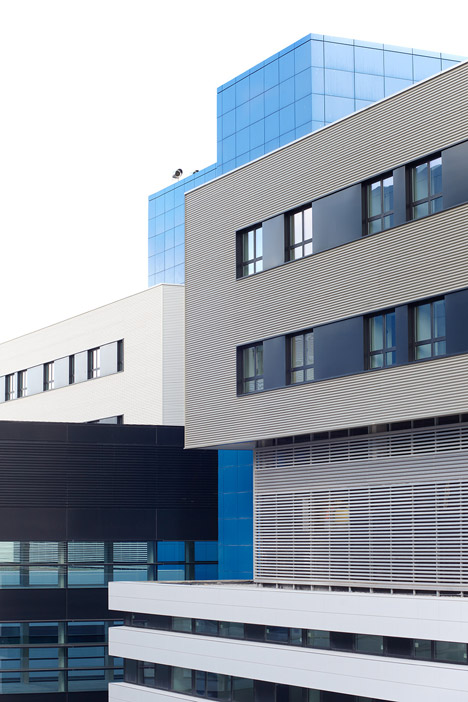
The street-facing facades of the new patient wings are now covered in perforated aluminium, with orange and yellow stripes to reference the tones of the island's urban landscape.
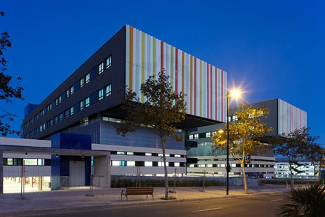
"The colours recall Ibiza's sunsets, and white is the colour of the island's traditional houses," architect Oscar Torrejon told Dezeen. "The white background also enhances the effect of the photoluminescent stripes at night."
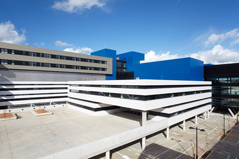
The 45,000-square-metre extension has more than doubled the size of the hospital, with seven new buildings at the edge of the site and a 165-metre-long building in the middle to link them together like a spine.
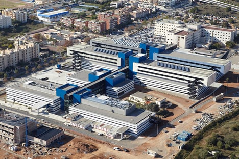
The central linking building is clad in black ceramic recyclable panels. It is also raised on V-shaped stilts where the ground slopes down, in order to maintain a flat floor level inside.
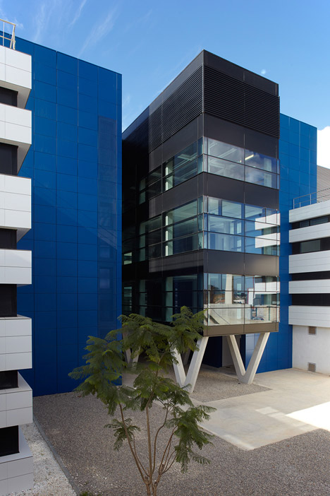
Buildings for lifts and stairs have been clustered around this central linking structure and are clad in blue metallic panels, intended to reference the colour of the Mediterranean Sea nearby.
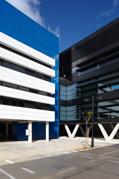
"The use of colour connects Can Misses Hospital with its immediate environment," said Torrejon.
"We also considered the psychological effects of colour when designing the building. We believe in the therapeutic use of colours, conceiving them as a source of energy that can have a direct effect on the patients."
Luis Vidal + Architects – which also has offices in London, Houston and Santiago – applied the same thinking for the circulation around the hospital as it did for its design of Heathrow Airport's new Terminal 2 building in London, which opened last year.
Both feature clear and direct paths, with specialised routes for different uses – in this case, patients, doctors, and maintenance and support staff.
"Can Misses applies a new typology for hospitals – the airport hospital," said Torrejon.
"Thanks to a long and dedicated process analysing circulation systems in highly complex buildings, we were able to understand the best strategy for moving around this hospital."
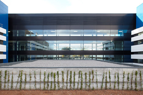
The blues and oranges used on the exterior were repeated inside to create visual connections between the public spaces.
"These colours are used to make the interior feel more friendly, and to make way-finding around the hospital more intuitive," said Torrejon.
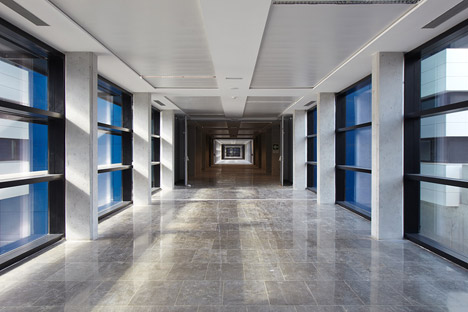
Additional windows are added wherever possible, to bring in more natural light and ventilation, and gardens and courtyards are dotted around the buildings to offer patients a better connection with the outdoors.
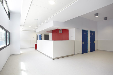
"The design is based on curative architecture," said Torrejon. "Patient wellbeing is assured through a careful study of combined aspects, including the presence of sunlight and the positive effect of gardens, colour and texture."
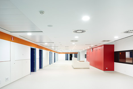
This curative approach follows in the footsteps of other recent hospital projects, including low-rise accommodation for parents at a children's hospital in Glasgow, set around courtyards, and a hospital in Brisbane covered in huge green and purple fins that match the colour of surrounding plants.
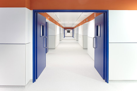
Hard-wearing materials were chosen throughout, with vinyl flooring and phenolic panels for the walls, which can be opened up for easy access to maintain ducts and shafts.
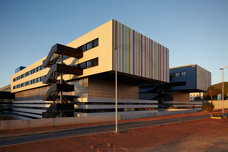
Work on the refurbishment and extension, which has also added 11,000 square metres of car-parking space around the hospital, was completed in phases over four years.
"One of the main challenges was that we had to maintain the hospital as fully operational during the work," said Torrejon. "To do this, we had to plan the project carefully through different stages – first the extension, and then the remodelling of the existing building."
Photography is by Xavier Duran