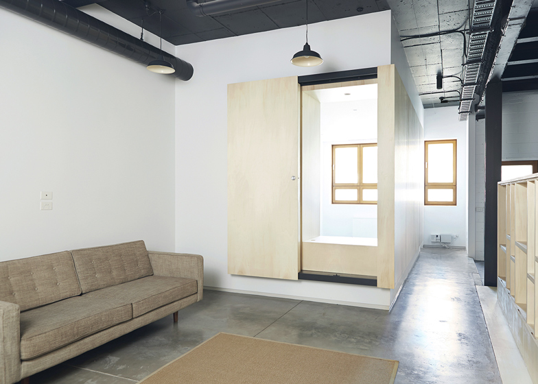
Australian studio Project 12 Architecture has used plywood partitions and furnishings to reconfigure a converted warehouse in Melbourne and make more space for a growing family.
The clients loved the location of their home in the city's Brunswick suburb, but needed more space to accommodate two new arrivals to the family.
"When first approaching us, our clients were at a loss as to how to make the existing warehouse conversion suitable for their growing family," explained Aimee Goodwin, one of the two directors of Project 12.
"With an 18-month-old toddler sharing their bedroom and twins on the way, they needed more room," she told Dezeen.
Named Brunswick Residence, the home has two floors, with an external roof terrace. Prior to the renovation, the clients spent most of their time on the first floor, which houses the kitchen, living room, bathroom and a bedroom. But they had struggled to find a way to utilise the ground floor space, because it was long and narrow, with windows on the two short walls only.
Project 12 chose to adapt this space by adding a number of walls with large openings. Across these, they installed plywood panels that slide back and forth, to ensure that natural light and ventilation can still filter across the plan.
"The brief called for the insertion of two bedrooms, a store room and a bathroom into the existing long, dark and narrow space," said Goodwin.
"Our answer, the humble plywood panel," she added. "Ply panels are fixed and held off bedroom walls, appearing to float and create a greater sense of space as you move through the narrow plan."
The bedrooms are located against the east- and west-facing external walls. A living space described as the rumpus room sits in between, while the storage area is slotted under the stairs and the bathroom sits in the far corner.
There is no entrance on this floor, so residents always enter the space from above. A plywood shelving unit runs along the edge of the staircase, framing the edge of the rumpus room.
Plywood panels on either side of this space lead through to the bedrooms. When open they create one large open-plan space, but when closed they blend in with panels on either side, providing the bedrooms with visual and acoustic separation.
"The continuity of the 'floating panel' was also able to feed into the detailing of the screens to each bedroom, and allowed us to achieve a sense of cohesion in the overall design," explained Goodwin.
"We selected plywood for a number of reasons," she added. "One, it is a durable material that could stand up to the knocks and bumps from young children, and two, its blonde colouring offers a sense of warmth and contrast against the darker, harder surfaces of polished concrete and exposed steel."
Offcuts from the doors and wall panels were used to build the shelves, drawers and wardrobes.
"The new design transforms a two-bedroom townhouse into a functional family home," said Goodwin. "The final design has greatly improved the functionality, but also enjoyment of their home."
Photography is by Jessie Prince.
Project credits:
Architect: Project 12 Architecture
Builder: MVH Constructions
Building surveyor: Rod Bethune & Associates

