Triptyque and Philippe Starck design TOG's first showroom to be as customisable as its furniture
The first flagship store for customisable furniture brand TOG in São Paulo is designed by French designer Philippe Starck and local studio Triptyque as a social space for creatives, like a "21st-century Andy Warhol Factory" (+ slideshow).
Triptyque designed the 2,100-square-metre store on Rua Iguatemi in collaboration with Starck, who is providing art direction for TOG's founders – Brazilian footwear company Grendene – as well as designing furniture for the brand.
The intention was to create a space in which visitors could participate in a variety of social activities.
The concept is based on the Factory studio setup by pop artist Andy Warhol in New York between the 1960s and 1980s, where artists and creatives would gather to help produce his silkscreen prints as well as attend parties.
"The flagship was designed as a mixed-use place of sociability, where you can buy, eat, drink, dance, read, create, spend time – a 21st-century version of the Andy Warhol Factory," Triptyque said.
TOG was launched in Milan last year as a "democratic design brand", which allows customers to create bespoke furniture pieces from a series of base products by internationally renowned and emerging designers.
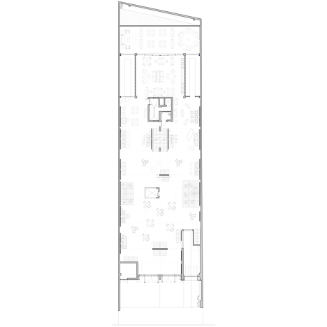
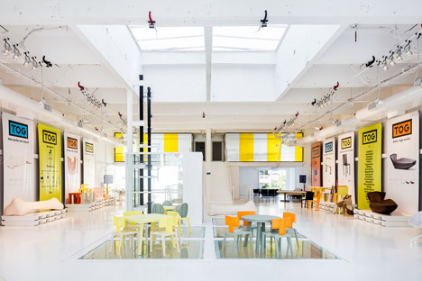
Spread over three main floors, the first TOG showroom space is designed to be as customisable as the brand's furniture.
"TOG was designed as a container and not a content, a repository of uses and different programs," said Triptyque, which has offices in both São Paulo and Paris. "Its infrastructure is ready to be adapted for all kinds of situations."
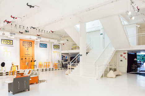
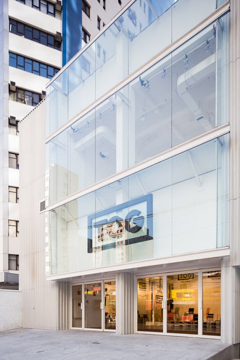
The 1980s building that previously hosted a games club was overhauled by Triptyque, which removed partitions and decorative elements, and painted the entire interior white.
"The base idea was to bare the existing place, which had totally disappeared under the layers of decoration, and to optimise its nature without any intervention in the structure," Triptyque told Dezeen.
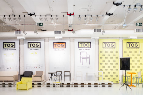
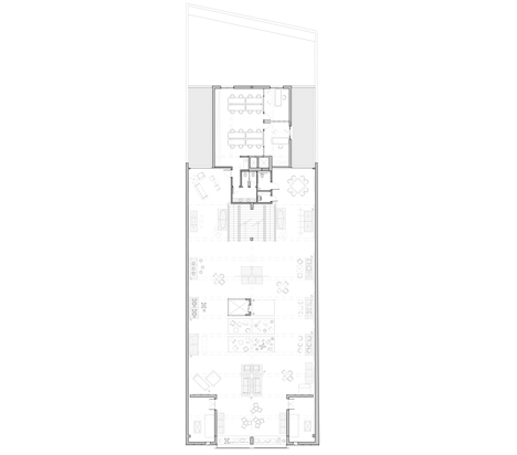
The main showroom areas are located in two double-height spaces on the ground level and the floor above.
At the front of the store, a partition set back from the glazed entrance creates a shop window-like presentation for featured products. No other walls are used in these spaces to keep the areas as open and flexible as possible.
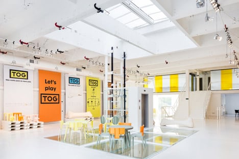
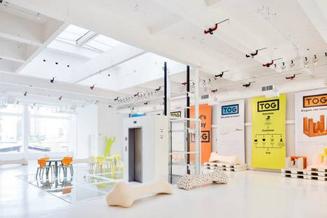
The showroom behind is sparsely populated with TOG's furniture, while large banners displaying its colourful branding are hung vertically along the walls on each side.
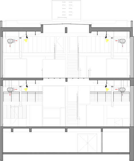
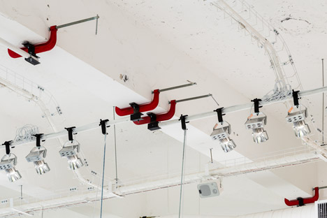
Industrial lighting mounted on long poles is attached to the ceiling beams using G clamps – vices more commonly used during wood or metalwork.
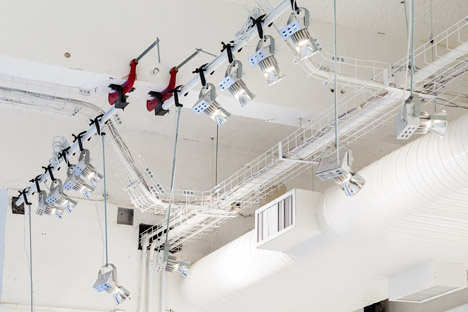
"We built a mixed-use light, which also can adapt to function requested," said Triptyque, which has also designed a marble and glass showroom to look like an ice cube in the city. "We played with the scale and shape of the G clamps to make them visible as a part of the proposition."
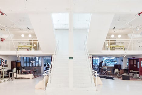
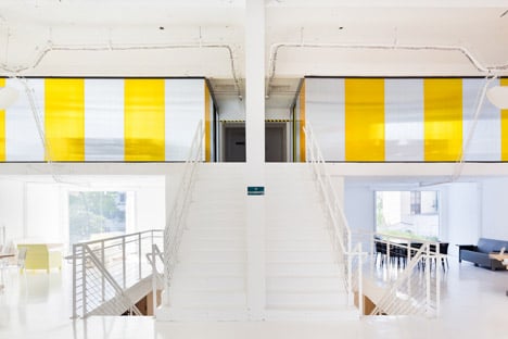
A wide feature staircase leads up to a mezzanine floor, before doglegging on both sides to provide two flights up to the next main showroom level.
At the top of the final stair flight, meeting rooms and offices are located within rooms surrounded by slightly translucent yellow and white striped walls.
Sections of glass floor allow light from a skylight directly above to reach the ground floor.
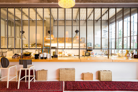
Behind the staircase at street level, a restaurant and bar area called Marakuthai serves food by local chef Renata Vanzetto, which is prepared within a glazed kitchen.
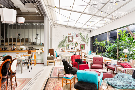
Mismatched furniture arranged on Persian-style rugs spills out into a lean-to, with its side open to a garden of tropical plants.
The basement functions as a warehouse for storing products before they are shipped to customers worldwide.
Photography is by Ricardo Bassetti.
