The Dezeen guide to Postmodern architecture and design
Pomo summer: the Postmodernists aimed to break Modernism's hold on design by offering something warmer, brighter and more experimental. Glenn Adamson, director of New York's Museum of Art and Design, presents a potted history of one of the 20th century's most divisive movements.
Over the years, Postmodernism has been accused of every conceivable form of fraud. It has been called ugly, superficial, derivative, and cravenly complicit to a profit motive. When design historian Jane Pavitt and I co-curated an exhibition on the topic at the V&A in 2011, it was difficult to find any architects who would even admit to the label. It got to the point that we would tease them: "are you now or have you ever been a Postmodernist?"
The denials were curious to us, given that Postmodernism was influentially defined by Fredric Jameson as "the cultural logic of late capitalism." That makes it sound rather pervasive. But if, like the Wizard of Oz, Postmodernism was both great and powerful, it pays to look behind the curtain.
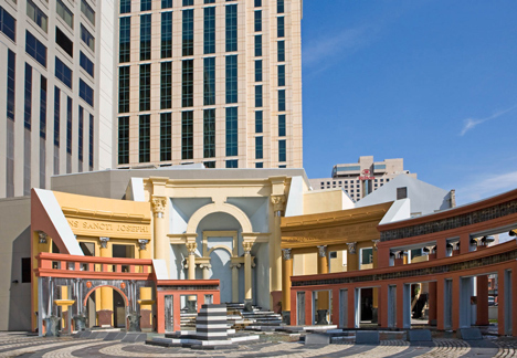
Today, 30 years after the height of the movement, it is possible to get past the hysterical debates that attended Postmodern structures like Charles Moore's Piazza d'Italia (1978), Michael Graves' Portland Building (1982) and Philip Johnson's AT&T Building in New York (1984). The historical quotations of this architecture – the red-sauce-restaurant Baroque, the swaggy Art Deco, that infamous broken pediment – were meant to provoke, for sure.
They signified a revolt against the Modernist architectural establishment, which had by the 1970s become utterly calcified. But they were also meant to be funny, warm, and engaging. In place of affectless glass and concrete, the Postmodernists proposed something as various and individual as people are themselves.
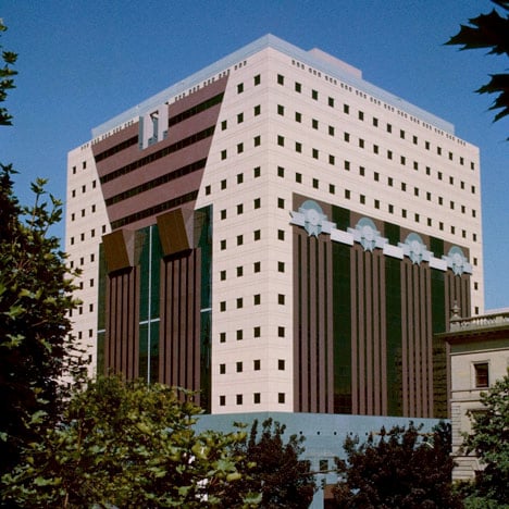
Not all Postmodern architecture has stood the test of time (literally – Graves' Portland Building, built on the cheap, is in terrible condition today and desperately requires restoration). But in principle, its humane and expressive leanings look pretty good in retrospect. Perhaps it's time to take a look back.
The intellectual origins of Postmodernism are typically traced back to Robert Venturi's book Complexity and Contradiction in Architecture (1966), a title that foreshadows the confused discourse that would follow. Venturi advocated a permissive architecture of the "both/and". He pointed out that great cities like Rome did not speak with one voice, but rather in historical layers and vivid juxtapositions.

He also argued that buildings were not only designed objects, but also feats of place-making, which should attend to local conditions of neighbourhood and public behaviour. On this basis, he embraced aspects of architectural history, notably decoration and disunity, that Modernism had repudiated.
Venturi's ideas expanded and developed in concert with his partner, the urban planner Denise Scott Brown. Their joint work would culminate in the splendidly counter-intuitive book Learning from Las Vegas (1972), which proposed that city's strip – meant to be viewed at 30 miles an hour – as a model for architects to emulate. For Venturi and Scott Brown, the garish neon, oversized signage, and incessant frontality of the casinos were not to be looked down upon as kitsch. They were an organic design solution, well suited to the demands of their public.
All the conflicts that would arise around Postmodernism in the 1980s were already present in Venturi and Scott Brown's study. They had seen the Vegas strip as "almost all right," tolerating its naked commercial imperatives in the interest of learning from its built form. But that "almost" was a depth charge. Should architects simply give the public – or for that matter, deep-pocketed developers – what they want? If so, did that not make them complicit with power structures that might better be challenged?
Over the subsequent years, advocates of Postmodernism formulated both theoretical and visual responses to Venturi and Scott Brown's contextualism. The most prominent of the theorists was Charles Jencks, an American-born, London-based architect. His book Adhocism: The Case for Improvisation, co-authored with Nathan Silver, was published in the same year as Learning from Las Vegas and argued similarly for contingency in design.
The Language of Post-Modern Architecture, which Jencks published in 1977, popularised the term "Postmodernism" and established him as the lightning-rod advocate for the movement. In the book, Jencks essentially laid claim to the work of a number of his contemporaries, drafting them into the cause whether they liked it or not. Of particular interest was his idea of "double coding," by which a structure like Moore's Piazza d'Italia could operate at the level of advanced architecture while also appealing to a broad popular audience.
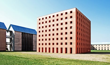
Among the many architects that Jencks singled out for attention were Italy's Aldo Rossi and Britain's James Stirling, both of whom had distinguished careers as Modernists before adopting a more historically referential style. Rossi had published his own argument for contextualism in 1966 (the year of Venturi's Complexity and Contradiction) and had subsequently developed a style of elegiac Classicism, enlivened by archetypal symbolic form.
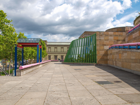
As for Stirling, his Neue Staatsgalerie in Stuttgart, Germany, has been called the best Postmodern structure ever built, at least among those (Stirling not included, by the way) who accept that it is indeed Postmodern. Centred on a stepped circular courtyard, the Neue Staatsgalerie was an addition to an existing historic museum, and riffed on the earlier building's classical vocabulary while also boasting high-tech metalwork (Stirling called it the building's "jewellery") in bold colours and an interior floor in bright green industrial rubber.
Postmodernism was not only an architectural phenomenon, of course. The show we staged at the V&A included graphics, music, costume, ceramics, industrial design, and many other disciplines.
As a matter of fact, the style was perhaps most succinctly captured by Milanese design groups such as Studio Alchymia (led by Alessandro Mendini) and Memphis (led by Ettore Sottsass). A longer essay than this one would be required to take the measure of these radical projects, which expanded the intellectual reach of furniture and objects just as surely as Graves, Rossi, Stirling and others were enlarging the vocabulary of architecture.

Mendini is the purest Postmodernist (if that's not an oxymoron) I have ever encountered – so much so that when I asked him in 2010 whether he would say Postmodernism was still alive and well, he laughingly replied, "of course, I'm still here." His work as an editor, designer, and architect has been prolific, yet the common strand that binds it together is an attack on the conception of authorship itself. Even at its most brilliant, his work always suggests that some sort of put-on is afoot.
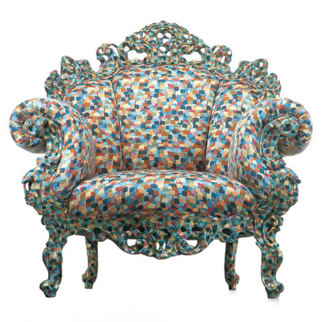
Mendini's most well-known creation, the Proust chair of 1978, is cobbled together from mismatched elements: an overfed Rococo form, dots from a Paul Signac painting, the title from literature's greatest melancholic obsessive. And his most high-profile projects, including Studio Alchymia and the 1983 collection of Tea and Coffee Piazzas that he commissioned for the metalware manufacturer Alessi, achieved their impact through the contributions of many other architects and designers, all of whom submitted to his slippery, elusive logic, by which design icons were formulated by committee, or through cut-and-paste.
If Mendini was the saturnine conceptualist of Italian Postmodernism, Ettore Sottsass was its glowing sun god – a fun loving, libidinous and charismatic guru. He too had been a proper Modernist, producing design classics for clients like Olivetti, though even in the 1950s and 1960s he had a waywardness to him. This found expression in one-off totemic ceramics and furniture, which were fuelled by the counter culture's enthusiasms for drugs and free love. Sottsass was a presence in early radical design, participating in a modest way in Mendini's Studio Alchymia. But it was not until 1981, and the founding of Memphis, that his own influence would be felt.
And influential it was. So sensational was the opening of Memphis that Sottsass almost did not attend, thinking (on his way there in the back of a cab, stalled in the crowds) that a terrorist bomb may have gone off in downtown Milan. What was all the ruckus about? A group of furnishings, all in bold colours and patterns, some seemingly anti-functional (Sottsass's room dividers with slanted shelves) and others with whimsical features (Martine Bedin's Super lamp on wheels, which the designer imagined being walked like a dog).

The majority of the Memphis furniture was sheathed in plastic laminate, provided by the company Abet Laminati. It has taken me a long time to realise it, but Memphis was essentially a product placement stunt for the company, which also provided some of the core funding for the project. Be that as it may, Sottsass's initiative took off in a big way. Before too long, the influence of Memphis could be seen not only across the domain of furniture design, but in fashion, in architecture, even in music videos on MTV.
In 1987, after only six years, Sottsass decided that Memphis had run its course. Bedin recalls the scene: "That made an incredible reaction – very Commedia dell'Arte, very Italian, though we weren't all Italian. [Michele] De Lucchi, who has a very low voice, was screaming at him: Ettore, you can't leave us! But Ettore said, 'it's like a love story. When you get used to it, you have to quit.'" 1987 was also the year of Tom Wolfe's Bonfire of the Vanities, Gordon Gecko in Wall Street, and an essay in Art in America entitled Late Postmodernism: The End of Style? It had been quite a ride, but the fun was over.

By this point, the compact with capitalism that lurked in the margins of Venturi and Scott Brown’s work was signed, sealed, and delivered. The most important examples of later Postmodern architecture in North America – Philip Johnson's PPG Building in Pittsburgh (1984), Jon Jerde's Horton Center in San Diego (1985), the Mississauga Civic Centre in Canada (1987), or Michael Graves' Swan and Dolphin Hotels for Disney (1990), were all developers' projects with huge money behind them. What had started out as a plea for complexity and contradiction became quite a simple matter, in which power dressed itself in unapologetically spectacular garb.
The story does continue from there, on a global basis (Dubai, built up largely since 2003, may be the most Postmodern place ever conceived). But as with many movements, what was best in Postmodernism happened early – when a bit of neon or a Classical column could still be seen as a firebrand's gesture, and when contextualism in architecture was a controversial premise.
Today, architects feel free to borrow from anywhere they like, and few would be bold enough to propose a new building without attending to local conditions. That happy state of affairs is largely thanks to Postmodernism, its complexities and its contradictions.