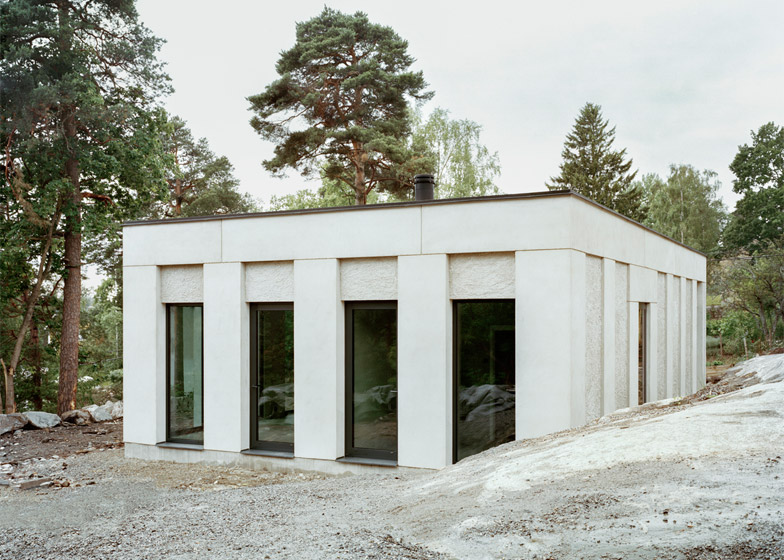
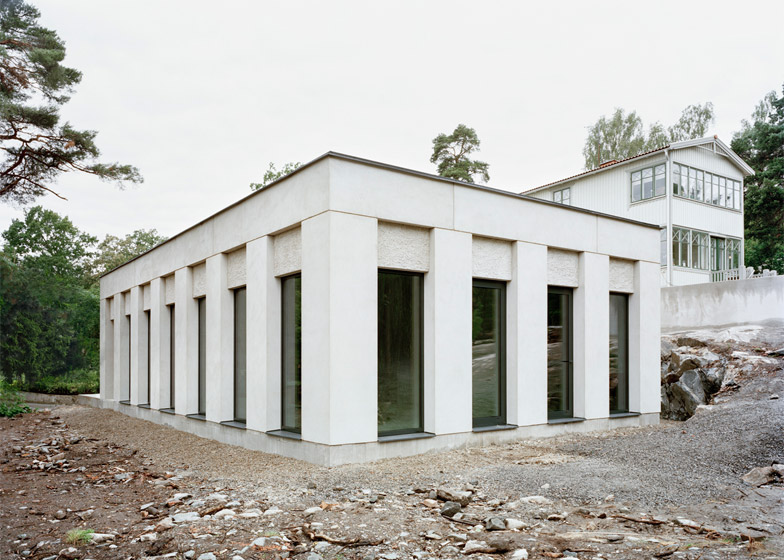
Broad white piers create a rhythm of regular openings around the facade of this small residence near Stockholm by architecture firm Hermansson Hiller Lundberg (+ slideshow).
Located on a rural site in Nacka, a municipality east of the city, House Skuru is a single-storey house featuring a monochrome colour palette both inside and out.
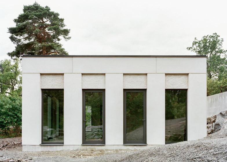
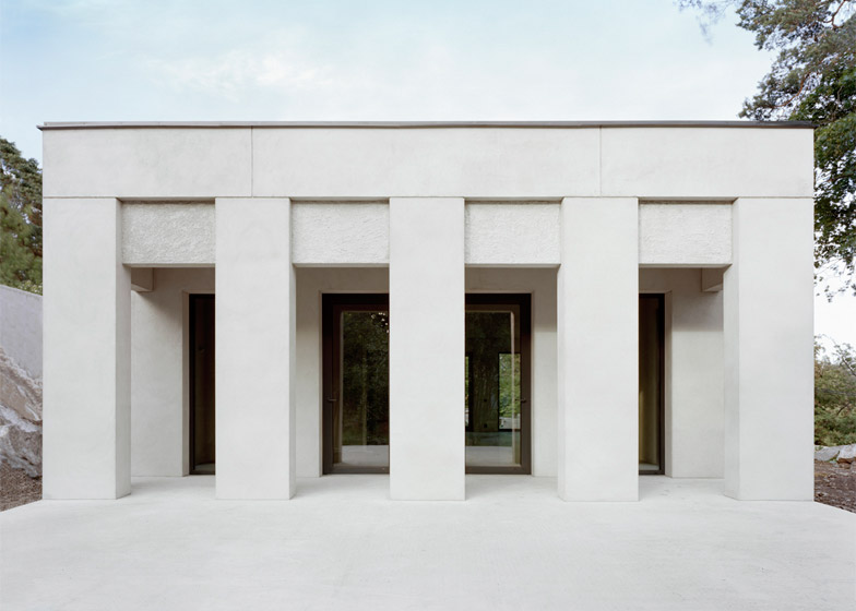
Rectilinear piers – supporting walls between openings – can be found on all four sides, giving the building a uniform appearance from every angle. The rhythm of openings and piers echoes the regular column arrangements used in Classical architecture.
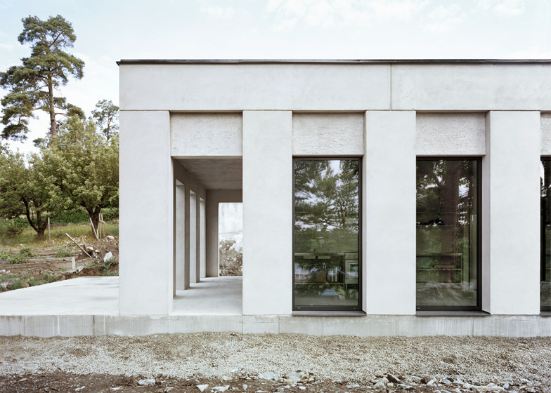
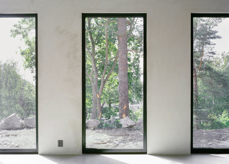
On three sides the piers frame a series of door-size windows. The fourth elevation features a colonnade using the same dimensions, creating a sheltered outdoor space.
Hermansson Hiller Lundberg – a Stockholm studio made up of architects Andreas Hermansson, Andreas Hiller and Samuel Lundberg – designed the building as a permanent residence for a family.
It is reminiscent of several projects by British architect David Chipperfield, particularly his Stirling Prize-winning Museum of Modern Literature and the recently completed Fayland House, which also reference the Classical architecture of ancient Greece and Rome.
The architects describe it as an unconventional dwelling with a monumental appearance.
"The repetition of pillars and the juxtaposition of building elements create a minimalistic complexity," said Hermansson Hiller Lundberg.
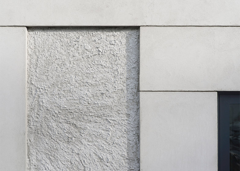
Although the house appears to be constructed from cast concrete, it was actually built using expanded clay masonry blocks. These were rendered off-white, with the most prominent surfaces given a smooth surface, while others were left with a rough texture.
"The clear volume of the house gains a richness of expression through the development of a tectonic order of discreet building parts," said the architects, referring to the arrangement of rough and smooth surfaces and materials.
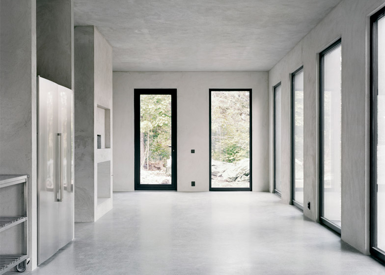
Inside, the building has a very simple layout, with a large living, dining and kitchen space taking up half of the floor plan. Behind this, two bedrooms are separated by an entrance lobby and a bathroom.
There are five entrances in total, making it possible to enter and exit any of part of the house without disturbing other members of the family. These doors all look exactly the same, so it is unclear to visitors which one is the main entrance.
Walls and ceiling surfaces inside the house have also been rendered off-white, while the floor is polished concrete.
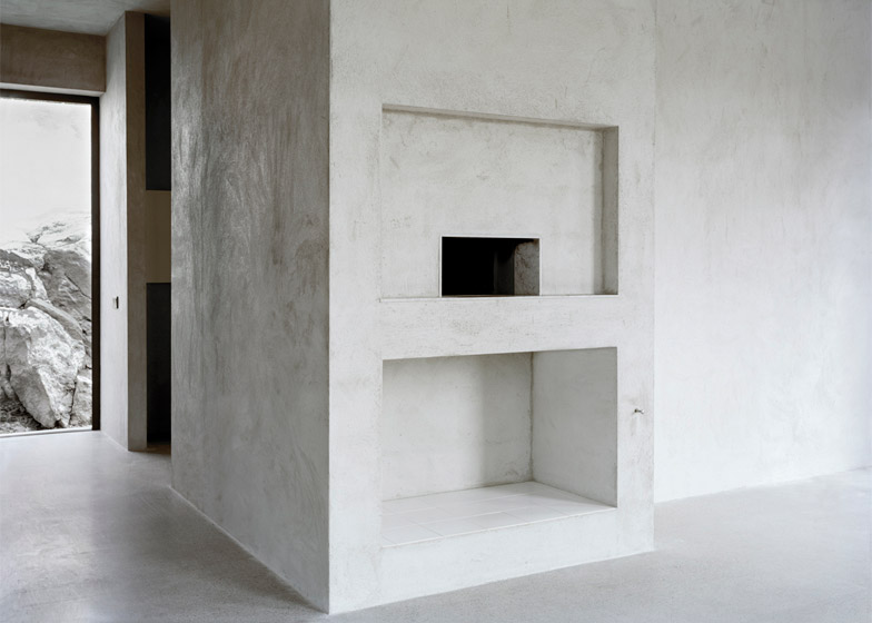
"In the interior the rhetoric is monolithic rather than tectonic, and this too lies in the surface treatment of the rendered walls and ceiling and the polished concrete floor," added the architects.
A hearth stands near the centre of the plan, and a tiled recess at its base creates a place where residents can store firewood.
Photography is by Mikael Olsson.

