"Somebody should be held accountable for this monstrosity"
Comments update: the latest controversy to hit Rafael Viñoly's Walkie Talkie skyscraper in London has prompted calls for city planners to face a public enquiry. Read on for more on this and don't forget to explore our new comments page to keep up to date with the latest discussions on Dezeen.
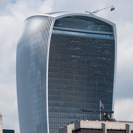
Windie Scorchie: nearly a year after Rafael Viñoly's Walkie Talkie skyscraper reflected a beam of light intense enough to damage cars, reports emerged that its curved facade was channelling gusts of wind strong enough to knock people over.
"Somebody should be held accountable for this monstrosity," wrote George. "It's a catastrophically bad piece of architecture that neither works for its occupants or the city."
"It's about time the authorities, planners and even the architect himself faced up to this in front of a public enquiry," he continued.
"I'd love to see a comparative shadow analysis from this and other London towers," added Jos. "It has to be one of the most inconsiderate buildings of the last decade."
Others took a more light-hearted view of the building's wind problem. "Put wind turbines in the spaces above the sidewalks," suggested Meg Webster. Read the comments on this story »

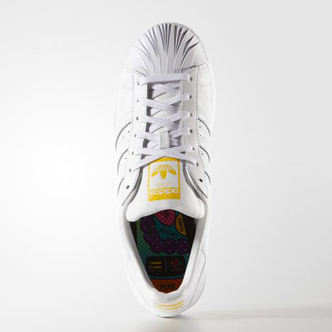
Zahadidas: a trainer created by Pharrell Williams and Zaha Hadid as part of a collaboration for Adidas surprised readers with its restrained design.
"That must've taken a while," scoffed Stutelf, while Eddy playfully rearranged our headline to "Pharrell Williams and Zaha Hadid collaborate to produce the blandest trainer ever."
One commenter also expressed concerns over the amount of media coverage celebrities attract when they design products. "Pop culture has taken over the design world," said Idracula. "Dezeen seems to be leading the way in promoting this kind of corporate sh*t." Read the comments on this story »

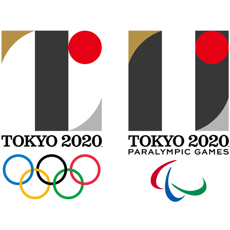
Identity crisis? A visual identity for Tokyo’s 2020 Olympics and Paralympics was unveiled just days after Zaha Hadid’s stadium for the games was scrapped. But should the logo share the arena's fate?
"What is really disturbing is that this logo is very close to the logo of Théâtre de Liège," claimed a commenter calling themselves Ileek.
"This is by far some of the worst identity work I've ever seen presented as professional," said Matthew Waldman. "The identity should be the visual language that communicates the ethos of the particular game and host city."
"I think it's a great design that suits Japan's global image," countered one commenter. "Surely [a logo] doesn't have to shock everyone to their core to be deemed a success?" Read the comments on this story »

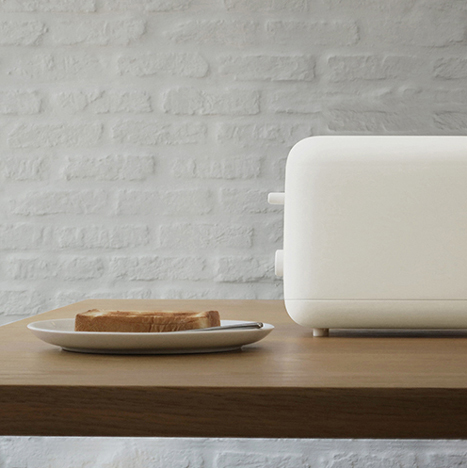
Toast of the town: Muji's range of minimally designed kitchen appliances by Japanese designer Naoto Fuksawa sparked a debate about the functionality and aesthetic of the brand's products.
"I love how Muji products look, unfortunately I don't like how they perform," said one guest reader.
"At a time when it's common to get a household item that performs multiple functions in a small house, Fukasawa and Muji decide to release single-function gadgets," observed Design Junkie. "It seems that they are out of touch with today's consumers and their needs."
"Can't wait for our [current] toaster and kettle to pack up," exclaimed another guest commenter excited by the prospect of owning Muji's latest range. "Ours has been playing up, so shouldn't be long." Read the comments on this story »