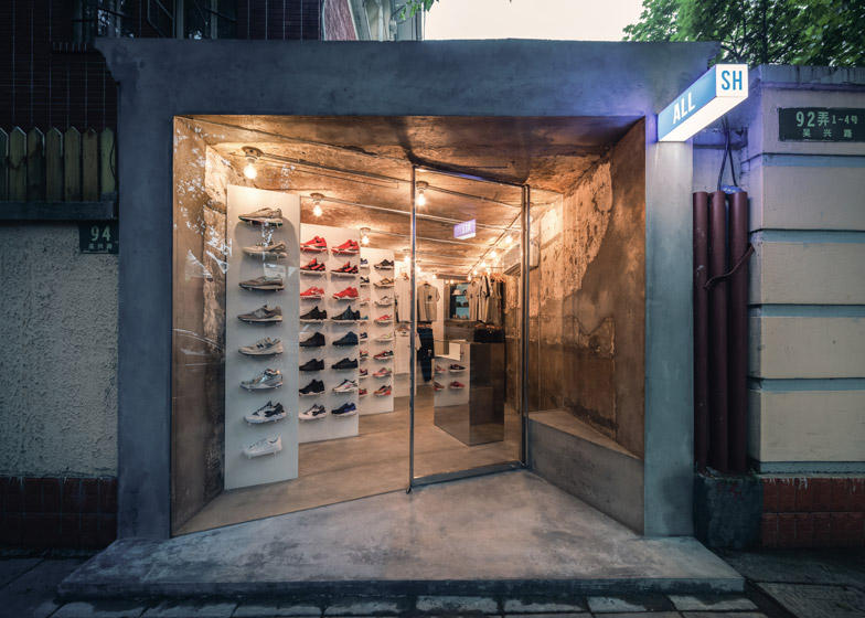
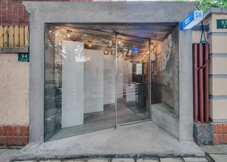
Slanted panels maximise display space against the crumbling concrete walls of this Shanghai streetwear shop, while reflective panels create a disorienting experience akin to a hall of mirrors (+ slideshow).
Local studio Linehouse gutted an old concrete-framed unit on Wuxing Road, a tree-lined street in the city's former French concession to create the clothing and footwear shop ALL SH.
The designers added a series of diagonally slanted partitions with mirrored spacers to display stock along one side of the 20-square-metre space. The angled walls were devised to increase the volume of stock visible from the street and to help lure customers into the shop.
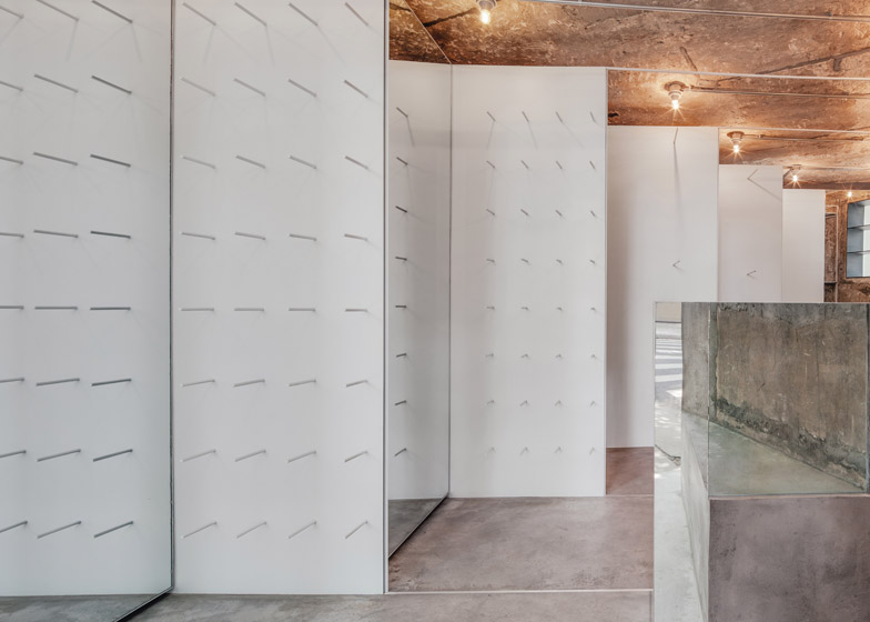
Shoes and clothing are displayed on slim white pegs to give the impression of the stock floating against the white walls, while the mirrored panels conceal storage units and a changing room.
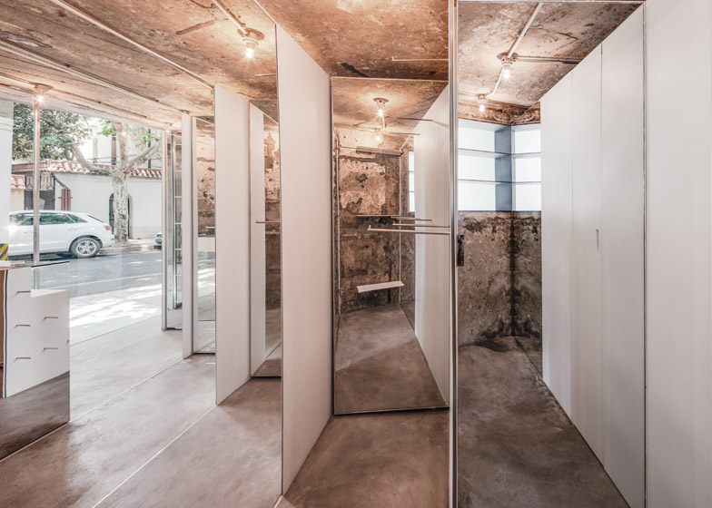
The mirrors reflect both the products and the raw concrete shell of the shop, creating a slightly disorienting effect that helps to give the illusion of greater space.
"The existing shell was stripped back to its raw state, exposing the patina of the concrete walls," said the designers.
"The new insertion is a series of white thin vertical planes, installed at an angle through the space. The space in between the planes is filled with mirrors, reflecting the rough existing shell and emphasising the thinness of the inserted walls."
The glazed shopfront is also set at an angle to encourage window shopping. The resulting wedge-shaped entrance is emphasised by an angled concrete bench with a triangular seat.
Shoes are balanced on the spools to the front of the store, while clothing hangs towards the back nearest the changing room.
Stainless steel strips extend from the tops and bottoms of these walls and run diagonally across the floor and ceiling, playing up the skewed angle.
"In working with a minimal palette of mirror, white metal and stainless steel, there is a strong contrast between the existing and the new," said the studio.
A mirrored cash desk is positioned opposite the display units, reflecting both the stock and movement from the street to catch the attention of passersby.
Related content: more architecture and design in Shanghai
The Shanghai studio, which was founded in 2013, has also overhauled a fishmongers using panels of metal net and created a patisserie lined with brass caging.
Photography is by Benoit Florencon.


