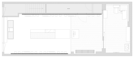
Wooden pegboard lines the walls within Ace & Tate's Amsterdam eyewear store
Amsterdam-based Occult Studio has designed the flagship store for eyewear brand Ace & Tate – installing wooden panels with peg holes that allow displays and mirrors to be easily moved around (+ slideshow).
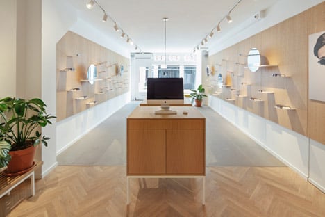
Occult Studio created a minimal interior for the shop and opticians on Huidenstraat, just west of the Dutch capital's city centre.
Aiming to create a space that offers a "unique retail experience", the designers took the brand's ever-changing eyewear range as a starting point for the project.
"Ace & Tate is a very dynamic brand with constantly changing collections," creative director Kim Keogh told Dezeen. "The concept for the store evolved around our intent to create a unique retail experience."
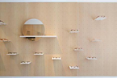
Wooden panels crafted from light oak run along the walls within the main retail area, and feature a grid of circular holes where custom-made shelving and mirrors slot into.
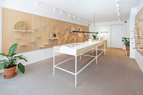
"We used the dynamic elements of the brand as a starting point and translated them into a unique modular system," explained Keogh. "The wall can be composed in continuously changing arrangements. Collections can be placed in groups and the mirrors can be placed at various heights to be at the customer's eye level."
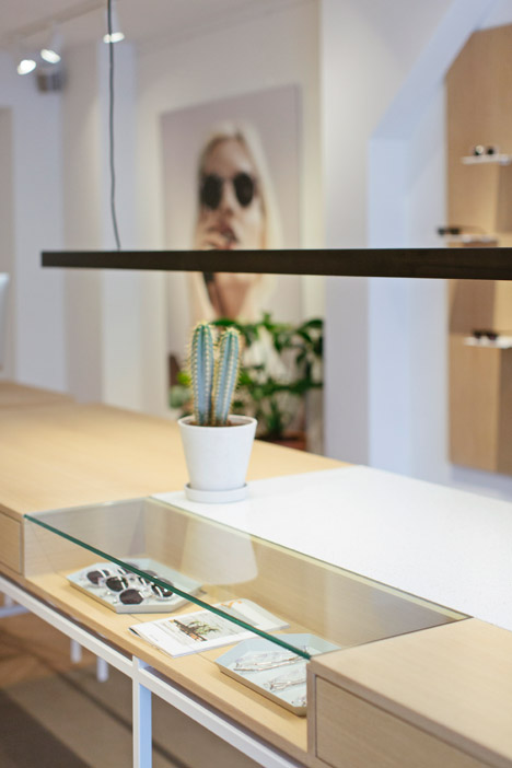
A long wooden table that was designed by Keogh stands in the centre of the shop. It features a glass insert that displays more items in the collection.
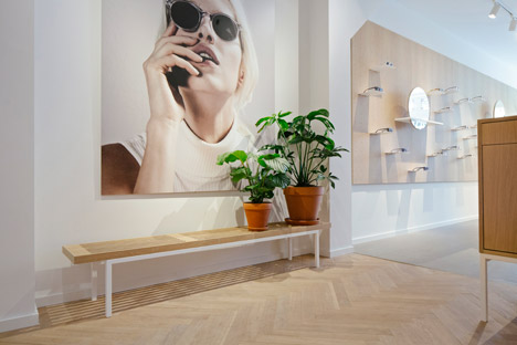
"The furniture pieces, wall systems, shelving and mirrors, are specifically designed and custom made to create a fine balance between form and functionality," she said.
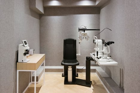
The walls of a private examination room towards the back of the shop are completely covered in a grey wool fabric – intended to create a "tactile, relaxing and sound-absorbing atmosphere".
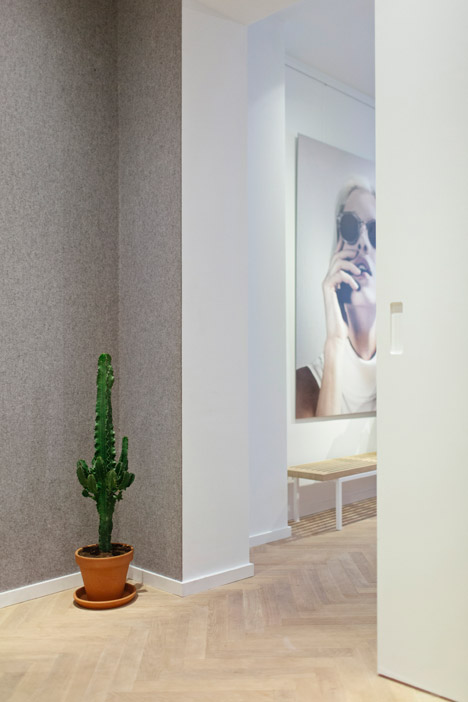
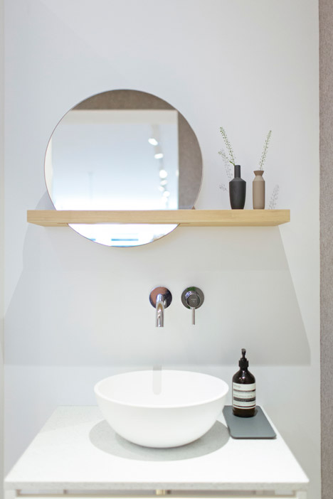
"By using carefully picked materials such as light oak wood, white steel, speckled stone and quality fabrics, we aimed to create a rich experience in a minimalist context – setting a stage for the product and the experience of the brand," explained Keogh.
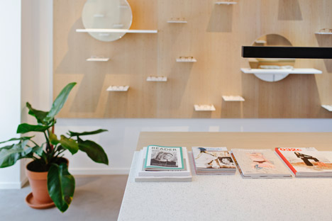
Benches are placed by the front window and outside of the examination area, with magazines available for customers waiting for appointments.
Canadian architecture studio Scott & Scott installed a similar peg system in a Vancouver restaurant – puncturing over 100 holes into the wall to store furniture, hold lighting and display art.
Pegboard also features in Aesop's Hamptons store, a tiny Soho office by Studio Swine and a shop in Stockholm by Form Us With Love.
Photography is by Jordy Huisman
