Charles Holland presents 11 lost icons of Postmodern architecture
Pomo summer: as part of our summer series on Postmodernism, Dezeen invited architect and former FAT director Charles Holland to look at some of the movement's most iconic projects that didn't stand the test of time.
Postmodernism began with an act of demolition. In 1972, the Pruitt-Igoe housing blocks in St Louis, Missouri were demolished following years of problems and neglect. Architecture critic Charles Jencks hailed this event as the death of Modernism and the birth of Postmodernism, an architectural style that would embrace popular taste and historic symbolism.
Since then, Postmodernism itself has grown old and if anything even more unpopular. It has suffered more than its fair share of lost or demolished buildings. But these losses are often more to do with the cycles of fashion than any innate deficiencies in the fabric of the buildings themselves.
Postmodernism is still at the bottom of the architectural depreciation curve, despite recent attempts at revivification. As a style that hit its peak in the 1980s, many of its landmarks were commercial and somewhat disposable building types including office blocks, shops and hotels.
What follows is a tribute to some of Postmodernism's more important lost icons, the buildings that future generations will come to mourn even if we don't quite realise it yet. Their demolition is all the more acute for the combination of monumentality and lightness of the buildings themselves and the way that they combined an interest in architectural history with popular taste.
There are 11 entries because Postmodernism is not meant to be compositionally tidy – or symmetrical. And there should always be room for loose ends...
1. Strada Novissima, Venice Biennale, 1980
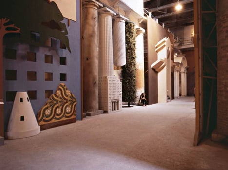
Let's start with Postmodernism's cultural high-water mark, the moment at which its disparate strands coalesced into a definitive architectural movement.
In 1980, Paolo Portoghesi, the director of the First International Architecture Exhibition in Venice, invited a number of architects to contribute to the Strada Novissima, an installation within the Venice Arsenale. This took the form of a "street" made up of individually designed facades by, amongst others, Hans Hollein, Michael Graves, Venturi Scott Brown and Robert Stern.
The roll call also included some more unlikely names including Frank Gehry and Rem Koolhaas. Gehry's contribution was actually one of the best – a bare stud wall with the timbers arranged to focus on one of the Arsenale's windows. His installation was barely there, an almost spectral presence that articulated a sense of fragility entirely appropriate to its site and an architectural movement obsessed with ephemeral signifiers
The whole exhibition was dismantled, but despite its temporary nature it was one of the most significant achievements of Postmodernism.
2. Clifton Nurseries, London, Terry Farrell and Partners, 1980 – 1988
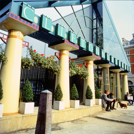
The first of two buildings in this list designed by Sir Terry Farrell, although the only one to have an intentionally short lifespan. Clifton Nurseries was a temporary flower shop in London's Covent Garden.
In a moment of admirable chutzpah, Farrell placed it directly on axis with Inigo Jones' St Paul's. Not only that, but the new building's facade directly echoed the temple front of Jones' church, albeit sliced down the middle so that only half of its implied width was inhabited. Behind this billboard front lurked a mono-pitch structure covered by a high-tech tensile roof. A mix of solid and void Doric columns supported the portico with an Art Deco-style rising sun fenestration pattern.
The Covent Garden building was the second that Farrell designed for Clifton Nurseries. The first, an equally delightful but less obviously historicist structure with a wave-form roof (and, it has to be admitted, a broken pediment) experimented with polycarbonate and gasket construction, a particularly fruitful and now largely forgotten marriage of high-tech and historical strains of Postmodernism.
3. TV AM, London. Terry Farrell and Partners, 1983 – 2011

An out-and-out classic and a tragic loss for London, Farrell's Camden Town TV studio was probably the most 1980s building ever designed. It provided a home for the shoulder pads and big hair of breakfast television and epitomised the emergence of loft conversions, canal-side regeneration and what Charles Jencks dubbed "wharfism".
Farrell turned a bunch of warehouses on the Grand Union Canal into a pop masterpiece. The street entrance featured giant 3D super-graphic letters and a keystone motif made from neon-coloured metal tubes. The interior was a blocky, neo-Egyptian landscape of pastel-coloured ziggurats and fake palm trees.
But the pièce de résistance were the giant eggcups that adorned the sawtooth roof profile (main image). Not only were these an amusing reference to the role of eggs in classical decoration – egg and dart motifs – and, of course, to breakfast, but legend has it that they were glued into place by members of the Farrell team after the contractors refused to counter such silliness.
The building suffered a number of indignities including the filling in of the giant letters and a monochrome paint job before being irrevocably buried under characterless cladding. Amazingly, at the last count the eggcups are all still standing.
4. Kensington Homebase, Ian Pollard/Flaxyard, 1988 – 2014
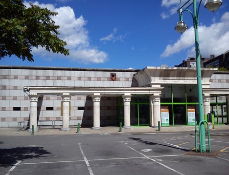
A recent loss and a controversial one. Ian Pollard's west London Homebase store was, depending on your point of view, a heartfelt homage to James Stirling's Staatsgalerie or a cynical and shameless rip off of the great man's work. As Stirling himself was an arch-pilferer, Pollard's creation could be seen as an entirely appropriate tribute.
Once again the building recycled some already third-hand Egyptian references in the form of hieroglyphics, deities depicted holding power tools and columns lifted straight from Karnak. It also featured one of the most Postmodern of all Postmodern "jokes" in the form of a draughtsman's section line painted on the facade where the material shifted from stone to render. Chuck in some of "Big Jim's" trademark green-framed windows and the fact that the whole edifice was in the name of cheap home makeovers and it was enough to give the entire architecture profession the heebie-jeebies.
Pollard himself was a very curious character, a hippy developer and professional eccentric who subsequently retired to become a naked gardener. Perhaps this was atonement for dressing up buildings in fake glitz for all those years.
5. Best Superstores, SITE, 1970-84 – ?
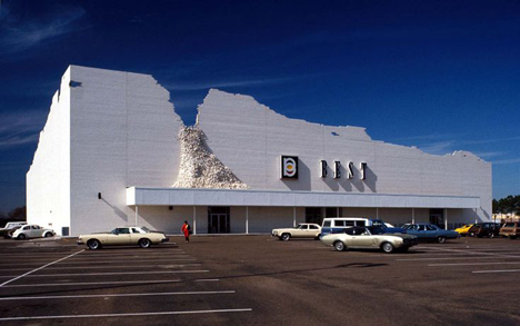
During the 1970s, the US-based Best superstore chain was an unlikely patron of art and architecture. They commissioned a number of contemporary architects to design their big-box retail outlets, including Robert Stern, Venturi Scott Brown and Stanley Tigerman. By far their most impressive and consistent relationship though was with James Wines' groundbreaking SITE practice. Wines was a sculptor not an architect and he brought a rigorous conceptual clarity to the process of designing buildings.
The series of stores SITE designed were audacious and witty. Each one was based on a single concept executed with complete conviction. There was the deconstructed Inside Outside facade, the Forest Facade which appeared as a ruin out of which trees were growing and the crumbling brick wall of the Indeterminate Facade.
Wines' genius – and the reason that Best liked him so much – was that he accepted the logic of the dumb retail box and used it much like Duchamp used the urinal – as a ready-made whose meaning could be played with precisely because of its conventional familiarity.
Sadly, as the blog site Failed Architecture has recently catalogued, pretty much all SITE's brilliantly unashamed one-liners have disappeared, the stores reverting back to the banal typologies that Wines was wittily riffing on all those years ago.
6. Moore House, Charles Moore, 1969 – ?
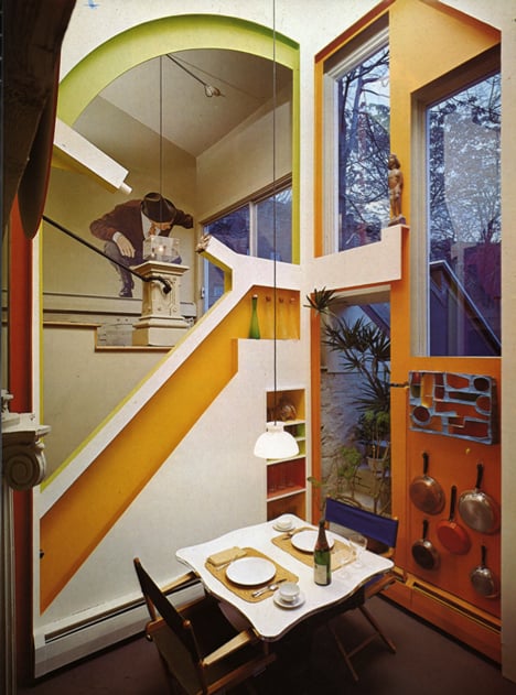
Moore's design is one of the absolute masterpieces of Postmodernism. Built while he was dean of the Yale School of Architecture, he hollowed out the interior of a timber-framed turn-of-the-century New Haven house and turned it into a Pop Art, bachelor playpen par excellence.
Three two-storey timber structures – named Howard, Berengaria, and Ethel – were inserted into the remains of the house. These objects were animated by vast super-graphic cutouts and layered with acid-coloured plywood shapes. Found objects including advertising billboards, Tuscan columns, neon signs and cow-skin rugs were artfully added to make a vibrant and deliberately discordant composition.
There is a convincing case to be made for Moore practicing a form of architectural psychedelia, designing sample-heavy, playful and often highly disorientating kinds of interior dreamscape – influenced equally by Mannerist architecture, Pop Art and the late 1960s counterculture. The house itself is lost in the mists of time, subject no doubt to countless DIY makeovers if it still exists at all.
7. Lieb House, Robert Venturi and Denise Scott Brown, 1967 – 2008

Not actually gone, merely moved. The Lieb House was designed in the late 1960s in Long Beach, New Jersey and its meaning was intimately tied to that context. The design echoed the forms and materials of the beach houses in the area but with sophisticated and mannered refinements.
Clad in asbestos shingles and constructed out of a simple balloon frame, the Lieb House was cheap and cheerful and represented Venturi Scott Brown at their taught and tense best. It was full of erudite allusions including Palladian windows, proportional games and scale refinements, none of which detracted from their obvious love of the rough-and-ready source material.
American artist Dan Graham has eloquently described the way that the Lieb House holds a mirror up to its surroundings. Threatened with demolition, it was eventually bought and moved to Long Island by another client of VSBA's, resulting in the surreal spectacle of this diminutive house being floated down the East River on the back of a barge. It now resides in the garden of a much later house designed by the pair, thankfully preserved but also thoroughly out of place.
8. Southgate Estate, Runcorn New Town, Stirling Wilford and Partners, 1977 – 1992
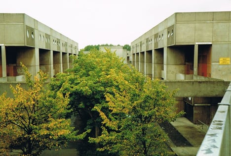
It is debatable as to exactly how Postmodern this work by Stirling Wilford really is. Architect and writer Douglas Murphy has coined the term Brutalamo to describe the moment when the big sculptural forms of Brutalism started to inflect more historicist elements. I've always inclined to the view that Stirling was a Postmodernist all along, collaging historical fragments from at least Leicester onwards.
What isn't in doubt that is that it has well and truly gone. It had an unhappy life up to that point anyway, never really loved even by Stirling's staunchest apologists. There were two distinct phases to the work, both problematic in different ways. One was in pre-cast concrete, uncompromisingly abstract blocks that Stirling compared to Georgian squares. A second phase experimented with GRP, one of the architect's favoured materials at the time. This was employed in violent shades of orange and blue and had a ribbed texture and circular windows, giving the whole thing the look of a vast outdoor launderette.
There were technical problems. It was unpopular with residents and the whole estate was eventually demolished in 1992. Stirling's buildings are always uncompromising and challenging. These ones proved a provocation too far.
9. RCA Bookshop, James Gowan, 1985 – about three weeks later

Stirling's sadly recently deceased ex-partner James Gowan was usually regarded as the more sensible, restrained one. His solo work was generally less spectacular but always interesting and technically flawless. The exquisite little facade he designed for the Royal College of Art bookshop was atypically strident for him. Allegedly Gowan hammed up its sophisticated toy-town classicism to wind up the then head of the RCA's School of Architecture. If the flamboyance wasn't typically Gowan, the acerbity certainly was.
The only known appearance in print of Gowan's bookshop is in one of AD magazine's late 1980s Pomo special issues and tragically it has been removed, replaced by the anodyne white plasterboard beloved of art institutions everywhere.
10. Snyderman House, Michael Graves, 1972 – 2002
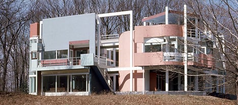
Back in the late 1960s, Michael Graves was part of the New York 5, a group of architects also including Peter Eisenman and John Hejduk that attempted to revive the revolutionary forms of early Modernism.
The Snyderman House represented Graves at a turning point from this early work to his later Pomo phase. Here, the pastel-painted figurative forms that he would go on to develop fully were just beginning to emerge from the constraining Modernist grid. The house was thus one of his most interesting works, exploiting a genuine artistic tension between figuration and abstraction, modernity and tradition.
It was the largest project Graves had undertaken – he'd been known up to that point as the Cubist Kitchen King – and represented a release of pent-up energy. It was easy to overlook the fact that somewhere in all that formal frenzy was an actual house. The composition teetered on the edge of legibility, the rational grid deployed to the point of irrational incoherence. There are relatively few interior photographs, partly because there wasn't much of an interior. There's even less now, as sadly the house burnt down in 2002.
11. Lassú Chair, Alessandro Mendini, 1974

In 1974, while editor of Italian design magazine Casabella, Alessandro Mendini set fire to a chair. The photograph of the resulting conflagration graced the front cover of the magazine. Mendini's ritual destruction of his own design can be read in various ways: as a comment on the ephemeral nature of architecture, as an example of design as media performance and as a personal comment on destruction and mortality.
What's clear is that Mendini's act was one of the very few examples in design where the demise of the object was intrinsic to its meaning. It is a fitting way to end this lament because Postmodernism was a movement that always acknowledged its own temporality and was obsessed by ruins, fragments and remains. Despite its claims to popularity and a shiny commercialism, Postmodernism was actually morbidly obsessed with the dead and (nearly) buried remains of architecture and culture. This is actually one of the most interesting things about it.
Contrary to popular misconception, materiality was very important to it. It's just that it also acknowledged the alchemical process by which that materiality gains cultural meaning, as well as how that meaning changes over time. Sometimes it disappears altogether. And in disappearing, it gains another, perhaps more permanent kind of meaning.
Charles Holland is a director and co-founder of Ordinary Architecture. Prior to setting up Ordinary Architecture he was a director of FAT, where he was responsible for a number of the firm's key projects including a House for Essex, Islington Square and Thornton Heath Library. Charles is also a respected teacher, writer and contributor to contemporary architectural culture. He is a visiting professor at Yale University, a design tutor at the Royal College of Art and practitioner in residence at the London College of Communication. He also edits the popular architecture blog www.fantasticjournal.blogspot.co.uk.