Paul Archer Design pairs glass with marble for extension to a remodelled London townhouse
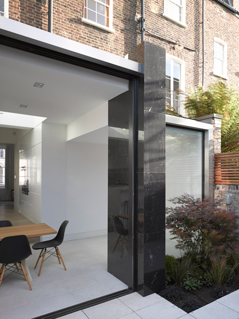
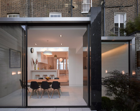
A glossy black marble wall divides the glass facade of this extension to a 19th-century townhouse in north London by local architecture office Paul Archer Design (+ slideshow).
The five-storey property is located within a conservation area in Islington, north London. As well as adding an extension, Paul Archer Design has completely remodelled the interior to create a family home more suited to 21st-century living.
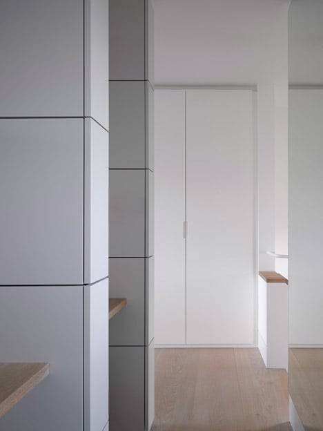
The clients' brief called for open spaces with lines of sight between the various rooms and a minimal aesthetic facilitated by plenty of built-in storage and a neutral colour palette.
"They wanted a very contemporary design with simple lines but also wanted it to be a family home that is easy to use and not some sort of showpiece building," project architect Emil Neumann told Dezeen.
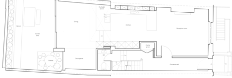
The improved connection between the rooms is particularly evident on the ground floor, where a reception room adjoins the new kitchen. The glass-walled extension is just beyond, housing a dining space and a playroom.
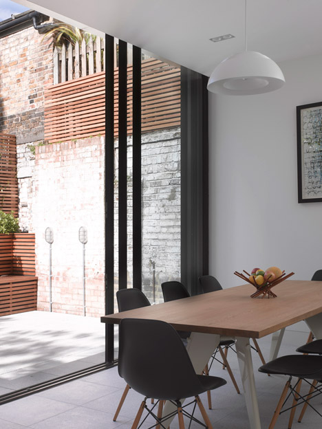
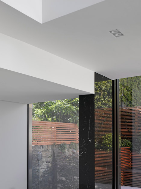
A black marble wall stands between these two spaces, complementing the dark frames of the sliding glass doors. The intention was to reference the luxurious interiors created by Modernist-era architects.
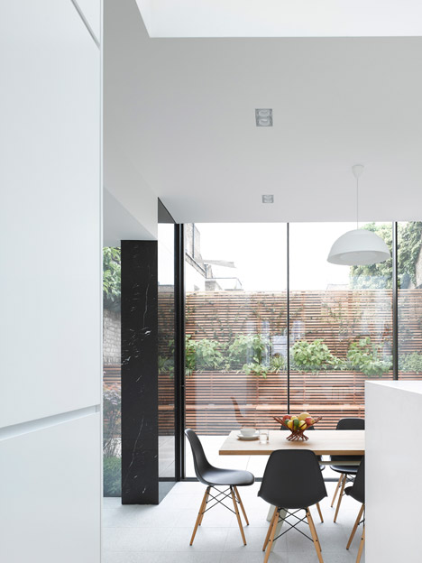
"The column was a very early part of the design and was always intended to be a beautiful stone, in the tradition of Mies van der Rohe or Adolf Loos," said Neumann.
"A light marble stone would have been pretty, so in the end black marble was the perfect choice. It becomes an object that stands out, almost mesmerising, and defines the space from the inside and outside."
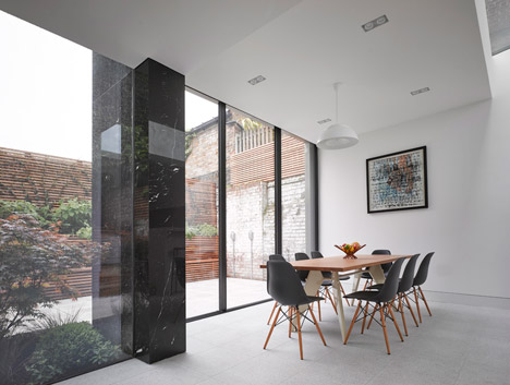
The level of the dining room matches that of a reconfigured patio, enabling a smooth transition between indoor and outdoor spaces paved with the same concrete slabs.
According to Neumann, connecting the rooms at the front and rear of the house optimises the dimensions of the plan while retaining the building's original character.
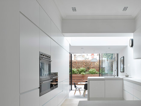
"The challenge when you change the proportions of rooms is to make the new spaces look sympathetic to the main house and not out of place," he pointed out.
"The ground floor now has a very generous feel which can be quite difficult to achieve in a narrow London house."
Many of London's Victorian houses have been rearranged and extended to accommodate today's living habits. In the same area, Architecture for London used stainless steel surfaces and a polished concrete floor for a similar ground-floor extension, while Mikhail Riches added a glazed kitchen and dining room to another a 19th-century house during its renovation.
At this property, a skylight above the kitchen brings light into this space, while the play area is flanked by a window looking out at a planted bed.
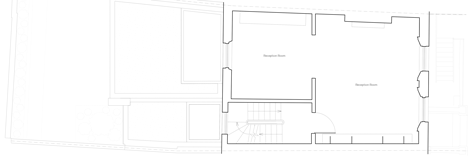
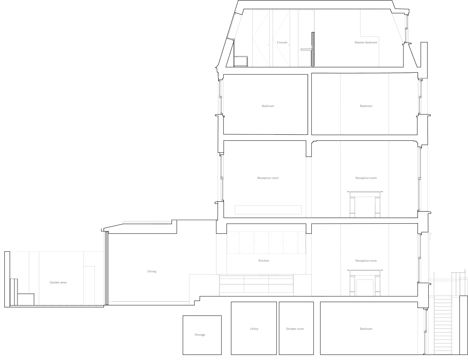
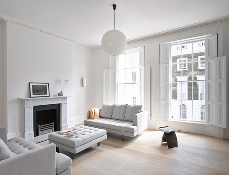
Front and rear receptions on the first floor were connected to create an open-plan living area, comprising a sitting room and library with a restored marble fireplace and a TV-viewing space at the rear.
Two bedrooms and a bathroom are accommodated on the second floor, while a previously uninhabitable basement level was structurally renovated to house an additional bedroom and a utilities area.
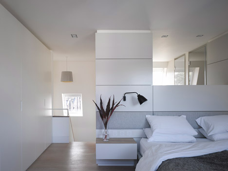
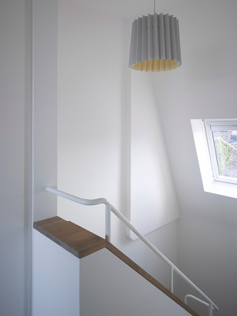
The master bedroom suite is situated in a 1980s loft extension at the top of the house, which the architects gutted before adding a central piece of furniture that divides the sleeping area from the en-suite bathroom.
Fitted cabinetry used in this space and throughout the interior helps to achieve the clean and clutter-free environment the clients requested.
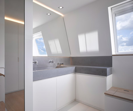
Materials were selected to create a consistently neutral and calming interior. Wide oak floorboards treated with a white oil and walls painted in shades of white give the spaces a light and serene feel.
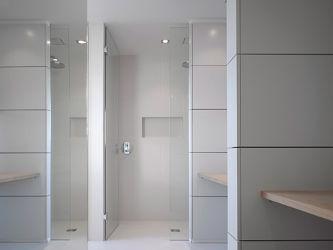
"The clients wanted a clean aesthetic but were worried it might look too clinical, so we used a palette of very light colours and materials like the white-washed floors and marble to tie in with that," Neumann added.
Original details were retained wherever possible, including the cornicing in the first-floor reception room and all of the doors and window shutters.
New additions complement the heritage feel of the interior or restore existing features, such as the marble fireplace.
Photography is by Nick Guttridge.
