Dara Huang of London studio Design Haus Liberty said she "used the palette that was already there" to ensure the newly created apartments of this converted building in the city's Marylebone district kept within a small budget (+ slideshow).
Design Haus Liberty completed the fit and finish for a developer who had combined two adjoining buildings near Marylebone High Street. The mixed-use property has a sushi restaurant on the ground floor and apartments spread over the four storeys above.
The second floor houses two separate one-bedroom flats, while two duplexes share the three levels above, including a newly added fourth floor.
The project is called Skip Stop House because staircases skip past some of the levels to provide dedicated access to the homes above.
The brief from the developer called for unique contemporary living spaces to be created with a budget of just £80 per square foot for the entire fit out and finish.
To reduce costs, Huang and her team focused on retaining existing surfaces and introducing complementary industrial materials.
"Everyone is refurbishing their own flats in central London and we aimed to find a unique way to do this using standard materials," Huang told Dezeen.
"We used industrial and off-the-shelf materials in fun and fantastical ways to create an atmosphere that's part industrial and part luxury."
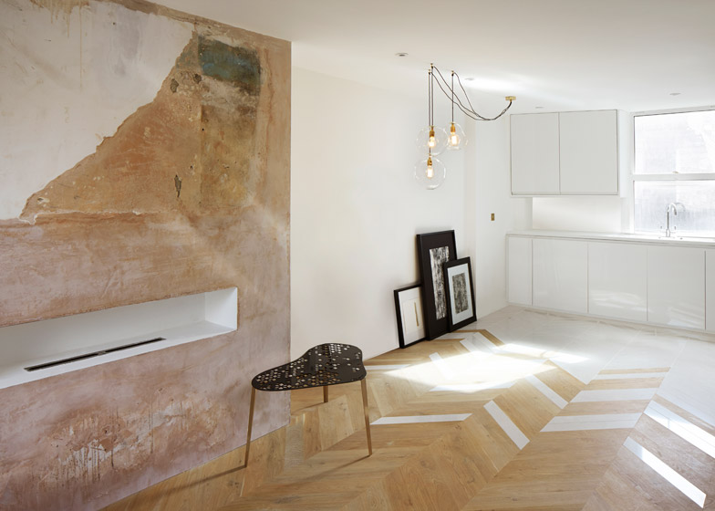
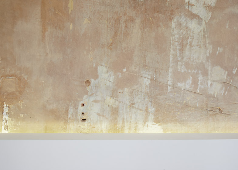
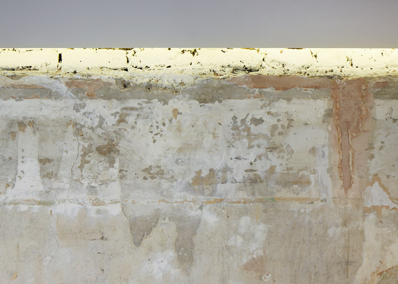
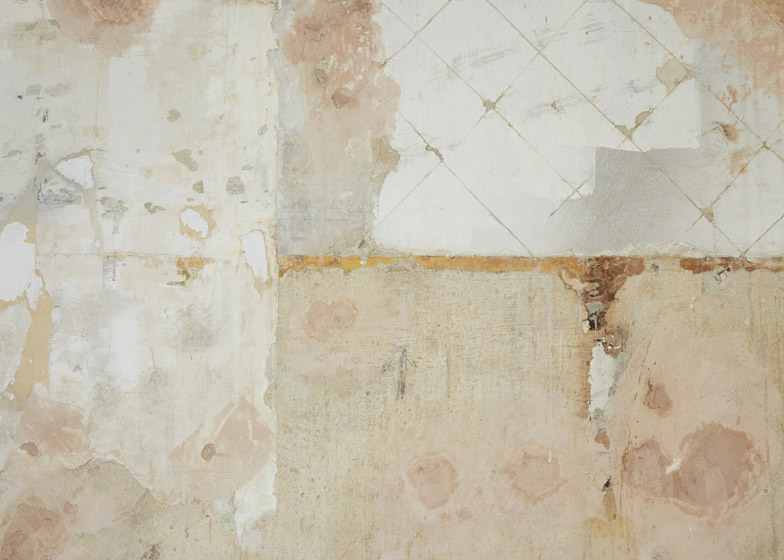
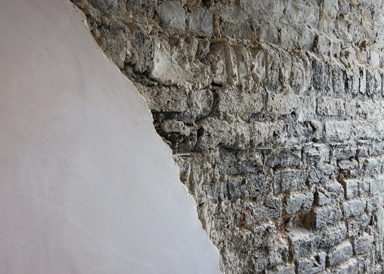
Each of the apartments in the existing areas of the building feature walls where layers of paint and wallpaper were removed to expose the patinated plaster.
"In a lot of the spaces, because it is a refurbishment, when you peel back the old wallpaper it creates these different colours underneath," said Huang, explaining how she convinced the developer not to plaster over these surfaces.
"We used the palette that was already there but was hidden, so if we uncovered a wall and there was brick behind it we left it and tidied it up," she added. "The things that were already there just needed to be uncovered and paired with the right materials."
The majority of other surfaces are painted white to accentuate the character of these original details, while new additions enhance the industrial feel.
Black metal mesh is used for the balustrades in the staircases, and also for closet doors in some of the bedroom suites.
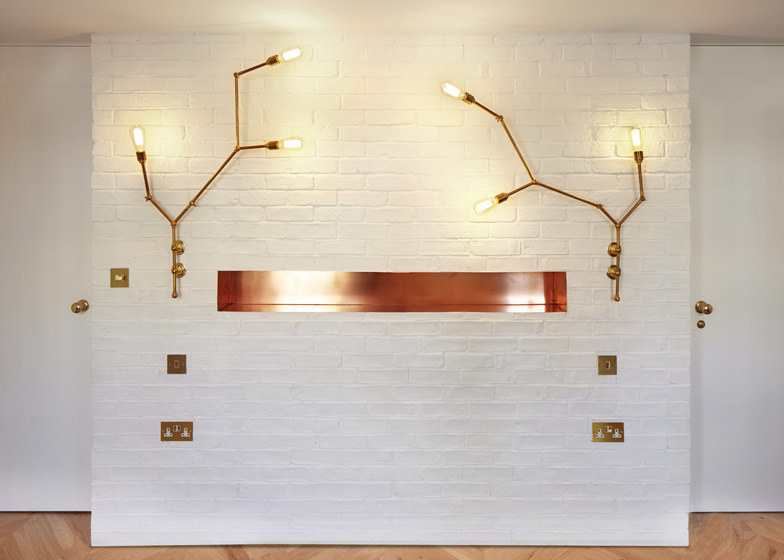
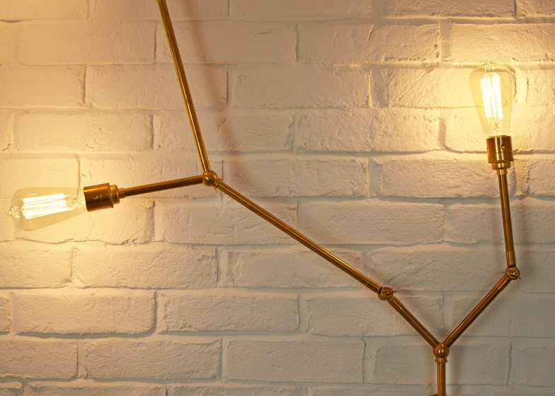
Brick feature walls are painted white and decorated with branching brass light fittings that were designed and custom-made by the project team.
Related content: see more renovations
Hand-blown pendant lights with intentionally irregular surfaces were also produced for the project.
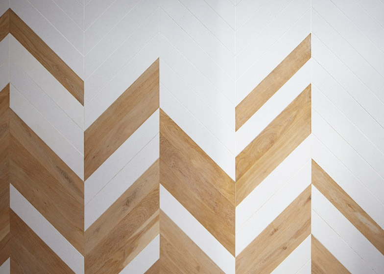
Chevron timber flooring is interspersed with white quartz tiles cut to the same dimensions as the wooden boards that indicate the transition between the living and kitchen areas.
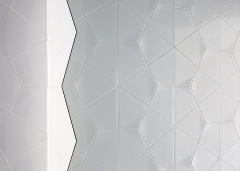
The patchwork aesthetic continues in the bathroom, where hexagonal white tiles combine with mirrored surfaces made to fit around the geometric shapes.
The rooms contained in the new mansard roof extension emulate the industrial feel of the converted spaces. A mirror-clad closet in the master bedroom blends in with its surroundings, including more mesh-fronted cabinets lining the wall at its rear.
Photography is by Jack Hobhouse.


