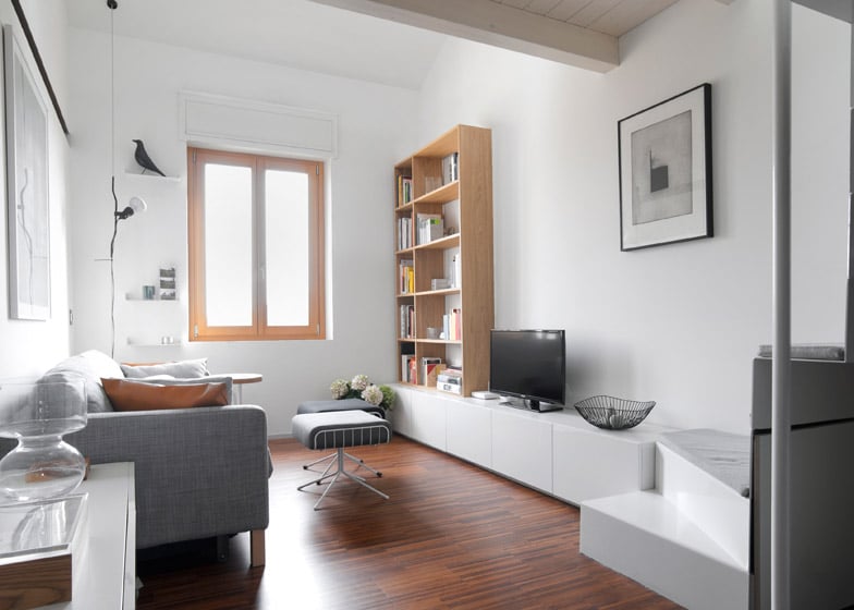
Italian architecture firm +R Piuerre has converted a dental practice at the top of a Milanese building into a 60-square-metre apartment (+ slideshow).
Created for a young professional who works from home, the CPR Apartment comprises a lounge and kitchen-diner on one floor and a bedroom and office upstairs.
The design was influenced by the "organic and intimate character of Nordic design combined with the attention to detail and the elegance of the Milanese Modernism", according to +R Piuerre.
Space restrictions meant that a number of visual tricks were used to make the interior appear larger, and clever storage solutions were integrated to maximise what room there is.
Similar techniques have been used recently to make the most of space in tiny apartments in Wroclaw and Berlin.
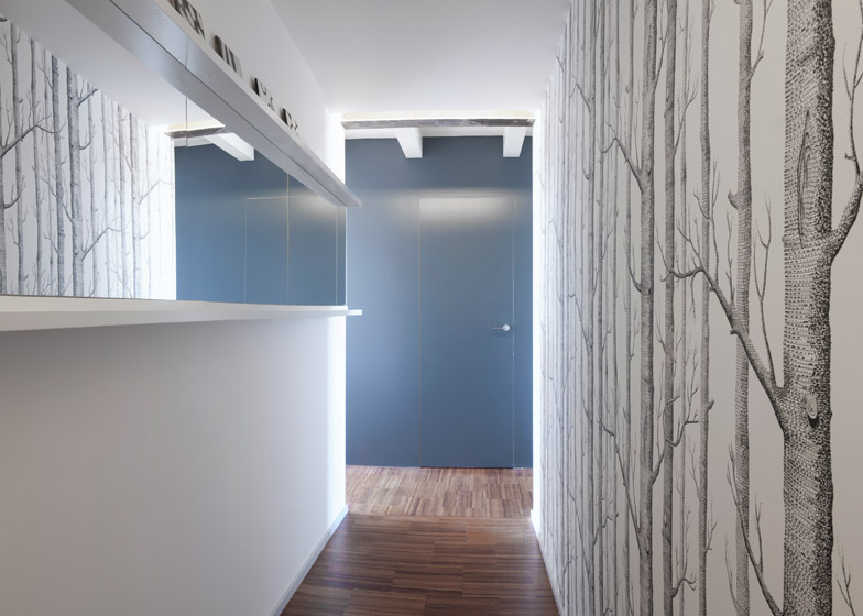
The architects used a horizontal mirrored strip to open up the dark, narrow entry corridor. This space was decorated using the pale-coloured Woods wallpaper by Cole&Son, with coat hangers placed exactly on the knots of the printed trees.
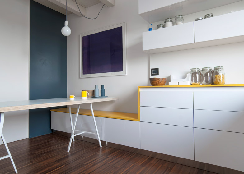
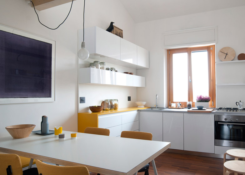
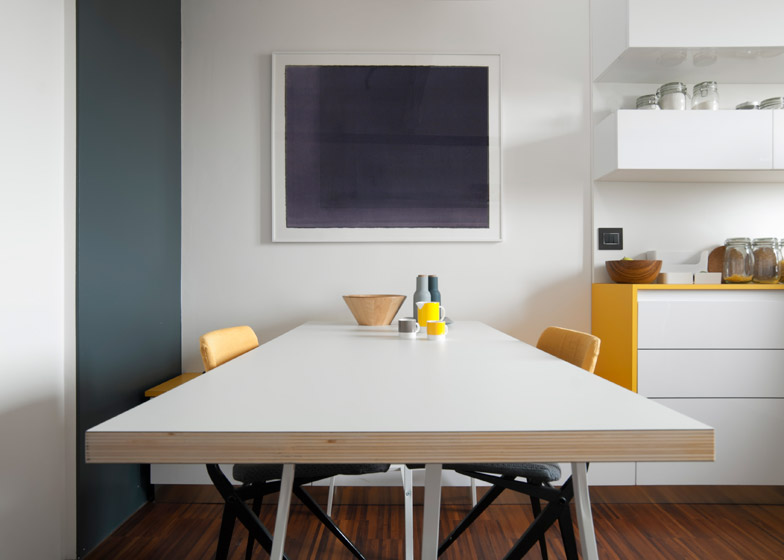
A custom kitchen on the north side of the building features a cooking area, which overlooks the view from the window, and a narrow counter for storage and preparation that drops down to form a bench.
The two areas are colour-coded according to function, with the latter featuring a bright yellow surface.
The dining table is made from a multi-layered wooden panel supported by two movable sawhorses to enable different configurations and is paired with bright yellow 1950s Danish Marko chairs.
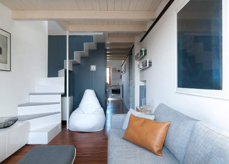
The only opaque divider in the apartment is the blue-grey painted service block, which houses the bathroom between the kitchen and the living room on the south side of the property.
It supports a white-enamelled, folded steel staircase designed to create a feeling of open space in the lounge.
The load-bearing section of the staircase, designed by +R Piuerre and custom made by a local craftsman, is camouflaged in order to make it look like "a white folded sheet of paper" against the darker background.
The office space and bedroom are housed on a mezzanine level carved out from a former attic space.
"The creation of a mezzanine rather than a full upper floor gave us the opportunity to emphasise the double-height space," +R Piuerre's Alessandra Castelbarco Albani told Dezeen.
Related stories: see more micro apartments
"Moreover this solution makes the apartment brighter, bringing the natural light from the skylights to the lower floor."
The two skylights add to natural light already provided by windows on three sides of the building. The artificial lighting is all indirect and located within specially created recesses, with the exception of a pendant bulb over the dining table and a Parentesi light by Achille Castiglioni.
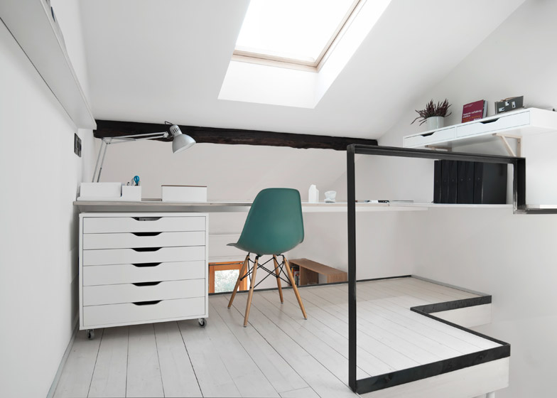
The office balcony extends into the double-height space so the desk overlooks living room below. The long desk wraps around the corner of the space and is supported by an extension of the stair handrail. Eames DAW and DSW chairs provide seating.
Although this space was conceived as the primary area for the client to work, the architects admitted that he "moves from one corner of the apartment to another, according to the light and his mood".
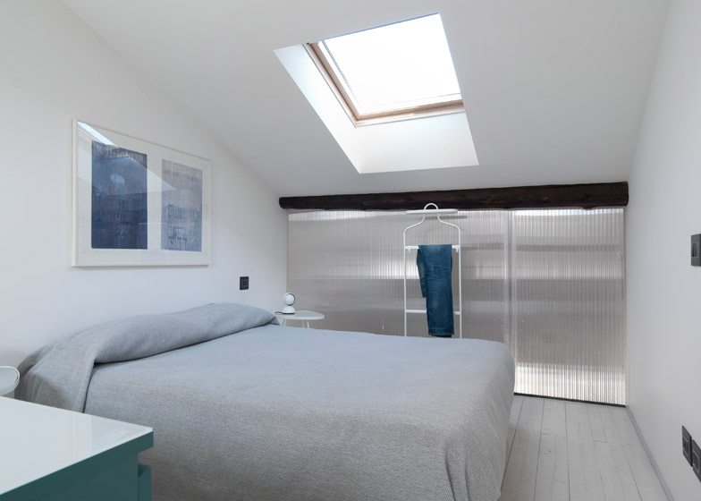
The bedroom features a built-in wardrobe to maximise space. A polycarbonate partition closes it off from the kitchen below, while increasing the brightness of both rooms and creating a "lantern effect" at night.
The kitchen light can be turned on and off from the bedroom and vice versa, enabling each space to provide diffused light for the other.
Photography is by Michele Filippi.

