Pomo summer: Mario Botta's monumental San Francisco Museum of Modern Art was the architect's first building in the US, but was frostily received by critics. Now undergoing a major extension project led by design firm Snøhetta, the building is the next in our summer series on Postmodernism (+ slideshow).
When Mario Botta set out to design a new home for the San Francisco Museum of Modern Art in 1988, his goal was to create a landmark building with "iconic strength".
Both admired and panned, the building opened in 1995 in the city's South of Market (SoMa) neighbourhood, a blighted area on the verge of a major construction boom. The museum (SFMOMA) had been located in the upper levels of the Beaux Arts-style San Francisco War Memorial and Performing Arts Center since 1935, and it wanted a distinctive new home when it selected Botta in 1988. The Swiss-Italian architect beat out several notable architects for the commission, including Frank Gehry, Tadao Ando and Charles Moore.
At the time, Botta had gained prominence in Europe. Born in Mendrisio, Switzerland, he studied at the Liceo Artistico in Milan and the University of Architecture in Venice, and had worked with Le Corbusier and Louis Kahn. Since founding his practice in 1970, he had designed mostly houses and churches. These featured strong geometric forms, masonry facades, and hints of historicism.
The SFMOMA project came with high expectations. It needed to establish a visual identity for a museum that didn't have one, and it needed to do so in a district characterised by dilapidated buildings. At 225,000 square feet (20,900 square metres), it was slated to be the largest building in the American West dedicated to modern art, and the second largest in the country, behind New York's Museum of Modern Art.
Moreover, it was Botta's first US building, and it was being constructed in the heart of a major American city. "The building has great significance to me," Botta, 72, told Dezeen. "The architect aspires to build in a city as the artist aspires to exhibit his works in a museum."
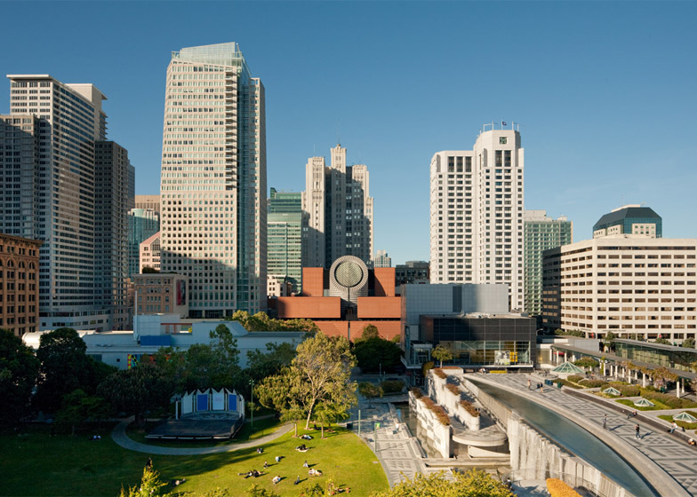
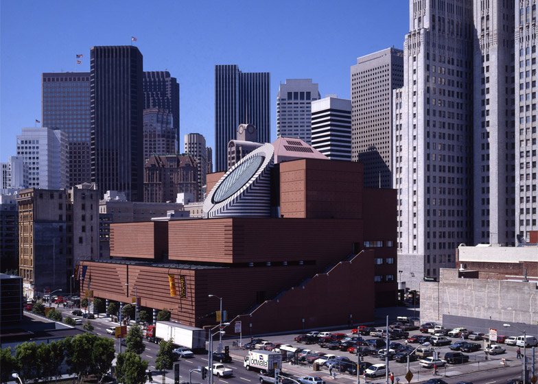
The building was to be constructed on the site of a former parking lot. An Art Deco tower dating to the 1920s and designed by architect Timothy Pflueger sat behind it. Within years, Yerba Buena Gardens, a large public park, would open across the street, and several towers and cultural buildings would start to rise in the neighbourhood. Nearby, the Financial District was already speckled with international-style skyscrapers made of glass and steel.
"The museum had to become a landmark, to have iconic strength," said Botta. His solution was to create a building with simple forms, clear geometry and solid massing – a piece of architecture that would be distinguishable from the "abstract language of downtown buildings," he said.
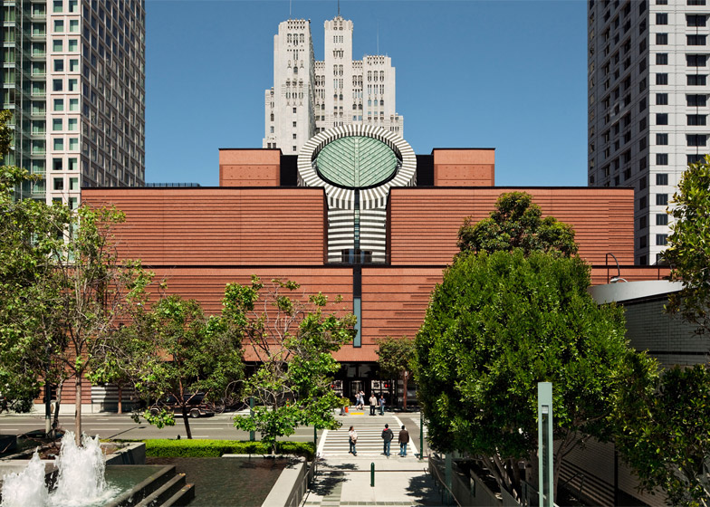
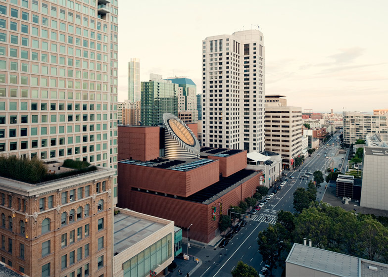
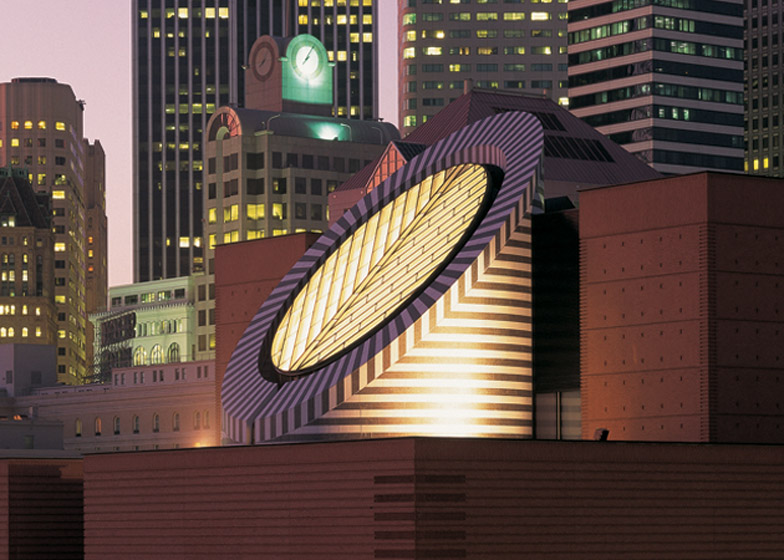
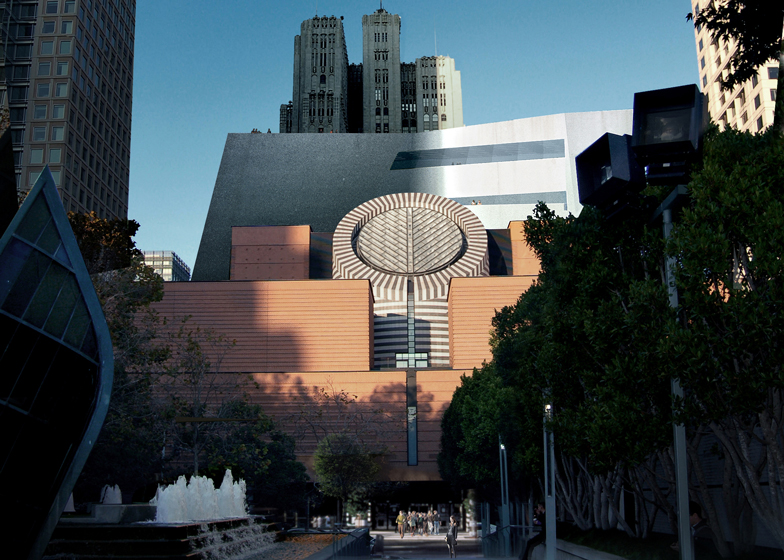
Working with local architects HOK, Botta conceived a five-storey museum composed of stacked boxes clad in various treatments of red brick. On the street-facing elevation, the orthogonal volumes step upward, giving the building a wedding cake-like appearance.
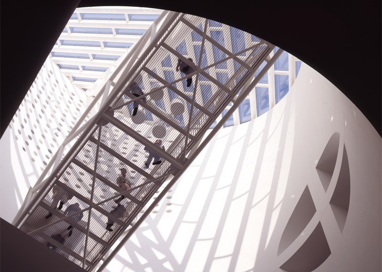
Emerging from the centre is a circular turret wrapped in zebra-like bands of black and white stone. The top of the cylinder is sliced off at an angle and sheathed in glass, resulting in a giant oculus that brings in natural light while also gesturing toward the city. Botta describes the oculus as a "sort of eye" that puts the building's interior in contact with the outdoors.
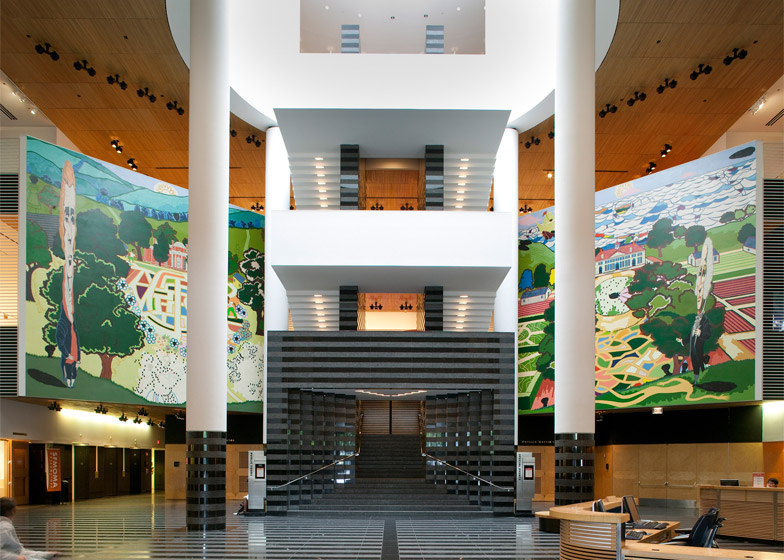
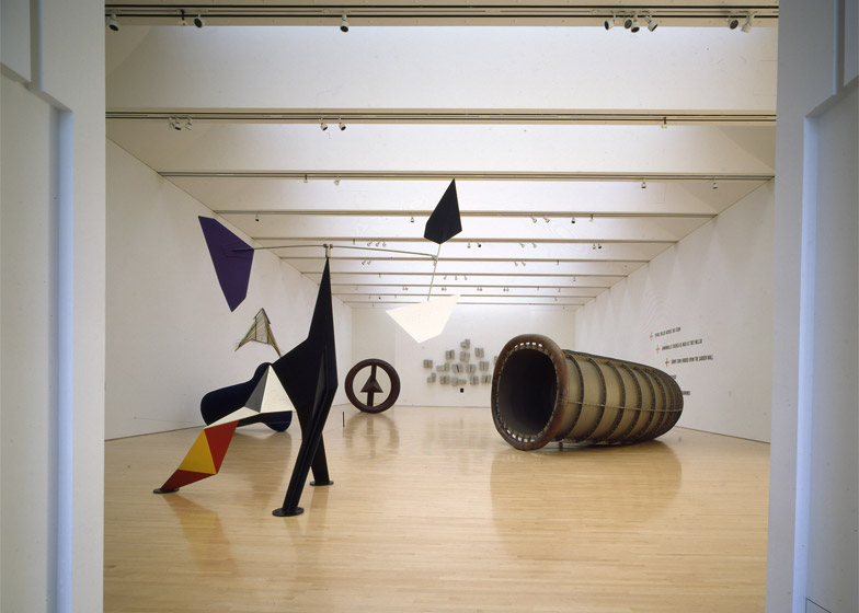
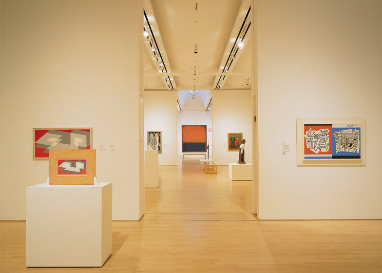
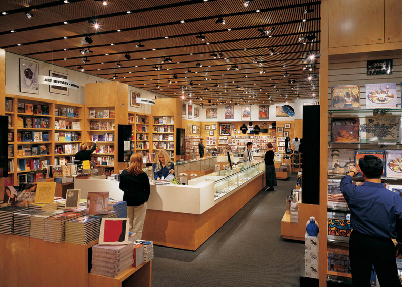
Inside, the diagonal skylight funnels light into an atrium with a grand yet compact staircase. Galleries, a library, cafe, and auditorium are organised around the atrium, which was meant to act as a lively European-style piazza. The material palette includes wood and granite, giving the space a warm and eclectic feel.
Botta is now typically listed among the top Postmodern architects, although his work can be difficult to categorise. Critic Paul Golderberger, in a 1986 story about Botta in the New York Times, wrote: "His work does not invite easy classification – it is surely modern, but it eschews the slickness and the sleekness of so much late Modernism. His material is masonry, not glass or steel, and he uses it to create buildings that are firm, self-assured essays in geometry."
British critic Charles Jencks, in his seminal 1980 book The Language of Postmodern Architecture, singled out Botta as a leading exponent of "Postmodern Classicism". Botta himself eschews such labels.
While not overtly Postmodern, the SFMOMA building certainly has many Postmodern elements: geometric forms, heavy massing and pre-industrial materials such as brick, wood and stone, said Mitchell Schwarzer, an architectural historian and professor at the California College of the Arts. "Whereas Modernist buildings had a weightless quality, the Botta building is very heavy," he said. "That solidity is a reaction against Modernism."
"I prefer to think of it as post-Classical, in the sense that I believe that architecture should not relate to styles," explained Botta. "It should be a testimony of the 'territory of memory' by means of a contemporary language."
The Botta building was an important contribution to San Francisco's cityscape, although it was the last of its kind. "It marked an end to the Postmodern period and the beginning of Neo-Modernism, which has really dominated San Francisco since then," Schwarzer said.
At the time of its completion, the building was among the most anticipated of the year in the US. Critics from across the country travelled to see it, and most of them delivered unfavourable reviews. "I am unsettled by the museum's air of flawless composure and by the stilted image of modernity that it projects," wrote New York Times critic Herbert Muschamp. Blair Kamin, critic for the Chicago Tribune, expressed that the "design is surprisingly standoffish – more an intimidating fortress than an enticing people's palace." Pilar Viladas, writing for the Los Angeles Times, lauded the museum's galleries, but said the lobby and exterior "seem to pursue a different agenda: that of bamboozling visitors with an extravaganza of glitz".
John King, today's architecture and urban design critic for the San Francisco Chronicle, told Dezeen that the commission was supposed to launch Botta's career in the US. "Instead, the tide quickly went out," he said.
The building's virtues have become more apparent, however, as SoMa has evolved. When Botta received the commission, the area was mostly "a barren landscape" that people never visited. Today, it serves as an architectural anchor in the vibrant district, now dotted with high-rise buildings. "It's gotten better as the neighbourhood has gotten better," said King. "The big, simple moves – the brick, the elemental strokes of granite, the single slice of oculus – they work well with the surrounding towers."
Related content: see more stories about SFMOMA
SFMOMA has since added a rooftop garden to the building, designed by local architect Mark Jensen. The space, completed in 2009, features a glazed pavilion and two open-air terraces, along with a glass-enclosed bridge that connects the space to the fifth-floor galleries.
And in the spring of 2016, it will open a sizeable addition designed by Snøhetta. The Norwegian firm, selected by a committee of museum and community leaders, was on a shortlist that also included Adjaye Associates, Diller Scofidio + Renfro, and Foster + Partners.
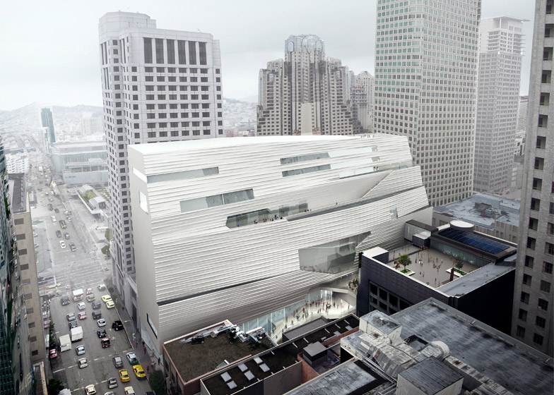
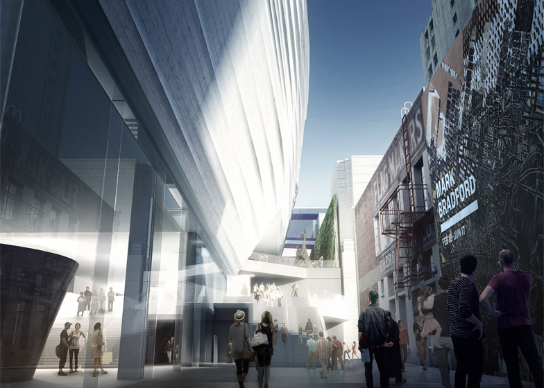
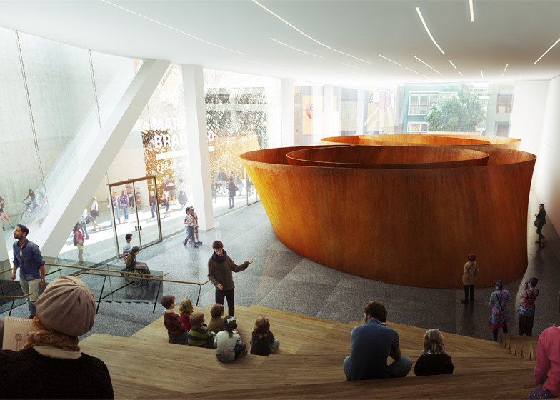
Encompassing 235,000 square feet (21,800 square metres), the new building will double the museum's exhibition space. Wedged into a relatively narrow site behind the Botta building, the 10-storey, steel structure will have a textured facade made of fibreglass-reinforced polymer. At ground level, glazing will provide views into art galleries and will engage pedestrians passing by the museum, explained Craig Dykers, a founding partner at Snøhetta.
"We wanted to create a building that opened toward the city, that was inviting to guests of different walks of life, and adapted to the changing environment of the SoMa district," Dykers told Dezeen. He noted that the area is increasingly under pressure from commercial interests. "Commercial buildings are tall and vertical. In contrast, our building is as low and horizontal as it can be," he said.
The new addition recognises the Botta building in several ways, said Dykers. It sits between the low-slung museum and the Pflueger-designed Art Deco tower, acting as a visual connector. The rippling pattern on its facade references the varied treatments of brick on the Botta building, and its white colour matches the white granite that wraps the circular turret.
Dykers said designing a companion for the Botta building was never viewed as problematic. "It's like having a dance partner," he said. "You don't want to be exactly like them, as you'll step on each other's feet all the time. A good dance partner is someone who has their own personality and can move freely together with you."
People often complain about the Botta building, but they don't take into account the full story, he added. "I think about its history, about what it tried to do and where it came from," he said.
The building created an identifiable image for SFMOMA and triggered development in a lifeless neighbourhood. "It made such an enormous impact because of its massiveness," said Dykers. "It is a primary ingredient as to why SoMa is as vibrant as it is today. It was a meteorite landing on the site. It did what it needed to do."
Plus, he thinks the galleries are successful. "I find many contemporary museums cluttered and difficult to manage," he said. "Botta's galleries are very simple. The work feels calm and comfortable. I'm not distracted."
Dykers added that he spent ample time in the Botta museum conducting research prior to designing the addition. In one day, he saw seven couples kissing in the galleries. "They were probably on dates," he said. "The point is, they felt good about where they were. Part of that is because of the intimacy and simplicity of Botta's galleries."
Botta isn't as generous in his compliments. When asked about Snøhetta's addition, he said it doesn't honour his original design intent for the museum. "The building, as I conceived it, compared itself either with the sky or with the top of the skyscraper dating back to the 1930s at its back. Now the expansion looks like a mute wall, an enlarged wardrobe," he told Dezeen. "My impressions simply come from the images I saw in newspapers. I hope the accomplished work will be better and prove me wrong."

