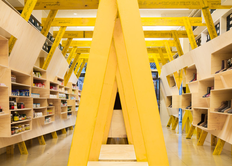
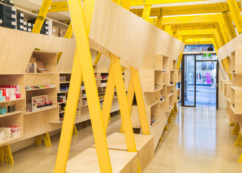
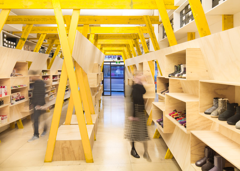
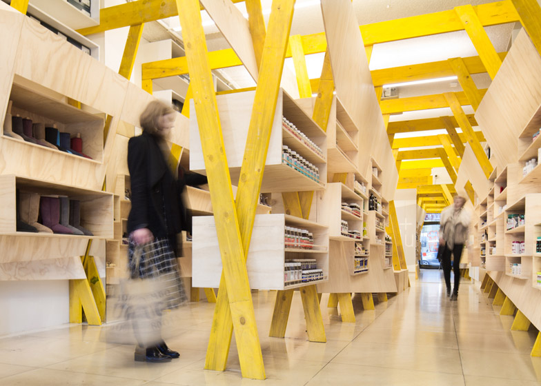
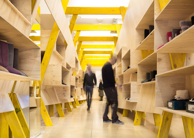
Melbourne-based Tandem Design Studio has designed the interior for a shop that sells both footwear and health products, featuring a complex wooden shelving system that "combines geometries" (+ slideshow).
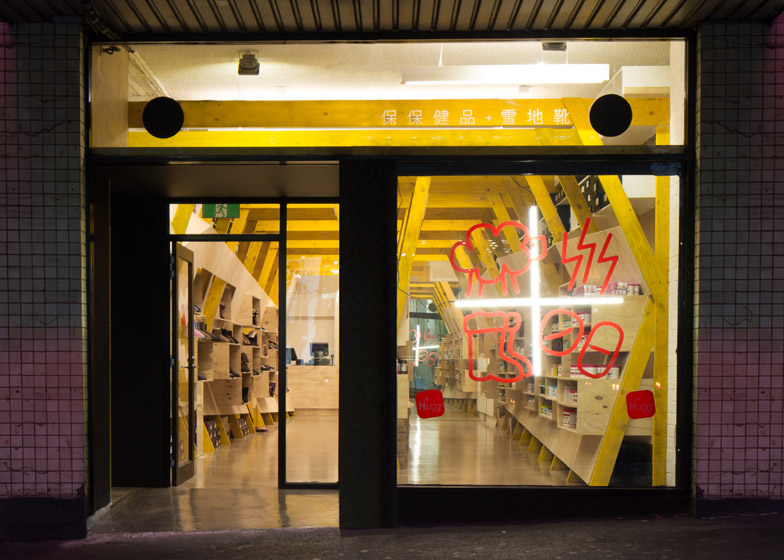
Located in Melbourne's City Business District, the retail space accommodates two disparate types of item – health products and sheepskin-lined boots. This prompted the name Hugg.
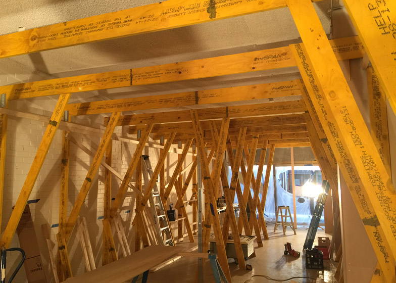
With a budget of $100,000 AUD (£47,622), the studio had just six weeks to complete the project.
"A major challenge was to create a shop that reflected the vitality of the brand," said the architects. "The space had to accommodate a large amount of stock and perform as two shops within one."
Inspired by the "possibilities of timber craftsmanship", Tandem opted to use affordable materials that had been left in an "unadorned" state.
"The fit-out is assembled from readily available building materials, and explores the interplay of two geometries; one regular and modular, the other a series of irregular surfaces," the architects explained.
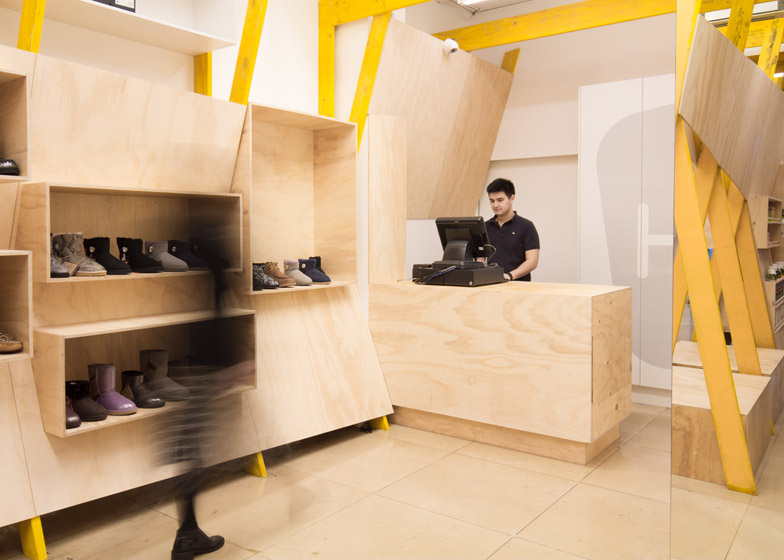
Planks of laminated veneer lumber (LVL) make up the shelving frame, while boxes constructed from hoop pine plywood are used to display the products.
A wooden cash desk is situated at the back of the store, while benches that allow customers to try on shoes are placed between the LVL frame.
A clear coat of epoxy has been applied to the floor – trapping in the spray-paint markings made by the builders while construction was underway.
"The original design included covering the existing floor tiles in a coloured resin," said the designers. "However, the floor had been used for the set-out and had builder codes, notes, paint overspray and other markings."
"The first coat of epoxy was clear, and entombing the construction markings," they said. "We all agreed to leave the epoxy clear revealing the site markings."
Other unusual retail displays created recently include an eyewear store in Amsterdam with peg hole walls and a Japanese ceramics shop with a floor made from 25,000 pieces of crockery.
Photography is by Nic Granleese
Project credits:
Design team:
Director in charge: James Murray
Director: Tim Hill
Graduate architects: Kirilly Barnett and Ricardo Hernandez
Graphics & branding: Work Art Life – Andrew Ashton
Building team:
Director: Tom Munro
Site foreman: Trent Retzlaff
Lighting: Ambience – David Justice
Electrician: Sam Butler
Building surveyor: Fotia Group – Stephen Fotia

