Pomo summer: when American architect Robert Venturi designed a home for his mother in the late 1950s, he reinterpreted the archetypal suburban house as a contemporary architectural statement. Its influence was so great, it is now credited as the first Postmodern building, and is the next in our summer season on Postmodernism.
The Vanna Venturi House, referred to by the architect as "my mother's house", took more than six years to design and marked the beginning of his break with the Modernist movement.
It incorporates many of the devices used by Modernist architects like Mies van der Rohe and Frank Lloyd Wright, from horizontal ribbon windows, to a simplistic rendered facade. But Venturi chose to also include ornament in the design – something his Modernist peers had shunned.
By reintroducing elements traditionally associated with houses – from a gabled roof to an arch-framed entrance – but stripping them of their original functions, he laid the foundations for the entire Postmodern movement.
Italian architect Aldo Rossi credited the building with having "liberated architecture in America and elsewhere", while fellow American architect Peter Eisenman described it as "the first American building to propose an ideological break with Modern abstraction at the same time that it is rooted in this tradition."
The project began shortly after the death of Venturi's father in 1959. His mother Vanna was keen to move out of the family home in favour of a more modestly sized residence, so she asked her son to come up with a design for a plot on Milman Street in the Philadelphia suburb of Chestnut Hill.
The architect was 34 years old, had yet to complete any buildings and was working as a teacher at the University of Pennsylvania – where the following year he was to meet his future wife and business partner, fellow architect Denise Scott Brown. He was also a teaching assistant to the already established architect Louis Kahn.
Vanna's brief was straightforward: she wanted a simple and unpretentious home, with most rooms on one level and no garage, as she no longer used a car. There was no detailed list of requirements and no deadline for completion.
"Vanna wanted to help Bob's career," Scott Brown told Dezeen. "He took years making a kind of odyssey by designing his mother's house. The students used to laugh at him: 'Bob Venturi, there he is, designing his mother's house again!'"
Many different designs emerged over the course of six years. The early versions were heavily influenced by Kahn, who was also building a house on the same street – the Esherick House of 1961. But by the final design, Venturi and Scott Brown were working together on the project and it took on a much more radical form.
"If you look at the first five of his designs, you'll see that Bob is the Kahn groupie," she explained. "And suddenly, the sixth one, it changes."
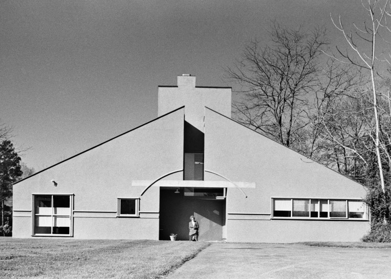
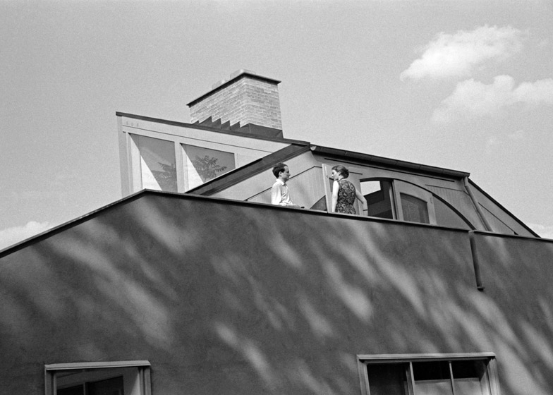
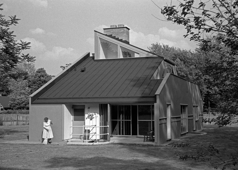
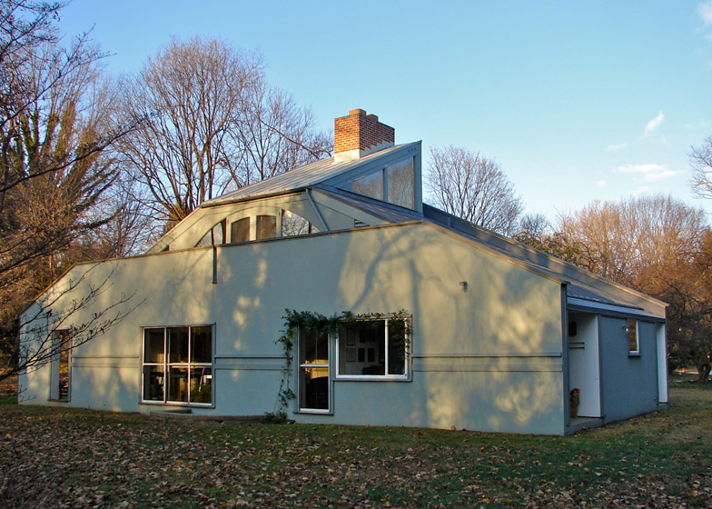
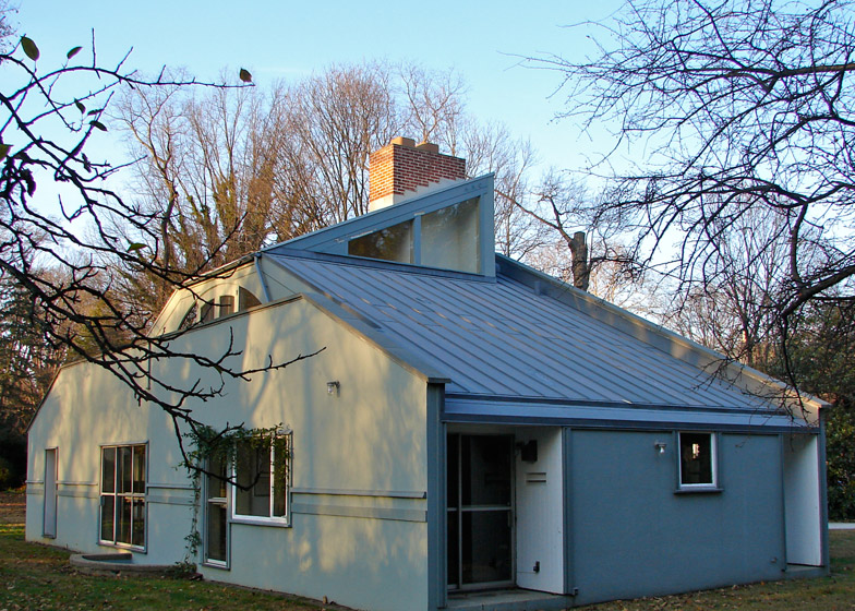
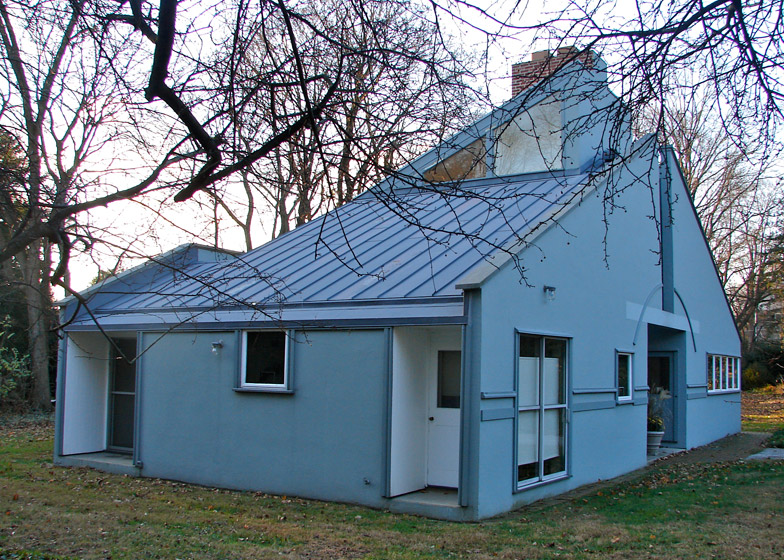
The house was completed in 1964, over a decade before Postmodernism got into full swing. It is perhaps best known for its facade – a monumental gable with an oversized chimney in its centre and an assortment of mismatched windows.
"Some have said my mother's house looks like a child's drawing of a house – representing the fundamental aspects of shelter – gable roof, chimney, door and windows," wrote Venturi in Architectural Record in 1982. "I like to think this is so."
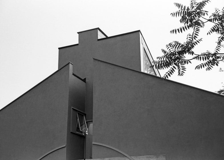
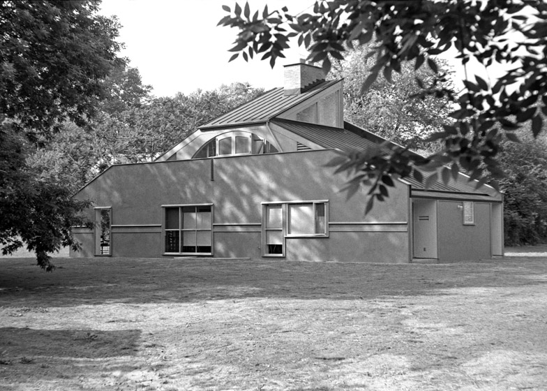
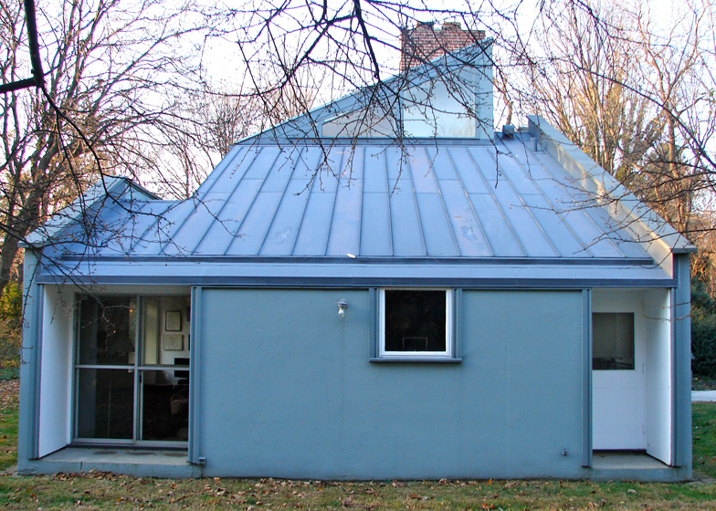
However, these traditional elements were applied in unconventional ways. Firstly, the gable has a vertical opening in its centre, and is located on the long rather than the short side of the building, completely distorting its scale. There is also no matching gable at the back – the element is purely decorative.
A square opening creates a sheltered doorway in the centre of the facade, yet the door itself stands to one side. There is also an arch that serves no purpose.
"If there is one single picture associated with Robert Venturi's work and Postmodern architecture, it is the front of his mother's house," wrote architect and author Frederic Schwartz in 1992.
Schwartz described the house as "both straightforward and idiosyncratic". "The simplicity of its front elevation masks its intellectual complexity," he wrote. "The dichotomies are the essence of its power and make it one of the most celebrated images of architecture in the second half of [the 20th] century."
According to Scott Brown, the exterior was inspired by Michelangelo's Porta Pia in Rome – another example of a building where the front and back don't relate to one another.
"If you look carefully at this teeny little house, which is just one room wide, it has all the aspirations of a Michelangelo," she said.
"You get the Queen Anne front and the Mary Anne behind. Or you could say Michelangelo and suburbia on the front, and Le Corbusier and Alvar Aalto at the back. I love it for that tension."
The building was initially painted taupe grey but was later repainted in pale green to make it analogous to its suburban location.
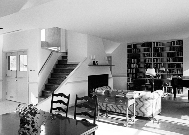
Inside, five rooms are arranged around a combined hearth and staircase. The living room is at the centre, with the dining space and separate kitchen on one side, the master bedroom and utility room on the other, and an attic bedroom located above.
This layout offers visible references to the city planning ideologies present in the university's teachings at that time.
"Bob created a street that goes right through the house," said Scott Brown. "It goes straight down to a doorway, and then you go inside and there you get that main street coming in and meeting an important cross street. That's where the main square of this little town-like house happened, at the meeting of two important streets – the one going upstairs and the one going inside."
She also suggests that the marble flooring in the dining area allows the space to take on the role of a town square, while the oversized central hearth becomes like a chapel.
"I say that every architect in every building puts a chapel somewhere of heightened emotion, something personally meaningful to them," Scott Brown explained. "Well, Bob has a great love of old Colonial houses with huge fireplaces in the middle – a medieval model that was taken to America and to Africa. And he loved the way the fireplace comes to the middle to keep the house warm and the staircase wraps around behind."
Two years after the completion of the house, Venturi published Complexity and Contradiction in Architecture, a seminal text that provided the intellectual origins for the Postmodern movement. In it, he articulated his aims for a new approach to design.
"Architects can no longer afford to be intimidated by the puritanically moral language of orthodox Modern architecture," he wrote. "A valid architecture evokes many levels of meaning and combinations of focus: its space and its elements become readable and workable in several ways at once."
This approach provided the groundings for his architectural practice from then onward. His firm – at that time named Venturi and Rauch, but shortly after changed to Venturi, Rauch and Scott Brown – went on to complete several important examples of Postmodern design, from the 1968 fire station in Indiana to the 1976 extension to the Allen Memorial Art Museum in Ohio.
"Within that house is everything we've ever done since," Scott Brown told Dezeen. "It's an embryo for everything."
Richard Pain, a British architect and long-time friend of Venturi and Scott Brown, told Dezeen the house was a game changer: "Built at a time when architecture was obsessed with Modernism – with absence of walls, with planar surfaces, with showing how far one could stretch the limits of structural belief, with abstraction and asymmetry, with anything that made a house not look like a house – suddenly here was a little house that looked like a house!"
"Bob Venturi understood the notions of hierarchy, of scale, of applied decoration to communicate, and how a building could communicate empathetically," he continued. "Some have denounced the house as two dimensional, but in reality it is anything but."
"Just compare it to the little house by Louis Kahn about six doors away – of a similar size but approached from a completely Modernist standpoint, where all elements are concerned with light and space, but not necessarily locking into the realities of house and home."
Vanna Venturi lived in the house from 1964 to 1973. The architect also resided there for a short time. He and Scott Brown moved into the attic room for the first six months after they were married.
After that it was bought by historian Thomas P Hughes and his wife, artist Agatha C Hughes, as a private residence, and later inherited by their daughter. Scott Brown described the family as "wonderful stewards of the house".
More recently, the house has been put back up for sale. Realtor Melanie Stecura told Dezeen the process won't be "the same as marketing a typical residence" but that she considers the building "a treasure".
"It is an icon of American architecture and in its original condition," she said. "But Postmodern design is certainly not for everyone and most consumers would not understand the complex design, nor would most people want to live in an icon."

