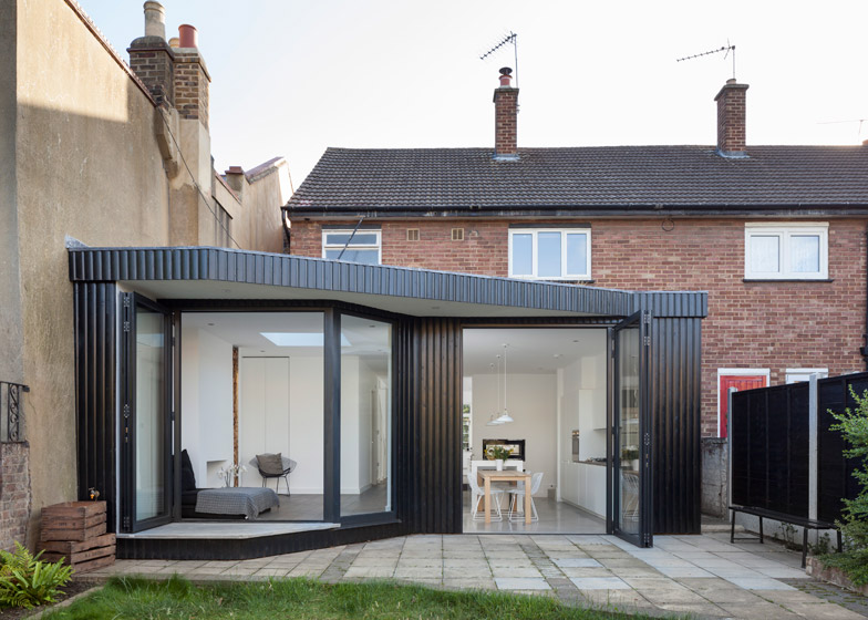
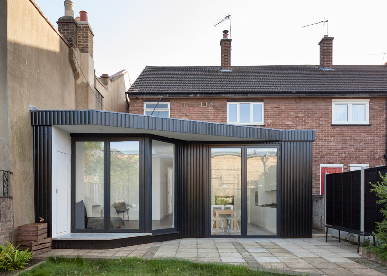
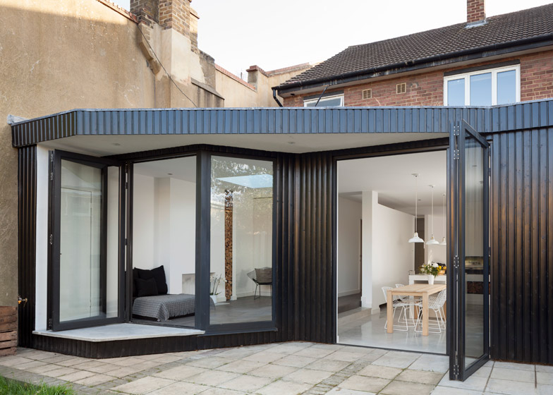
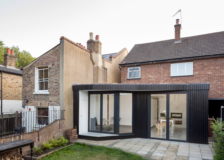
Scenario Architecture has completed an extension to an east London residence, featuring blackened wood cladding that references Japanese architecture, and a dedicated walkway for cats (+ slideshow).
London-based Scenario Architecture – which also recently added a sunken roof terrace to a London home – designed the extension in Hackney for a young couple, providing them with a new kitchen-diner and living space at the back of the house.
"One of the owners is Japanese, and they requested a darker shade of wood to reference to Japanese garden extensions," architect Fanis Anastasiadis told Dezeen.
"The vertical planks also help form the curves of the design, and the colour creates contrast with the existing house, giving the extension a more contemporary look."
This 23.5-square-metre extension replaces a cluttered arrangement of rooms and an uninsulated conservatory at the back of the two-storey house.
"The previous ground-floor layout had segregated dark spaces and a poorly built conservatory, so the owners ended up only using the top floor – they didn't cook, and used the reception area for storage," explained Anastasiadis.
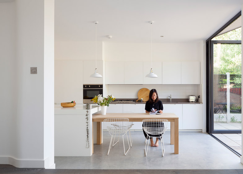
"They wanted a more open space that would be fit for a contemporary lifestyle, with more light, a better connection with the garden, space for working, and storage for their bicycles," he added.
"Their request was not necessarily for more space, and that was reflected in the final layout. It is only 3.5 square metres bigger than before, but functions better for their needs."
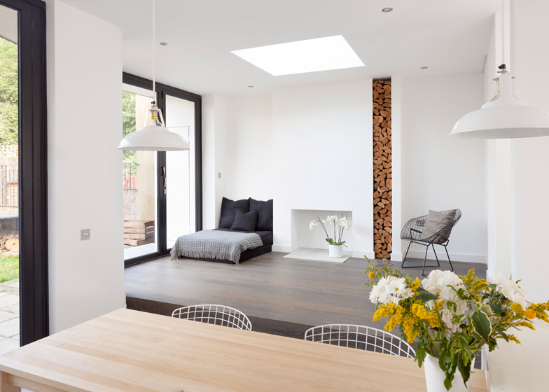
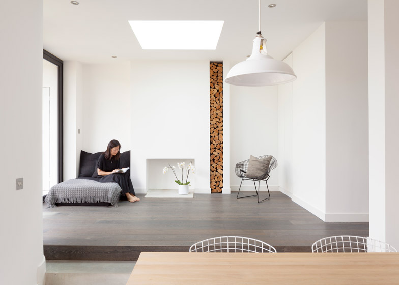
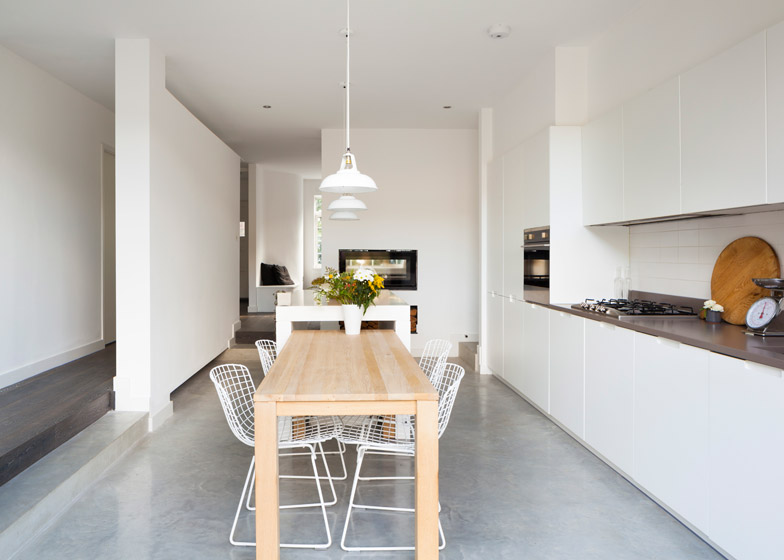
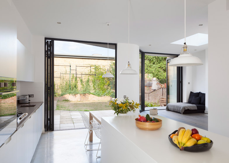
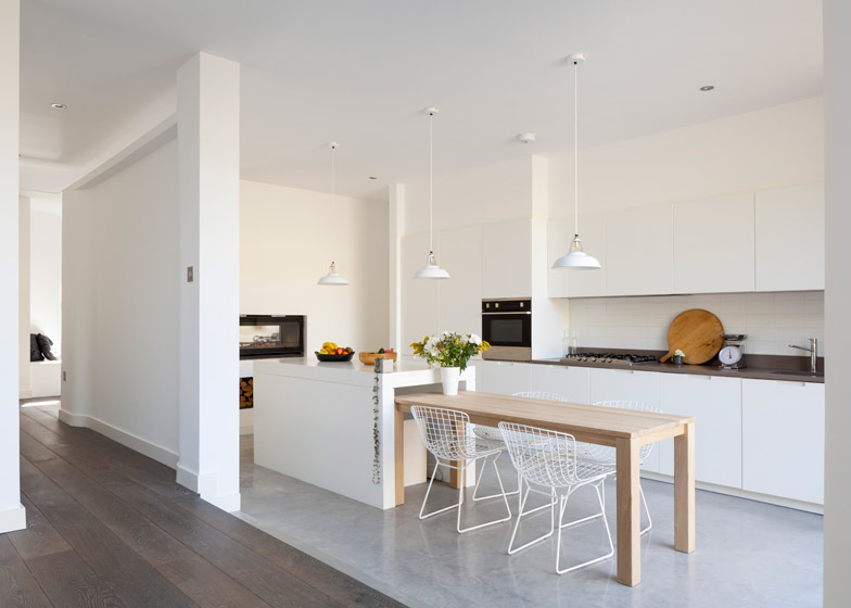
The kitchen-diner sits where the conservatory used to be, and is set down lower than the rest of the ground floor to create a level threshold with the garden, and to provide a degree of separation from the rest of the house.
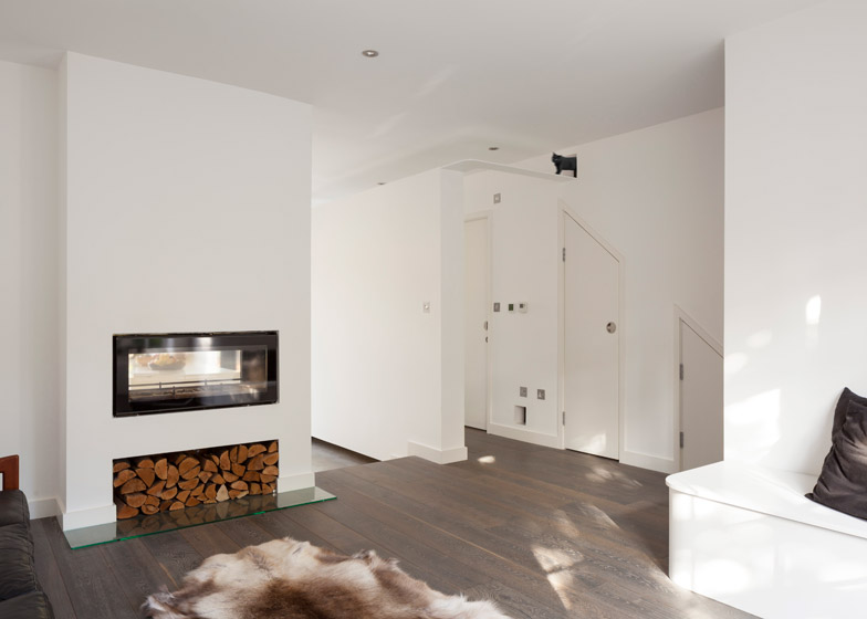
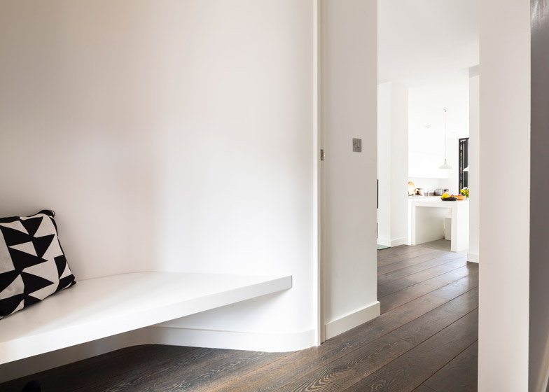
The wall flanking the kitchen stops short of the ceiling to provide space on top for a walkway, which is used by the owners' two cats. The walkway continues across the hall near the entrance, and through a hole in the wall to a room where their litter tray is kept.
"The cats use it a lot, especially when there are visitors in the house, as a means to investigate the newcomers safely, and have a controlled view of the whole ground floor," said Anastasiadis.
A new multipurpose room for reading, relaxing and working was added beside the kitchen-diner, and protrudes further at the rear to give it a more intimate relationship with the garden.
"The space is designed as a more private, Japanese-inspired area, where the owners can sit on the floor, or on pillows," said Anastasiadis. "The idea was to create a secluded area with its own access to the garden, which also still feels connected with the kitchen."
The stepped form of the rear facade was also designed to follow the footprint of the previous house, in order to make it easier to obtain planning permission for the extension.
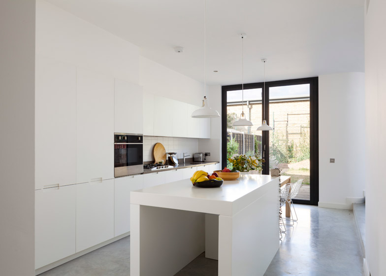
To minimise costs, the owners fitted the kitchen with ex-display cabinets from London-based company Simple Interiors.
Related content: see more buildings clad with blackened wood
A spray-painted MDF kitchen island, designed by Scenario Architecture, was also added to the centre of the space, and features a recess in the middle so the dining table to be tucked away when not in use.
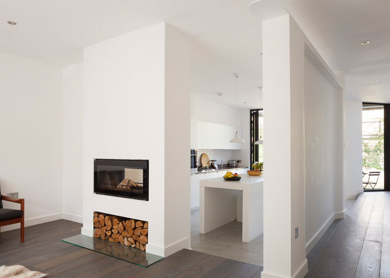
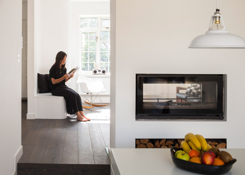
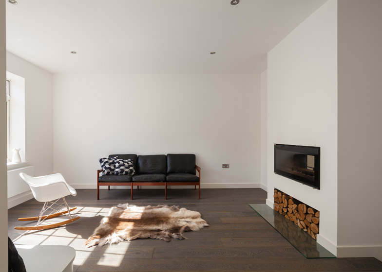
In the front reception room, a double-sided fireplace was added to create a connection with the kitchen.
"The two-way fireplace acts like a window from the reception area to the kitchen, and allows both rooms to benefit from the heat," said Anastasiadis.
Insulation was also added to the ground floor to improve the home's energy efficiency, and a sedum roof was laid on top of the extension, to provide an additional level of insulation and a more pleasant view from the rooms above.
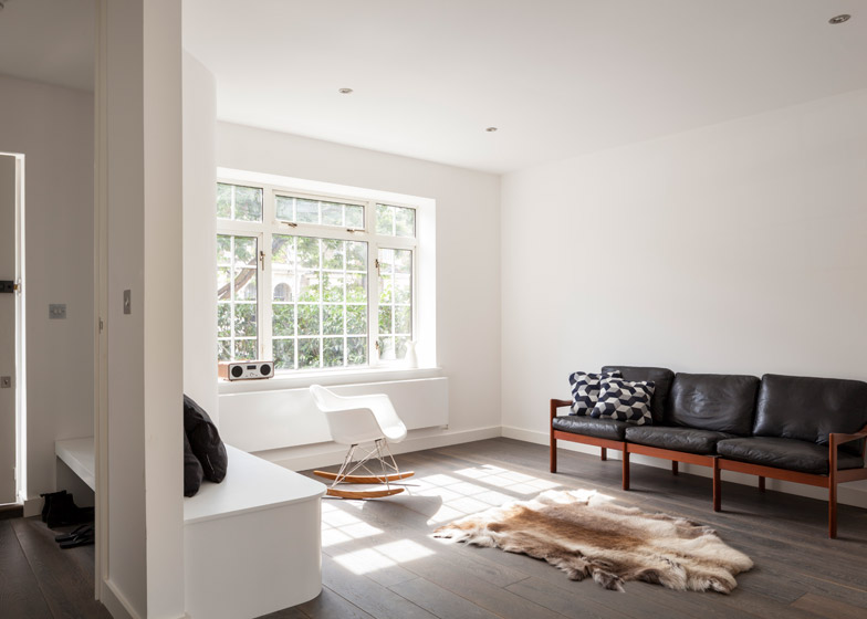
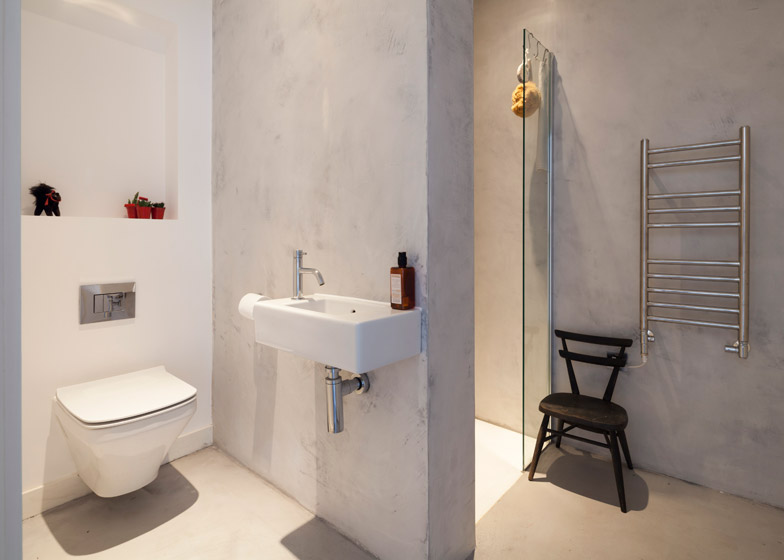
Engineered oak flooring was used throughout the house, except in the kitchen, where polished concrete was added.
"We used this different material to signify a transition between the different areas in the open-plan space," said Anastasiadis. "The concrete flooring is also hard-wearing, easy to clean, and provides a visual connection with the concrete paving tiles in the garden."
Photography is by Matt Clayton.

