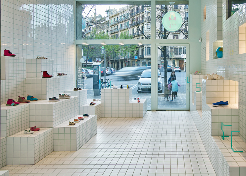
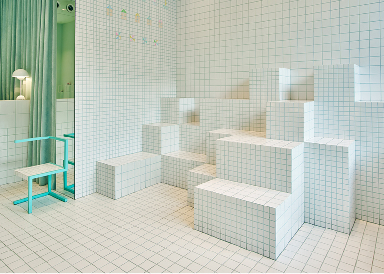
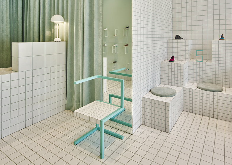
Ceramic tiles arranged in a grid pattern line the interior of this children's shoe store in Barcelona by local studio Nábito (+ slideshow).
Located near one of the city's main shopping and business thoroughfares, Passeig de Gràcia, the Little Shoes store is a retail space created to appeal to both adults and children.
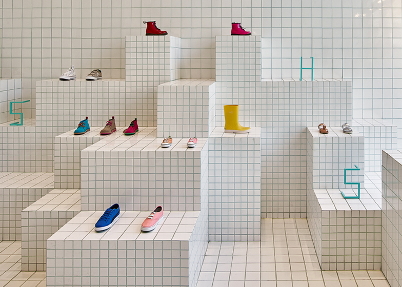
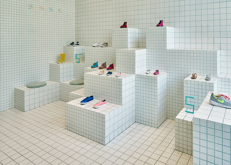
Nábito's interior comprises mainly ceramic tiles manufactured by Italian tile specialist Ceramica Vogue, which have been placed together to form a precise pattern.
They cover the entire 100-square-metres of the store, featured on walls, floor and ceiling.
Arranged as a grid, the tiles are intended to reference the ordered lines of children's school notebooks, as well as function as a guiding backdrop for the store's products.
"The atmosphere reminds of a pre-adolescent school ambience where duty (grid) and play (cubes composition) are calibrated together with decoration," said the architects.
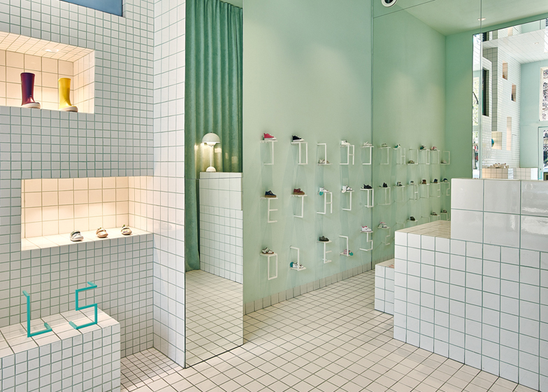
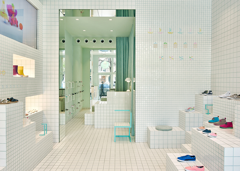
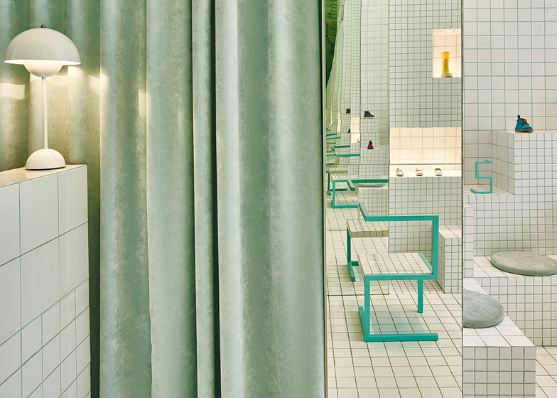
Shoes are neatly arranged on a series of tiled plinths – appropriately shown at varying heights to cater for some of the shop's more diminutive visitors – with the footwear offering a colourful contrast to the more minimal ceramic interior.
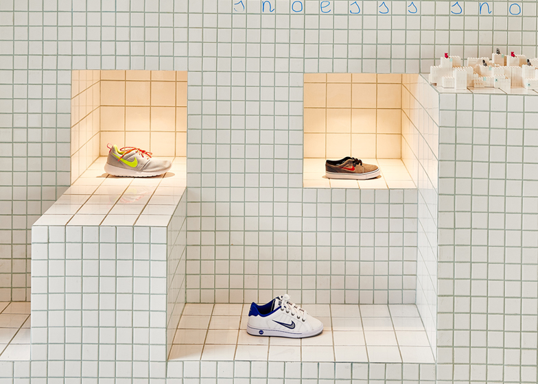
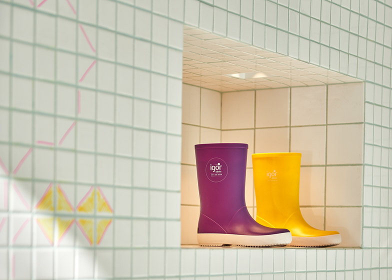
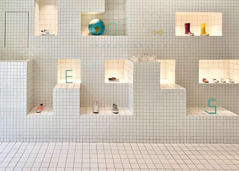
Lit alcoves provide additional display areas, and pastel accents referencing the shapes of boats, houses and windmills echo the colours of the shoes.
The occasional purposefully childish scrawl of handwriting also helps to break up the background grid.
Further nods to the schoolroom are made in the form of bright, metal letters placed atop the shoe display areas, as well as the occasional classroom prop, including a world globe, crayons and set of books.
The store furniture and fittings, which have been kept minimal, echo the background grid pattern with the use of ordered, angular lines.
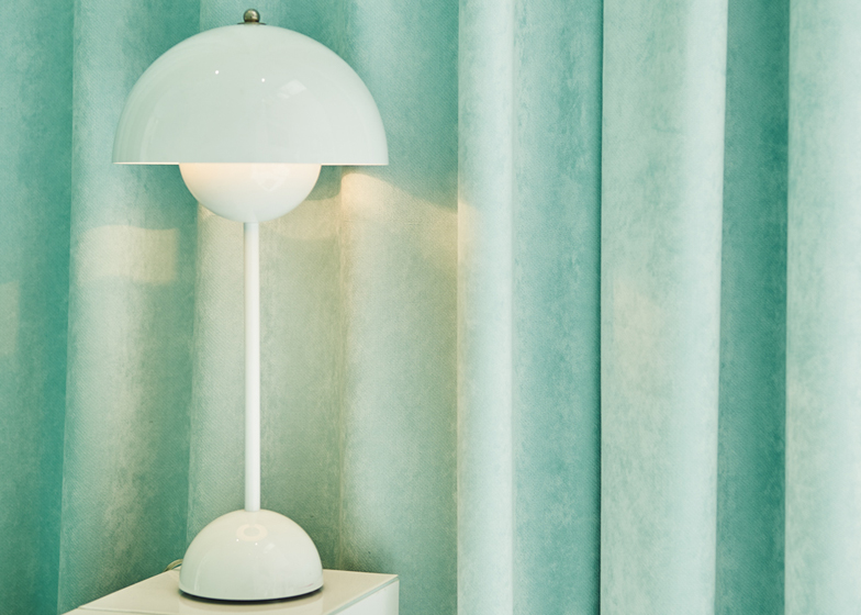
A softer contrast is also provided by floor length curtains, made of material chosen by Nábito for its softness and texture, and "to evoke the warmth of childhood".
A grid was also used by Kengo Kuma when designing the interior for a shoe store in Milan, while a footwear boutique in Santiago displays its products in diagonal stacks.
Photography is by Eugeni Pons.

