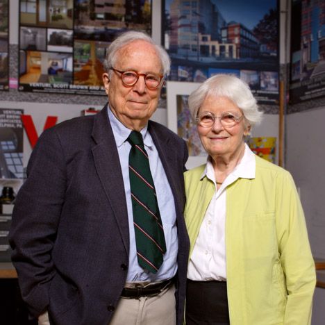
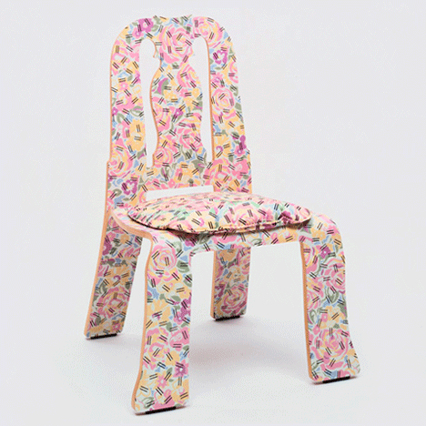
Pomo summer: Robert Venturi and Denise Scott Brown helped lead the charge for Postmodernism in America. Their Queen Anne chair – one of a series of flattened designs developed by the duo in the 1980s – injected humour into the furniture industry and is the next in our summer series on the controversial movement.
American architect Venturi became a key protagonist of Postmodernism after publishing his 1966 essay, Complexity and Contradiction in Architecture, and completing the Vanna Venturi house – credited as the first Postmodern building.
He married British architect and planner Denise Scott Brown in 1967, and the pair worked together to use their Postmodern principles to "turn around the culture of architecture" using a new way of looking a historical styles, according to Scott Brown.
Following a series of architecture projects, Venturi and Scott Brown decided to apply these ideas at a smaller scale. They created a range of chairs for Knoll in the early 1980s, at a time when Postmodernism was already filtering into design via the Memphis Group.

The duo's aim was to make furniture that could be easily and cheaply produced – aligning with the ideas of Modernism – while offering a new take on the decorative elements of historic designs.
Unlike many architects and designers associated with Postmodernism, Venturi and Scott Brown avidly wave the flag for the movement they have spent their careers exploring and refining.
"A vision that Bob had... was that you should be able to use industrial production methods to make furniture, which is also reminiscent historically," Scott Brown told Dezeen. "And that decoration is part of communication."
The eagerly anticipated collection incorporated a wide range of major historical furniture styles, including Chippendale, Queen Anne, Empire, Hepplewhite, Sheraton, Biedermeier, Gothic Revival, Art Nouveau and Art Deco.
Although given the same visual flattening treatment – making the designs look like they had been put through a mangle – the carved shapes and flourishes used to identify each of these styles all remained apparent in the silhouettes, which took five and a half years to refine.
"You can produce wonderful complexity with a Chippendale chair, so you flatten out the decoration of a Chippendale chair and you produce a wonderful transitional Chippendale chair," said Scott Brown.
"We love transitional things, transitional architecture and transitional furniture," she added. "All the furniture in our house is a mixture of things."
Although the historic designs can still be recognised when viewed from the front, the side view presents thin plywood profiles more reminiscent of 20th-century furniture pieces by Alvar Aalto and Marcel Breuer.
"[Venturi and Scott Brown] know what the immediately recognisable characteristics of Queen Anne are and zero in on that, like the great visual editors that they are," said critic and Dezeen columnist Alexandra Lange.
Venturi gained his interest in furniture from his mother Vanna – for whom the iconic house was designed. She worked as a decorator and collected reproductions of historical pieces. By analysing and drawing different chair styles in his spare time, Venturi learned why decoration was placed in certain places and how styles developed from one another.
"The analysis of those chairs and the history of them just seeped into his being," said Scott Brown.
The duo made many models for their range of seats, but ended up developing the designs that provided a broad overview of different styles, and that Knoll liked best. Of the final collection, the Queen Anne, Chippendale and Empire versions were the ones that stuck out for Scott Brown. "I think of those three chairs as the mama chair, the papa chair and the baby chair," she said.
The Queen Anne chair – based on the furniture style developed during and after the reign of the British monarch from 1702 to 1714 – turned out to be a personal favourite for Scott Brown, as a bulge in the shape of the seat back helped relieve her back pain.
"I had years of back trouble," she said. "When my back was really, really bad that was the only chair that was comfortable for me."
"Bob couldn't believe that, because he didn't think of himself as having designed with that in mind, but Knoll did and they always had a model and I would be the one to test it. Having, by reputation, the best bad bottom in the office."
Knoll kept the project tightly under wraps during its development. When finally unveiled at the brand's New York showroom in June 1984, the chairs received a mixed reaction.
"If for some the furniture is difficult to like, it is also difficult to dismiss," said New York Times critic Joseph Giovannini in his review of the launch. "The chairs might have an intentional bluntness, but they are also quite subtle."
Nine of the chair styles were put into production by Knoll after the launch, in a range of colours and finishes that enabled 183 variations.
"We're not designing the perfect chair or chairs, but a method that can involve many variations." Venturi told the New York Times at the launch. "It is the way General Motors can get so many variations from the standard Buick, Chevrolet and Oldsmobile models. Standardisation in our case gives us richness and variety, not the universal chair."
The most distinctive pattern added to the designs was the Grandmother print. Venturi and Scott Brown combined the repeat of a tablecloth belonging to American architect Frederic Schwartz's grandmother with a flecked black and white motif commonly found on the front of school notebooks.
Described by Scott Brown as a "mixed metaphor", this pattern was laminated onto the two curved plywood surfaces of the chair.
"That [the chair] is actually expressing the limits of its material, plastic laminate, is part of the joke," said Lange. "Why should birch plywood and aluminium have all the fun?"
In the Modernist tradition, the pair chose materials that would allow the chairs to be mass produced at low cost. The aim was to make the designs accessible to a wide range of people. But apparently Knoll had other ideas.
"Knoll, it turned out, was not going to use it in housing for seating the poor," said Scott Brown. "They were using it as starchitecture, to let it rub off on all their other stuff. And if they'd told us what they really needed was lightweight furniture that could be stacked and that could have two different colours on it, depending on the taste of the client who bought it, we would have done an entirely different design. But they didn't say any of those things."
The company began producing the chairs in 1984 and featured the designs in a catalogue as part of a marketing exercise.
"They published it as though it were an arcane book of modern verse, or something to lend prestige to their publishing house, but not ready to sell and we were very disappointed at that," said Scott Brown.
At the time, all of the credit for the chairs was given to Venturi and, despite Scott Brown's requests, Knoll still doesn't recognise her contribution to the project – a recurring issue for the architect.
In 2013, she asked to be retrospectively acknowledged for her role in her husband's work, which earned him the 1991 Pritzker Prize. A petition supporting her bid was signed by Zaha Hadid, Farshid Moussavi and Hani Rashid – and Venturi himself backed the campaign – but it was rejected by the jury for the prestigious architecture award.
Knoll stopped producing the chairs in 1990, but they quickly became collectible items. The Queen Anne now features in the permanent collections of institutions including New York's Metropolitan Museum of Art and Museum of Modern Art, and recently featured in the latter's Designing Modern Women exhibition, which explored how women shaped 20th-century design.
"The significance of [the Queen Anne] chair is most obvious when you put it in a lineup of famous architect chairs," said Lange. "The pastel colours, the pattern, the blobby curves – a needle-skip in the parade of cheek-sucking, truth-to-materials, lightweight, legless chairs."
"It gave furniture design at the time a much-needed injection of colour and pattern," added Juliet Kinchin, curator at MoMA's architecture and design department. "It was also about looking at the overlooked, taking inspiration from one of your granny's textiles, a fuddy-duddy old chair, printed plastics, and re-imagining their appeal for a contemporary audience."
"The design also embodies the duo's collaborative approach to every project, however large or small."
Photograph is by Graydon Wood and courtesy of VSBA, unless specified otherwise.

