Pomo summer: as one of the few architects that didn't shy away from being labelled a Postmodernist, Terry Farrell is responsible for some of the UK's first and most important examples of the style. In the latest instalment from our Postmodernism series, we look at his television studios for TV-am, which featured a Japanese temple, a Mesopotamian ziggurat and 11 rooftop eggcups (+ slideshow).
Farrell is regarded as one the "big five" of late 20th-century British architecture, along with Norman Foster, Richard Rogers, Michael Hopkins and Nicholas Grimshaw. For 15 years he and Grimshaw worked together but in 1980 they split up and moved in different directions.
While Grimshaw continued working in the High-tech style – similar to Foster, Rogers and Hopkins – Farrell saw the break as an opportunity to reinvent himself. Influenced by his time spent at the University of Pennsylvania, where he became close to established Postmodernists Robert Venturi and Denise Scott Brown, he developed a more experimental approach to design.
The first examples of this were the greenhouse garden centres he created for Clifton Nurseries, London, in 1980 and 1981. In 1982 he followed these up with a television broadcasting centre for a new breakfast channel, now known as one of the UK's most important Postmodern buildings.
Shortly after its completion, critic Jonathan Glancey called it "one of the most obviously spectacular architect-designed interiors completed in recent years and one of the high points of Postmodernism".
"Postmodernism should be a popular style of architecture. But much that has been built so far has been crass, crude and crammed with oh-so-clever ironies and architectural witticisms that nearly always fall flat," he wrote in the Architectural Review. "What the language of Postmodernism has needed is refinement, a pruning away of the excess, a polishing of phrase and diction – Terry Farrell is doing just this..."
Speaking to Dezeen, Farrell himself described the projects as a "tremendous release" from the restrictive Modernism that had come before.
"The Modernism that was around before the 1980s was very grey, restrictive, utilitarian and quite doctrinaire really," he explained. "You absolutely couldn't do a pitched roof, it had to be a flat roof. There were all kinds of things it had to be, and architects like my ex-partner were very proud of the fact that they never used components other than ones that were made in a factory."
"For me personally the split from Grimshaw was an opportunity to completely start again. I saw it as a great release to establish a new identity any way I saw fit, but to also have 15 years of practice and experience in knowing how to get things done."
Farrell had already been in contact with Peter Jay's TV-am team when they won the franchise for breakfast programming on Britain's ITV channel. Their deal with a previous premises had soured and they needed to build two television studios, technical facilities, offices and conference rooms.
The architect found them a new site – a 1930s industrial garage on Hawley Crescent in Camden, north London. His vision was to completely renovate the old structure, creating a building that could function as a visual backdrop for filming. "I was very keen on the idea that television created a virtual existence," explained Farrell. "I saw it as an opportunity to create a representation of the TV channel through a building."
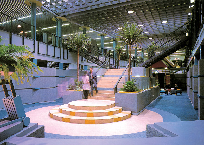
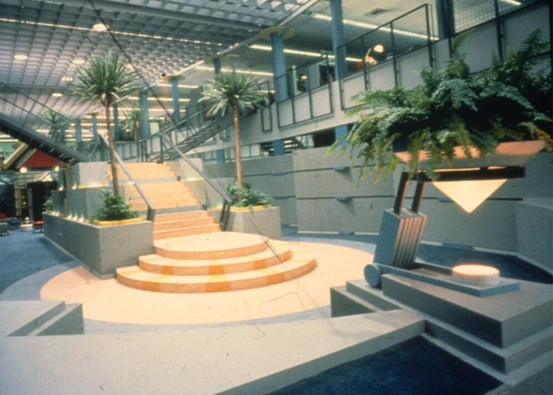
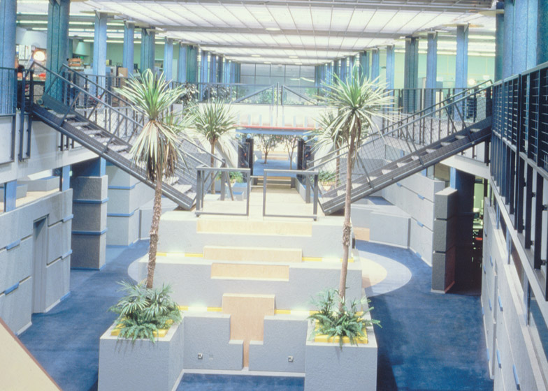
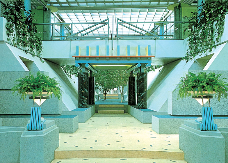
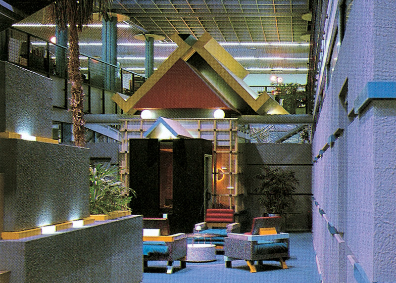
The interior was planned as a series of spaces from all around the world, with a central atrium running east to west to follow the sun's path. The hospitality suite was styled as a Japanese temple, the central staircase was modelled on a Mesopotamian ziggurat, a bridge took on the form of a Classical temple, and the space at the far end became a desert. All were dominated by bold colours, shapes and motifs.
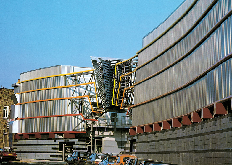
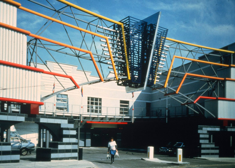
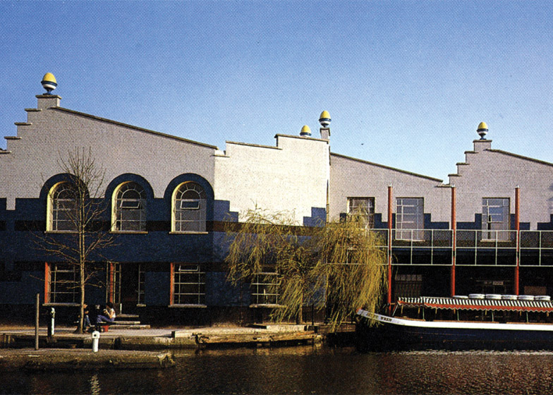
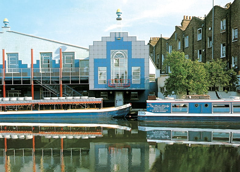
A similar approach was taken to the building's exterior. Rather than developing a unified design, Farrell treated the front and back of the building as separate entities. The curved front facade featured stripes of colour designed to represent a sunset, as well as four large letters spelling out TV-am, while the rear facade showed off the building's sawtooth roof profile, with arched windows framed in blue.
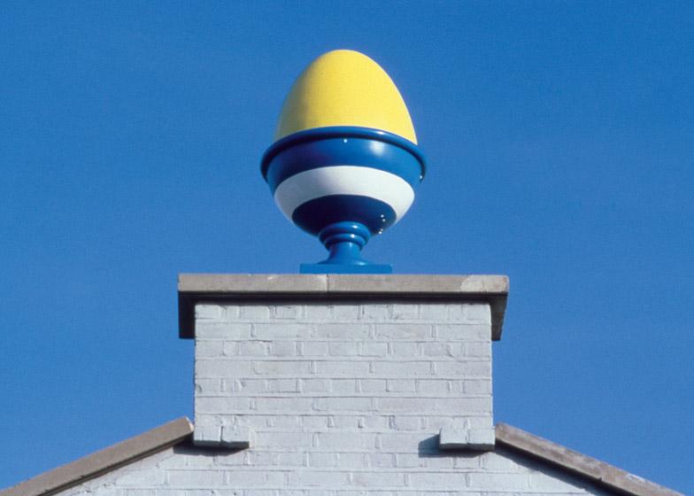
Farrell also added a huge eggcup on each peak of the sawtooth – offering a symbol for breakfast time while simultaneously referencing London's tradition for using urns, acorns and pineapples as architectural decoration.
These eggcups – which cost £100 each – were so popular they soon become the brand image for the station, usurping the original logo. According to architect Charles Holland, their mix of history and pop culture can be see as a metaphor for the building itself.
"The giant eggs are brilliant because they refer to Classical architecture but in such a ridiculously over-the-top manner that they become something completely different," said Holland, founder of Ordinary Architecture and a former director of the now-defunct firm FAT.
"At its worst Postmodernism is dismissed as being purely historicist, referencing only history, and people might dismiss it for that," he told Dezeen. "But TV-am is much more pop than it is classical, it's a rare example of a full-on piece of Pop architecture. That makes it quite important in the context of Pomo – although it has classical or historicist elements to it, they are a very small part of the more contemporary pop sensibility."
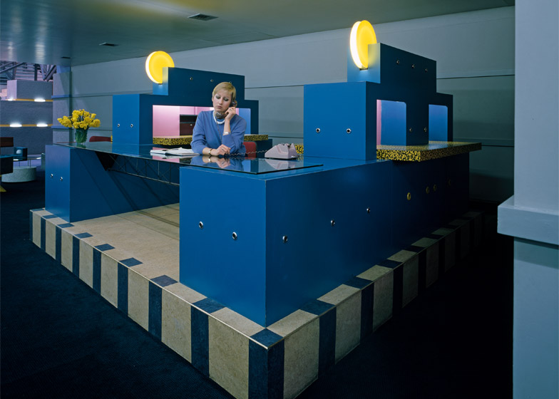
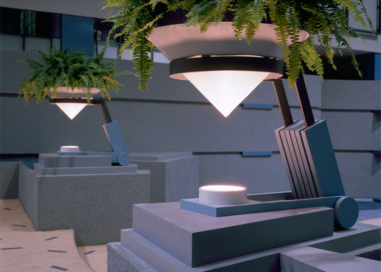
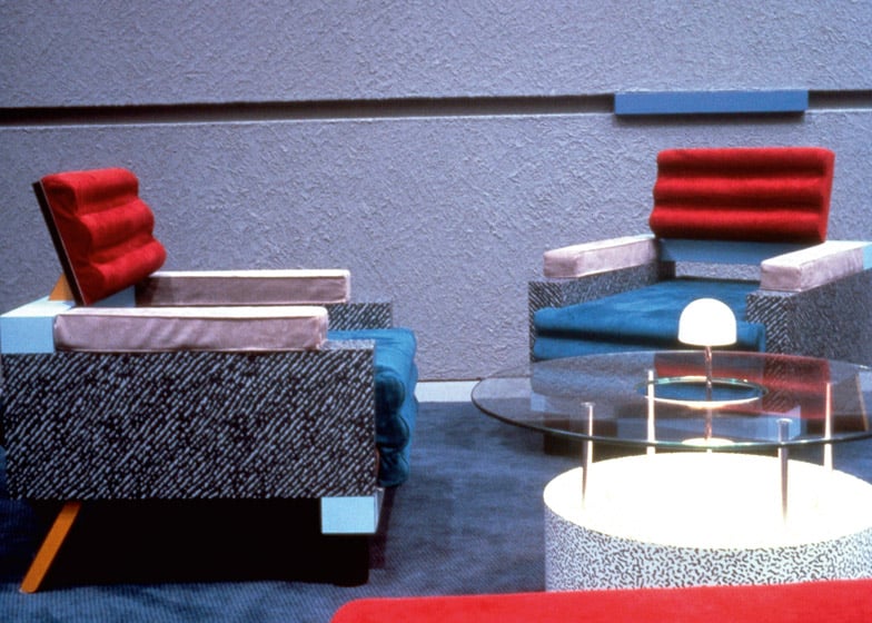
Farrell's team was also given the opportunity to design all the furniture for the building, with highlights including Memphis-inspired chairs and lighting fixtures, tables supported by the TV-am lettering, and a monumental reception desk.
The whole project was completed within a budget of £5 million, which included the cost of the land and all of the equipment. It was one of the cheapest television studios that had ever been built.
TV-am's breakfast shows first went on air on 1 April 1983. Initially it was a disaster and struggled to attract viewers, but after a team restructure the station at last started to become profitable. As the situation improved, filming began to spill out of the studios – with everything from aerobics to news reports being shot in the atrium.
"We tried to use the building in an all-embracing way right from the very off," explained Clive Jones, TV-am's former managing director. "That was a groundbreaking aspect of television – trying to use the whole environment, rather than just being tucked away in the studio."
"Television studios before then had all been fairly functional, but this building was a much different environment, much quirkier and much more flamboyant," he told Dezeen. "We had got off to the most terrible start, so the building was rather important in keeping everyone's spirits up."
TV-am was in operation until the end of 1992, after which the building was sold to music channel MTV. Two decades on, a renovation was proposed that would completely change the building, prompting an outcry from architects across the country. But Farrell refused to back the campaign to preserve the design, as he felt the original interior was already gone.
"It had just changed so much that I hardly recognised it," he said. "I had been around many television studios when I was designing it, and I knew then that they aren't respected – it's a laboratory working environment."
He claims the ephemeral nature of the design was a big part of what made it so successful. "In the 1980s I did a lot of buildings that, because they were temporary, there was a freedom to experiment," he said. "It was great fun, and it shows. And I think architecture should have more fun."
Today, the project could be seen as an early precursor to the overtly playful workplaces of technology companies likes Google and Facebook. Clive Wilkinson, the architect behind the Googleplex, was actually among Farrell's team.
Wilkinson told Dezeen the project was "ahead of its time", while designer Adam Nathaniel Furman described it as "a building of the media that heralded the beginnings of our saturated age".
"TV-am was something it would be wonderful to see more of: a rapturous celebration of its contents," said Furman, who also edits a blog called The Triumph of Postmodernism.
"It was a building that functioned perfectly as a studio, but which also performed brilliantly as an architectural embodiment of, and story about the new world we were entering, in which old categories were dissolving and hierarchies collapsing," Furman said. "It was a stylistic explosion that formed itself around the volatile excitement of a new media age, and in the process became entrenched in our national consciousness."
Images courtesy of Farrells.

