
Postmodern buildings: AT&T Building, New York by Johnson/Burgee
Pomo summer: originally designed for American communications giant AT&T, Philip Johnson and John Burgee's Postmodern skyscraper was the first of its kind. Now known as the Sony Tower, the building remains controversial and is the next in our season on Postmodernism.
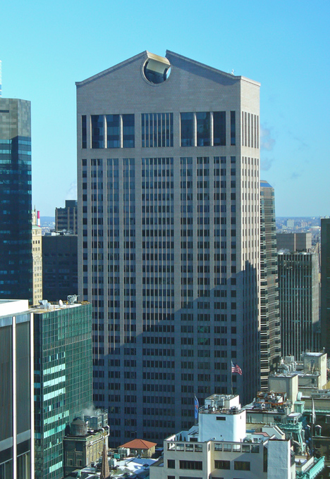
When it opened in 1984, the AT&T Building stood in stark contrast to the boxy glass-and-metal towers that had sprung up in Midtown Manhattan since the 1950s. Regarded as the first Postmodern skyscraper, the 37-storey building – designed by Philip Johnson and John Burgee – featured a number of ornamental flourishes, from its granite cladding and "Chippendale" roof line to its brass and marble finishes on the interior.
"The announcement of this project made the front page of The New York Times not because of its size or economic impact, but because of its heralding of a new architectural era," wrote architecture critic Carter B Horsley in The City Review. "It was not the first building of its time to base its style on historical allusion, of course, but it was the most prominent and most publicised. Because Johnson and Burgee were the nation's most favoured corporate architects at the time, and because AT&T was not a minor company, the design took on even greater significance and clout."
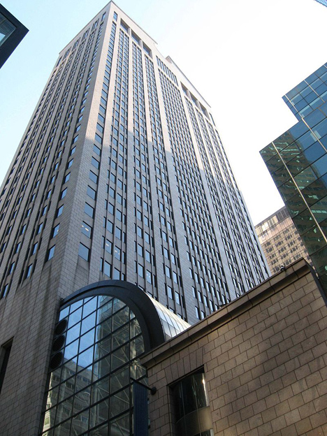
In 1975, American Telephone & Telegraph (AT&T) – one of the world's largest companies – set out to construct its new corporate headquarters in New York. It chose a 36,800-square-foot (3,400 square metre) site on Madison Avenue between East 55th and 56th Streets, located just blocks away from the Seagram Building, the seminal Modernist skyscraper by Mies van der Rohe that opened in 1958.
AT&T wanted a tower that rivalled the stature of the bronze and glass Seagram Building, but it wanted its new home to look markedly different. The chairman asked for a dignified headquarters that wasn't a glass box, a building that would signal the next direction in architecture.
The company solicited qualifications from 25 leading US design firms, with Johnson/Burgee Architects among them. The New York studio was founded in 1967 and had gained recent attention for corporate projects, notably Pennzoil Place, a pair of trapezoidal glass towers completed in 1975 in Houston, Texas.
While Johnson and Burgee collaborated on many designs, Johnson had the stronger pedigree and was regarded as one of America's most influential architects. He was the first director of the architecture department at New York's Museum of Modern Art (MoMA), a position he held from 1932 to 1934, and again from 1946 to 1954. He studied architecture at Harvard under Marcel Breuer and Walter Gropius, and later joined the office of Mies van der Rohe, where he worked on the Seagram Building.
Johnson was an early – and forceful – advocate for Modernism in America. A 1932 exhibition he co-curated at MoMA is credited with introducing the term International Style. But his tastes started to shift in the 1960s as glass towers became more commonplace.
"What fascinated him most was the idea of the new, and once he had helped establish Modernist architecture in the United States, he moved on, experimenting with decorative Classicism, embracing the reuse of historical elements that would become known as Postmodernism," wrote critic Paul Goldberger in 2005 upon Johnson's death at the age of 98.
The AT&T Building gave Johnson the chance to indulge his interest in Postmodernism at a grand scale. Johnson/Burgee made the shortlist for the coveted commission and ultimately won. As the story goes, the two architects brought only two props for their presentation to the company's selection committee: a photograph of the Seagram Building and a photo of Pennzoil Place. The designers otherwise relied on their gift of gab – "on Philip's inimitable mixture of wit and willing but hardly eager urbanity together with Burgee's complementary cool exposure," wrote Franz Schulze in the 1994 biography Philip Johnson: Life and Work.
In conceiving the design, Johnson/Burgee drew inspiration from the city's Beaux Arts-style architecture by esteemed practises such as McKim, Mead & White. They also took cues from historic skyscrapers like the Empire State Building and Chrysler Building – specifically their majestic crowns. As opposed to the flat roofs that defined Modernist towers, Johnson/Burgee wanted a skyscraper with a distinguishable cap that was visible from a distance.
"The nature of the client was so marvellous," Philip Johnson recounted in the book Philip Johnson: The Architect in His Own Words, authored by Hilary Lewis and John O'Connor. AT&T's chairman told the architect: "Now, look, I don't want just another building. We'd like to make the next step in tall buildings since the Seagram building – just go to it."
When their design was unveiled in 1978, it sparked an uproar in the architecture community. A "Declaration of Independence" from Modernism, the design featured a symmetrical tower sheathed in pink granite and topped with a crown resembling a broken pediment. The distinctive roof line earned the nickname Chippendale, a reference to the historic cabinetry by the English furniture maker Thomas Chippendale. "This was seen to be a kind of bad-boy behaviour, having an absolutely ornamental top," architectural historian and the former chief architecture curator at MoMABarry Bergdoll told Dezeen.
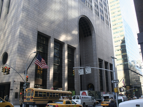
The base of the tower also marked a notable departure from Modernism. Zoning laws required that the architects incorporate retail space and a public plaza into the building's ground level. To accomplish this, Johnson/Burgee took an unusual approach, placing the office tower atop 60-foot-high (18 metre) columns. Underneath, they created an airy loggia with cafe chairs and tables, and a shopping arcade modelled after the famous galleria in Milan.
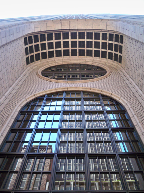
Interior finishes included bronze-plated elevator doors, marble flooring and a gold-leaf ceiling. Spirit of Communication, a 20,000 pound (9,100 kilogram) gilded sculpture that had adorned the peak of AT&T's former Manhattan headquarters, was placed in the atrium. Outside, they adorned the lower portion of the facade with large oculi and a soaring archway that served as the tower's main entrance.
The project gained national attention. In January 1979, TIME Magazine featured Johnson on one of its covers with the architect shown holding a model of the building. The accompanying story, by critic Robert Hughes, examined Postmodernism and posited Johnson as its leader. That same year, Johnson was the first ever recipient of the Pritzker Prize, established by the Pritzker family in Chicago to honour the world's most influential architects.
Construction of the AT&T Building began in 1979 and was finished in 1984. With a structural frame made of steel, the 648-foot-tall (198 metre) tower was clad in glass and 13,000 tons of granite. To mimic traditional masonry construction, false joints were incorporated with real ones. Each panel of granite was affixed separately to the building's skeleton to prevent the "domino effect" in case one fell, according to reports.
AT&T occupied the building for decades. Facing financial troubles, however, the company sold the building to Sony Corporation in 2002, and the skyscraper was renamed the Sony Tower. The entertainment company made controversial modifications to the atrium, converting portions of the public space into retail showrooms for Sony products. While Sony didn't lower the ceiling, it filled the lofty space with "large banners and lighting fixtures heralding their products and the redesign resulted in a very cluttered appearance," wrote Carter B Horsley.
The building changed owners once again in 2013 when Sony sold it to the Chetrit Group, a real-estate developer, for $1.1 billion. The developer is now converting the office tower into luxury condos and possibly a hotel.
Whether or not it's an important building in architectural history is up for debate. "Prescient for its time, the design's historicist shtick has aged with surprising grace, its once-goofball Chippendale top having acquired the architectural gravitas of the city's most cherished skyscrapers," wrote architectural journalist Samuel Medina in Metropolis Magazine.
Still, while largely embraced by the general public, the building is often dismissed by architectural critics and historians. In his book Modern Architecture Since 1900, historian William JR Curtis wrote that Johnson had "done little more than stick some historical quotations on to a standard office space." He added: "The reduction of a skyscraper to a cartoon-like sign in the cityscape was no doubt symptomatic of pressure to treat architecture as a marketing device."
Barry Bergdoll echoes his sentiments. "My personal opinion? I actually don't think at the time it was an important building, and now it's just banal, it's silly," he told Dezeen. "I think it's a mediocre building, and mostly because it's famous and controversial."
The top photograph of the AT&T Building seen from Park Avenue is by Jim Henderson.