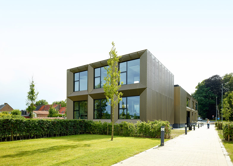
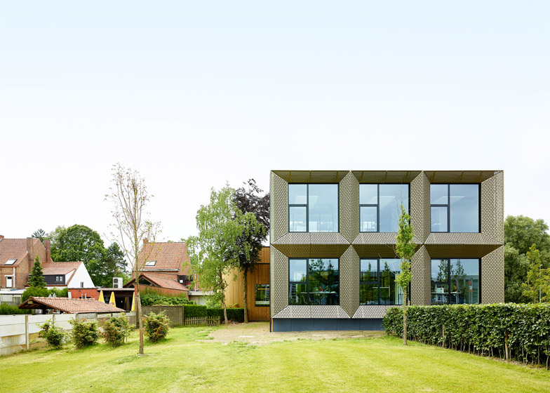
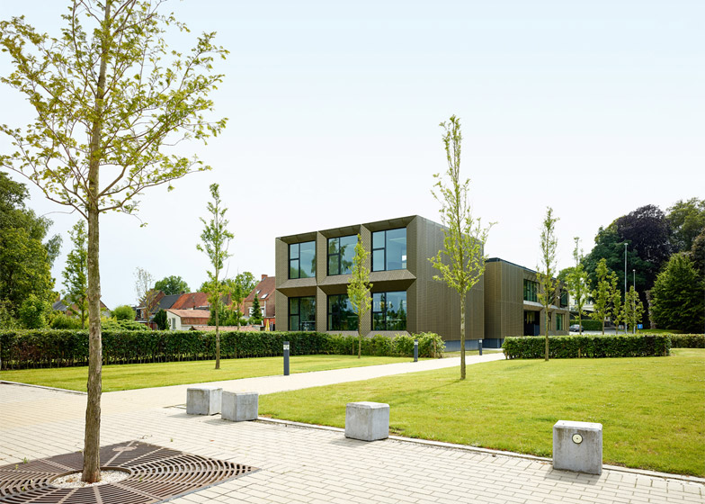
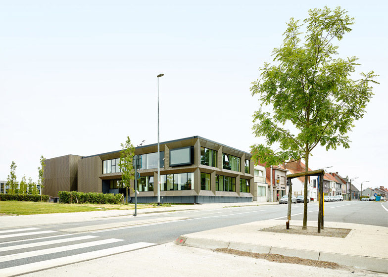
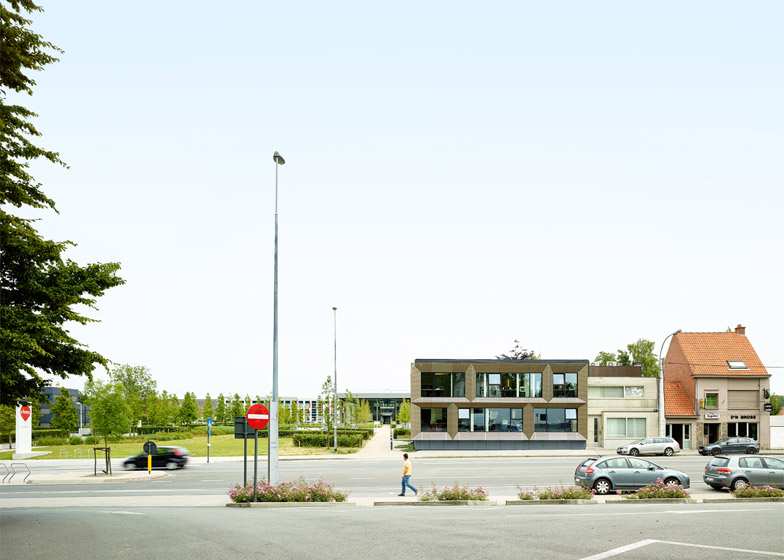
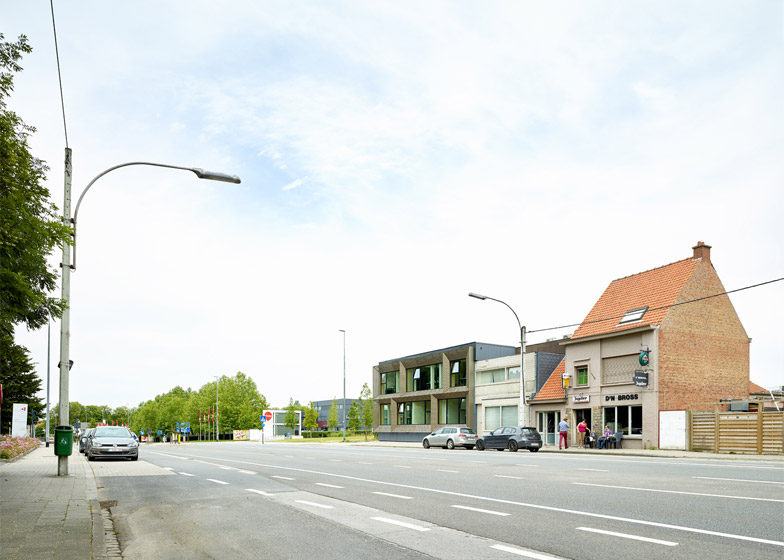
Aluminium sheets perforated with a geometric pattern create angled facets around the windows of this university student centre in Kortrijk (+ slideshow).
Vives University College is situated to the south of the Belgian city. The new building accommodates offices and other amenities for the student support staff, which had previously been located in the main block.
Instead of designing a completely new structure, local studio AVDK was asked to restore and extend the former offices of a missionary organisation to minimise the cost of the project.
But the university also wanted the building to act as a landmark due its position at the entrance to the campus, so the architects developed a bold folded facade of gold-coloured aluminium.
"They wanted it to be a prominent building but we didn't want it to be too expressive," architect Andie Decock told Dezeen. "It's nevertheless prominent due to its materialisation which is unseen in the street."
Each of the angled reveals frames a single window, so the building's internal layout is articulated through its external form.
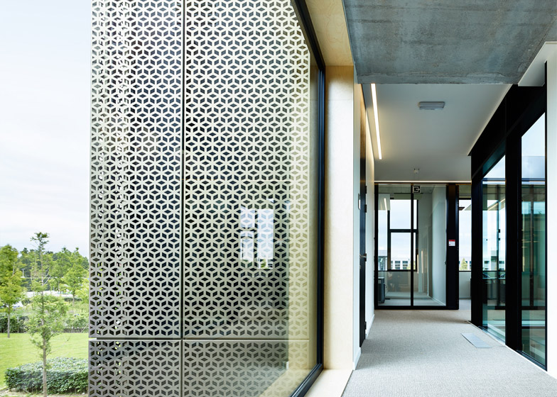
A geometric pattern punched into the aluminium panels gives the surfaces an intricate texture – similar to a recent office extension in Sweden and a waste incinerator in Denmark.
At close range, the diamond-shaped holes tesselate to create the illusion of thousands of tiny cubes.
"We wanted to give the rigidness of the structure of the facade a lightness by means of the perforations, which are a neutral design based on a cube," Decock added.
"The anodised aluminium makes it stronger because of its reflective and shiny character."
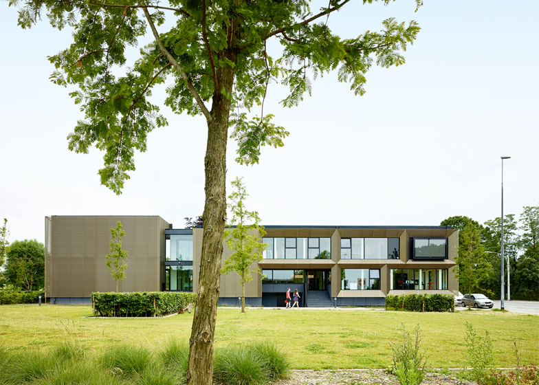
An entrance is incorporated into the facade that extends along a pathway leading towards the rest of the campus. This facade also features recessed windows and a large television screen framed in one corner.
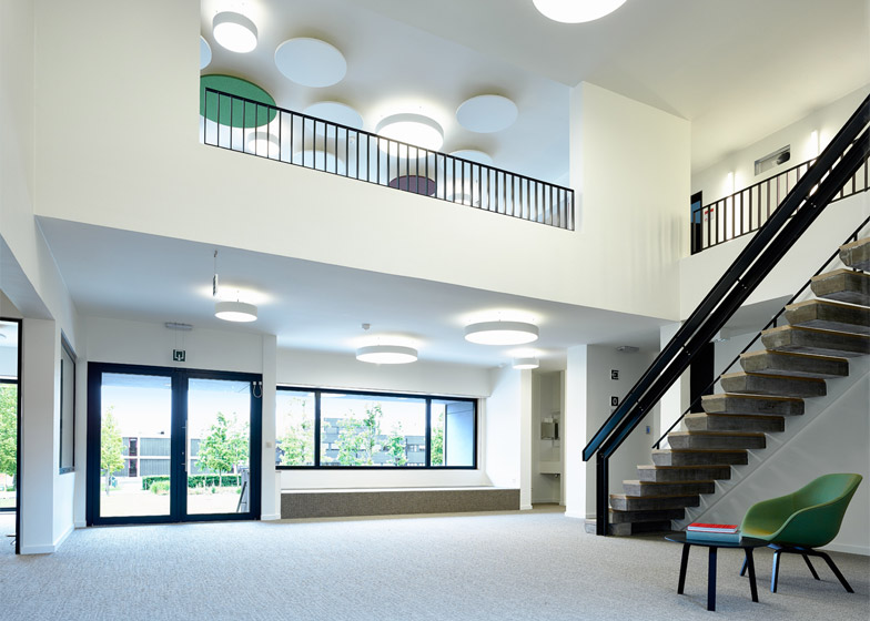
Inside, the building's ground floor accommodates a double-height reception room, areas for social services and a staff canteen. These facilities are mostly housed in existing rooms towards the front of the building, with an extension at the rear containing offices.
Related stories: see more university buildings
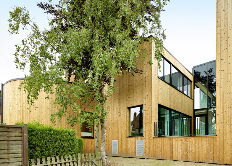
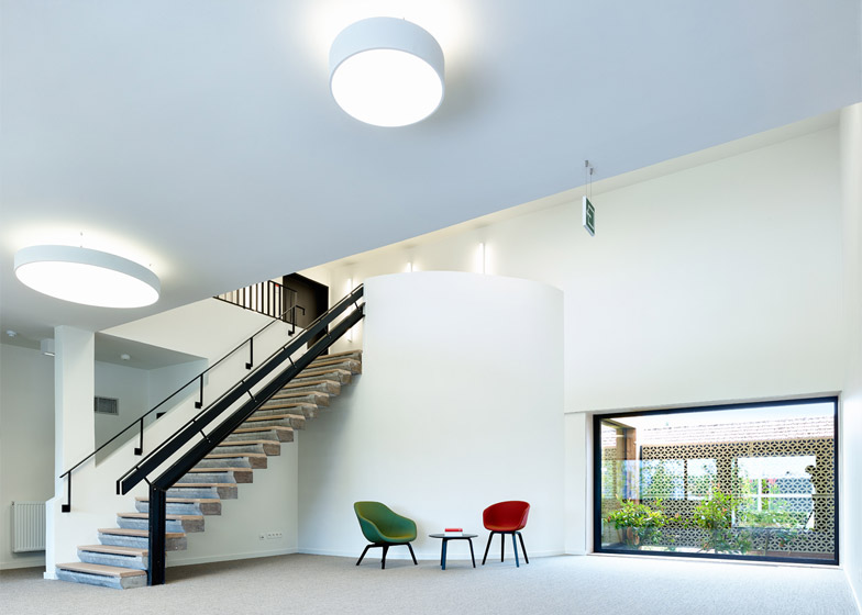
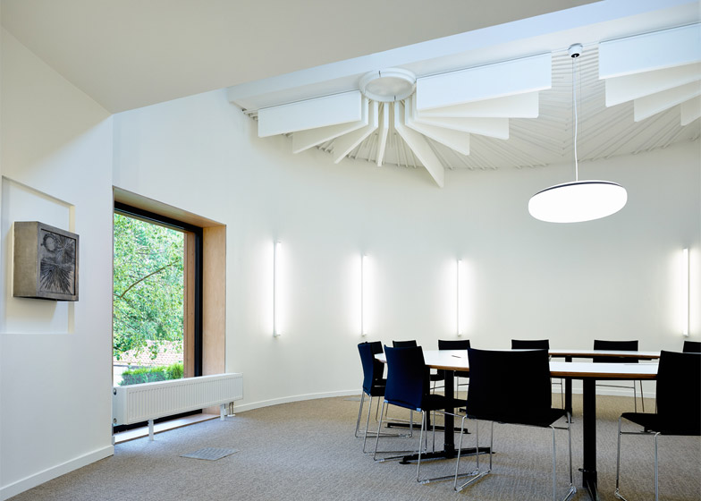
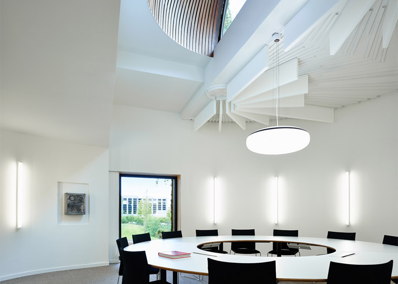
A circular room that was previously used as a chapel for the missionary organisation was retained and transformed into a meeting space. Radial fins integrated into the ceiling to improve acoustics in the chapel remain intact and are enhanced by additional acoustic baffles.
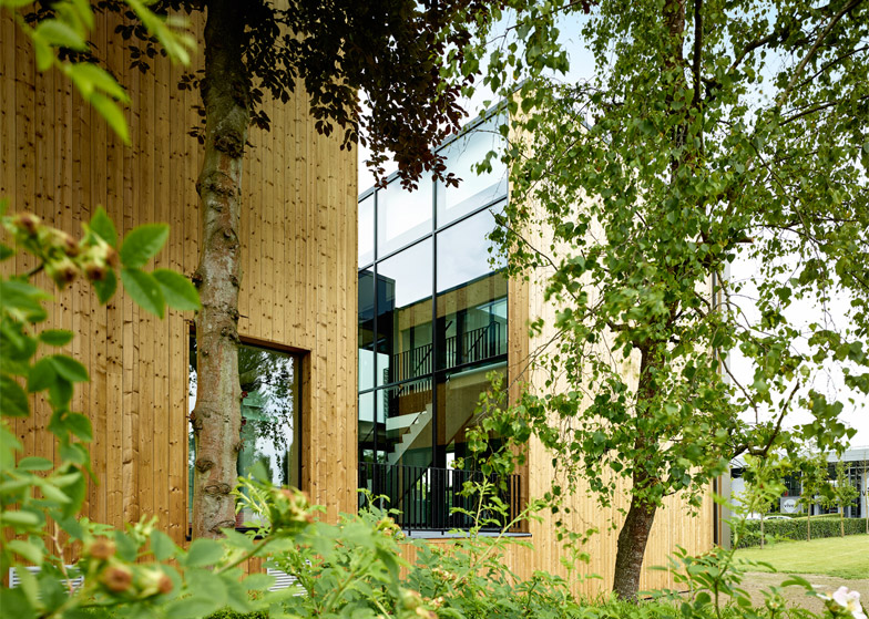
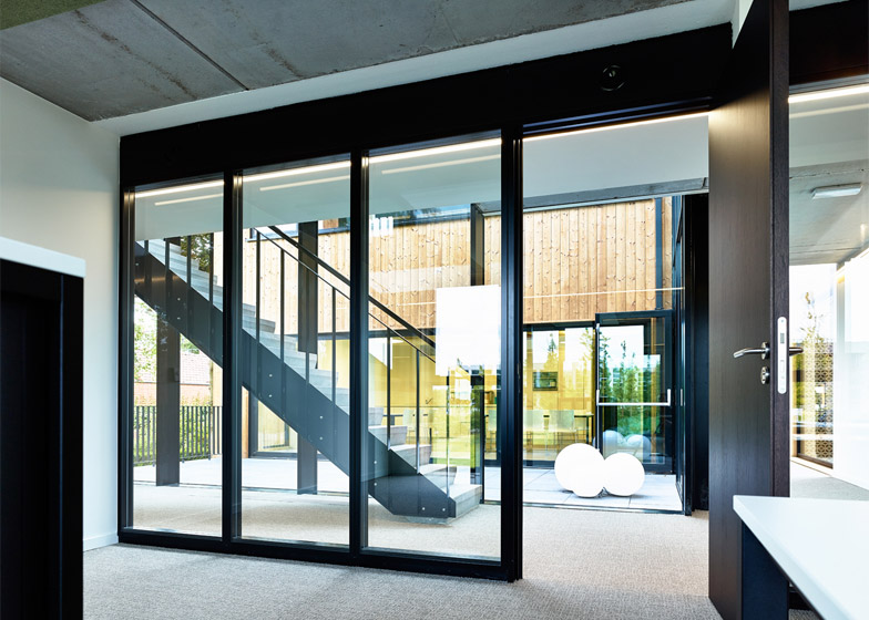
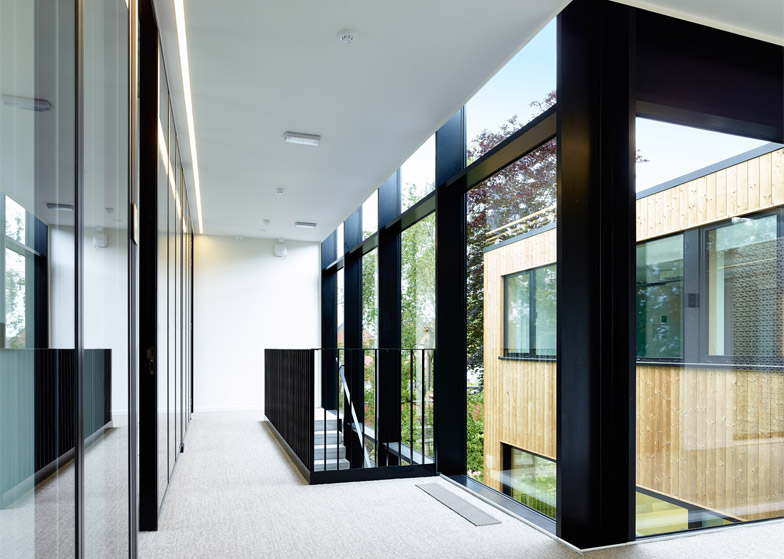
The architects inserted a glass-sided courtyard between the old and new sections of the building, bringing natural light deep into the interior.
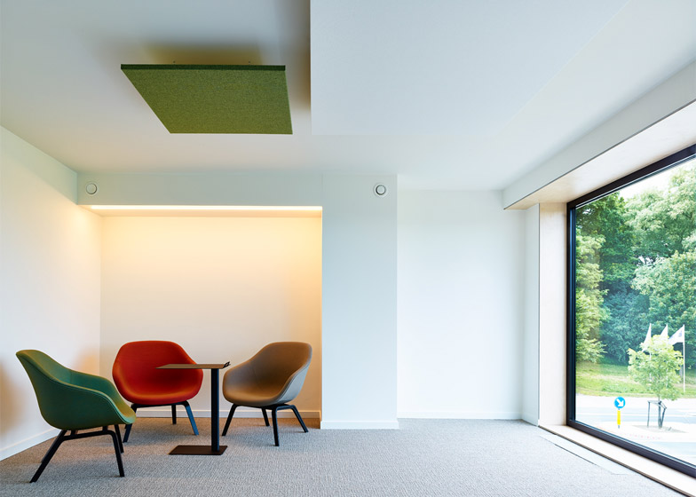
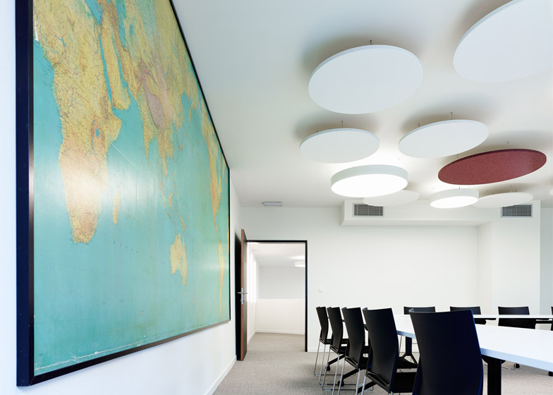
Staircases positioned next to this courtyard and in the main reception area ascend to the first floor, where there are more offices, a lounge and a second meeting room.
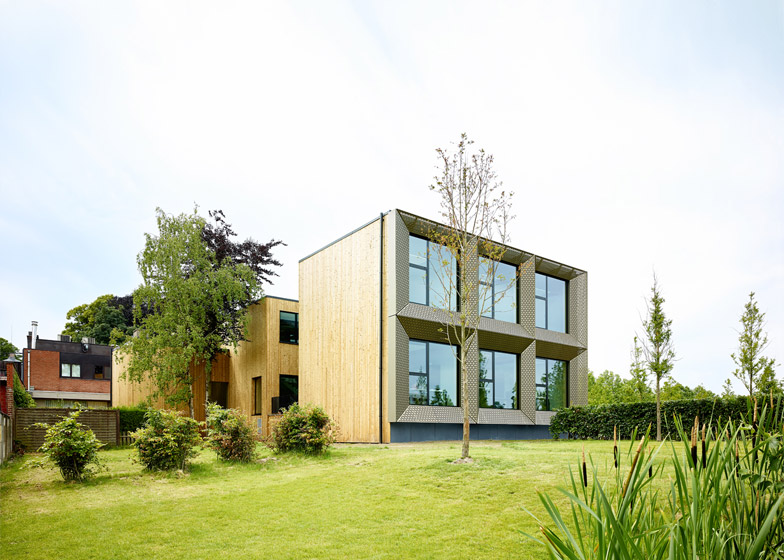
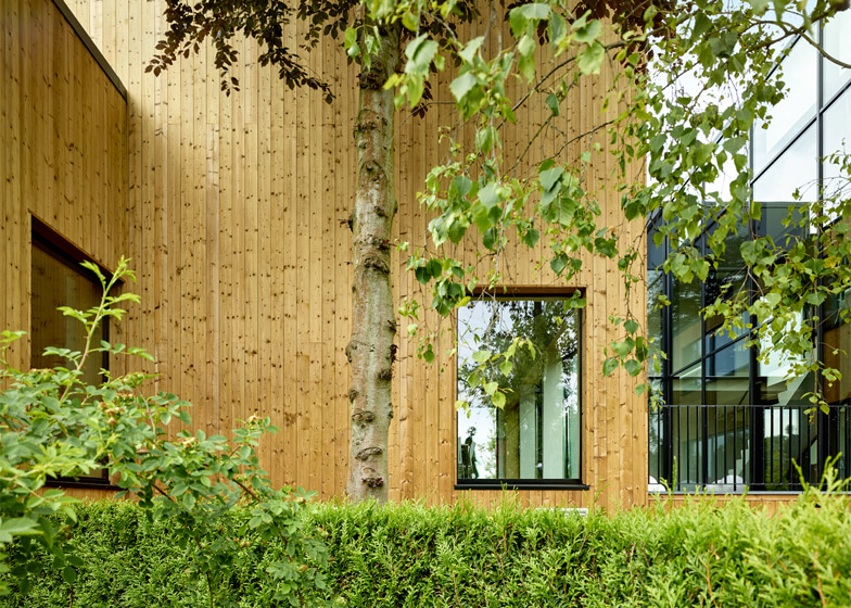
The elevation – from which the drum-shaped chapel extends into a private garden – is clad in wood that provides a warm and natural contrast to the aluminium.
Photography is by Dennis de Smet.

