"The Broad museum represents the start of something big for Los Angeles"
Comments update: LA's architectural boom continued to set the agenda this week as the first official photographs of The Broad museum were published. Read on for more on this and explore our comments page to keep up to date with the latest discussions.
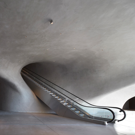
Broad appeal: Situated across the street from Frank Gehry's Walt Disney Concert Hall, The Broad museum features a white exoskeleton and a cave-like lobby (pictured). But does the building signal the beginning of an architectural uplift in Los Angeles?
"Looks better in photo than in reality," wrote Tony. "I remember seeing renders a few years back and was excited about it, but the exterior doesn't have the impact that you would think."
"The exterior is slightly underwhelming in person," agreed Sean. "However, the building itself represents the start of something big for Los Angeles architecturally."
"The real head turner sits across the street from The Broad," retorted Darci. "There's no doubt things are getting interesting in LA, but it will take something radically new before I get excited, and this museum isn't it." Read the comments on this story »

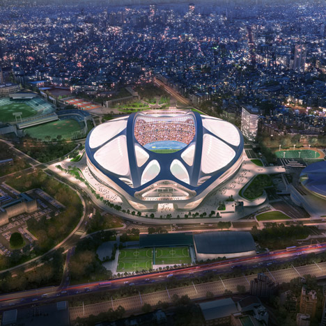
Zaha saga: Zaha Hadid Architects announced that it is working with architecture and engineering firm Nikken Sekkei to win back the Tokyo Olympic stadium project last week.
"It'll look too bad for [Japan's Prime Minister] Abe to take her back now," said Mikan. "There's no way that he'll let the board choose her design."
"Hadid has plenty of work," added another commenter. "Why is she so intent on winning this one?"
"I think they made a good argument for making a design that would be sustainable after the Olympics," countered Kon. "I am not a huge fan of the aesthetics of the design, but they do have a case there... Let them fight for it." Read the comments on this story »

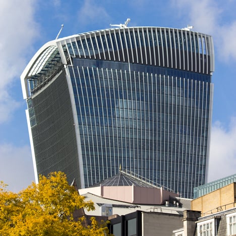
Over and out: Commenters discussed the decision to name Rafael Viñoly's Walkie Talkie skyscraper in London as the winner of this year's Carbuncle Cup – an award created to name and shame bad architecture in the UK.
"Thoroughly deserved," wrote one guest commenter. "Are the assenting planners feeling shamefaced?"
"It's excellent that this is stimulating debate about city planning across London, but is it too late?" asked Kay. "You can't reverse the damage done by badly designed buildings all over the capital."
However, one reader felt the decision to name Viñoly's skyscraper as the UK's "worst building this year" was unjust.
"I love the fact that the panel choosing the award made no reference to its commercial success or about the concrete monstrosity it replaced," argued a commenter calling themselves The Czech. Read the comments on this story »

Google doodle: Google simplified its logo with a more rounded typeface, which proved controversial with readers.
"I'm surprised they didn't go for Comic Sans," joked HJ, while another reader questioned whether consumers want new versions of established branding.
"I already miss the older logo," added Brennan Murray. "I thought it was a nice juxtaposition to a company like Apple where everything is crisp and clean." Read the comments on this story »