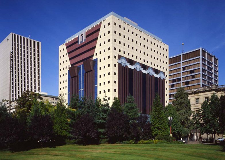
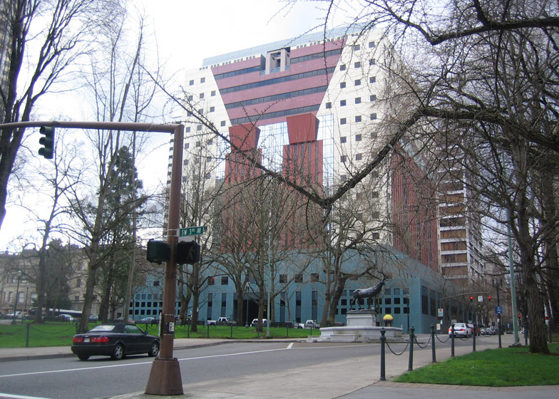
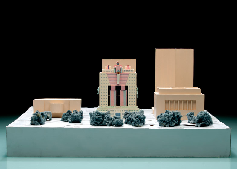
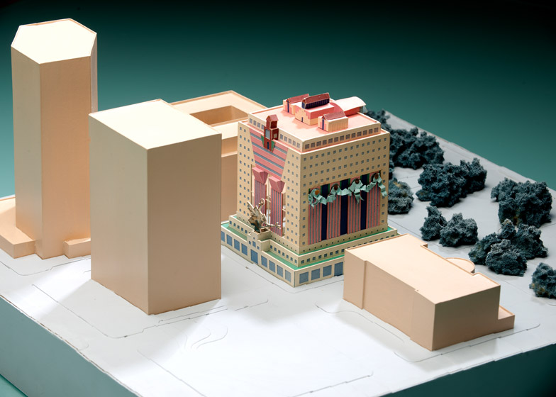
Pomo summer: Michael Graves' pink and teal Portland Municipal Services Building in Portland, Oregon, is one of Postmodernism's most important structures – and also one of its most divisive. As our season dedicated to the controversial movement nears its end, we revisit the building that kickstarted the debate about preserving Postmodern architecture.
When the Portland Municipal Services Building designed by Michael Graves opened in 1982, architectural Postmodernism gained a new level of prominence in the US.
Though Postmodernism had been spreading as a reactionary movement in architecture from the late 1960s, most of the major early works, like the Vanna Venturi House, were for private clients. The Portland Municipal Services Building, better known as the Portland Building, was a large civic structure designed for everyday workers – a cheerful and monumental tribute to the daily functioning of city government.
The 15-storey structure is located next to Portland City Hall and contains offices for many of the city's public agencies, with rentable office space on the top floors and a food court in the base.
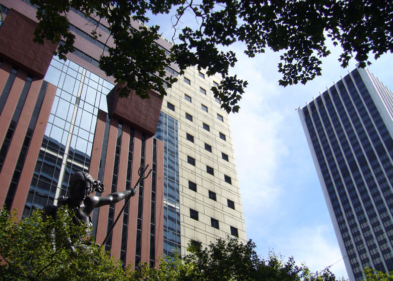
The blocky edifice is dominated by highly abstracted classical elements – including columns, pediments, and a frieze-like decorative band – all set amid a grid of small square windows. A teal-coloured podium encompasses the entrance level, and features a Classically-styled sculpture of a woman called Portlandia, by artist Raymond Kaskey, above the front doors.
In a lecture he gave for the Architectural League of New York in November 1982, shortly after the building opened, Graves said the facade design reflected classical, anthropomorphic orders representing the base, the body, and the head.
Born in 1934 in Indianapolis, Graves set up his architectural practice in Princeton in 1964. In the 1960s and 70s, he and fellow architects Richard Meier, Peter Eisenman, Charles Gwathmey, and John Hejduk became known as the New York Five, united by their Modernism-inspired work in the areas around the city, and were featured together in the book Five Architects.
"He was very important in architecture because he was not just practicing architecture with a big A," said Lyndon Neri, co-founder of Shanghai-based architecture and design firm Neri&Hu, who worked for Graves for 10 years. "He always believed – quite contrary to what most architects think – that we're designing for the masses."
"He's always considered a Postmodernist architect, but I think he hated that label – he wanted to be considered a good architect or designer," added Neri.
In the 1980s Graves was recruited by Italian designer Ettore Sottsass to join Memphis, the radical group that would help define the decade's Postmodernist style in furniture and home accessories.
Graves became a prolific product designer, creating the hugely successful 9093 kettle for design brand Alessi, which was a best-seller for 15 years and recently marked its anniversary with a new whistle design.
"He explained that it was acceptable, even on a cultural point of view, the fact of being ludic, of being Postmodern, of bringing a completely new hybrid language instead of the very purist language of, for example, Sapper," said the Italian brand's founder Alberto Alessi.
Towards the end of his life, Graves worked with President Obama as an advisor on accessible design. But the Portland Building remains his best-known piece of architecture.
"It was extremely well-publicised and popular when it opened," Richard Meier told Dezeen. "It was the unusual decorative design – it's a big boxy building and Michael tried to break down the mass with the decorative elements."
The Portland Building won an honour award from the American Institute of Architects in 1983.
While Graves aspired for the building to be imbued with lofty symbolism, the project was compromised from the start by a tight budget and construction schedule. It was built for a modest $22.4 million dollars (£14.5 million) or $51 (£33) per square foot.
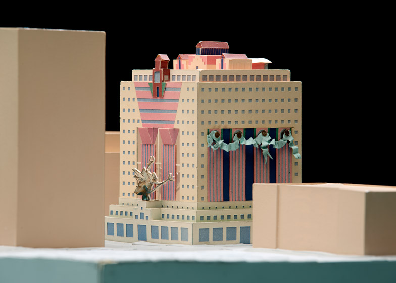
So, while Graves wanted his facade built in glazed terracotta – a material common in historic buildings in Portland – coloured reinforced concrete and fibreglass were used for the cladding and decorative elements. Graves felt the importance of the commission outweighed the compromises in materials. "I don't care if it's made of oatmeal, we're going to be on budget," he said of his thinking at the time. "We did not make it out of oatmeal, but very close."
Moreover, his tiny windows, which were meant to also evoke the body – or "one window, one worker," as he said in his 1982 lecture – were immediately criticised by occupants as too small, leaving the interior dark and uninviting. "Perhaps they were too small, but that was the intention," Graves conceded in the League talk. Graves also lost a bid to outfit the building's interiors.
While Graves's building may look cartoonish today, it was radical at the time. To win the commission, he beat out finalists Mitchell Giurgola, a New York-based firm, and Arthur Erickson, a Vancouver-based architect, then at the height of his career.
Though Graves liked the Mitchell Giurgola scheme, he knew it would come in over budget and didn't see it as a threat. Erickson, however, became his sole serious competitor and the object of his architectural critique. Ericson was an orthodox Modernist, and Graves railed against his "ficus-fied" spaces that contributed to a "monotonous world." The Portland Building, for all its eccentricity, was an instant icon for the Pacific Northwest city.
Though it received wide attention, many critics believed its successor, the Humana Building in Louisville, Kentucky, completed in 1985, to be superior. Where the Portland Building suffered for its inferior materials and needed multiple renovations beginning soon after it opened, Humana has remained a commercial icon and symbol of the solidity of its owner, a private health insurance company.
In his review for the New York Times, architecture critic Paul Goldberger wrote, "Humana is a remarkable achievement – in every way Mr Graves's finest building, a tower that proves his ability not only to work at large scale, but to create interior and exterior details as well wrought as those of any architect now practicing."
Where Portland is flat with a pictorially decorated facade, Humana is sculptural, with a more intricately developed relationship to the ground and the skyline. It meets the street with a deep colonnade that relates to nearby low-rise buildings. The top features a cantilevered armature that evokes the nearby bridges that cross the Ohio River. Time magazine named it one of the best buildings of the 1980s.
The Portland Building's reputation has continued to falter. By 2009, Travel + Leisure magazine had dubbed it one of the world's ugliest buildings. But worse than clickbait criticism, the building faced the real possibility of demolition. In early January 2014, a report found that the building was in need of $95 million dollars (£61.5 million) in repairs, largely due to leaks that have plagued the structure since it opened. The building also failed to meet seismic codes.
The report spurred many on the Portland City Council to call for the structure to be demolished with a new municipal services building to be constructed in its place. At an event following the announcement of the report Graves bemoaned his reception in the city. "350 buildings, and I don't have this treatment anywhere else... Usually when I revisit buildings, it's to get the keys to the city. Here, there are tomatoes for sale," Graves told an audience during the city's design week in 2014. "The whole idea of tearing the building down, it's like killing a child," he added.
The suggestion of demolition prompted a reconsideration of the building, and started a debate on the preservation of Postmodern buildings, which has since continued with the controversial plans to refurbish British architect James Stirling's 1 Poultry building in London.
"Postmodernism is not, now, our style, but are we really comfortable demolishing its most prominent exemplar?" asked Dezeen columnist Alexandra Lange.
"I hate to be in the position of telling a city it has to keep something I wouldn't want in my own, but history does change perception."
The estimates for a full renovation rose to $195 million (£126.3 million), but that proved lower than demolition and reconstruction, which could have cost more than $300 million (£194.4 million). And so the city is moving ahead with a renovation that could substantially alter the building, such as changing its tinted glass to clear.
For all its shortcomings, the Portland Building remains seminal in the development of Graves's work and of Postmodernism in general. "It is more significant for what it did than how well it does it. It had a profound effect on American architecture and brought a return to Classicism that brought us better buildings," Goldberger later told the Oregonian newspaper.
However, Meier is not so sure. "It's important in relationship to Michael's work, but it's not an important building," he told Dezeen.
Graves died in March 2015 this year knowing his first major public commission would endure in some form.

