Matteo Fogale and Laetitia de Allegri install tinted acrylic tunnel across V&A bridge
London Design Festival 2015: holes cut out from vertical sheets of coloured acrylic form a tunnel designed to distort perspective across a bridge in the V&A museum (+ slideshow).
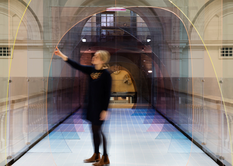
The Mise-en-abyme installation was created by London designers Matteo Fogale and Laetitia de Allegri, who were partnered with UK company Johnson Tiles for the project.
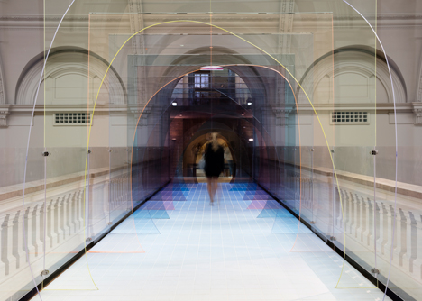
The duo, who have previously teamed up to produce furniture using old jeans, took influences from the areas of the V&A close to the site they were given – a bridge that crosses over the museum's Medieval and Renaissance sculpture gallery.
"The first thing we were told was that we'd been given this amazing bridge in the V&A," said Fogale, who's earlier projects include a combined valet stand, dresser and set of mirrors for an east London boutique.
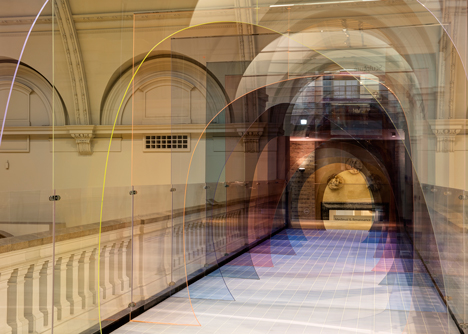
"We looked at the Renaissance room downstairs and the glass room next door, and these were our starting points," he added. "We found out that during the Renaissance, perspective line drawing was created."
A grid of custom-made tiles were used to cover the floor. Each row has three per cent more colour added to the ceramic than the previous, forming a gradient from light to dark blue across the bridge.
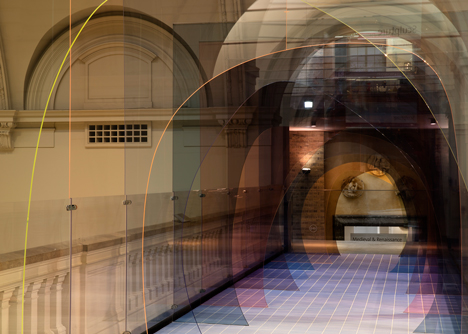
Along its length, vertical sheets of acrylic are spaced at intervals and tinted with different hues – remaining almost completely transparent yet slightly reflective.
"Stained glass was used a lot during the Renaissance," said Fogale. "We used acrylic as an alternative to glass because it has the same characteristics and beautiful colours."
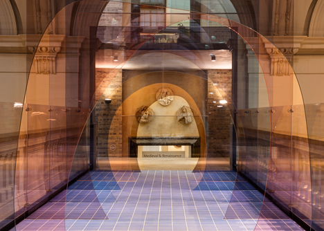
Irregular openings cut out from each panel gradually become smaller along the route while the tints become darker. This serves to exaggerate the perspective when looking through the tunnel formed by the overlapping sheets.
Mise-en-abyme translates from French as "placed into abyss", and refers to the artistic technique that shows an image containing a smaller copy of itself in a recurring sequence.
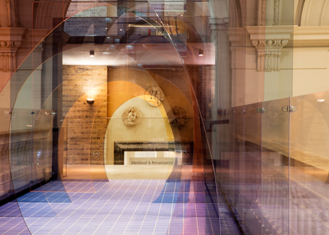
Taller visitors passing from one side of the installation to the other have to duck when they reach the far end of the bridge, which overlooks Barnaby Barford's installation of tiny ceramic shops stacked into a six-metre tower.
Related content: see more from London Design Festival 2015
"We both wanted to create an installation that you can experience," said de Allegri. "When people walk through, they get the feeling of it becoming smaller and darker."
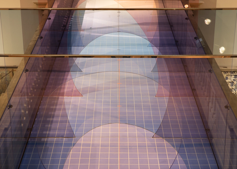
The panels were also specially designed so they could stand up without appearing to need additional support. However, transparent balustrades run along the sides help to brace the partitions.
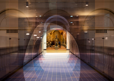
The installation was created to coincide with this year's London Design Festival, which runs from 19 to 27 September 2015. As a hub venue for the event, the V&A is also hosting also hosting a giant crystal zoetrope, an interactive cloud of glass bubbles and a series of mirrored platforms, all in different locations around the building.
Photography is by Ed Reeve.