Philippe Malouin's design studio Post-Office has used a minimal colour palette and custom-designed furniture to turn a London warehouse into the UK head office of skincare brand Aesop.
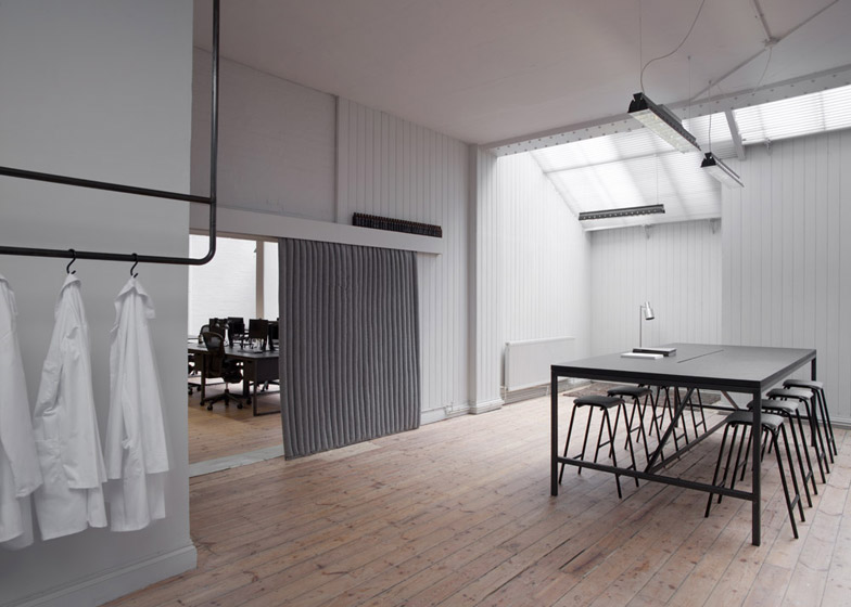
Located within a former manufacturing warehouse in Bloomsbury, the 232-square-metre space is split into two rooms – both with a pared-back look designed to respect the original building.
"The Aesop brief entailed reference images to various galleries with an emphasis on clean, simple lines and open space," London-based Malouin told Dezeen. "The idea was to keep the open spatial feel, highlighting the skylights and the historical features, whilst keeping with Aesop's art direction."
Aesop has collaborated with a score of different designers on studios for its store interiors around the world. In an interview with Dezeen, the brand's founder Dennis Paphitis explained that no two stores are of the same design.
Malouin's team put their own spin on Aesop's style – building on the same aesthetic used for its earlier interior projects, including a photography studio with herringbone parquet covering the walls and floor, and turning a former doctor's surgery into Dezeen's previous workspace and watch store showroom.
"Key areas were highlighted within the space and they needed to fulfil the functional requirements appropriately without having an over-designed feel, which is usually our approach for any interior concept," said Malouin. "It was very important to us to incorporate all of the requirements without unneeded aesthetic artifice."
When Post-Office first arrived at the space all of the partitions had already been removed, so Malouin was keen to keep the space as open as possible.
"We proposed strong limitations on any structural changes to divide the space and essentially keep an open, fluid environment," he said.
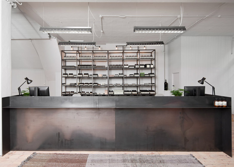
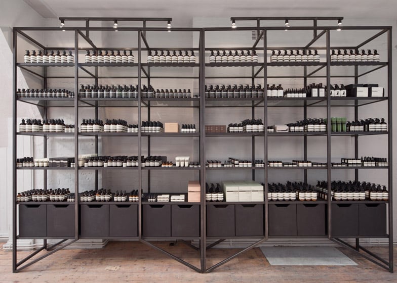
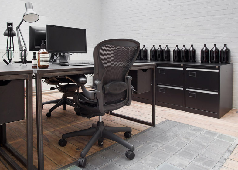
Perpendicular planes of raw steel form a custom-designed reception desk, which sits in front of a shelving unit displaying a selection of Aesop's skin and haircare products in their distinctive brown bottles.
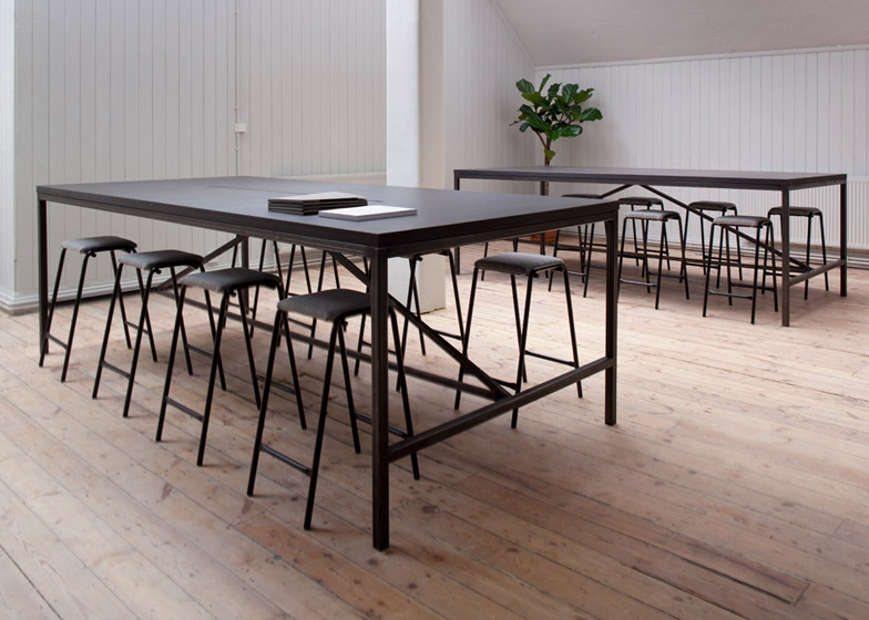
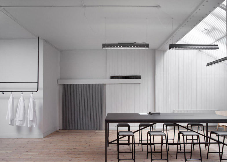
The space beyond is populated by three-metre-long tables – also bespoke for Aesop – which function as both standing work spaces and for hosting dinners.
"The main idea behind the design was to create simple, yet elegant custom items to respond to Aesop's UK head office's needs," said Malouin.
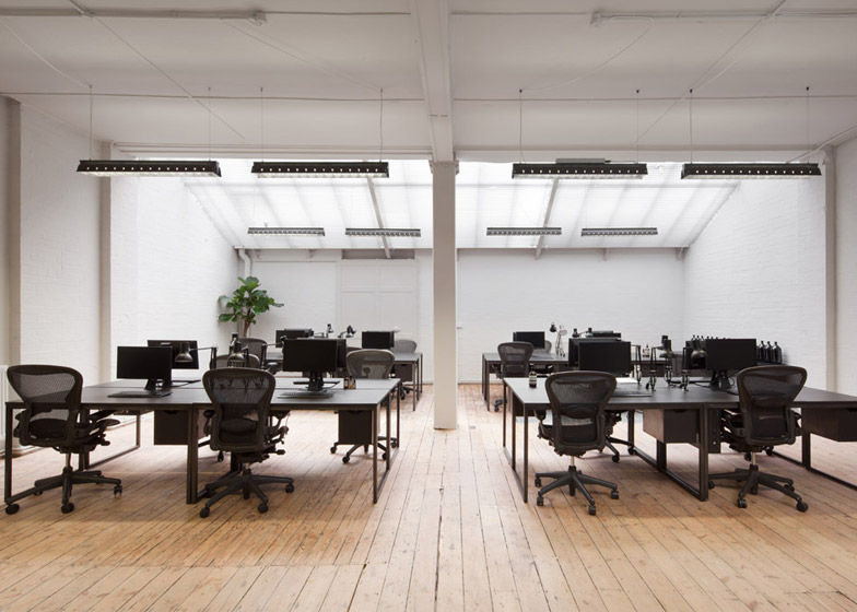
Accessed through a curtained hole in a wall, the second area is predominantly furnished with office desks and chairs.
Both rooms are lit naturally by angled skylights and feature sanded wooden floors throughout.
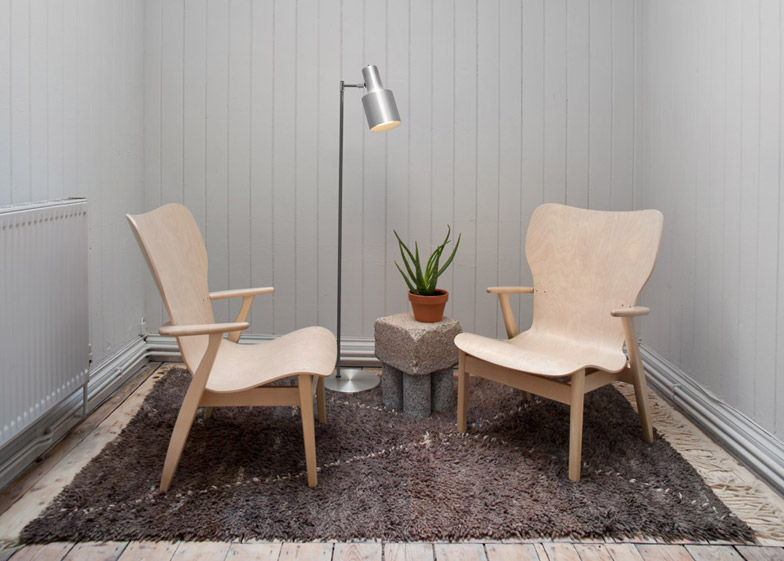
Two Domus Lounge Chairs by Finnish designer Ilmari Tapiovaara are tucked into a niche for one-on-one chats, alongside a stone side table by British designer Max Lamb.
A partition of Georgian wired glass creates privacy for the dark blue-painted meeting room but allows employees to gauge its occupancy.
The glass wall hides a conference table by American Modernist designers Charles and Ray Eames with a custom dark green top, which is illuminated with Michael Anastassiades' conical String Lights.
"As far as furniture goes, we tend to only like certain items," Malouin said. "And these items were very much applicable to the Aesop scheme. Just as the material palette, we believe that the choices we made were simple and elegant."

