Layer redesigns the charity collection box for Maggie's
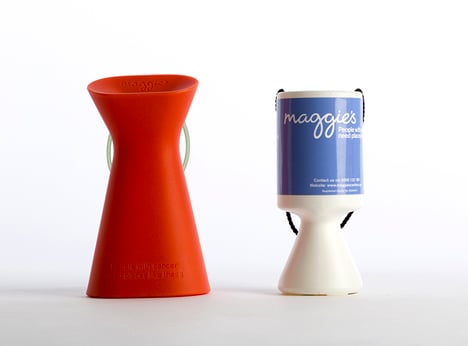
Benjamin Hubert's design agency Layer has created a new ergonomically-shaped change box with a tilted head for UK cancer charity Maggie's.

The new collection box has been designed by Layer as an alternative to the "generic OEM product" that many charities use, functioning as an identifier for the charity as well as an attempt to encourage donations with a more welcoming shape.
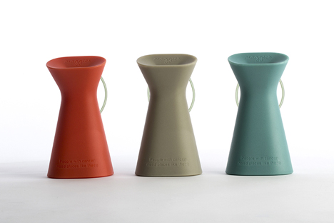
The box has a 25-centimetre-tall silicon body that tapers away from a pinched-in neck, and a head that's tilted slightly forward.
"The normal charity boxes are fairly soulless objects, which don't talk about the charity or engage the person that's donating," Hubert told Dezeen.
Hubert relaunched his studio earlier in 2015, adopting the new name Layer to focus on the design of physical and digital goods and more "human-focused" projects.
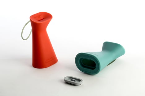
"We wanted something approachable, warm and identifiable. Just the gesture of the object coming slightly towards the user – such a small sub-conscious thing that we think can encourage donation. We think it's a big change for an object that's never been considered," he added.

Generic charity boxes are usually held around the base with the weight of the coins carried above, but the Maggie's box has been designed to be held at the top to assist volunteers when carrying a heavy load.
The coin bank also has a strap, attached to the back of the box, that can be threaded around the wearer's wrist.
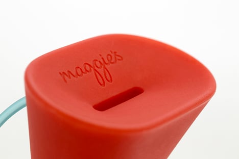
The coin slot – which has been designed to accept various denominations – is set into the top of the box, beneath an engraved Maggie's logo.
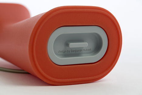
Available in grey, red, and blue, the banks have been designed with a smaller base that will take up less space on counters. Coins can be collected by removing a silicon stopper set into the bottom of the box.
Maggie's – a UK charity that provides support to people with cancer – has a history of design collaborations, having worked with architects including Snøhetta, Thomas Heatherwick and Norman Foster on its successful Maggie's Centres that offer support to anyone affected by cancer.
Earlier this year construction started on Steven Holl's controversial Maggie's Centre at London's St Bartholomew Hospital.
The new coin box will be part of a trial, starting in October, which will benchmark donations using the new design against donations to traditional collection boxes.
"Architecture and design are vital to the care Maggie's offers," Sarah Matthew, marketing director at Maggie's added. "We will be piloting the new design over the coming months. Benjamin and his studio have demonstrated great insight in understanding the needs of our organisation and that of our supporters. They have sensitively captured our design philosophy and values."