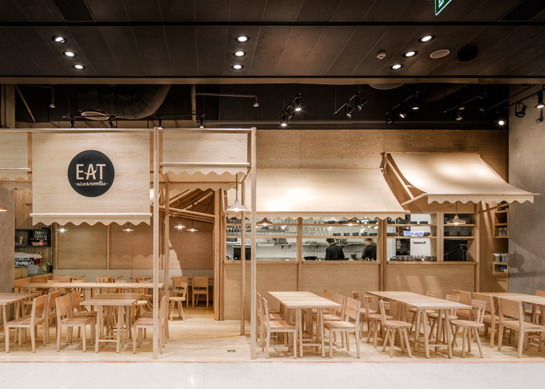
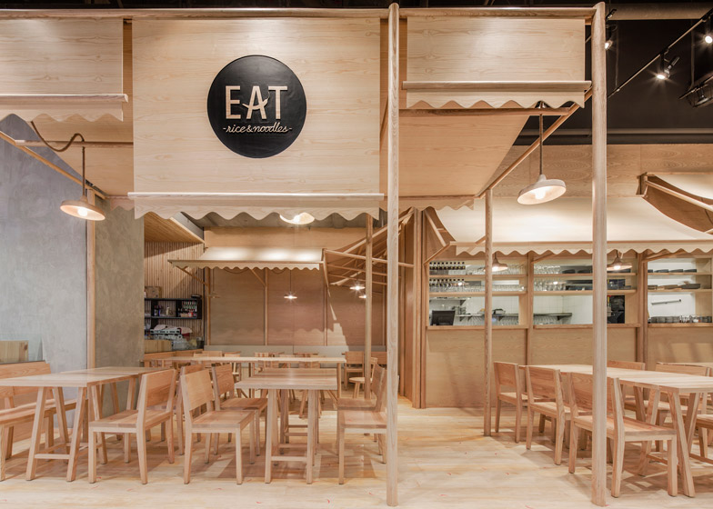
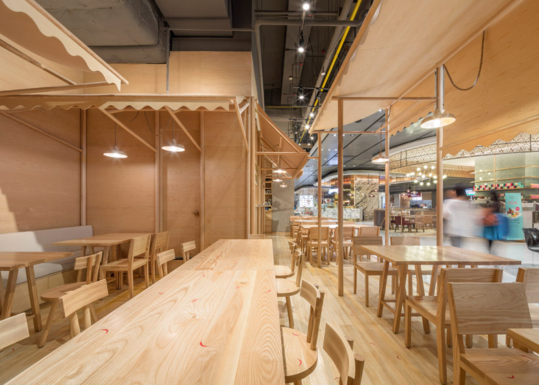
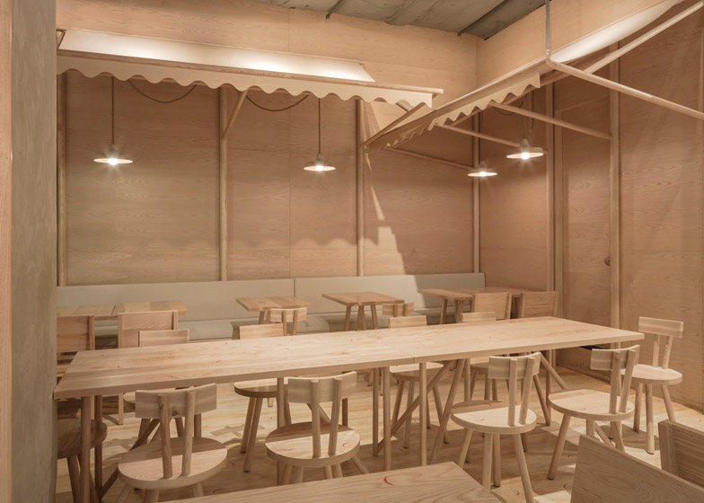
Furniture and surfaces at this restaurant in Bangkok's EmQuartier shopping precinct are almost exclusively ash, creating a monochrome interior that looks like it's made from balsa wood (+ slideshow).
Designers Siriyot Chaiamnuay and Arisara Chaktranon of local studio Onion designed the interior for Eat Rice&Noodles, a restaurant located in the basement food court of the retail complex created by New York firm Leeser Architecture.
The 66-square-metre restaurant specialises in Thai food influenced by the proliferation and familiarity of good quality street food in the region.
"Since street food is an essential part of everyday life in Thailand, Eat has been designed with the intention of capturing its banal experience and making it feel unique," said the designers in a project description.
The restaurant's design directly references the street stalls found around the city, where diners can build their meal by choosing from different types of rice, noodle and meat.
"What we wanted was to catch the eyes of the passerby as much as we could," Siriyot Chaiamnuay told Dezeen. "We were interested in bringing the outdoor elements of street food restaurants into the indoor space."
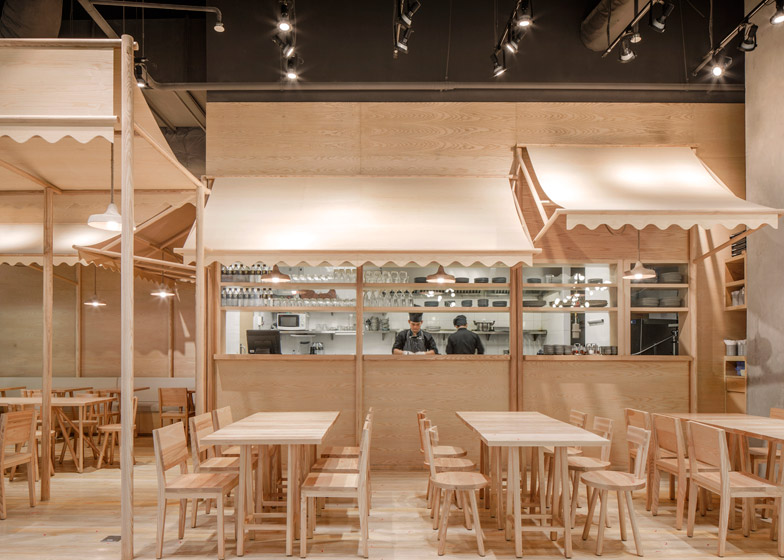
The awnings that provide shelter and a way of marking the territory of each street stall are recreated in curving plywood sheets within the space.
Other items commonly found in street restaurants, including the bistro-style pendant lamps and wooden furniture, provide further references to the archetypal eateries.
The designers used wood to create a structural frame, as it is a common building material in Thailand. They applied the same material to the walls, floors and furniture to give the interior a homogenous aesthetic.
"The monochrome palette is about unifying various materials applied at Eat," Chaiamnuay added. "Also, we wanted Eat's customers to feel like they are dining in a balsa model."
The designers claimed that the use of bleached ash is also intended to soften the "grimy, rough-and-tumble feel of a street stall" while achieving an accurate visual resemblance.
An open kitchen enhances the sense of connection between the diners and chefs, providing a view of the cooking process that also recalls the preparation of food by street vendors.
Onion's other projects include a hotel with fluted brick walls lining a passageway that leads to the guest rooms. The studio also designed a house to display a collection of toy bears that it later returned to and added more display cases in the garage.
Photography is by Wison Tungthunya.

