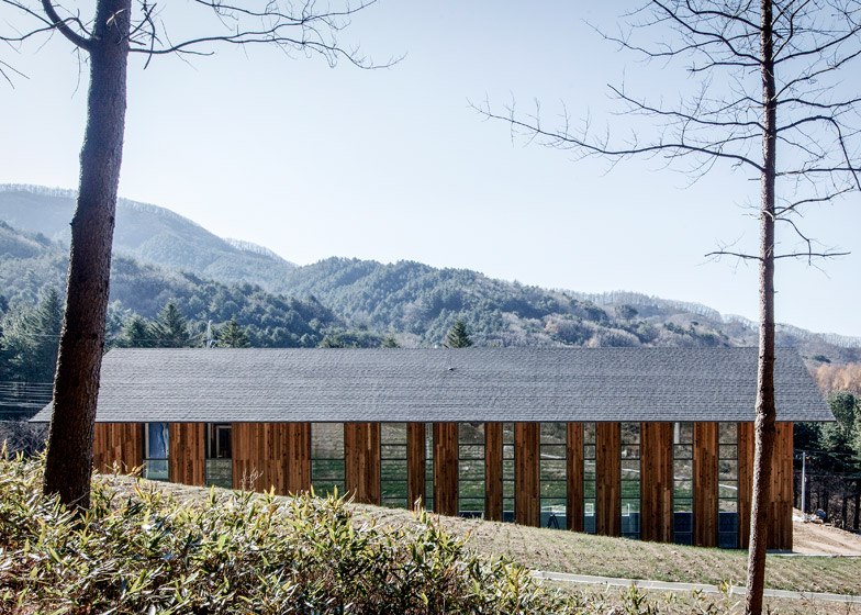
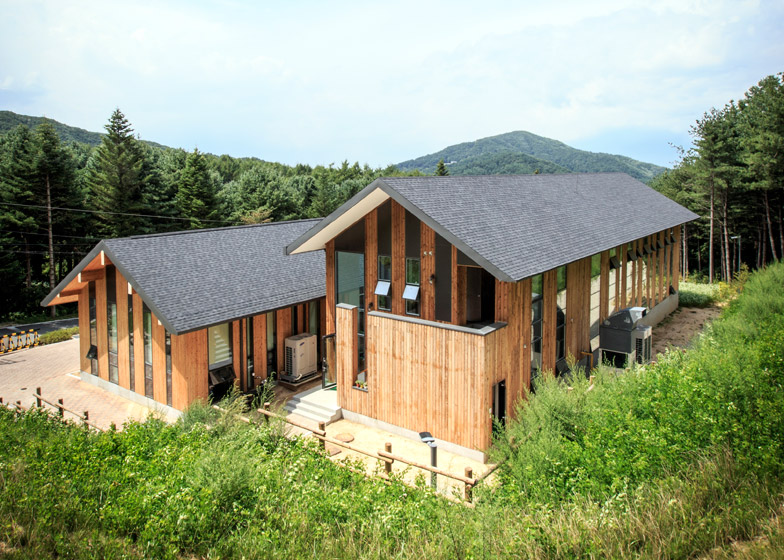
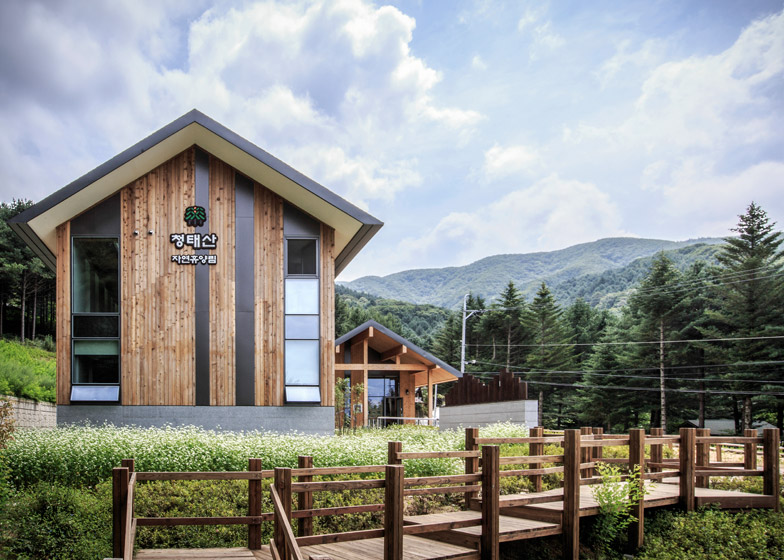
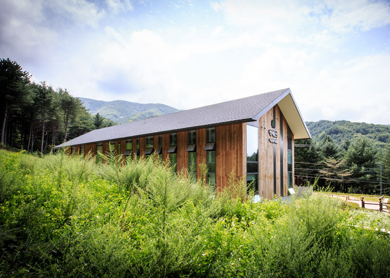
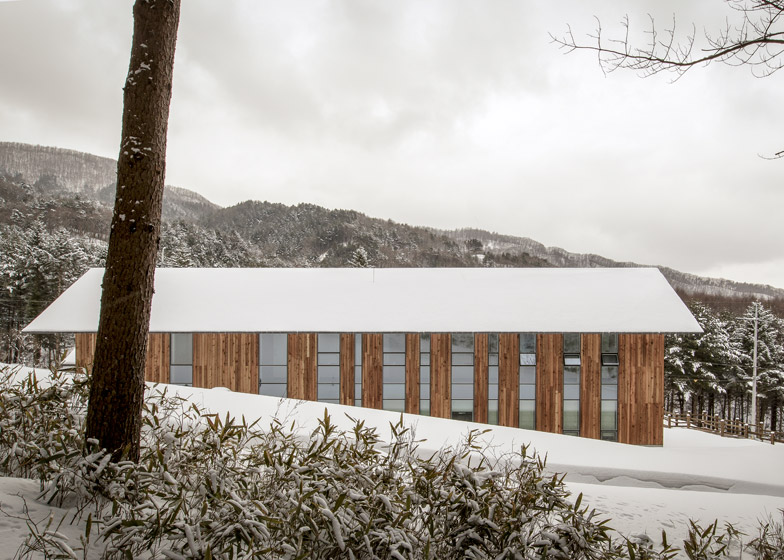
This visitors centre for a mountain in South Korea by Namu Architects comprises a pair of gabled buildings with vertical cladding and windows, intended to reference the trunks of tall trees that surround the plot (+ slideshow).
The CeongTae Mountain's Visitor Information Center by JaeBum Myung of Seoul studio Namu Architects stands on the edge of a mountain forest in South Korea's Gangwon Province.
The centre comprises a pair of timber-clad buildings with pitched roofs. One taller and longer than the other, they sit side by side and are connected by a small porch.
The roofs are covered in grey tiles and pitched at the same angle as the Sudeoksa Daeungjeon, the primary Buddhist temple in the region.
Their timber eaves shelter long stripes of glazing on the facade, and are left exposed across the interiors.
"A gable roof is one of the most common building types in agricultural villages," said Myung. "It has been used not only for Buddhist temples but also for storages and houses that were unknown."
"Although materials and construction methods have been changed, the gable roof's refreshing quality and strength are reproduced in this project," he added. "The traditional gable roof is applied to modern interpretation by using pre-cut post and beam construction."
The outer walls of the building are covered in planks of timber in varying tones, creating an "abstract painting of the forest".
Long vertical windows that run from the eaves to the ground break up the wooden cladding and give views into the adjacent stand of pine and fir trees.
The buildings' traditional gabled form and timber siding were selected to help the new structures harmonise with the local architecture and appear "as one with the forest".
Related content: more architecture in South Korea
"The site is located in front of the forest that is full of coniferous trees like pine and fir trees," explained the architect. "The trees grow straight toward the sky at irregular spots. These vertical rhythms of the site are adapted to the building's elevation."
Similarly, when Japanese architect Kengo Kuma designed a tourist information centre in Tokyo overlooking an ancient temple, he fragmented the structure into several house-shaped segments. Stacked one on top of the other, the construction helps to lessen the visual impact of the building on its surroundings.
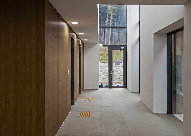
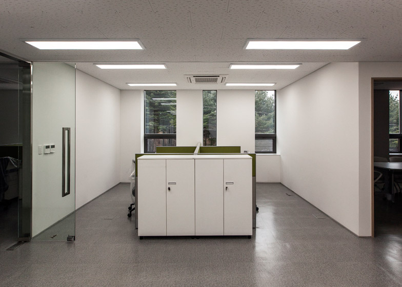
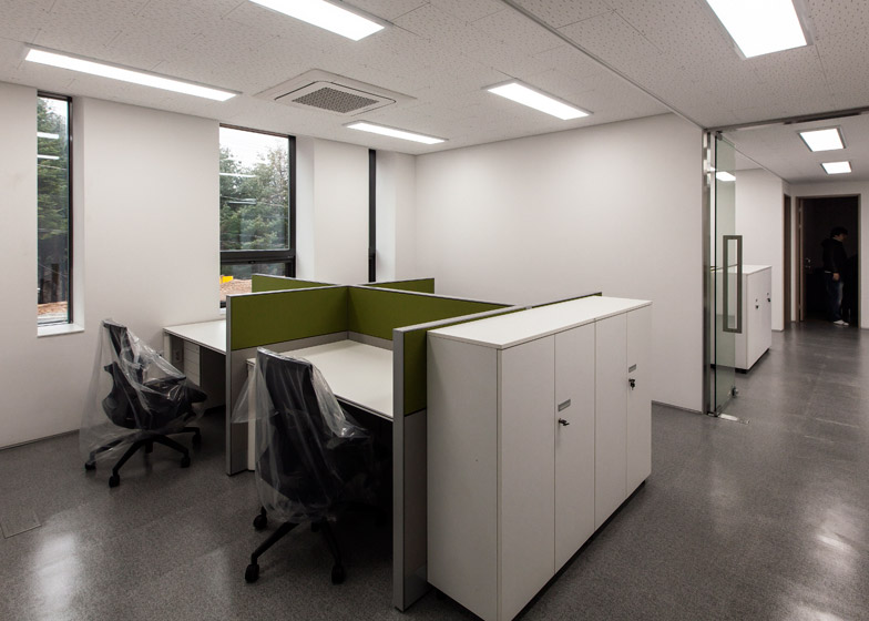
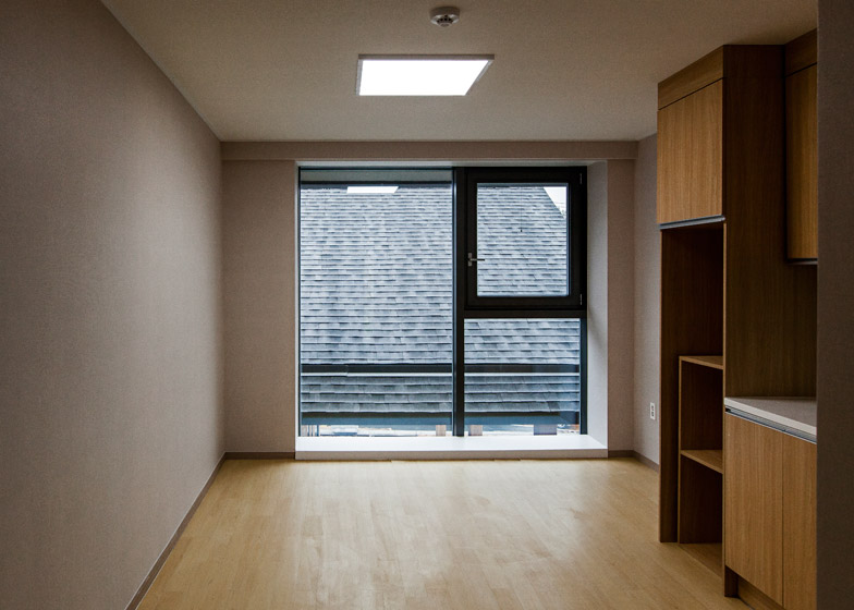
Non-load-bearing walls subdivide the minimally decorated interior space, allowing for future adaption. Currently, offices, conference rooms and toilets occupy the ground floors of the two blocks, while the upper floor of the larger building contains staff accommodation.
Photography is by JaeBum Myung.

