Japanese industrial designer Naoto Fukasawa has worked with electronics company Hitachi to create a stripped-back concept for a passenger lift (+ slideshow).
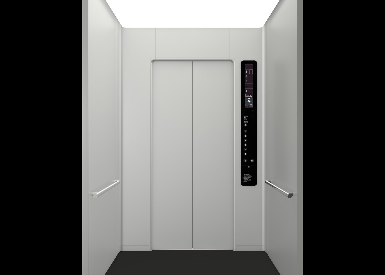
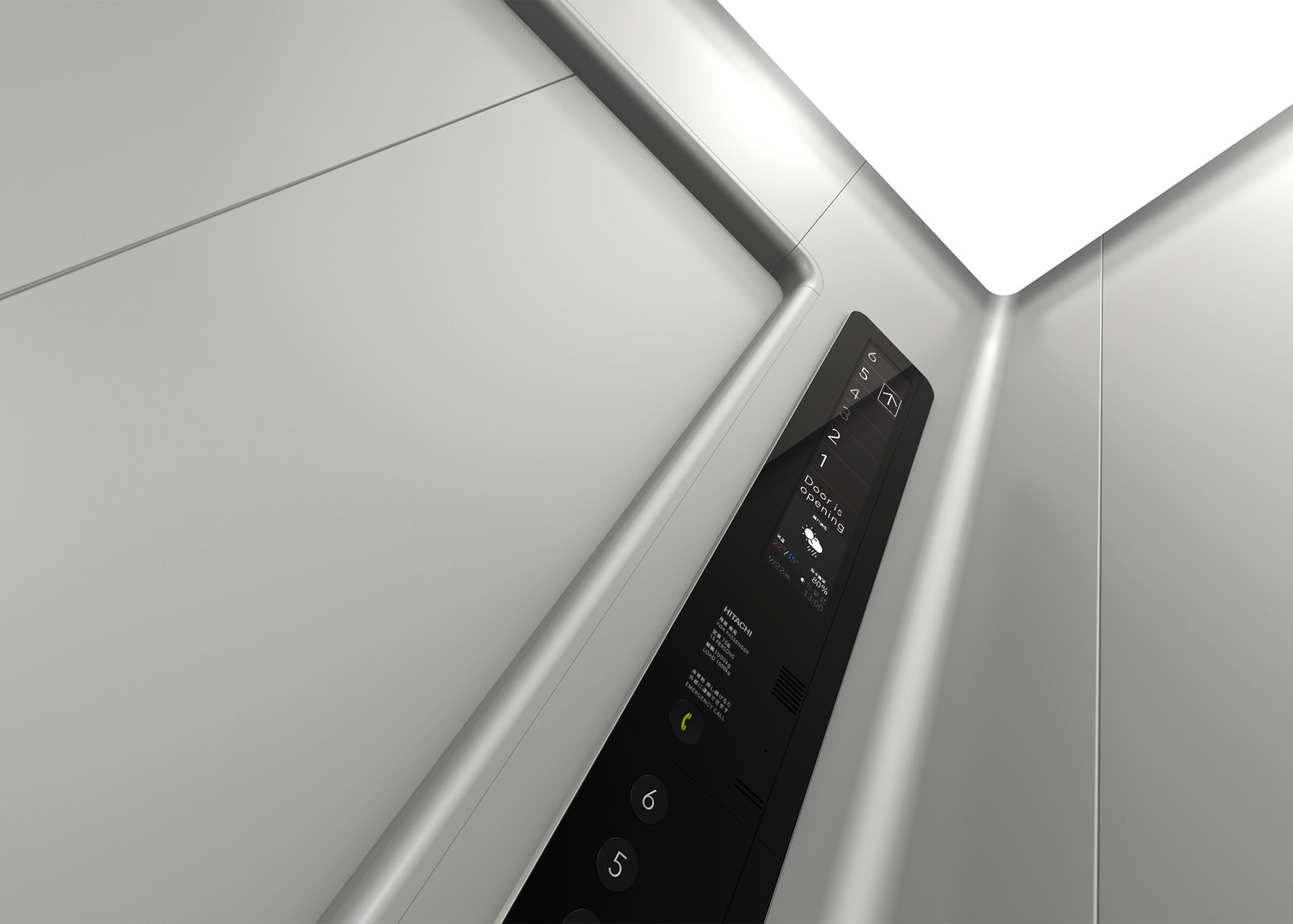
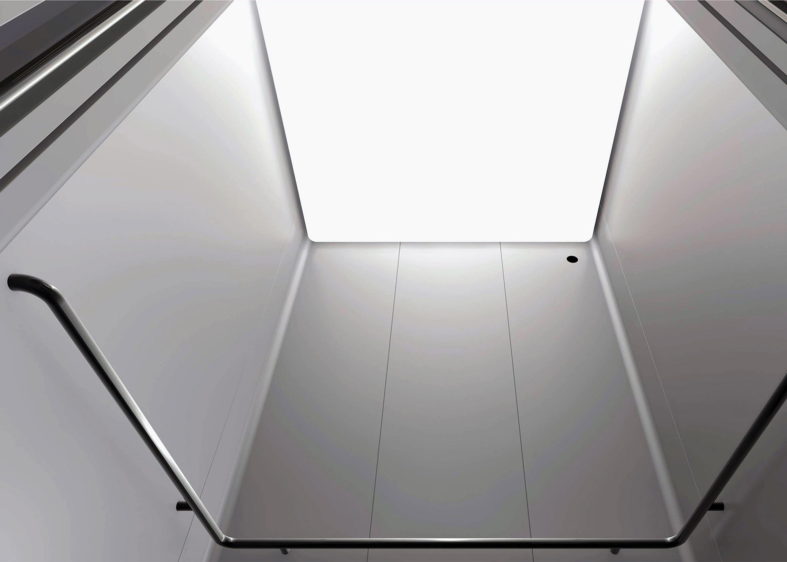
Prompted by people's tendency to gravitate to a single corner of an elevator, Fukasawa's design features walls joined into a seamless rounded shape that is proposed to "intuitively escort" riders.
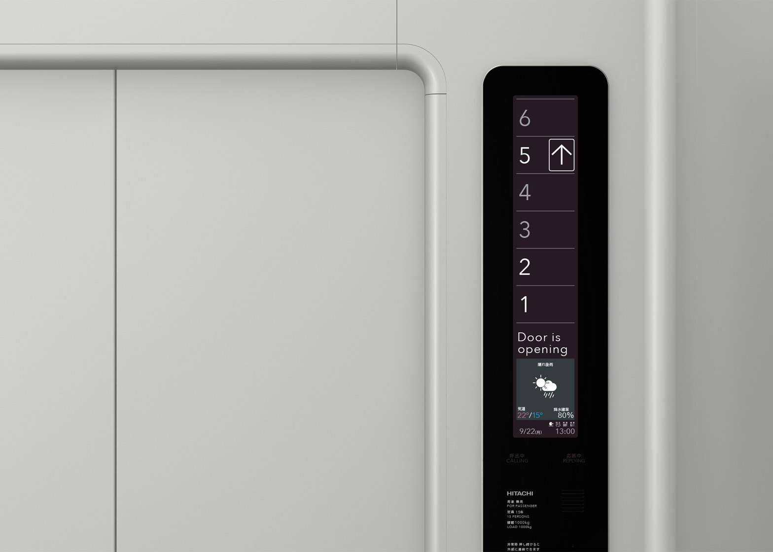
Standard push buttons have been replaced by a vertical LCD control panel, which has been developed with "a pleasant sound" to ensure passengers' comfort.
Initial images of the elevator's pared-back interface show a sans-serif typeface used to convey floor numbers, as well as weather information and essential messages.
Hitachi said the screen could also be used to display an image of the building that would help passengers more easily identify their location.
A single chrome handrail curves round the interior of the lift which, according to the electronics giant, would offer "unprecedented smooth movement".
Compared to a typical elevator, the ceiling height has been raised and an overhead light panel includes two types of LEDs. These allow the ceiling to change colour temperature depending on the time of day or the season.
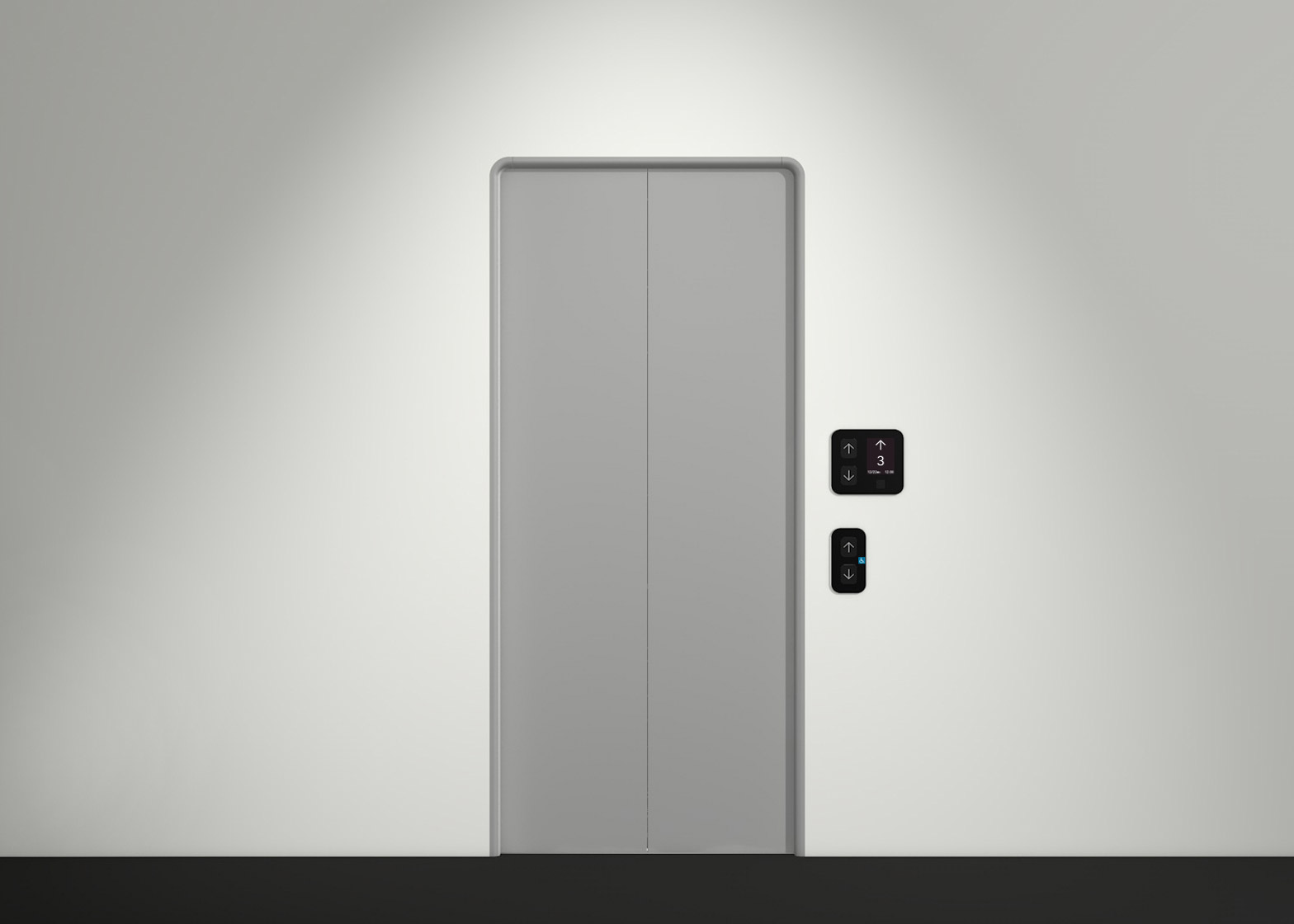
The exterior of the lift features two door panels inset into the wall, accompanied by touch screens that would display information about where the lift is, and allow passengers to call the elevator.
A statement from the company described the elevator – the recipient of a 2015 Good Design Award – as an attempt to embrace "unconscious human behaviour", although Fukasawa's concept is only the first phase of an ongoing initiative.
The elevator's pared-back appearance is representative of Fukasawa's distinctively minimal approach, which he recently applied to a series of kitchen appliances for Japanese design brand Muji.
Another more unusual take on the elevator, German company ThyssenKrupp's Willy Wonka-style glass lift uses magnets to move horizontally and vertically.

