Tato Architects' House in Toyonaka is divided into offset horizontal volumes
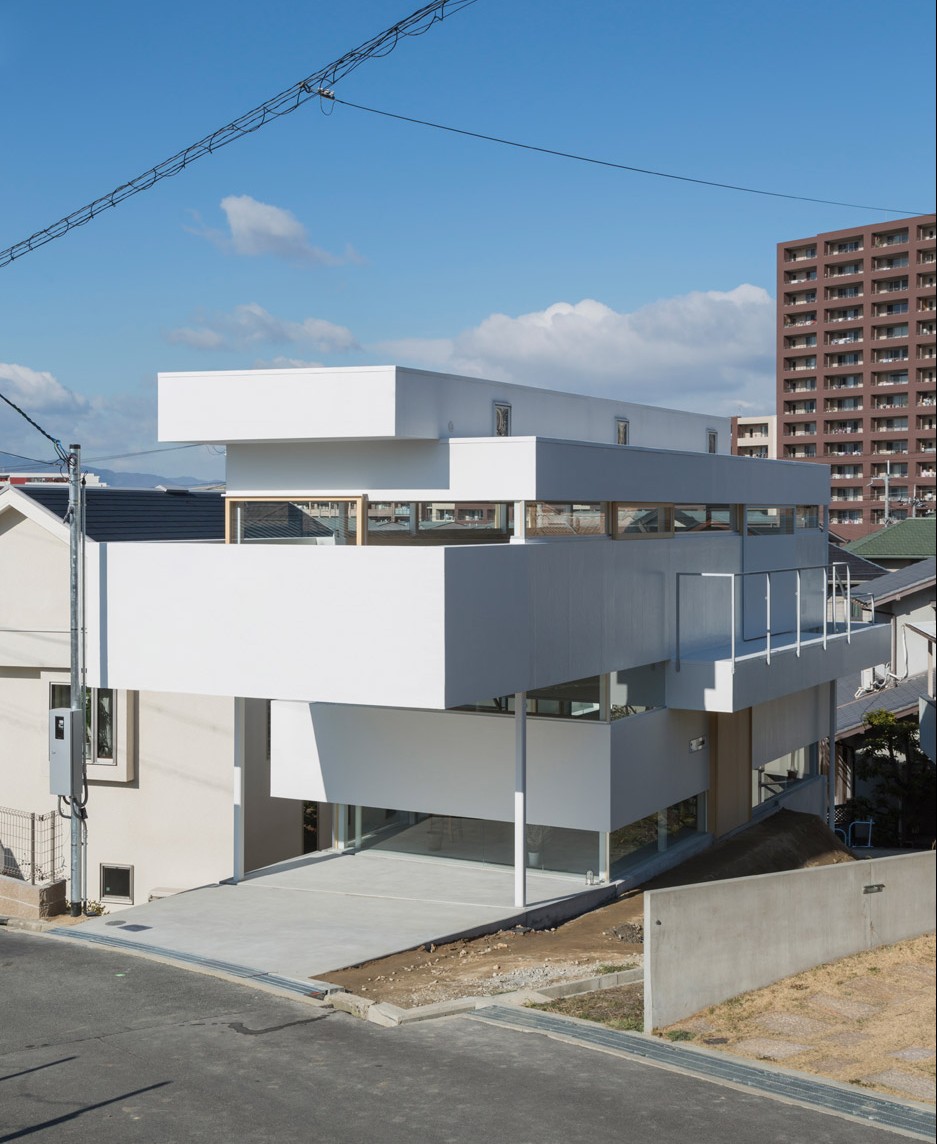
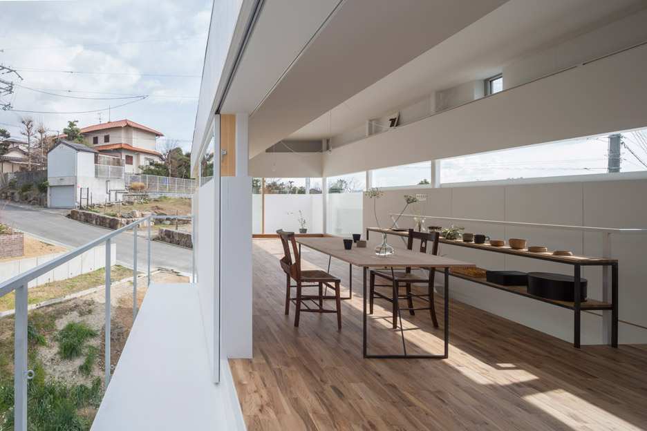
This house in Osaka by Japanese studio Tato Architects features walls that step back and forth, worktops that merge with staircases, and windows that wrap around entire rooms (+ slideshow).
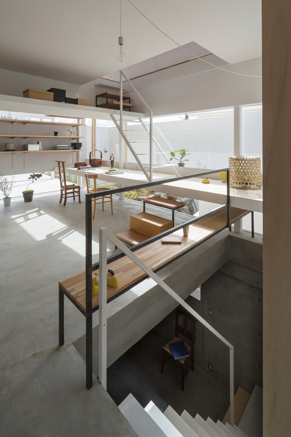
With his design for House in Toyonaka, Tato Architects founder Yo Shimada wanted to give more importance to secondary elements like staircases, balustrades and windows, which he believes often feel more like afterthoughts.
"It is difficult to deal with architectural elements that don't have a direct relation to the main architectural composition," explained the architect, whose past projects include a home comprising a metal barn on top of a glass box.
"It might be my prejudice, but architectural space gradually becomes static when additive elements are reduced to be abstract," he said.
"My query was to find out whether it is possible to create space that has quality of dynamic abstractness, enabling space to get more settled when activities and things are mixed with the space, and objects are flooded in there."
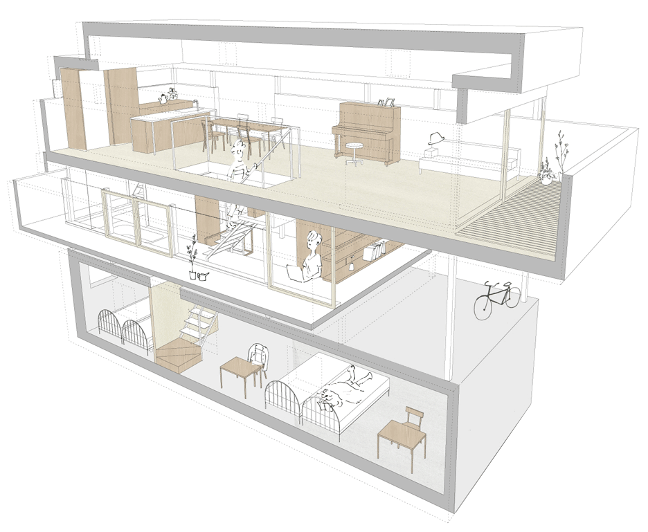
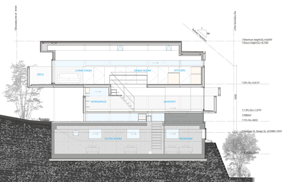
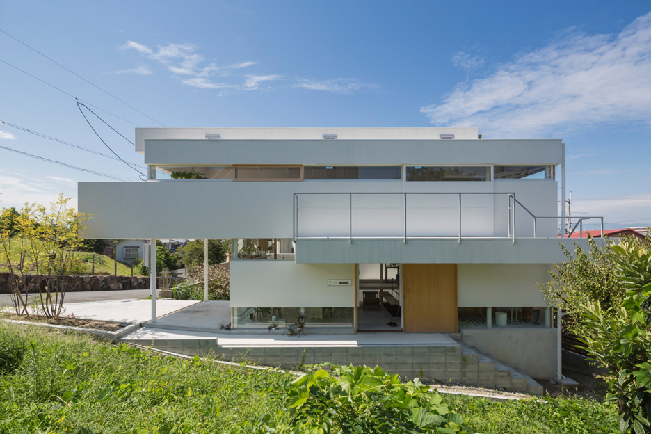
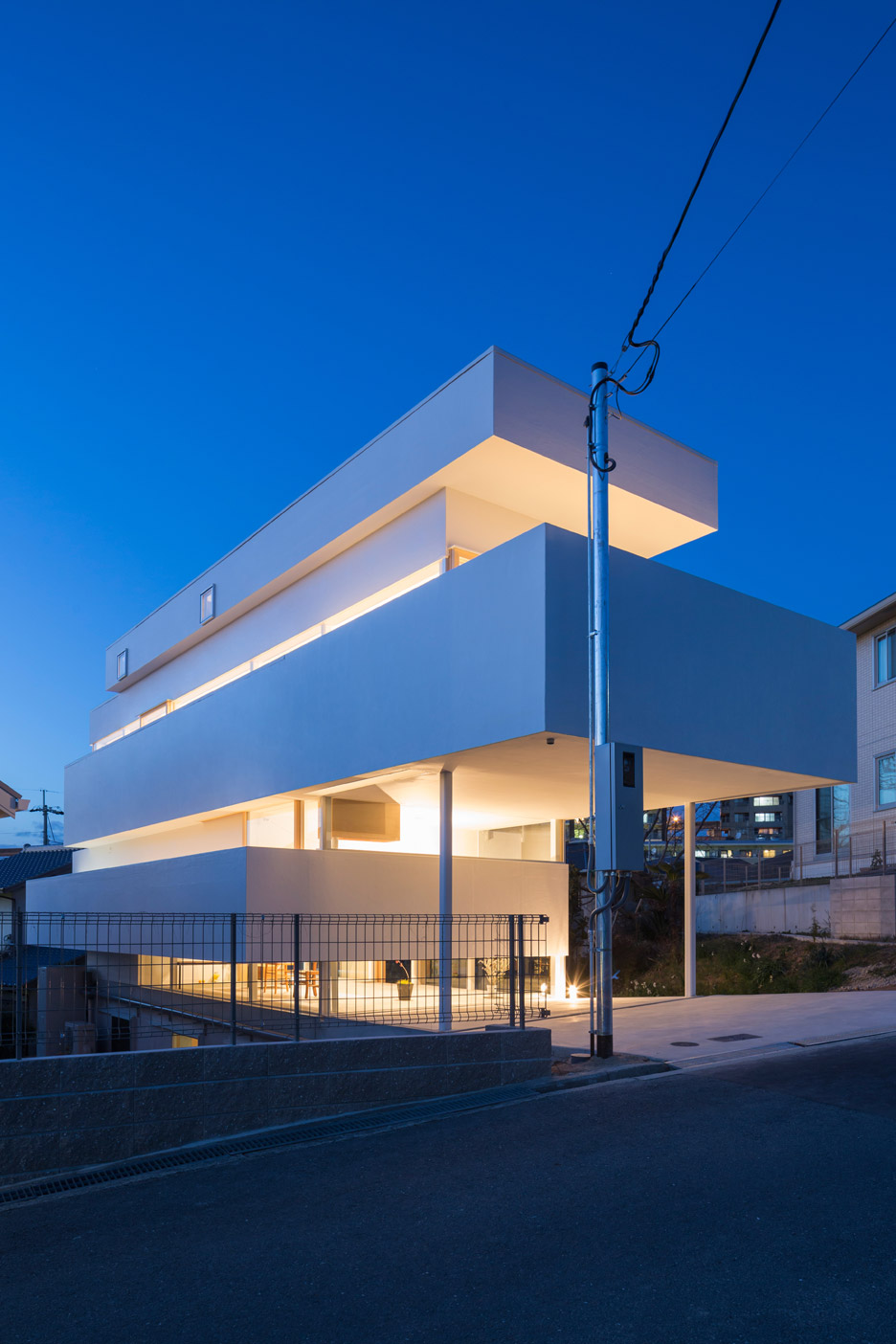
To achieve this, he designed a three-storey building where the floors are broken up into seven layers that step back and forth, in line with window openings and furniture surfaces.
It builds on the growing trend for stacked rectilinear boxes in architecture, with other recent examples including a Vancouver gallery by Herzog & de Meuron and a housing development in China by NEXT Architects.
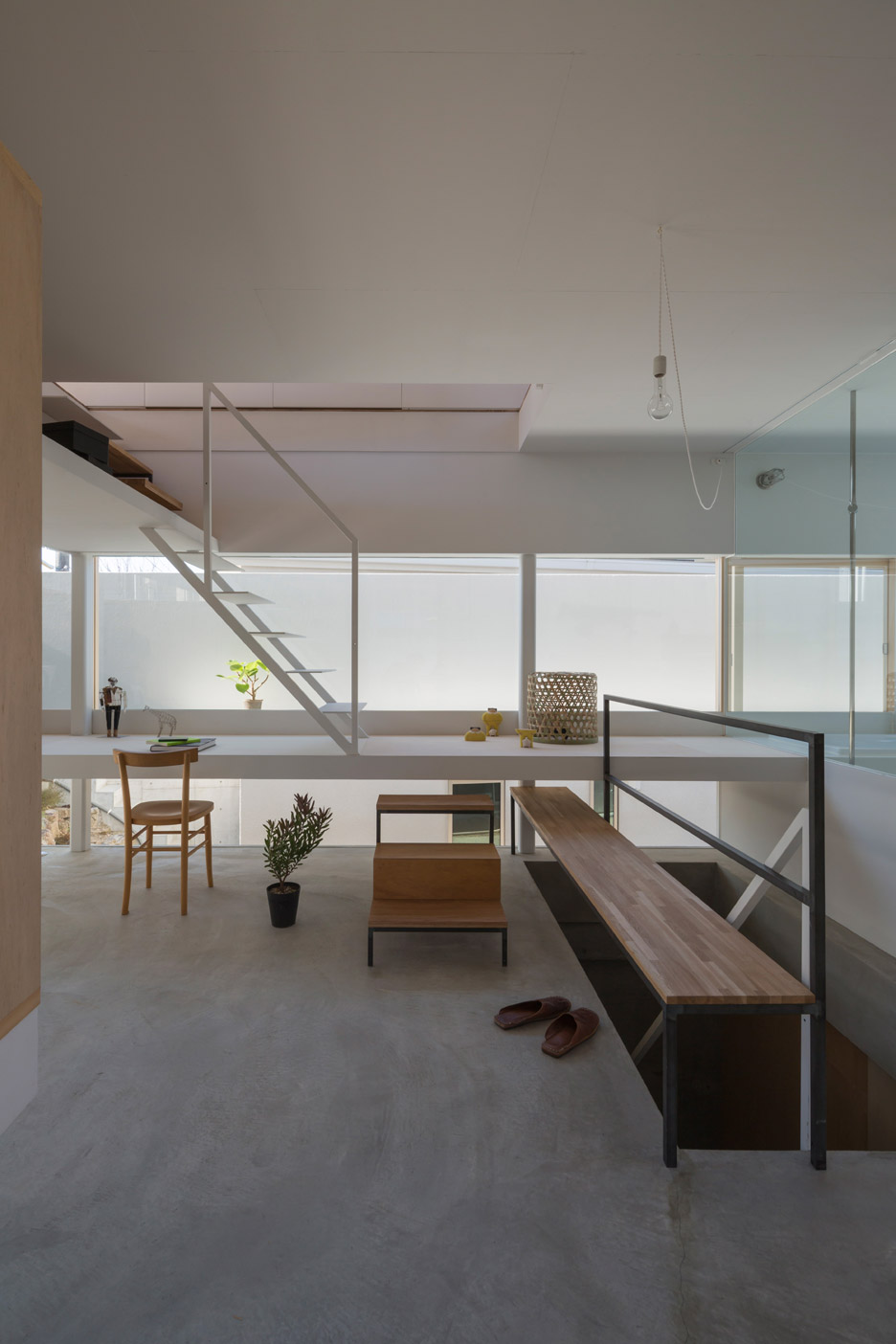
One of the floors is mostly sunken below ground, although it emerges at the rear of the site where the landscape slopes down. There are also roof terraces and balconies wrapping around different walls.
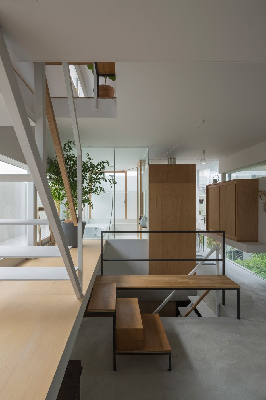
"I have tried to achieve a design in which the main architectural composition, such as relation between slabs, stands out, but at the same time secondary elements also become a vivid issue," said Shimada.
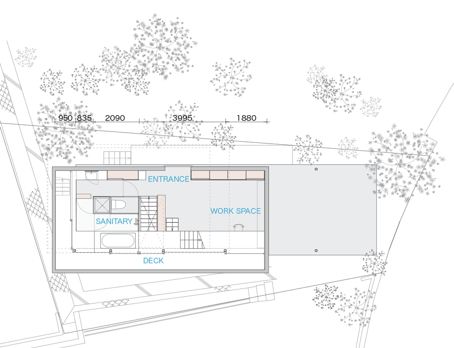
The house is located on a fairly open plot in Toyonaka, a residential area to the north of the city. The triangular plot next door is unlikely to be built on, while a small agricultural plot is located on the opposite side of the street.
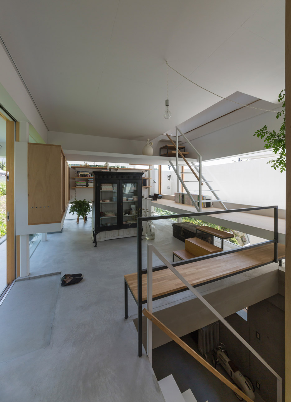
As is often the issue with houses in Japan, privacy played an important role in the design. The stepped form of the building also helps to shield certain sections of the interior, while the setbacks create distance between living rooms and the street.
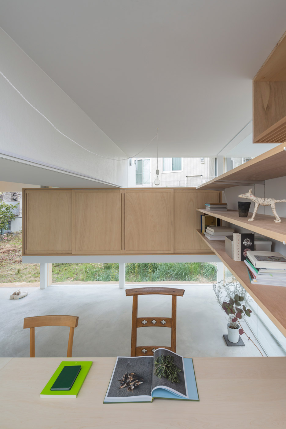
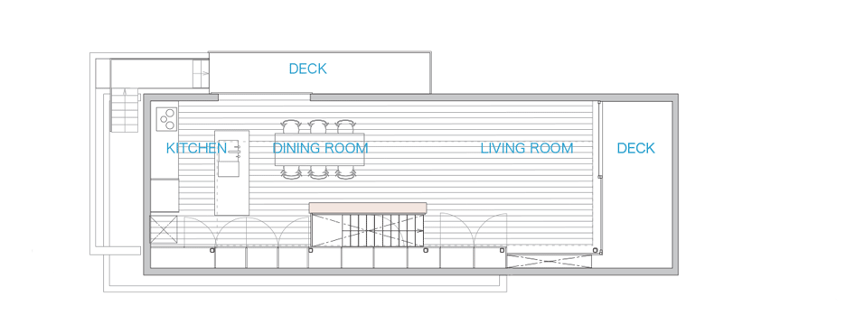
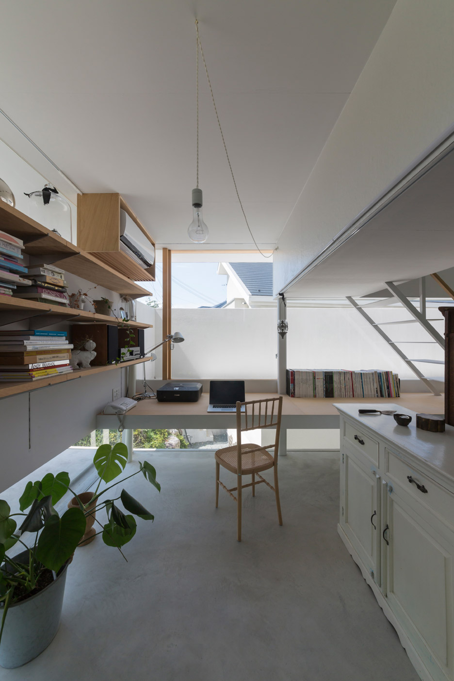
The uppermost floor houses the family living, dining and kitchen space, while bedroom spaces occupy the basement storey. Sandwiched in between, the ground floor functions as a reception room and study, and also accommodates the bathroom.
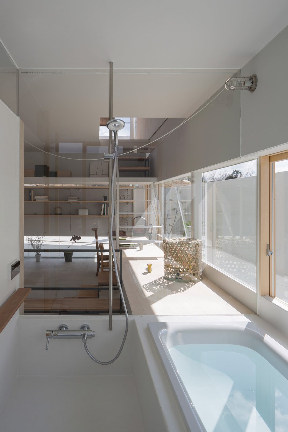
The staircase connecting the three floors is broken into different sections. In one place, it lands on top of a desk, while elsewhere it extends up behind a shelving unit. There are also some smaller sections comprising just two or three steps.
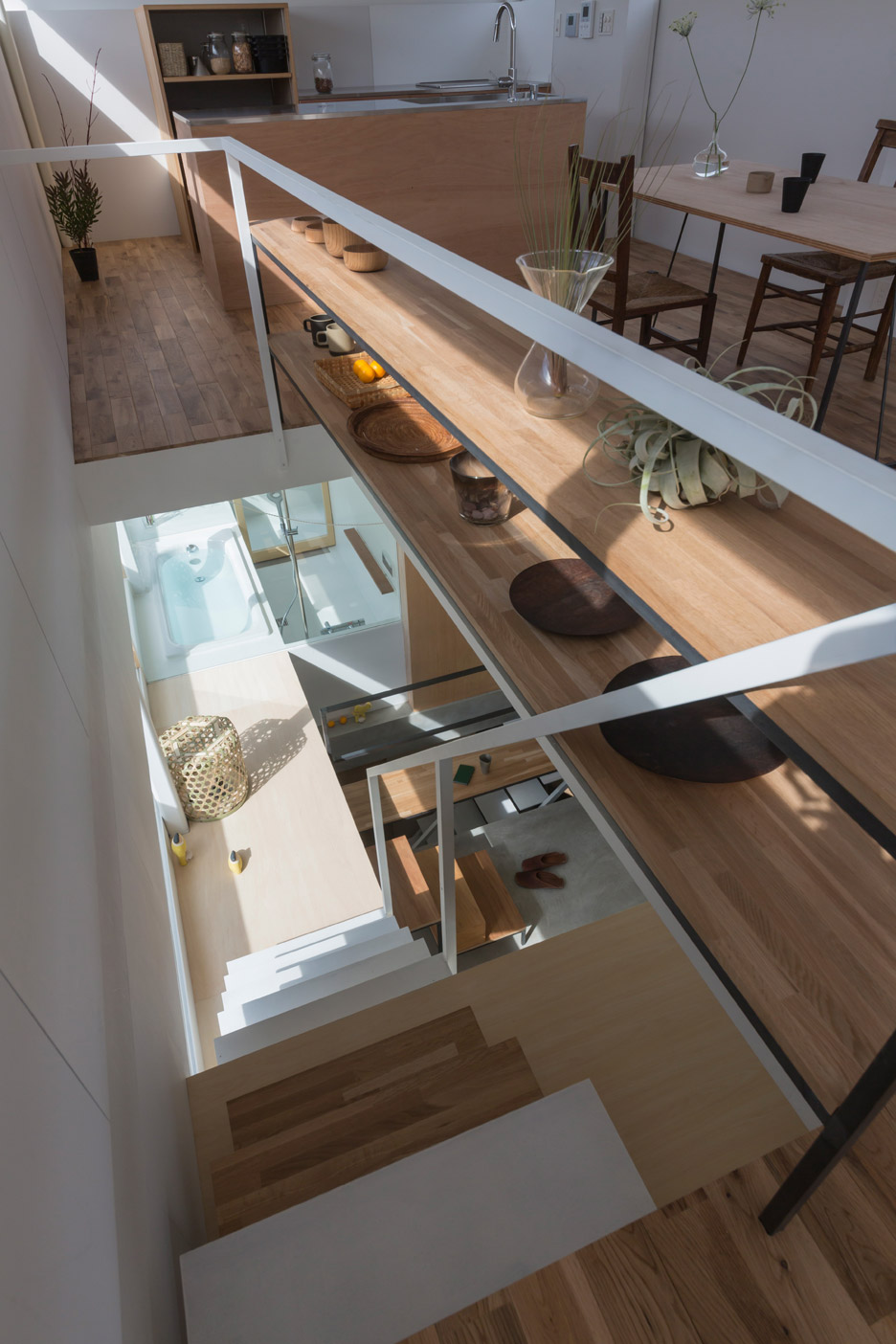
Built-in furniture in each room follows the lines of the building's form. Shelves are slotted into alcoves, while cupboards and other elements are often raised above floor level.
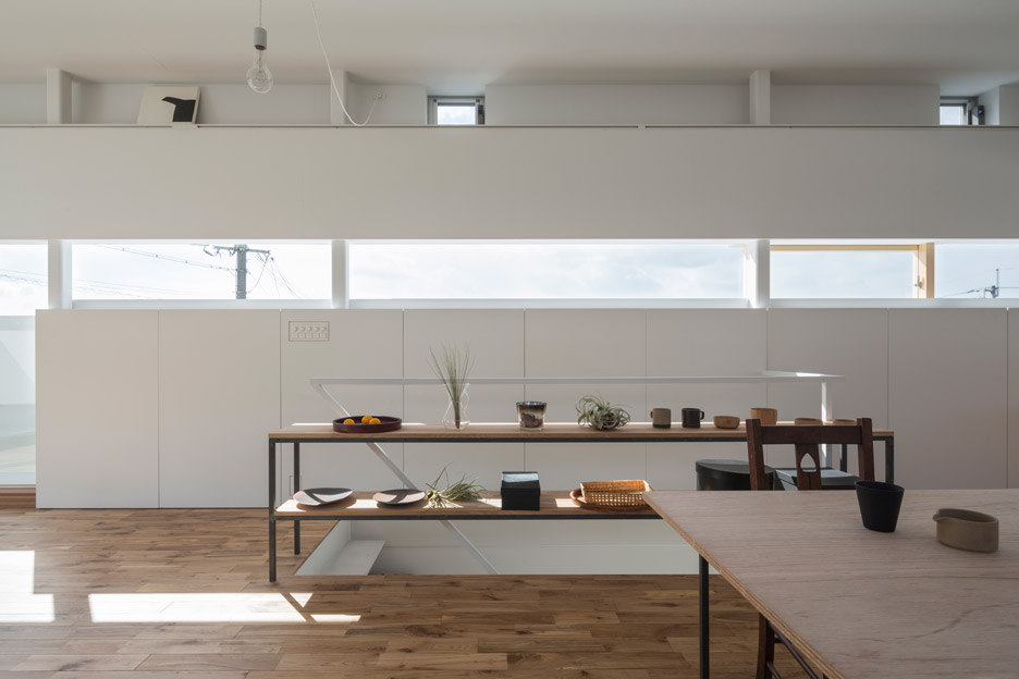
"We tried to make a relation with the exterior space, while protecting the inside by wrapping it in a belt-like form," said Shimada.
"The shifted volumes function as balconies, eaves and windows outside, while the level gaps generated by the shift work as a desk, landings and shelves inside," he added. "From the windows created in between stripes, nearby bushes and a series of tiled roofs are framed horizontally."
Shimada established his studio Tato Architects in 1997. Other projects include a house featuring 42 windows and a curving staircase, and a dental clinic with translucent treatment rooms.
Photography is by Shinkenchiku-sha.
Project credits:
Design: Tato Architects – Yo Shimada
Team: Yo Shimada, Nobuhiko Sato
Structure: Takashi Manda Structural Design
Team: Takashi Manda, Taijiro Kato
Construction: Kohatsu
