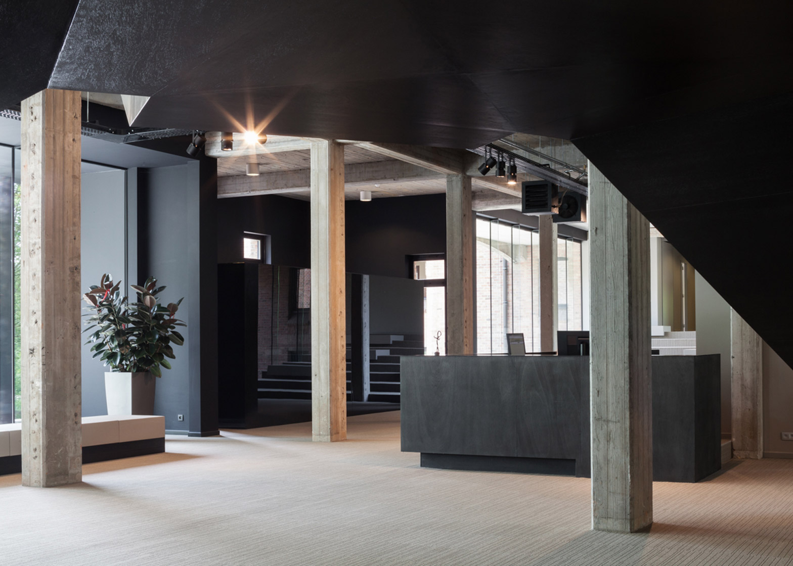
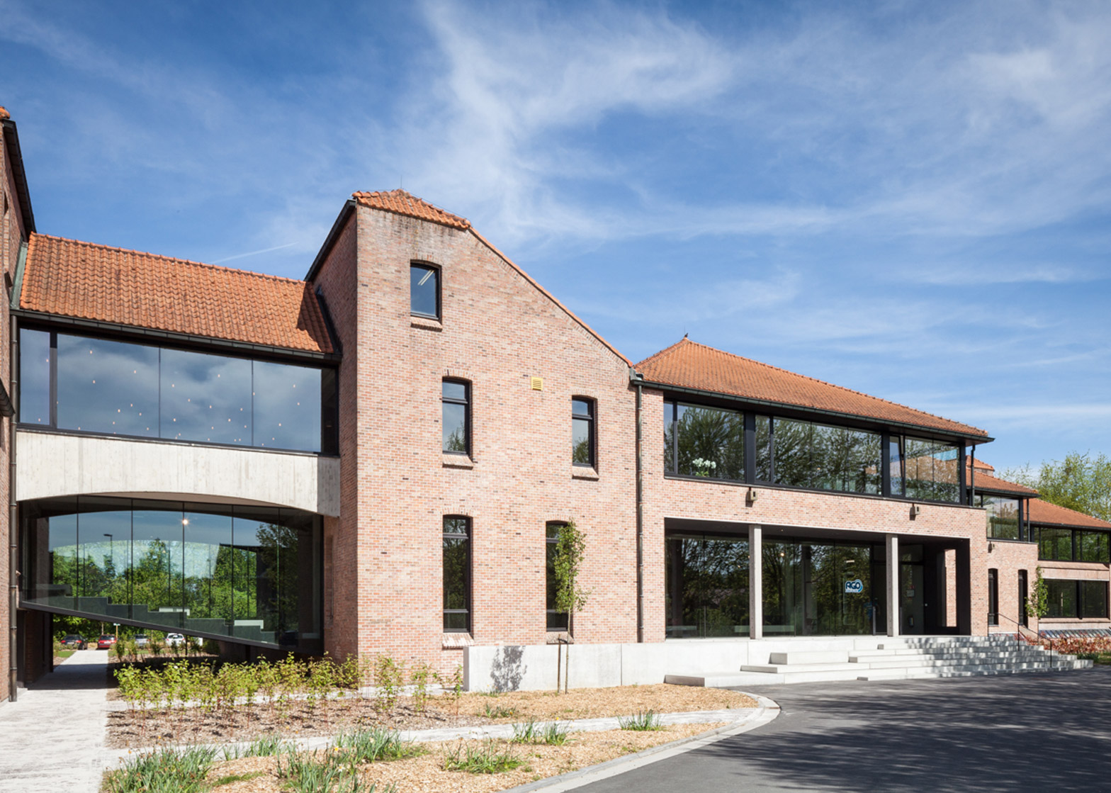
A multi-directional black staircase bridges the main entrance space in this converted office building in Belgium (+ slideshow).
Having outgrown its previous offices, temping agency Ago purchased a former telecoms building near central Kortrijk and invited local studio Steven Vandenborre Architects to oversee its refurbishment.
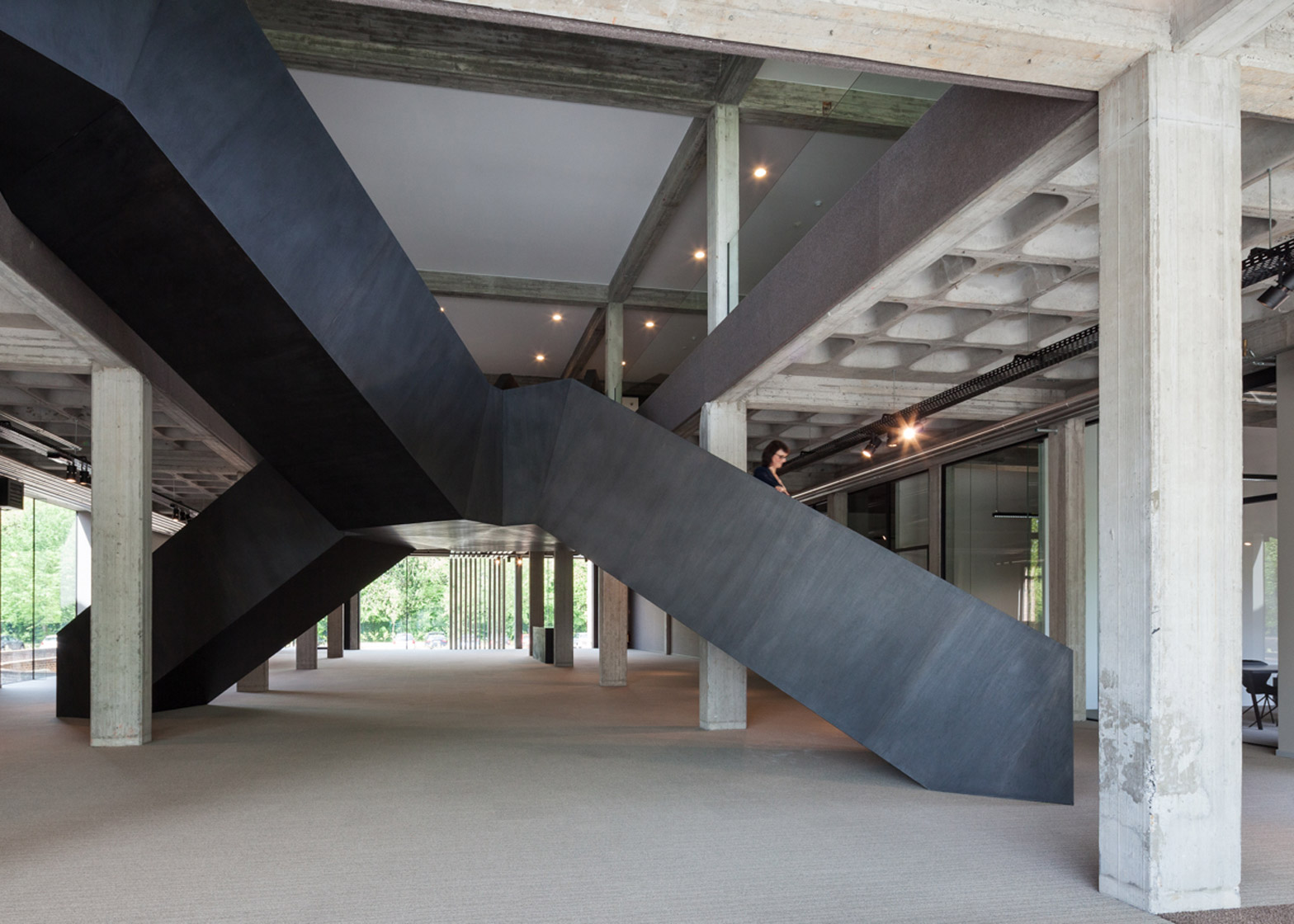
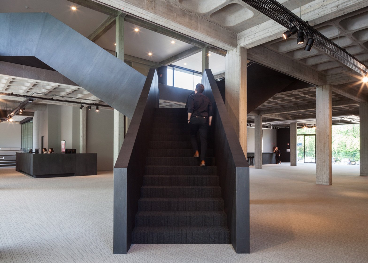
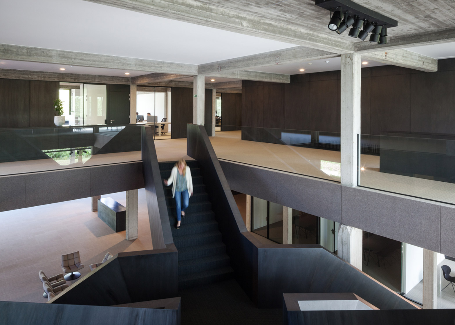
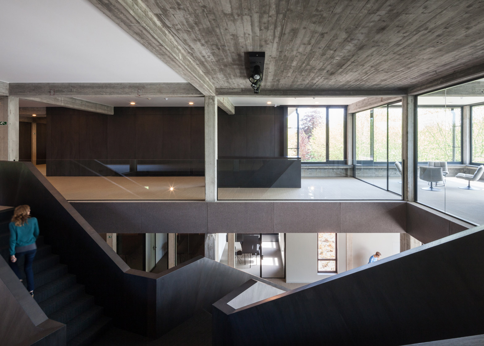
Vandenborre designed a monumental bespoke black staircase as the main feature. Two flights of steps rise up to form an angular arch over the ground floor before splitting off again in opposite directions, connecting to the upper level.
The architect – whose previous projects include a concrete and glass poolside extension to a 1970s villa – incorporated a variety of elements more typically found in public spaces in his plan for the building. These include steps with built-in furniture, and promenade and square-like spaces.
"Because of the scale of the building, the interior design of the new offices was based on a small city where you walk, work, sit and dine like in a real city," said the architect.
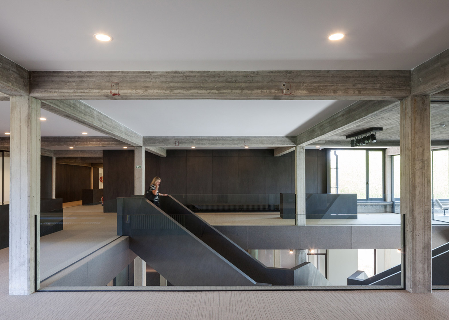
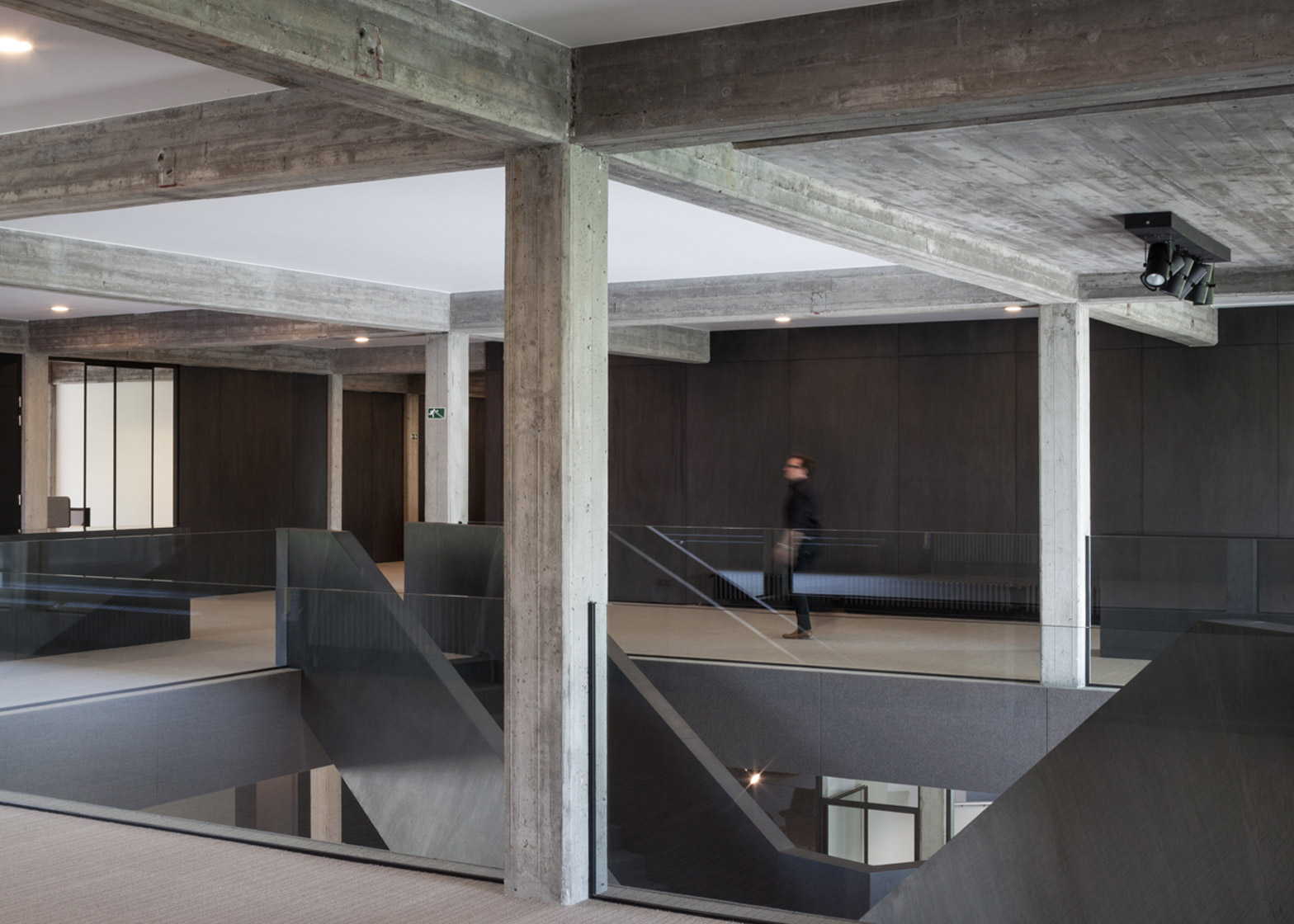
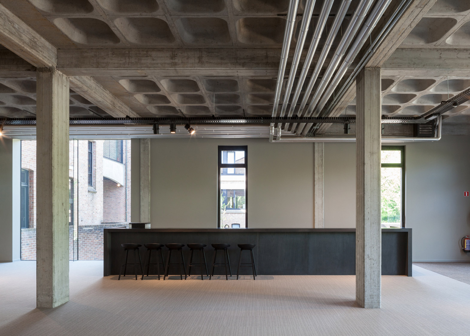
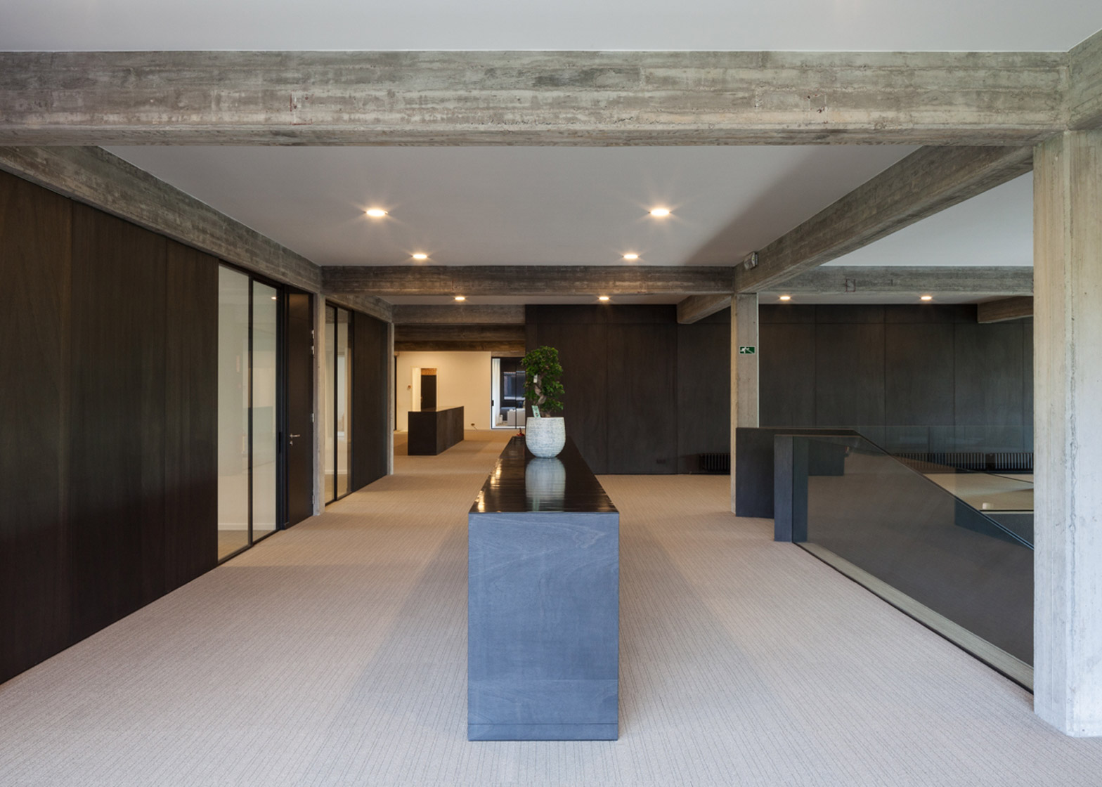
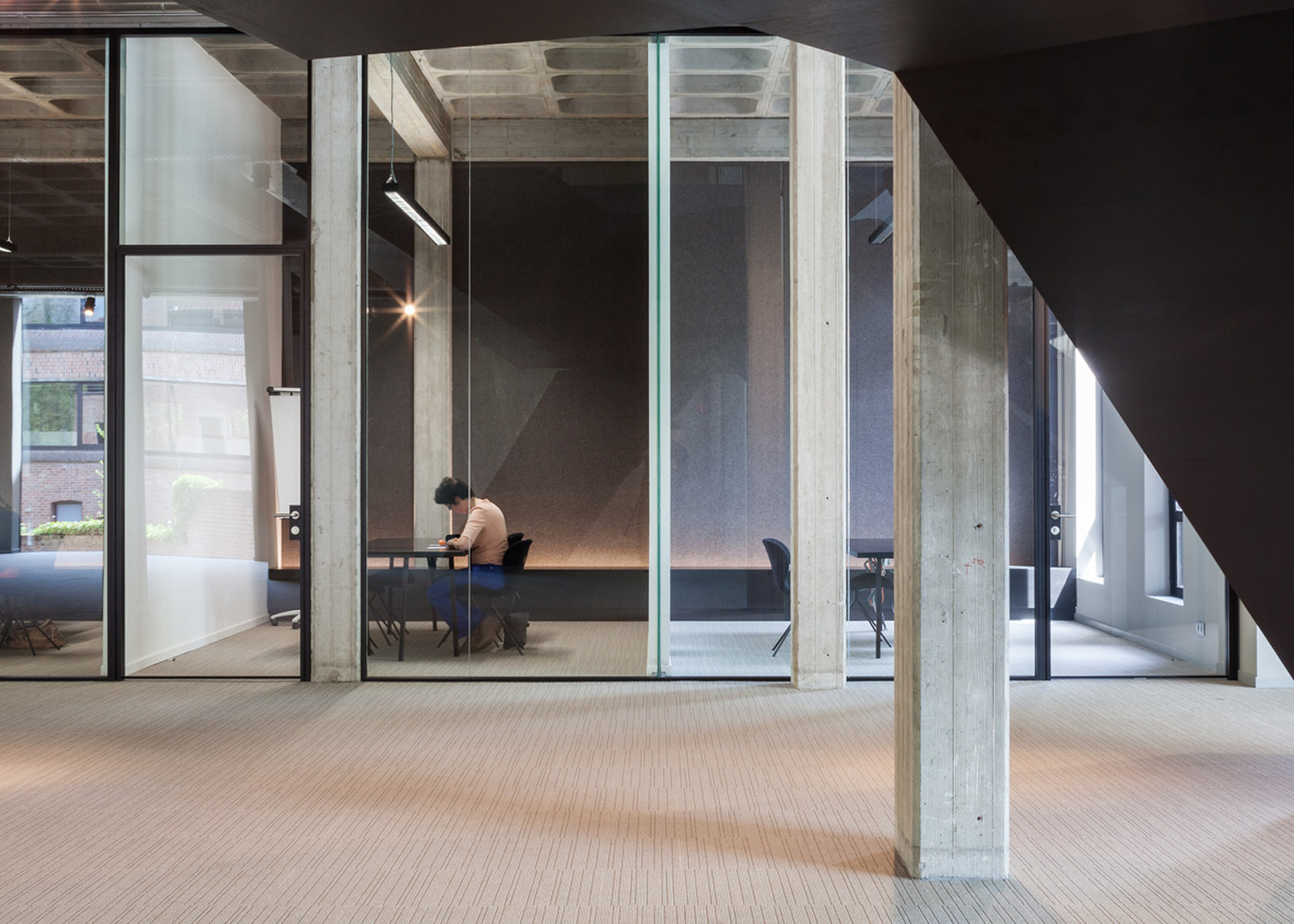
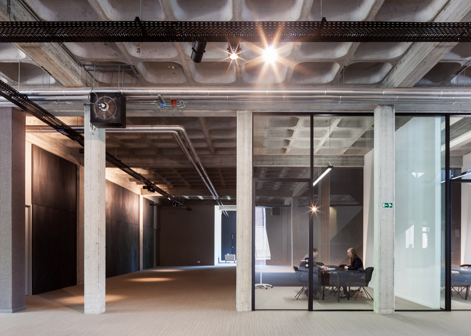
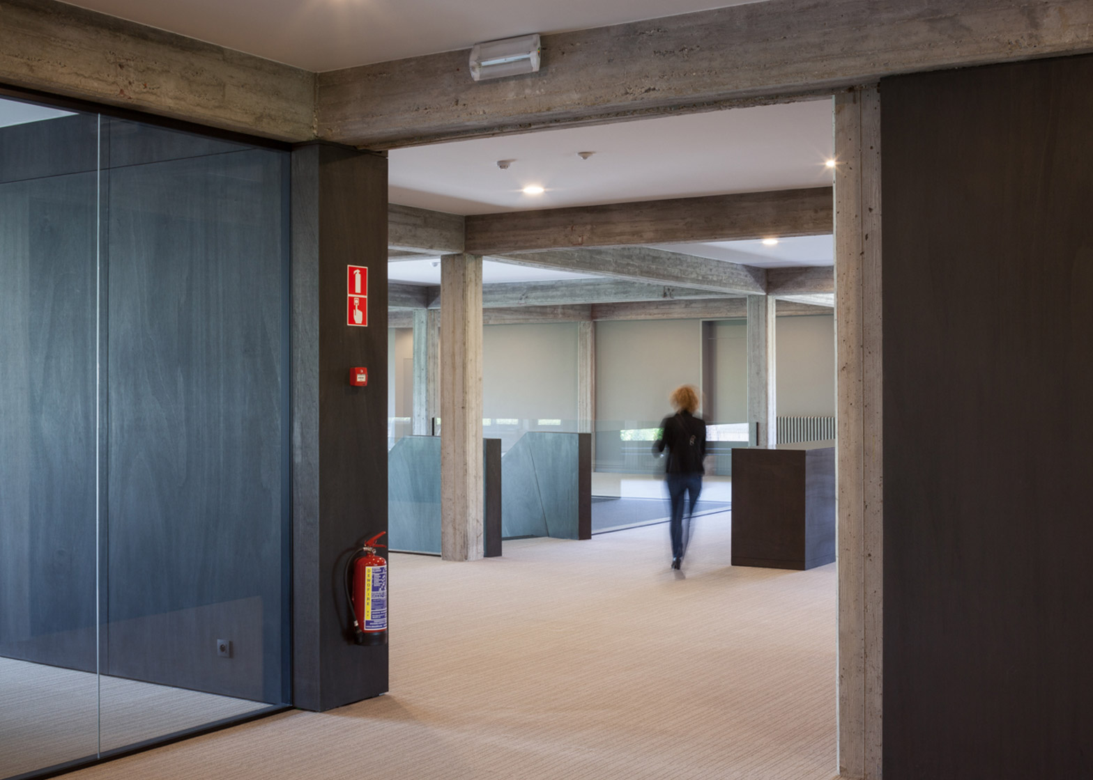
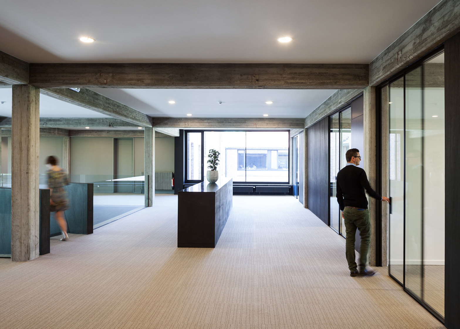
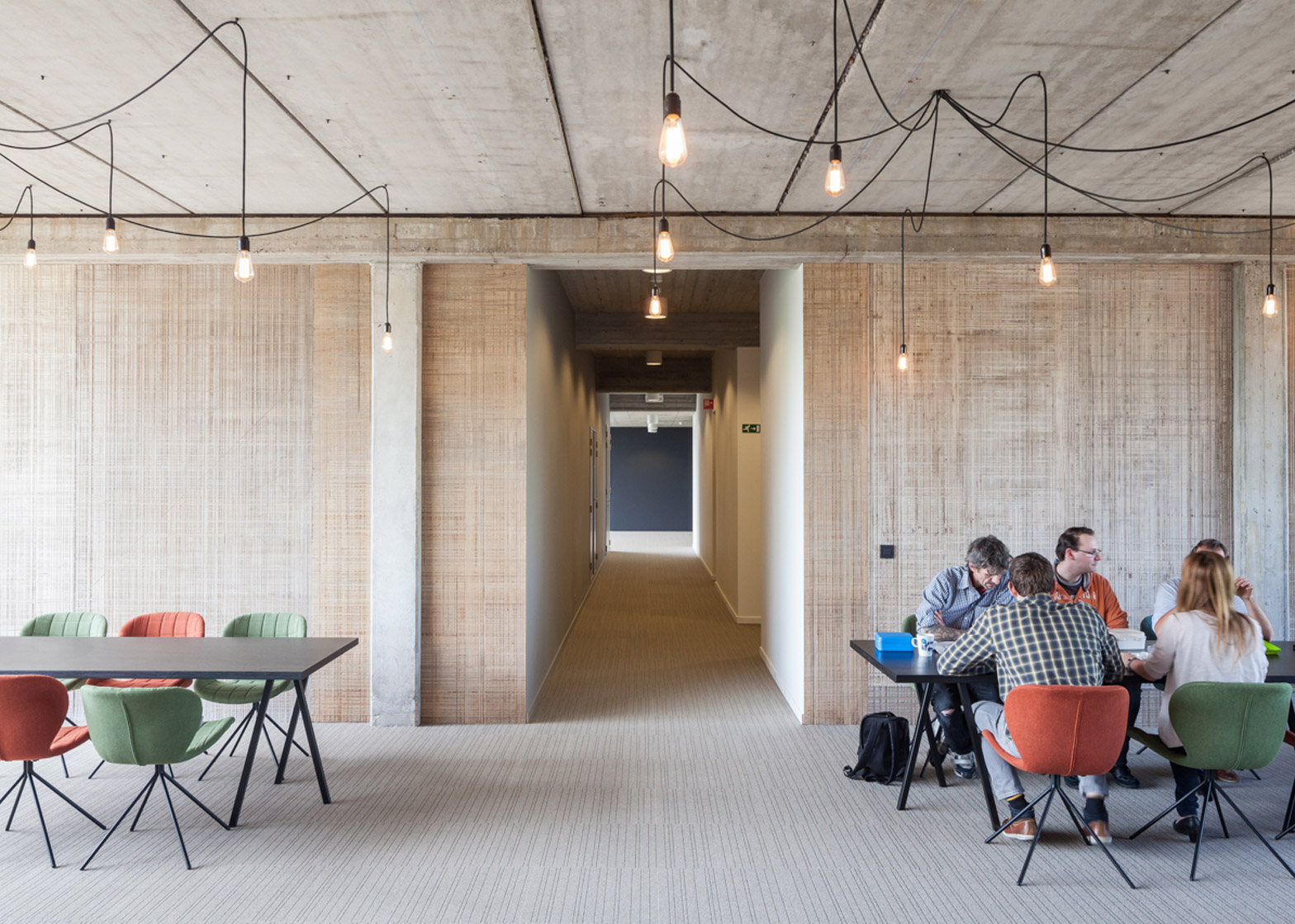
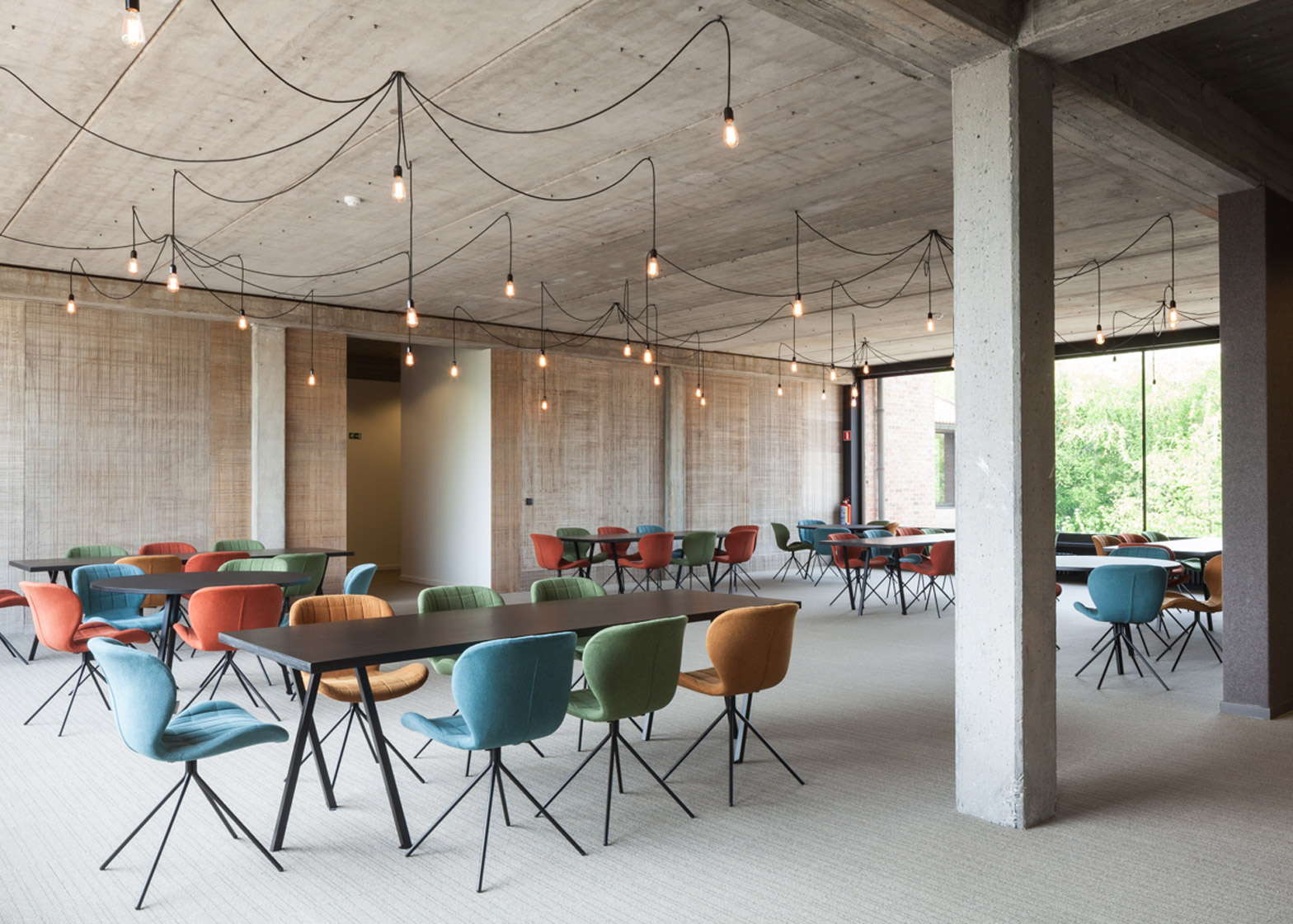
He stripped the interior back to its raw concrete structure and focused on creating a communal space that extends like a promenade through both levels of the building.
"The main goal of the design was to eliminate all disturbing objects and to make a feature of the typical character of the building, like the concrete columns, concrete floors, big spaces and large panoramic windows," Vandenborre explained.
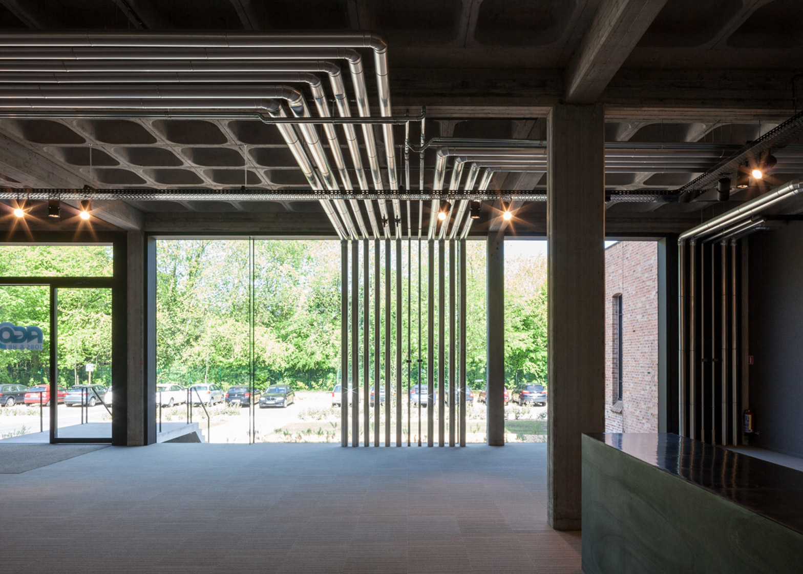
A hole was punched through the first floor to create a double-height entrance area, with large windows added on either side.
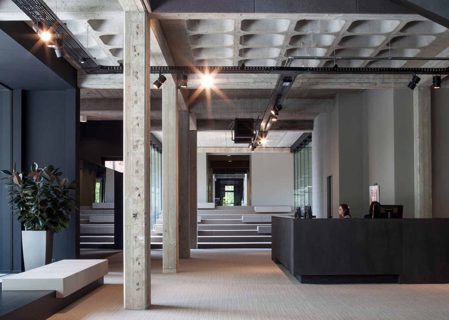
The resulting brightly lit space is interrupted only by the stairs and is intended as a public zone where staff can stop for informal meetings or lunch breaks. Larger events such as lectures and parties can also be conducted in this area.
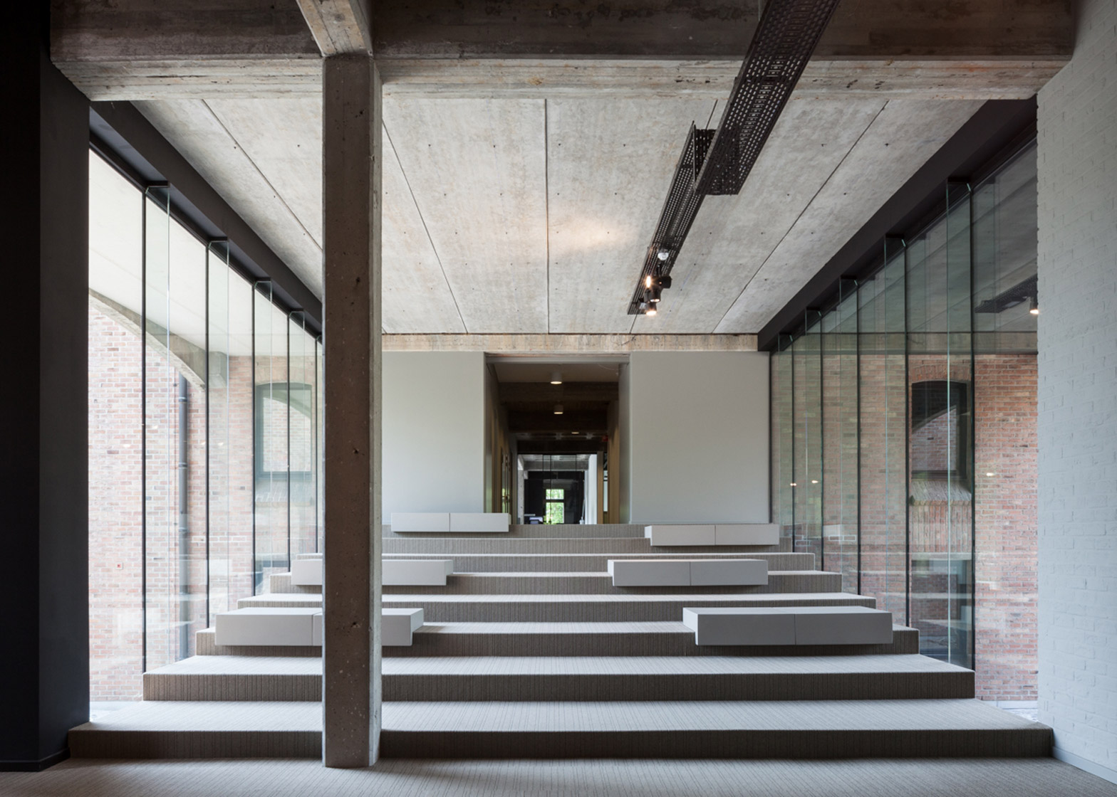
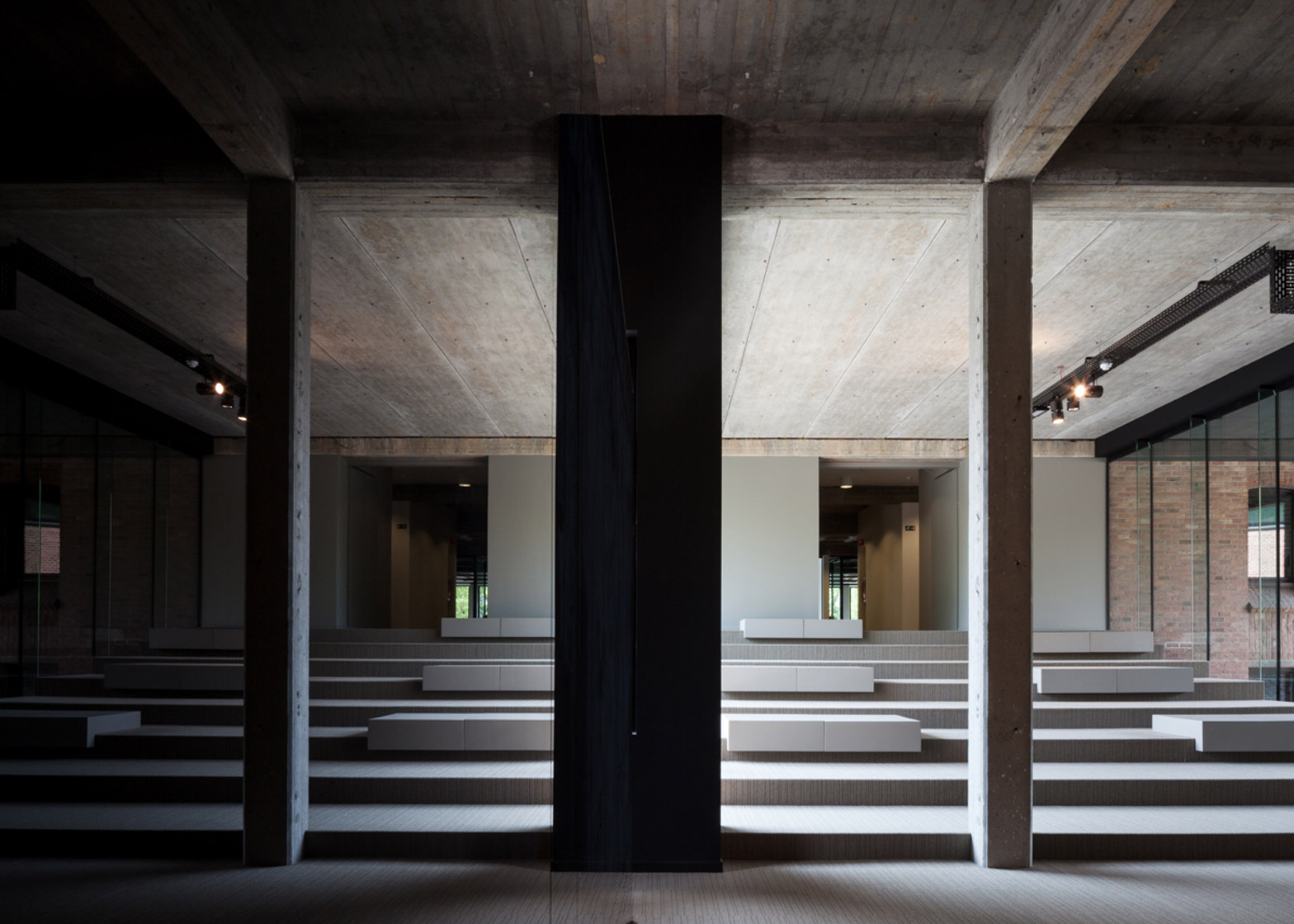
On the opposite side of the reception desk, a set of steps leading to offices in one of the building's wings incorporates benches so it can be used as an additional meeting or breakout space.
Glass walls fill the corridor with natural light and provide views to either side. Office spaces are also partitioned with glazing to help maintain light levels throughout the building. Mirrored surfaces, exposed pipes and bare light bulbs add to the industrial aesthetic.
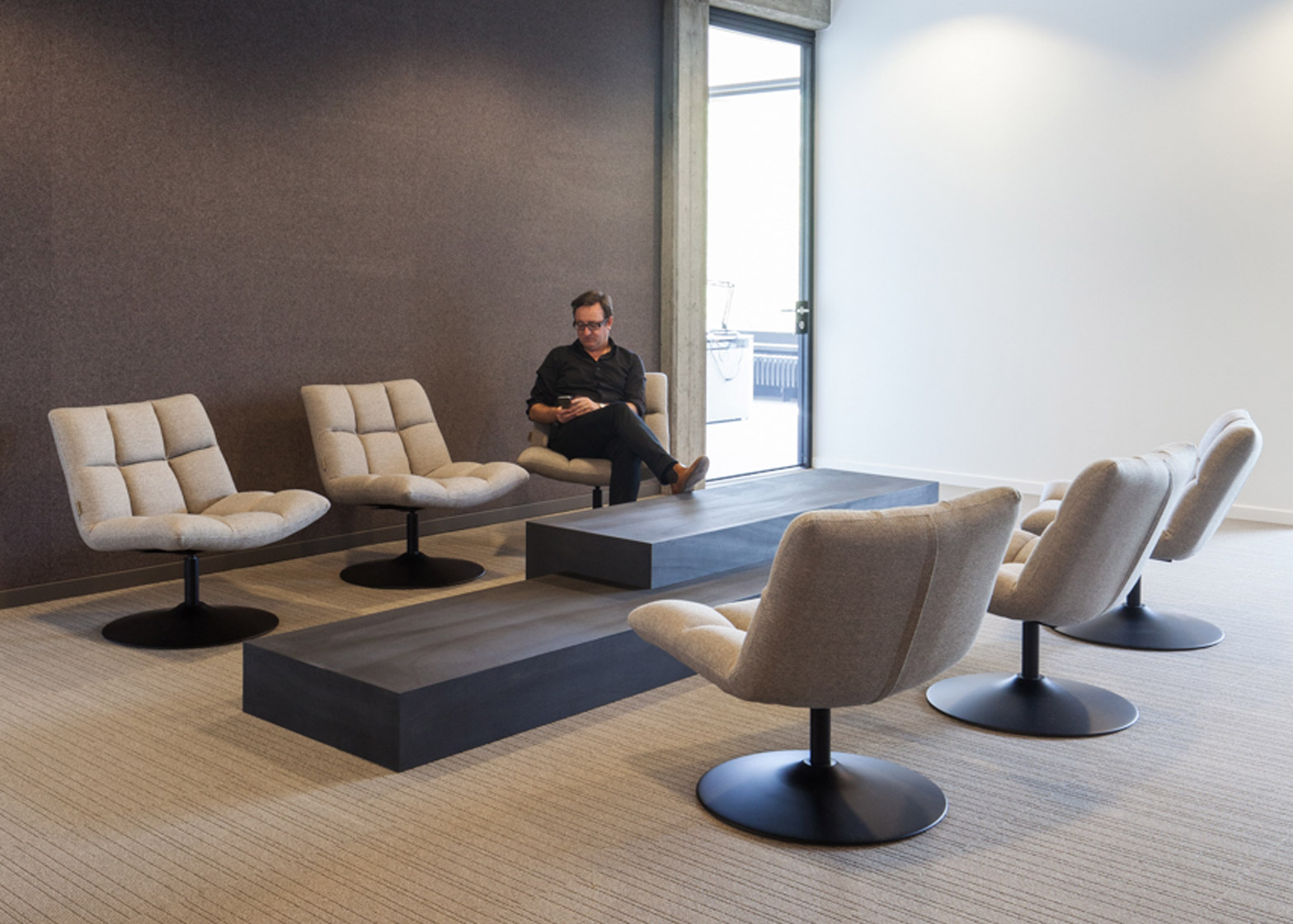
Dark stained-wood furniture and felt wall coverings introduce texture. The felt also helps improve the acoustics of the rooms, while a subtle stripy pattern on the carpets references the existing board-marked concrete surfaces.
"The overall look is a balance between an exciting old structure, open spaces and a luxurious work place," claimed Vandenborre.
Other industrial office conversions published on Dezeen include a converted warehouse in London with furniture and artworks made from reclaimed objects, and an office for a German conveyor-belt company featuring aluminium mesh partitions.
Photography is by Tim Van de Velde.

