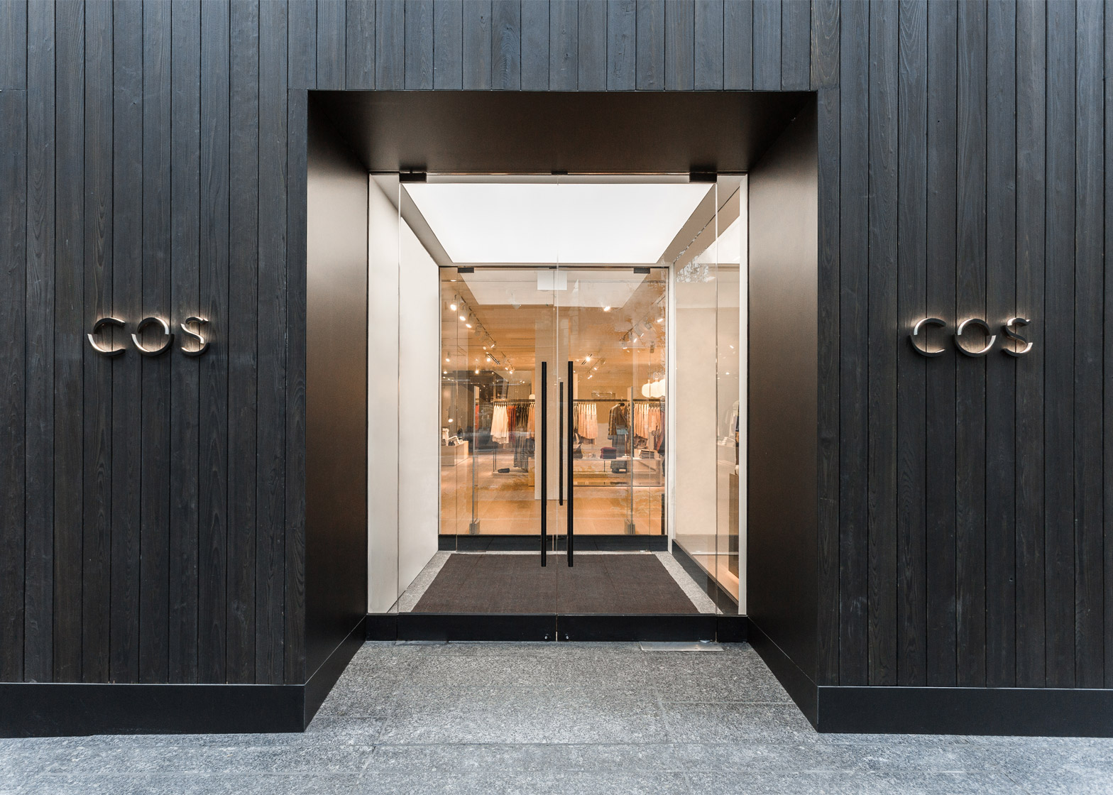
Fashion brand COS has opened its first Canadian store, concealing a minimal-looking interior behind a blackened cedar facade (+ slideshow).
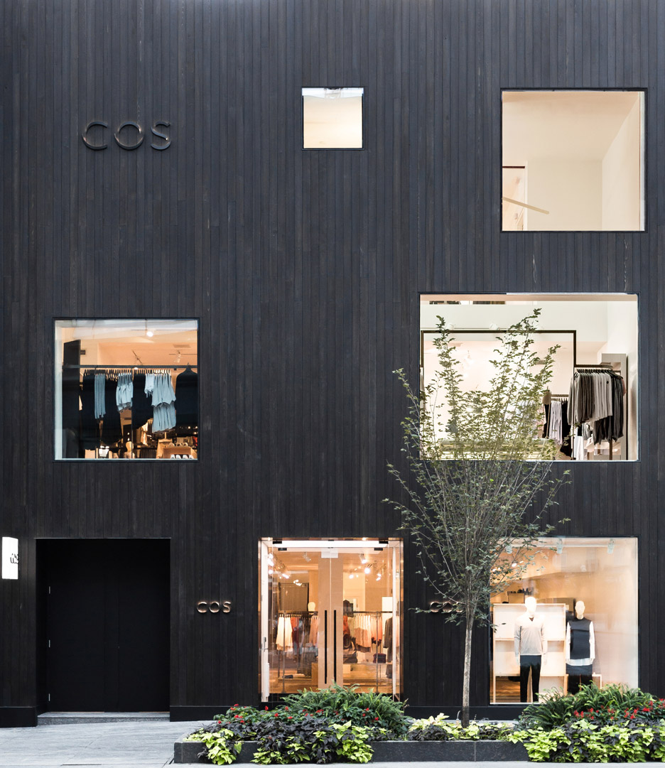
The shop is located on Bloor Street West, one of Toronto's main shopping streets and home to the Royal Ontario Museum, with an extension by architect Daniel Libeskind.
To help the shop stand out from its neighbours, COS' team of in-house architects designed the storefront using an ancient Japanese technique called Shou Sugi Ban. This preserves cedar through charring, giving it a blackened colour.
The material is becoming increasingly popular in architecture projects, with Cheshire Architects using it to cover a pair of holiday homes in New Zealand.
"The technique was chosen for its proficiency at sealing and preserving wood and making it significantly more fire-resistant," COS told Dezeen. "The Toronto store is the only COS store to use this technique."
Soft warm-coloured lighting from within the store shines through five square and rectangular windows that puncture the face of the building.
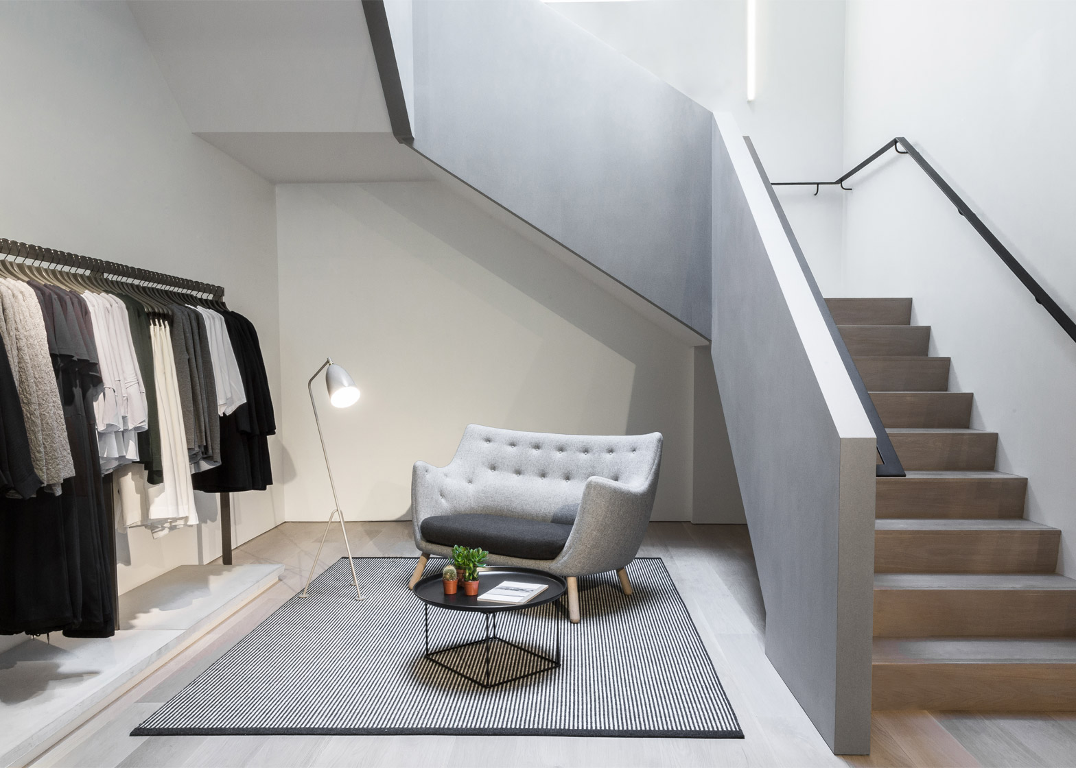
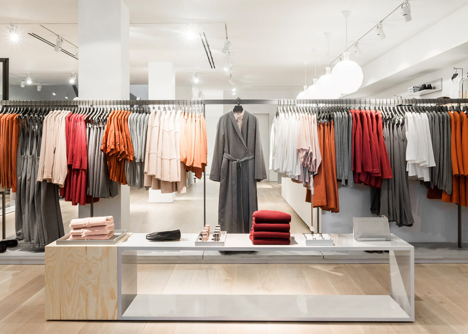
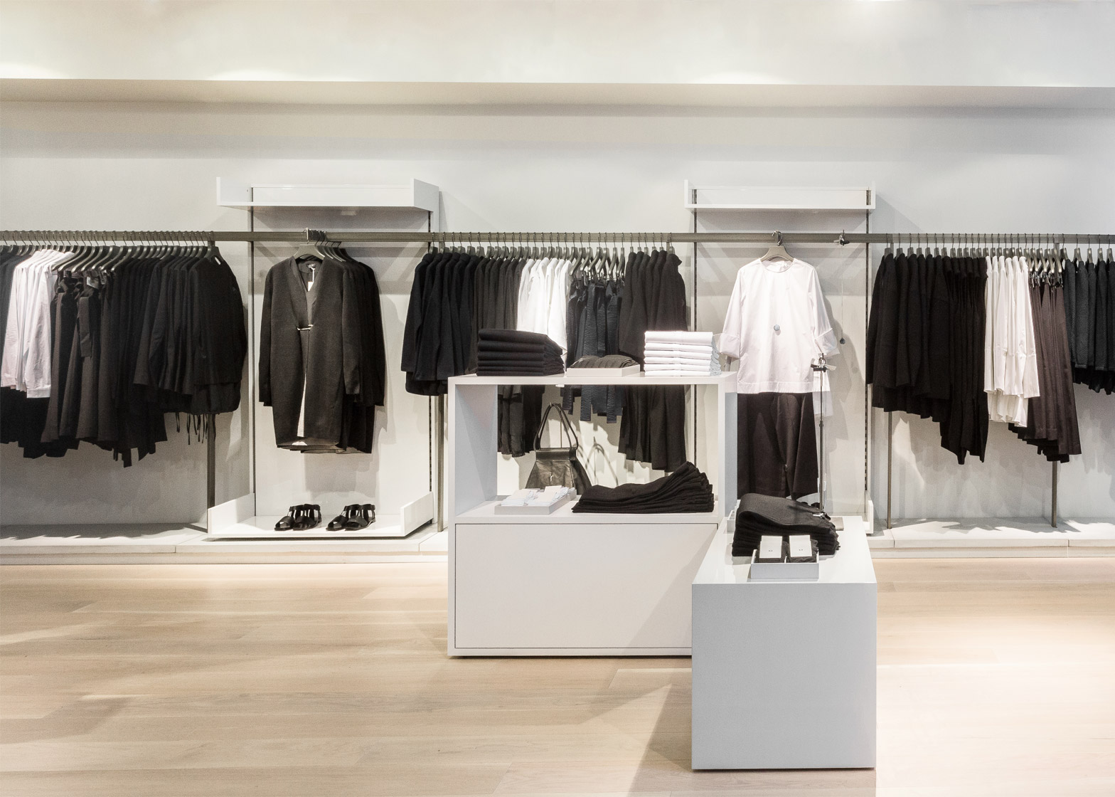
On the inside, mid-century design informed the choice of materials and colour schemes. Fittings are minimal to ensure focus remains on the collection.
"We used accent colours against neutral nuances for those unexpected twists and materials that create a clean aesthetic such as concrete, steel, brick, zinc, wood and copper," they said.
"As a brand we all work with the same inspirations and starting point, we look to Mid-Century Modern design; we love a pared-back Scandinavian design aesthetic and are all inspired by the art world," they added. "In effect the store acts like a blank canvas to showcase the collection."
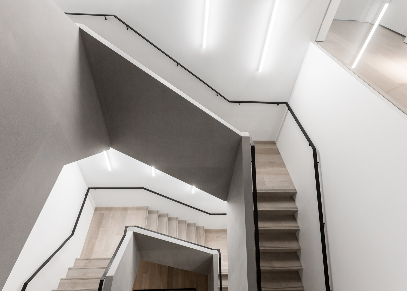
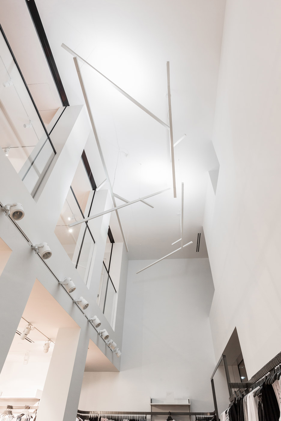
The architects installed a skylight at the top of the staircase that cuts through all three floors to help fill the shop with natural light.
A lighting fixture by Italian company Artemide is suspended over the top of the staircase, and is made up of varying lengths of florescent bulbs.
"When selecting furniture for the store we chose brands that we feel have a similar aesthetic to COS with functional and tactile products," they said.
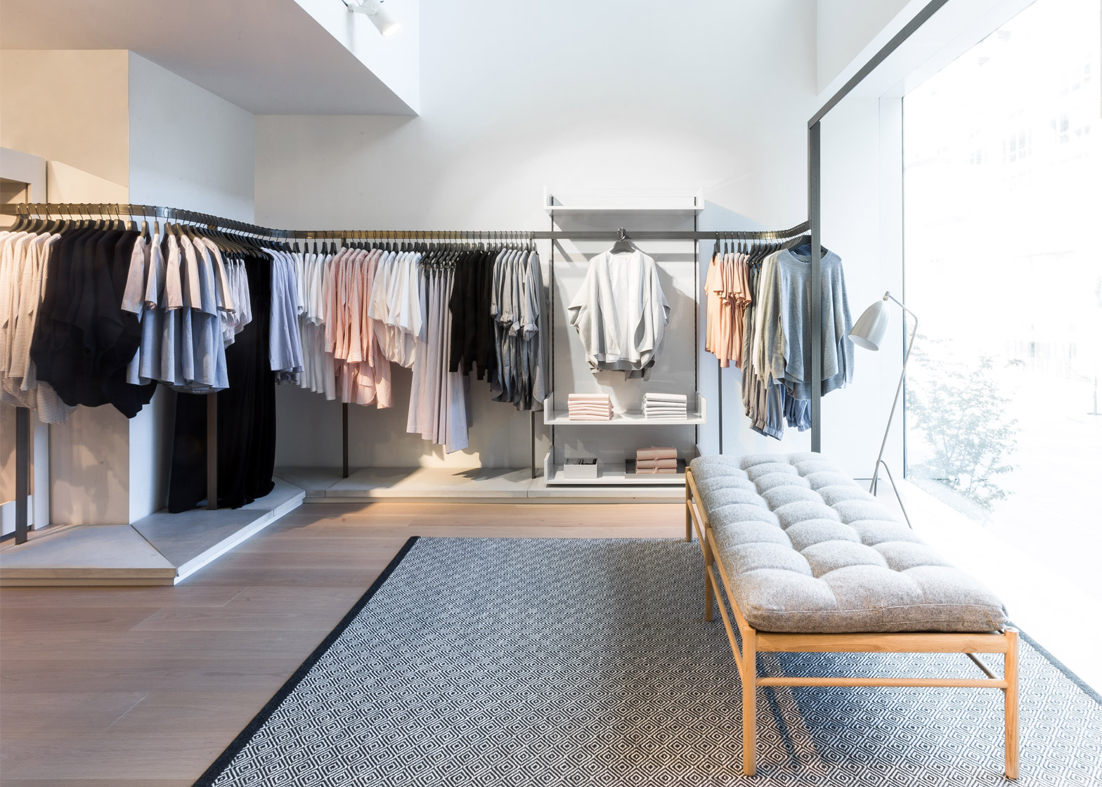
Clothes hang on railings made from square metal tubes, which also help divide the space. This design is common across COS' stores.
"We have the four different concepts within our collection, so the idea was to create rooms within rooms," COS managing director Marie Honda told Dezeen in a 2014 interview. "That's why we have the metal rails and we don't have any fixed walls."
Recently, Brooklyn studio Snarkitecture created a pop-up shop for the brand in LA using pink-hued steel sheets and mirrored walls.

