Leading American typographer Tobias Frere-Jones has released his first type design since splitting with his business partner Jonathan Hoefler.

The release of the Mallory typeface marks the launch of Frere-Jones' own company, Frere-Jones Type, following the dissolution of his creative partnership with Hoefler in January 2014.
Together the pair had run Hoefler & Frere Jones – one of the world's largest type foundries – which was responsible for the Gotham typeface used by Barack Obama in his 2008 presidential campaign. When they spilt, Frere Jones filed a $20 million lawsuit against Hoefler claiming he had been cheated out of half of the company, which has since rebranded as Hoefler & Co.

Mallory – called after Frere-Jones' own middle name – began as an experiment in blending British and American typographic traditions, prompted by the designer's American father and English mother.
The sans-serif design features eight weights, from Thin to Ultra, and 26 styles. The heavier weights feature subtly angled cuts, while the lighter weights are more calligraphic.
"The first is tidy but potentially cold, the other is friendly but sometimes too casual," said Frere-Jones. "The idea was to isolate the best aspects of these genres and combine them. The end result is a 'permissive' geometric, one that is both orderly and approachable."
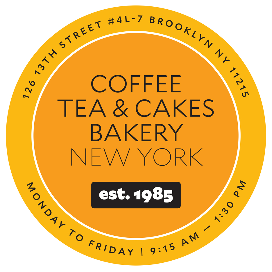
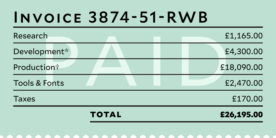
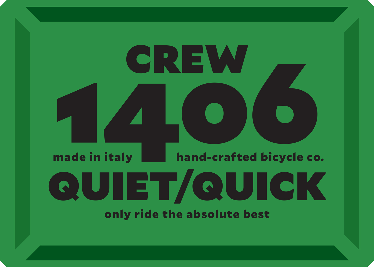
Created to be "a reliable tool", Mallory is designed to be paired with other typefaces, and used for a multitude of outcomes including visual identities, packaging, publishing or presenting complex data.
The typeface includes small caps, and supports 72 languages. Alternate characters are also available, including substitute tails for the q, and different versions of the pilcrow paragraph mark.
The design can also be purchased in a MicroPlus version which features wider letter spacing and taller lowercase letters, tailored to low-resolution or small-screen environments such as the Apple Watch, as well as tiny print sizes.
Other recent typeface releases include Monotype's Eric Gill superfamily, and Neville Brody's bespoke Horseferry and Chadwick designs for Channel 4.

