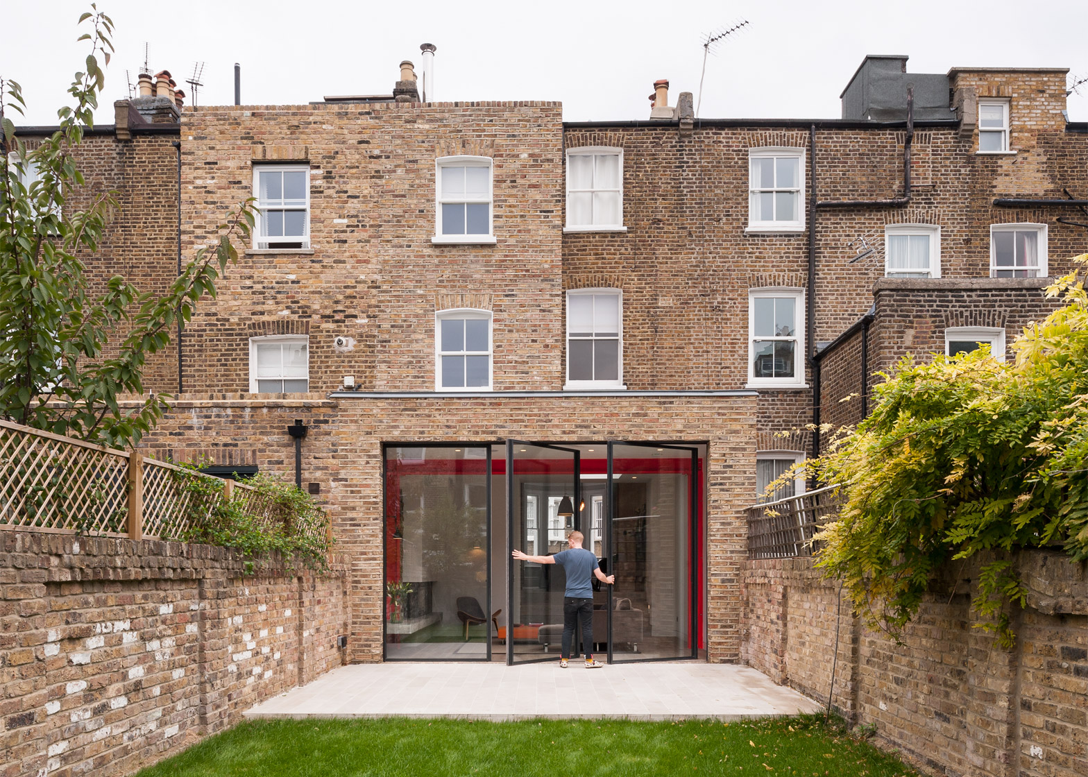
Beams supporting the rear extension of this Victorian house in west London are painted vivid red to create a bold contrast with the property's traditional interior.
Local studio Tigg Coll Architects completed the update of a tired terraced property for a young family in need of more space.
The house's location within a conservation area dictated that the addition must match the aesthetic of the existing building, so the architects specified reclaimed stock bricks and kept the forms simple.
But there was also a desire to introduce a sense of playfulness and contemporary character to the project, which was achieved through the use of contrasting materials and modern detailing.
"The house really looked as if it hadn't been upgraded since 1890," architect David Tigg told Dezeen. "We wanted to retain the external form, but where we added new extensions, we decided they should feel very different and contemporary."
The building was extended into the rear garden, where an outside toilet and shed were demolished.
A closet wing projecting from the rear facade was extended vertically to create two new upstairs rooms, including a study on the first floor and a family bathroom on the second floor.
Finally, a basement level was created by excavating beneath the existing floor. A lightwell at the front of the building enables natural light to reach the underground rooms.
Incorporating the new basement and the vertical extension at the rear of the building provided structural challenges as well as requiring a rethink of the house's internal spatial configuration.
"To make the rear space work we had to rearrange the levels above it from what would have been the original format whilst making it appear externally exactly the same as all the neighbours," Tigg explained.
"Internally the level differences were very tricky and required very thin floor thicknesses to enable an even set of internal spaces that all read nicely and appear well-resolved."
A change in level between the dining room in the old part of the house and the extension helps to give the new living area a sense of intimacy and separation, whilst increasing its vertical volume.
Original details like cornicing and traditional skirting boards help retain the ornate character of the existing rooms, while details such as flush or recessed skirting give the new spaces a more minimal aesthetic.
Slimline, pivoting glass doors are set into the new rear elevation. The three-metre-high glazing ensures that plenty of daylight reaches the centre of the house, and creates a line of sight between the outside areas at the front and rear of the property.
A muted colour palette creates a seamless transition between the old and new rooms, while the brightly coloured treatment of the exposed I-beams in the living room highlights its structure.
"In a lot of extensions of this type the structure is not expressed and is hidden away behind plasterboard and flush surfaces," Tigg added. "We wanted something that shows off that it is doing a huge amount of work holding up this extension above it."
Other details in the new space include a cantilevered concrete plinth that provides a bench and shelf, alongside an integrated wood-burning stove.
Tigg Coll's previous projects in London include a brick extension with glass doors that retract into the walls, and a staircase that combines open treads with a glass balustrade to let light filter down to the floors below.
Photography is by Andy Matthews.

