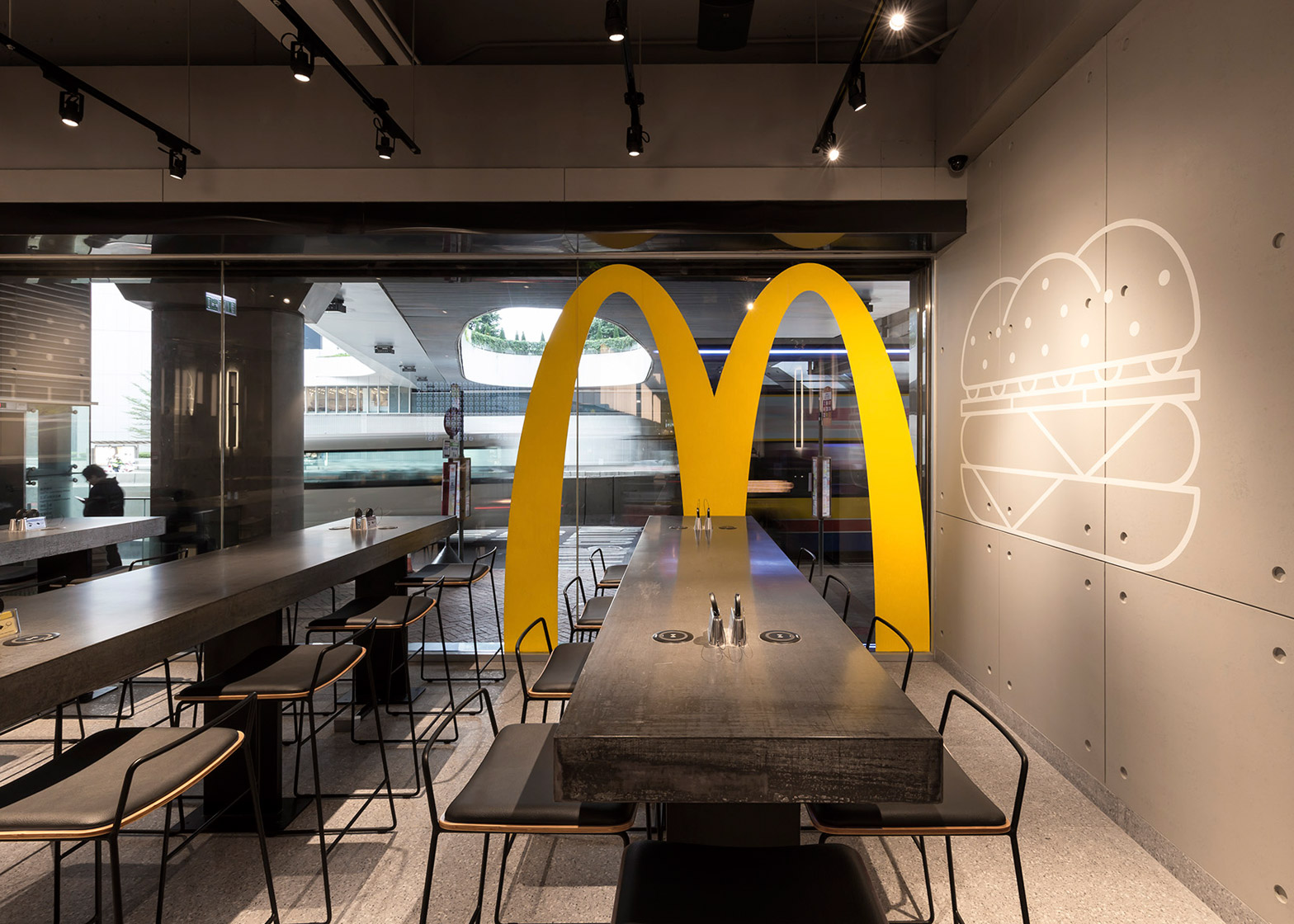
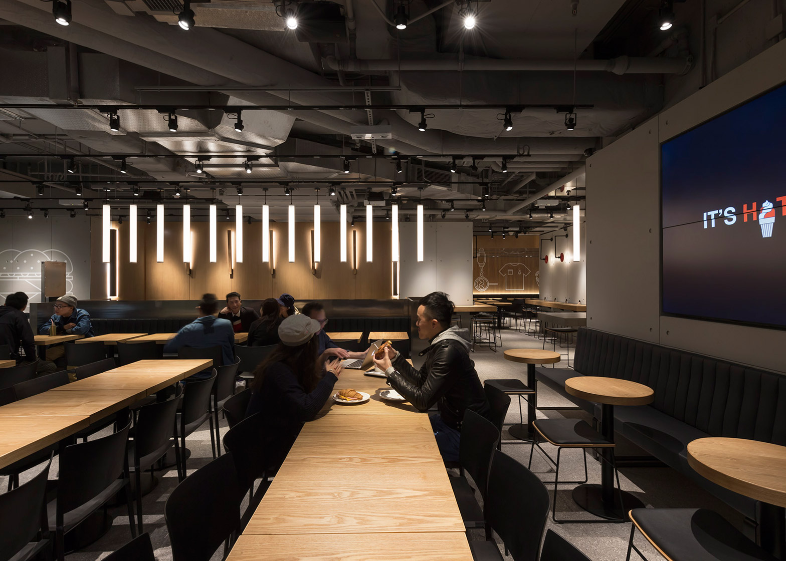
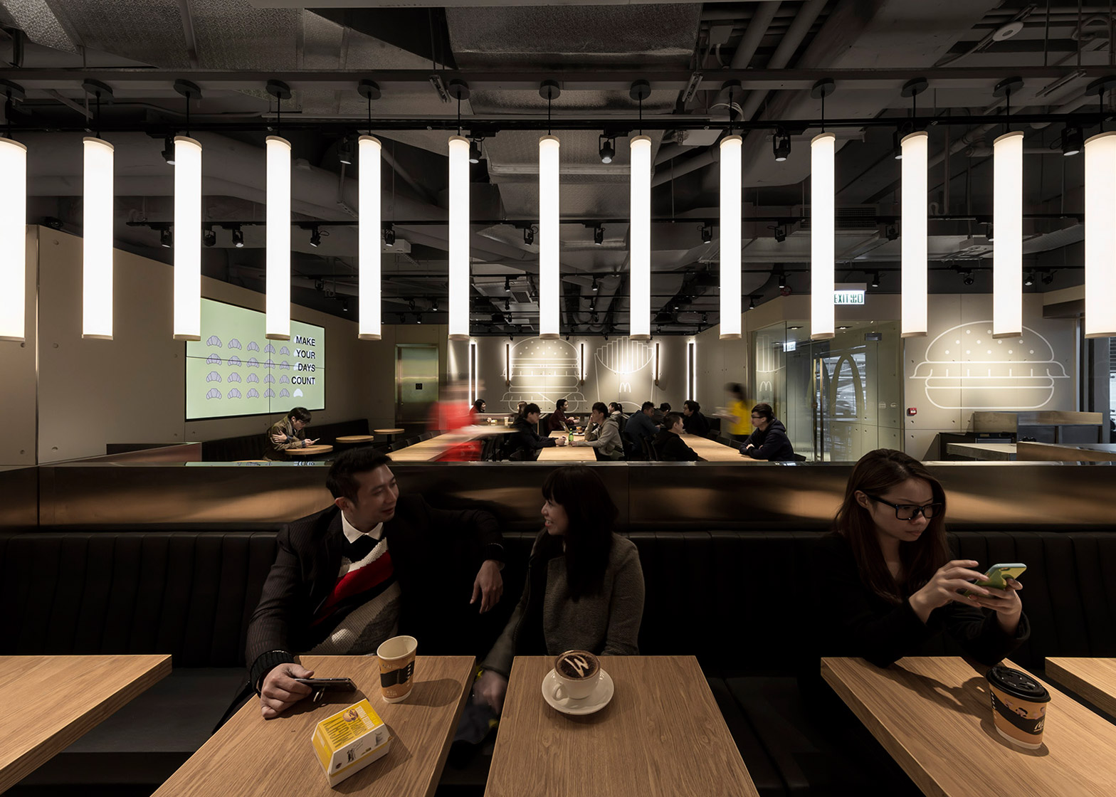
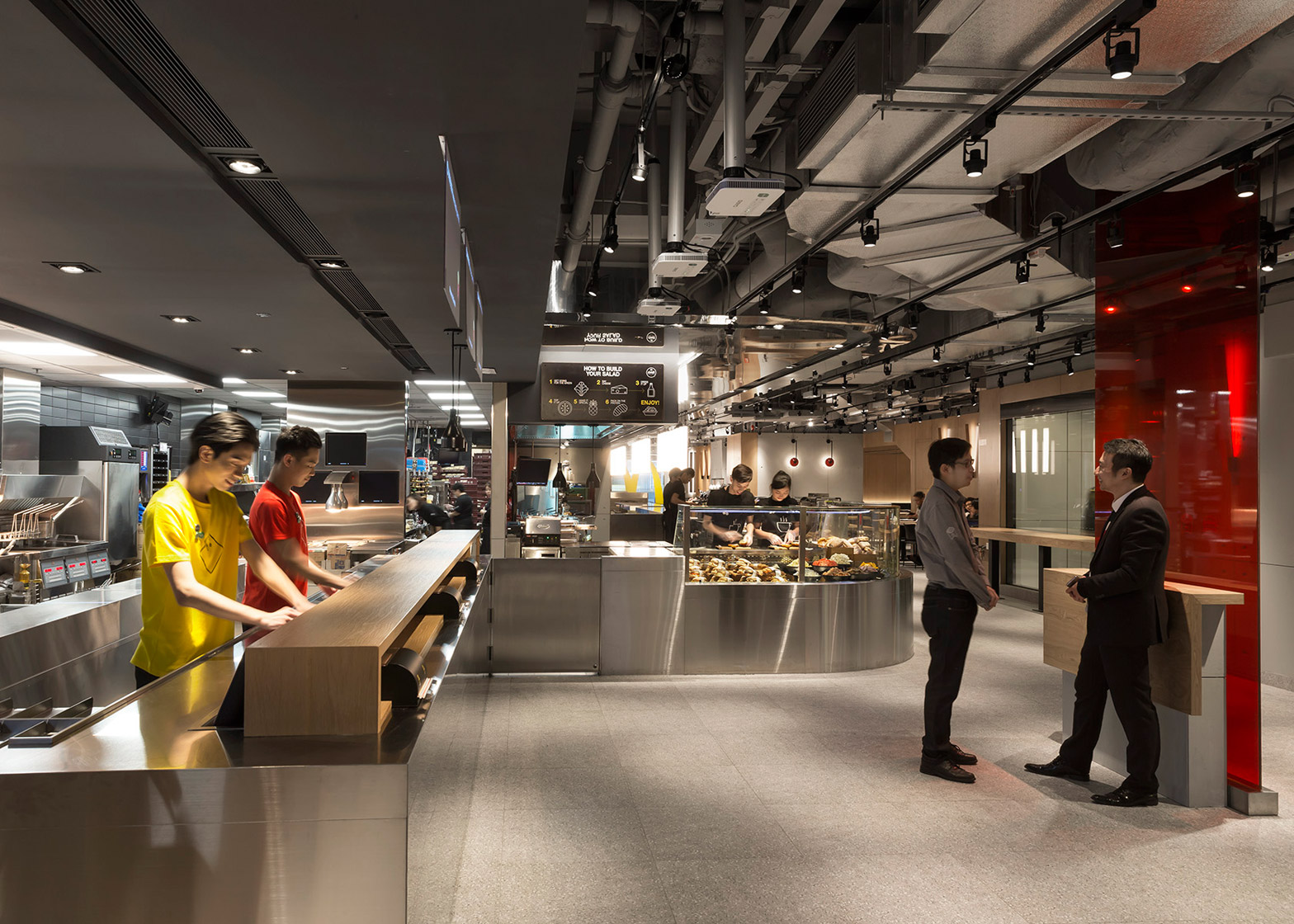
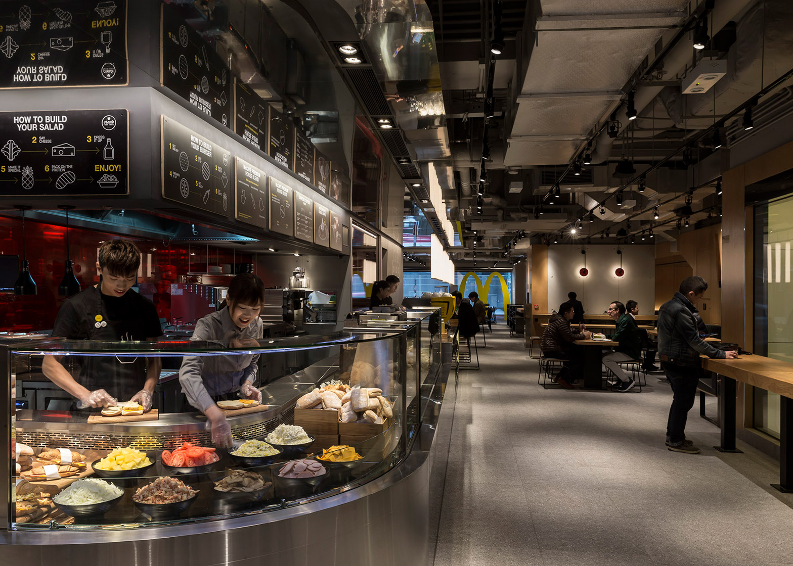
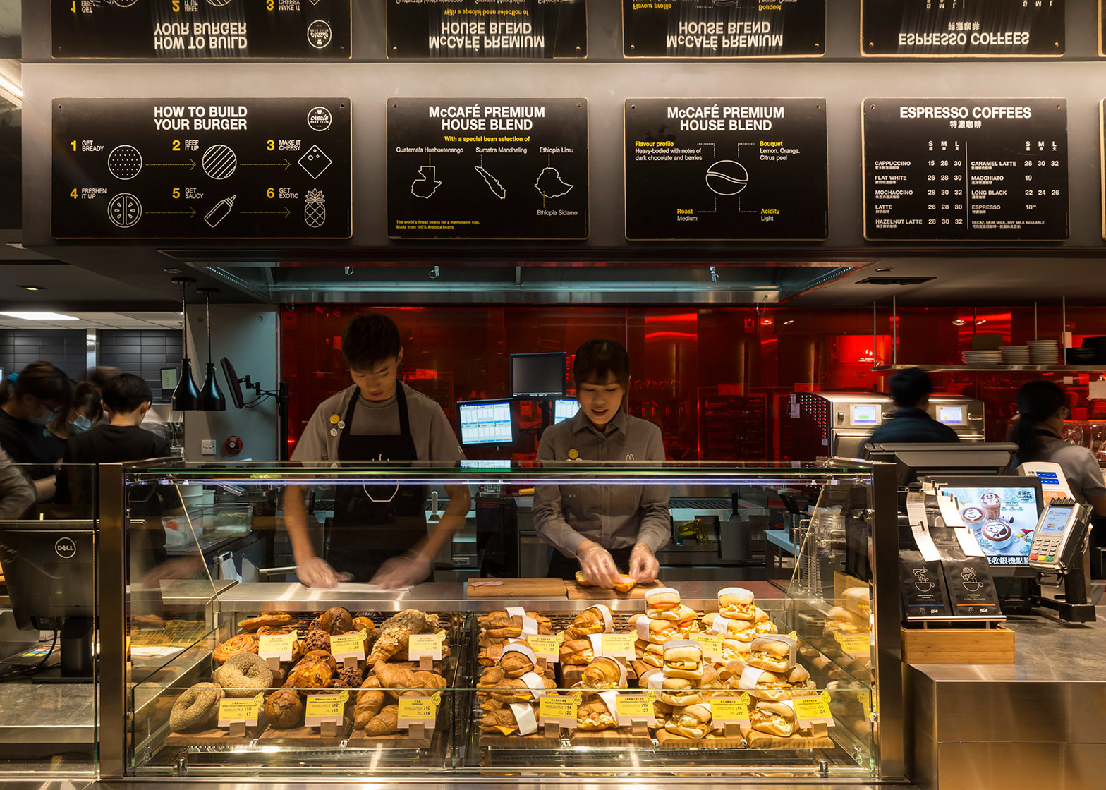
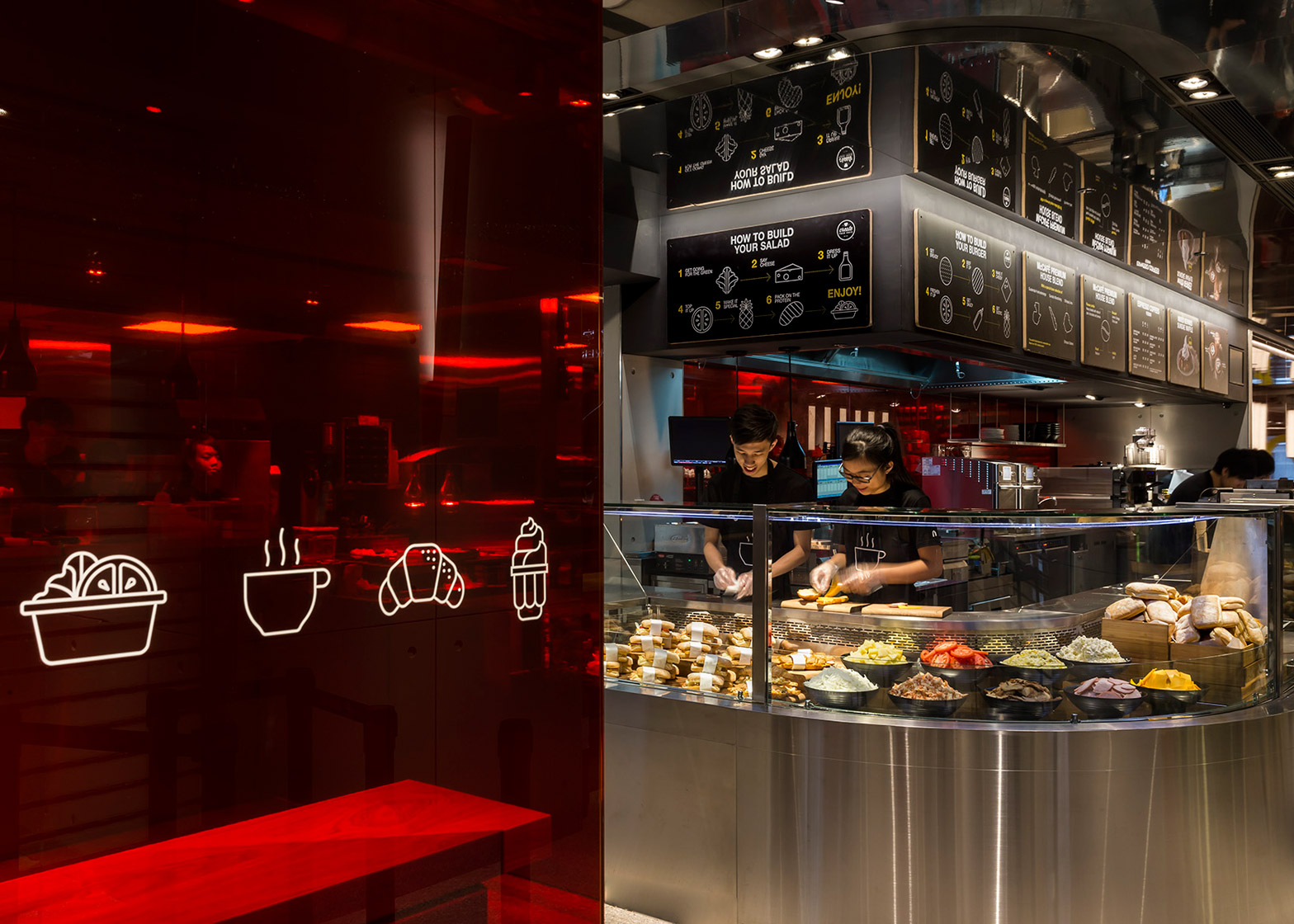
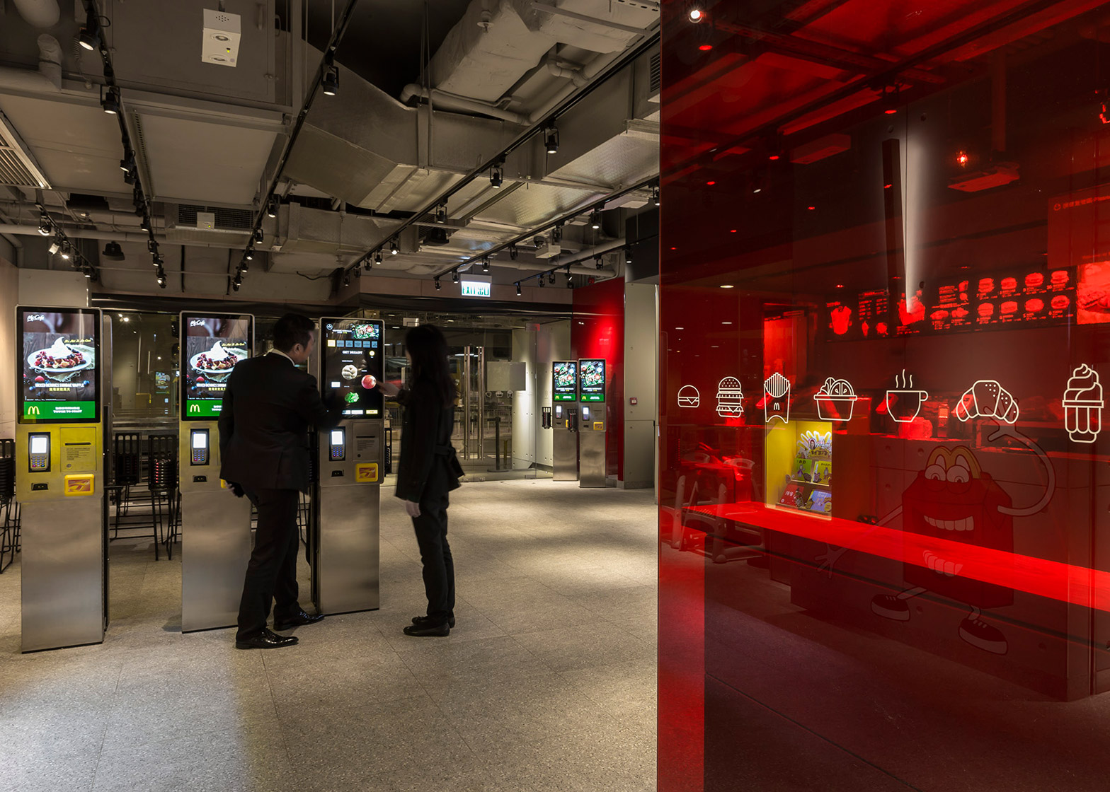
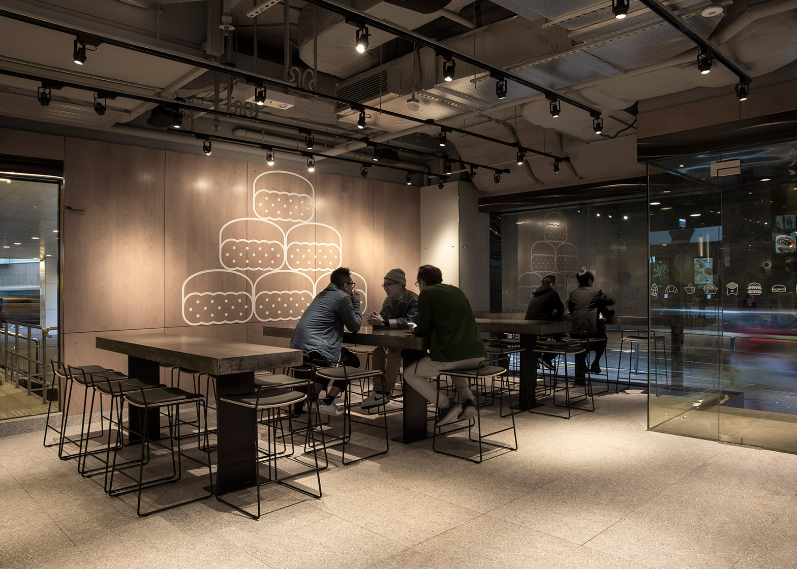
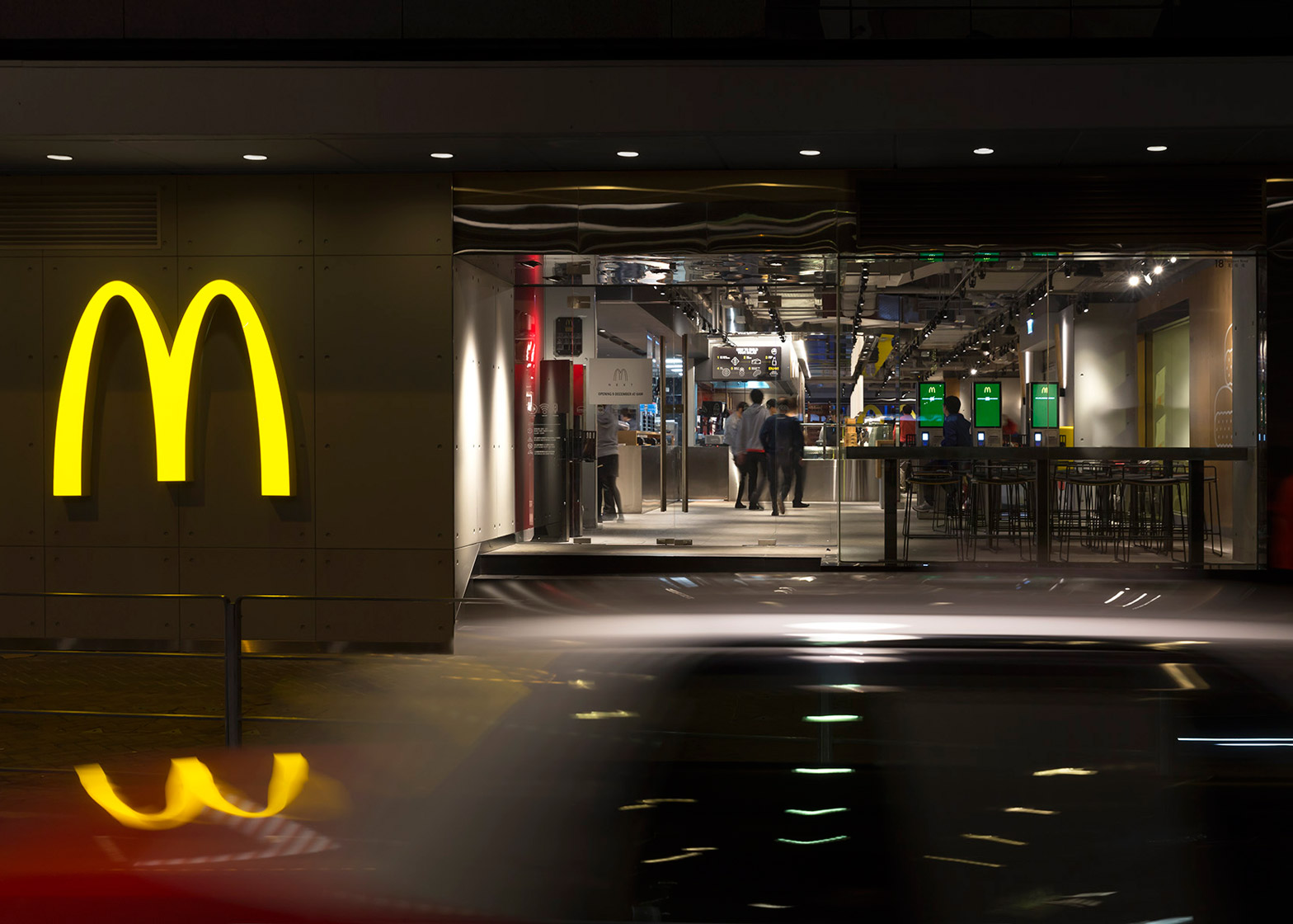
Concrete tables and atmospheric lighting feature inside this Hong Kong branch of McDonald's, designed by branding consultancy Landini Associates as an alternative to bright and colourful fast-food restaurants (+ slideshow).
Described by the Sydney studio as "an experiment in non-design", the neutral tones of the McDonald's at Hong Kong's Admiralty station are intended to provide a more comfortable setting for customers.
"The colourful graphic environments that became the signature for McDonald's internationally, are now replaced with a simpler, quieter and more classic approach," explained Landini Associates.
"The intention is to hero the food, the service and the people who come to enjoy it, and to create a 'recognisable neutrality' that allows this to happen," it said.
The redesign includes the restaurant interior and kitchen layout, wall graphics, product packaging and staff uniforms.
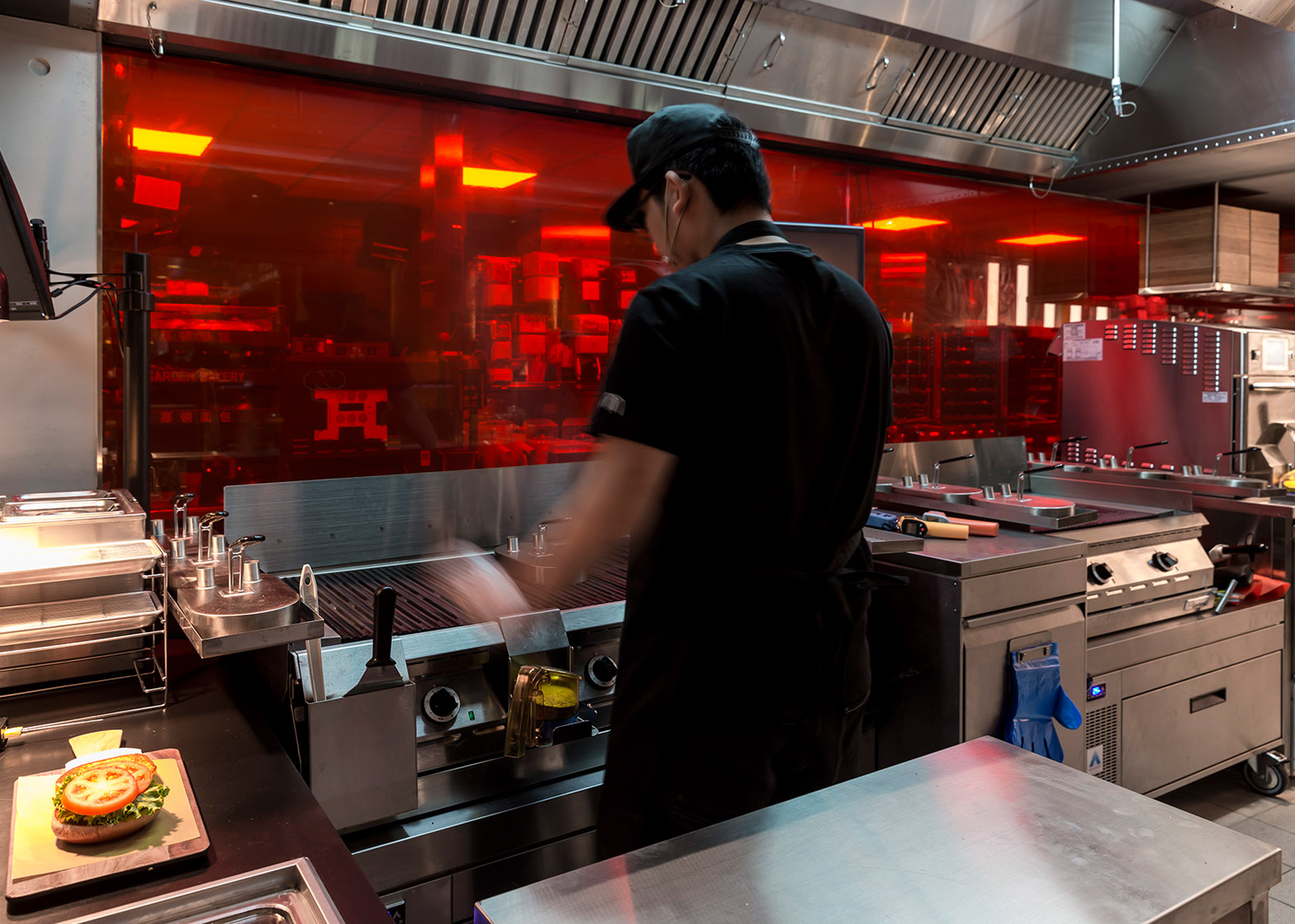
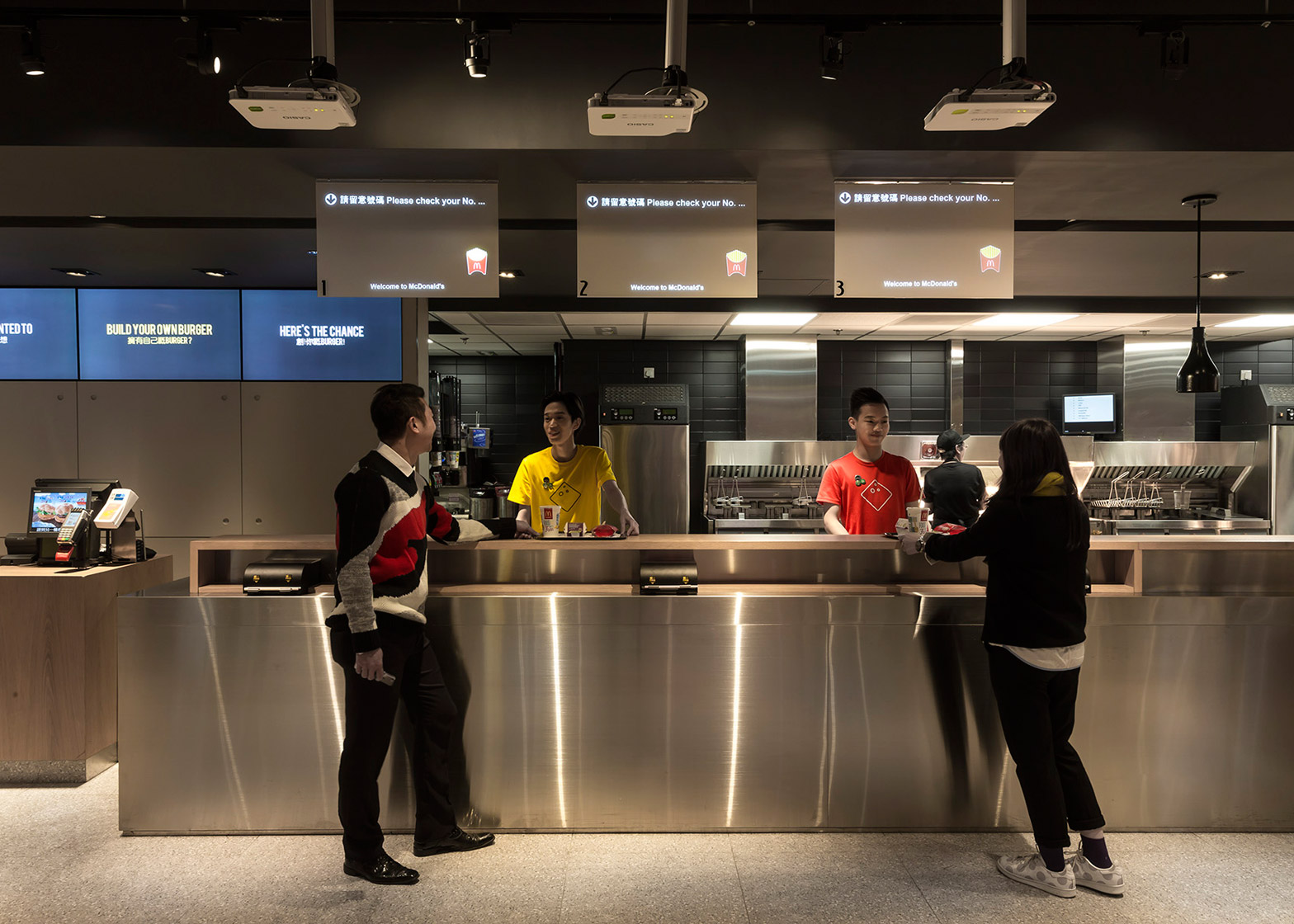
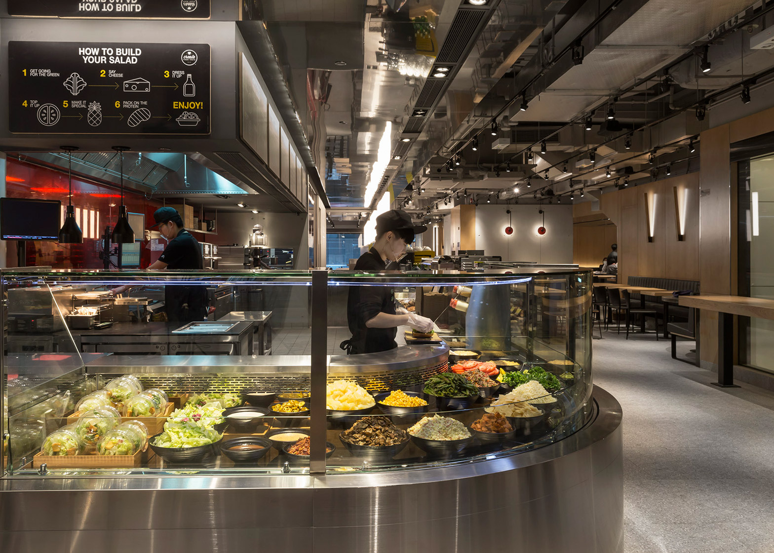
The biggest change is the shift from a closed kitchen to an exposed cooking area. Customers are able to watch the entire process of food preparation, including the grilling of the meat and the assembling of the burgers.
Very few areas are concealed from customers, but those that need to be are screened behind a wall of precast concrete panels.
Customers can either order their food at a standard counter, at a computerised kiosk, or at the table. There is also a cold service bar for salads, deserts and drinks.
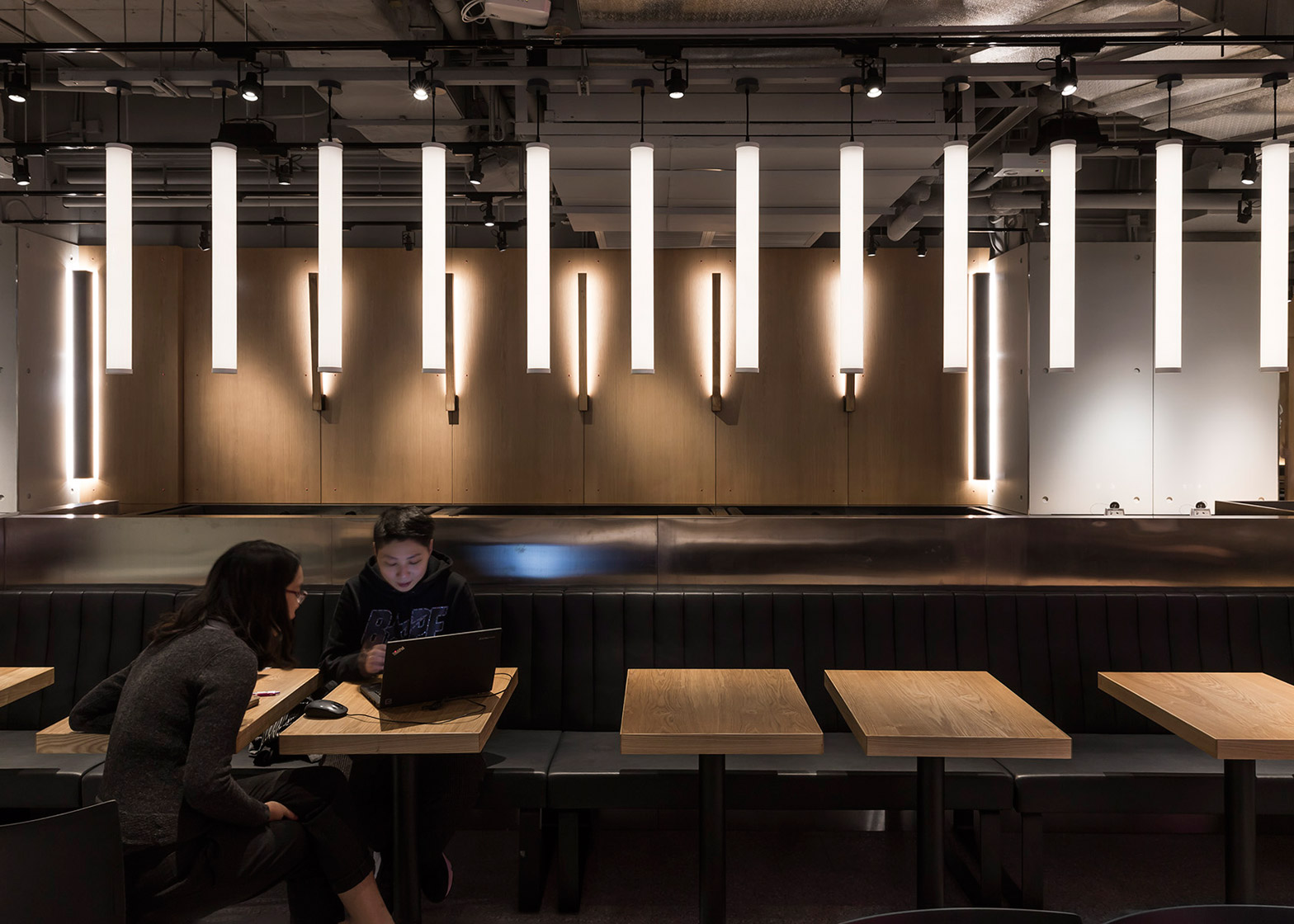
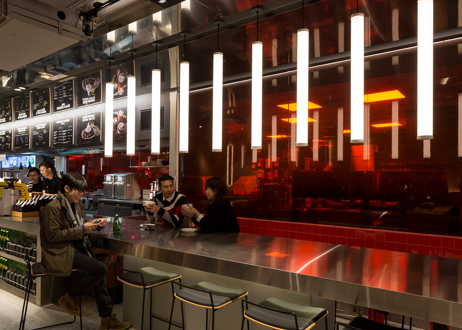
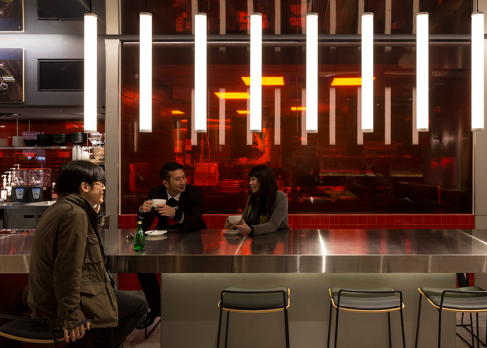
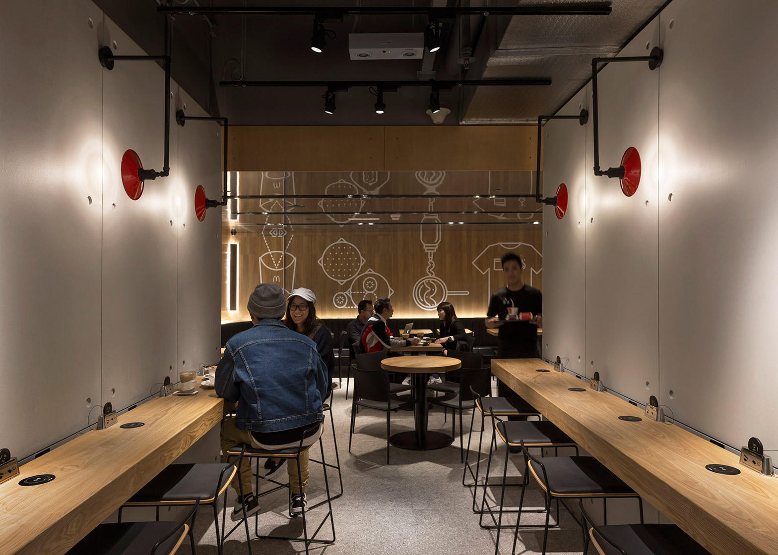
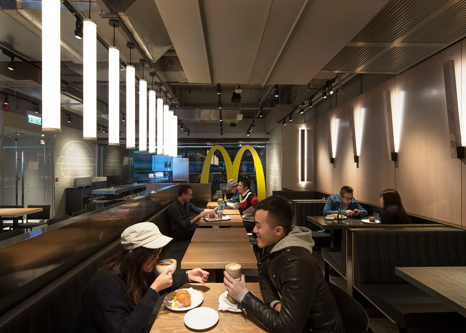
Tables feature surfaces of concrete, zinc and oak – described by the design team as a "palette of Miesian simplicity". Some are more suited to families, while others are designed for either groups or individuals.
A computerised lighting scheme changes the brightness of the space at different times.
"This calmer, more intimate solution delivers a relaxed nighttime experience for the diners and a sharper quicker one for the day," said Landini Associates.
The firm is now working on adaptions to the design to suit branches in Australia, China, Singapore and elsewhere in Hong Kong.
This isn't the first time McDonald's has turned to a designer to overhaul its restaurants. Patrick Norguet was brought in to rethink the look of branches across France, while Mei Architects recently completed a golden restaurant in Rotterdam.
Meanwhile, Burger King opened a garden-inspired restaurant in Singapore in 2011.
Photography is by Ross Honeysett.


