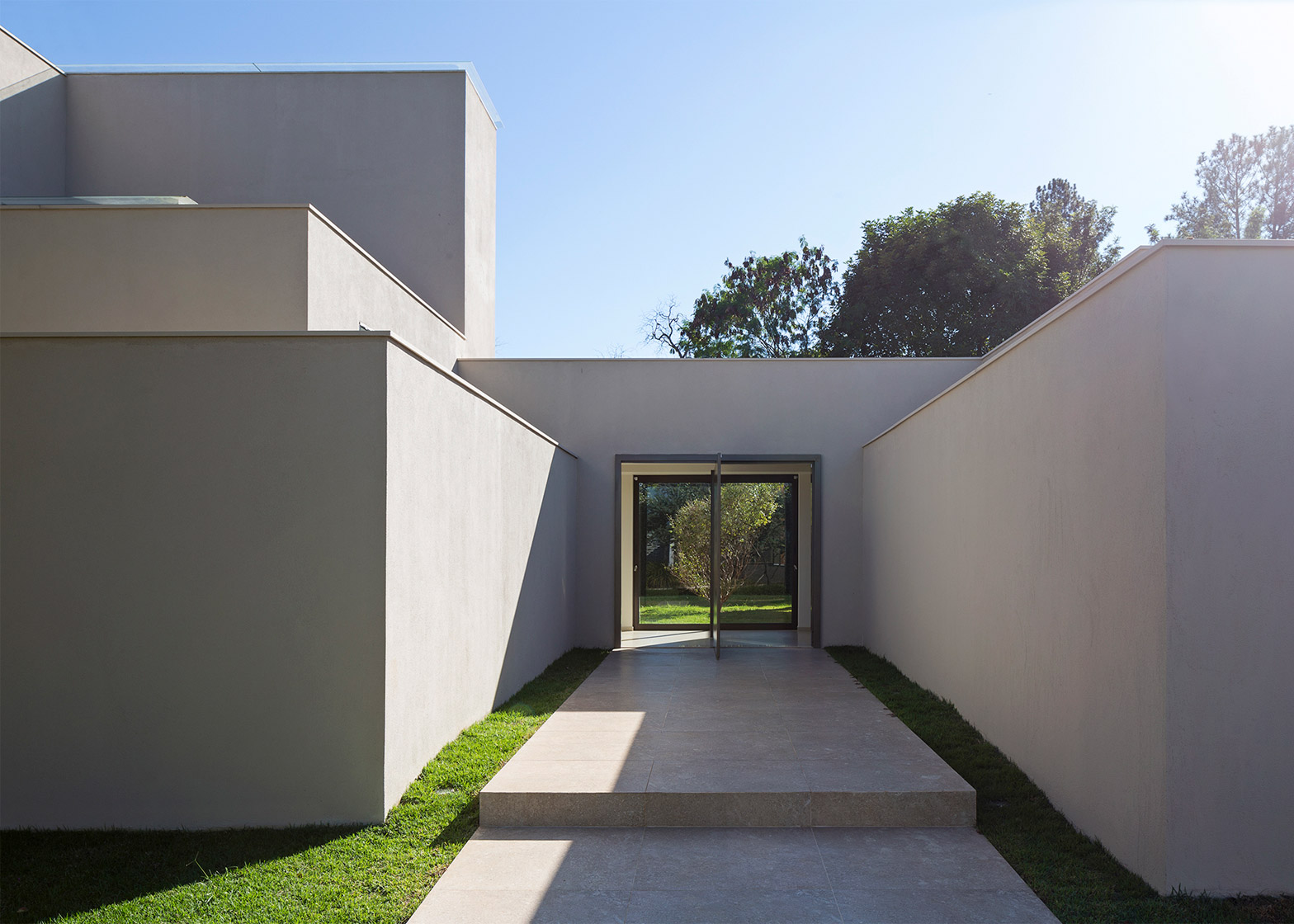
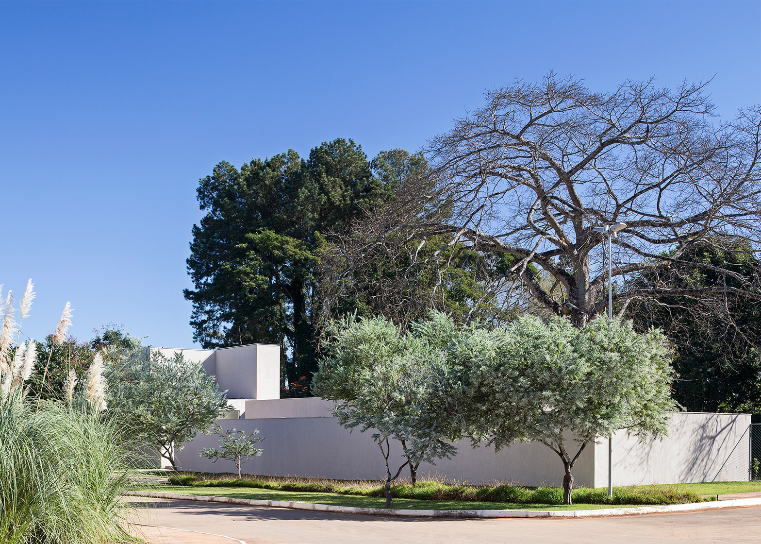
The cubic construction of this house in Brasília by local studio Bloco Arquitetos reveals the layout of spaces inside and was influenced by a 1930s villa designed by Modernist architect Adolf Loos (+ slideshow).
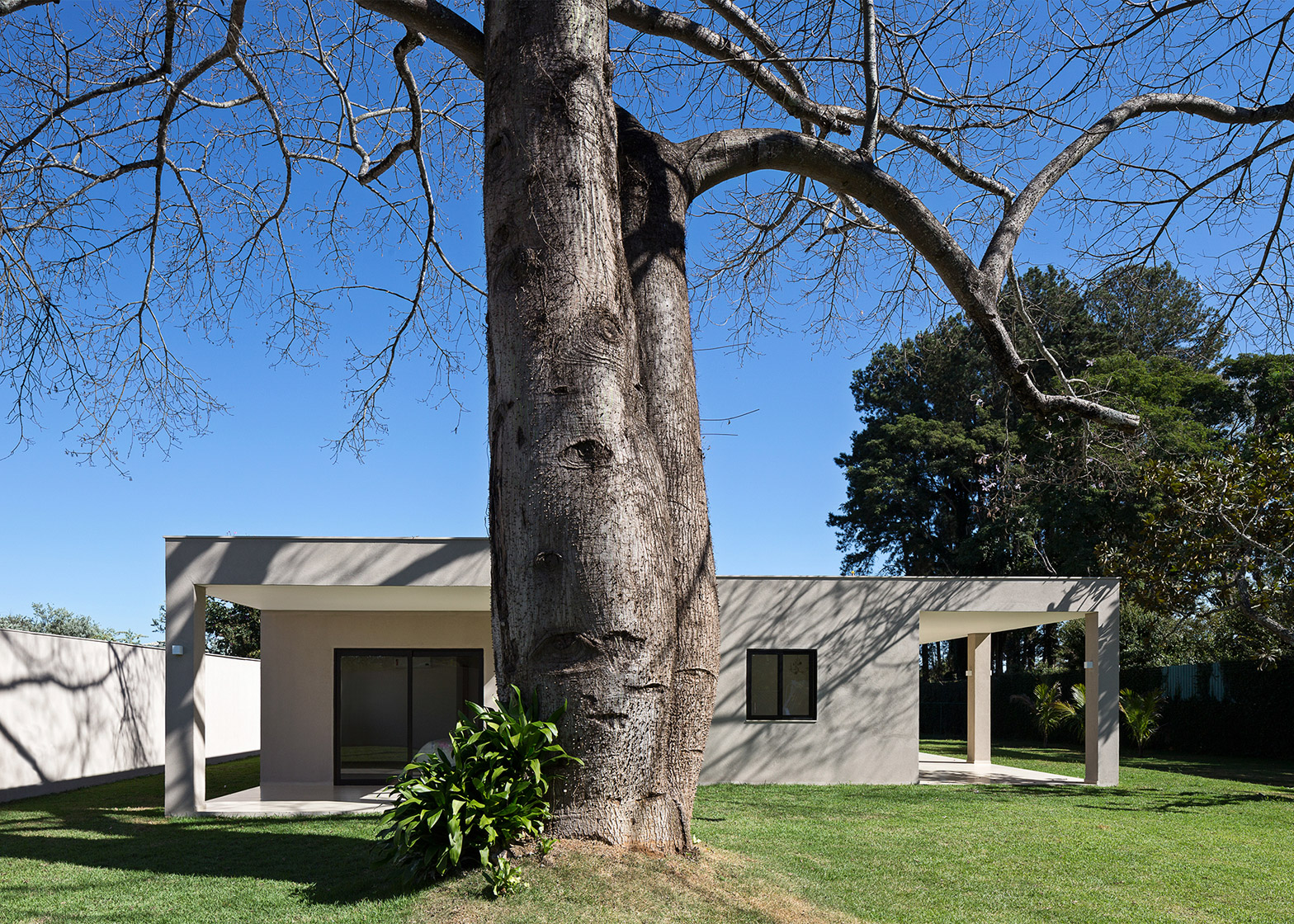
The Paineira House was designed by Bloco Arquitetos for a plot in the Brazilian capital dominated by a 15-metre-tall paineira tree.
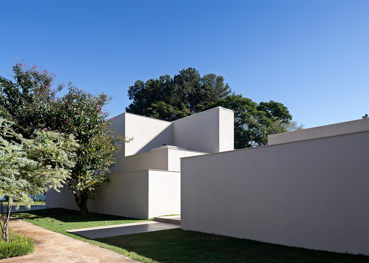
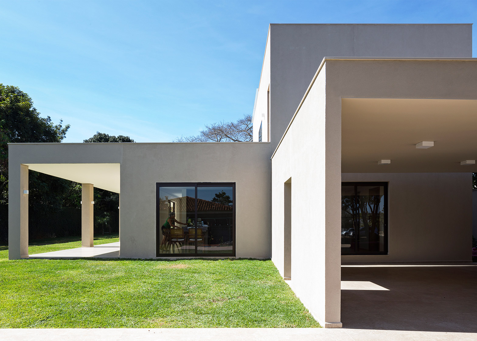
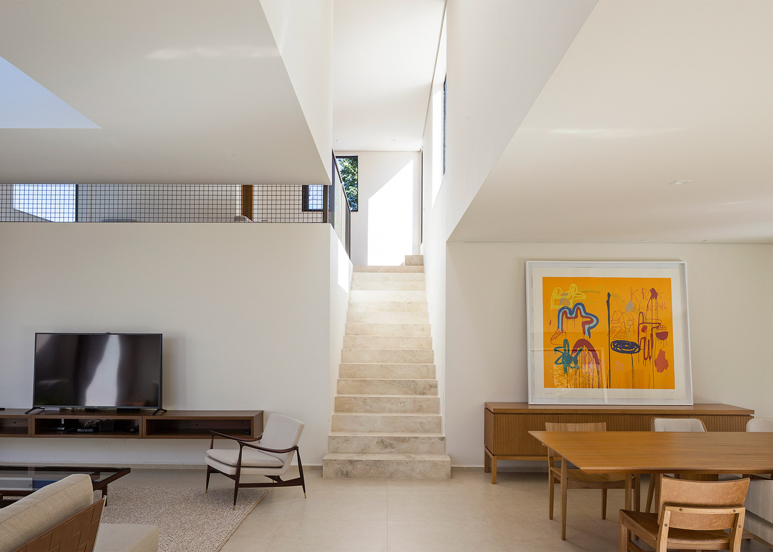
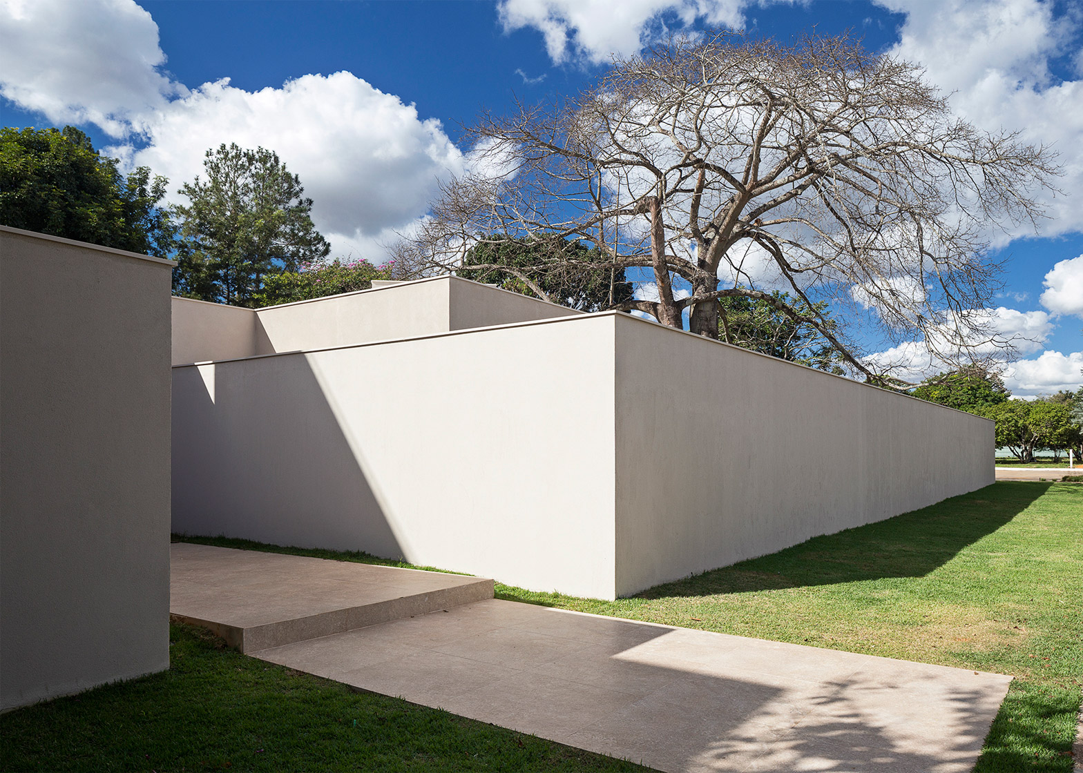
The house comprises a series of geometric volumes, with different dimensions that reflect the use of the various rooms within.
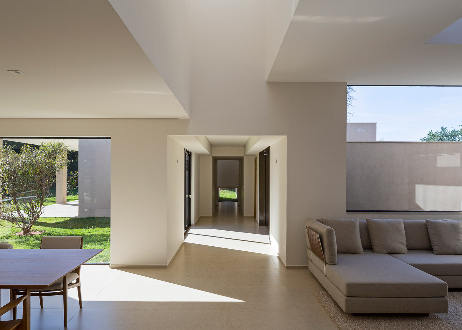
A corridor extends through the centre of the building to connect two separate blocks, one containing the main living areas and one housing the bedrooms.
The function-led configuration was based on the Villa Müller house designed by early modernist architect Adolf Loos in Prague, where a series of cubic forms create interconnected spaces that are positioned and proportioned to indicate their function and importance.
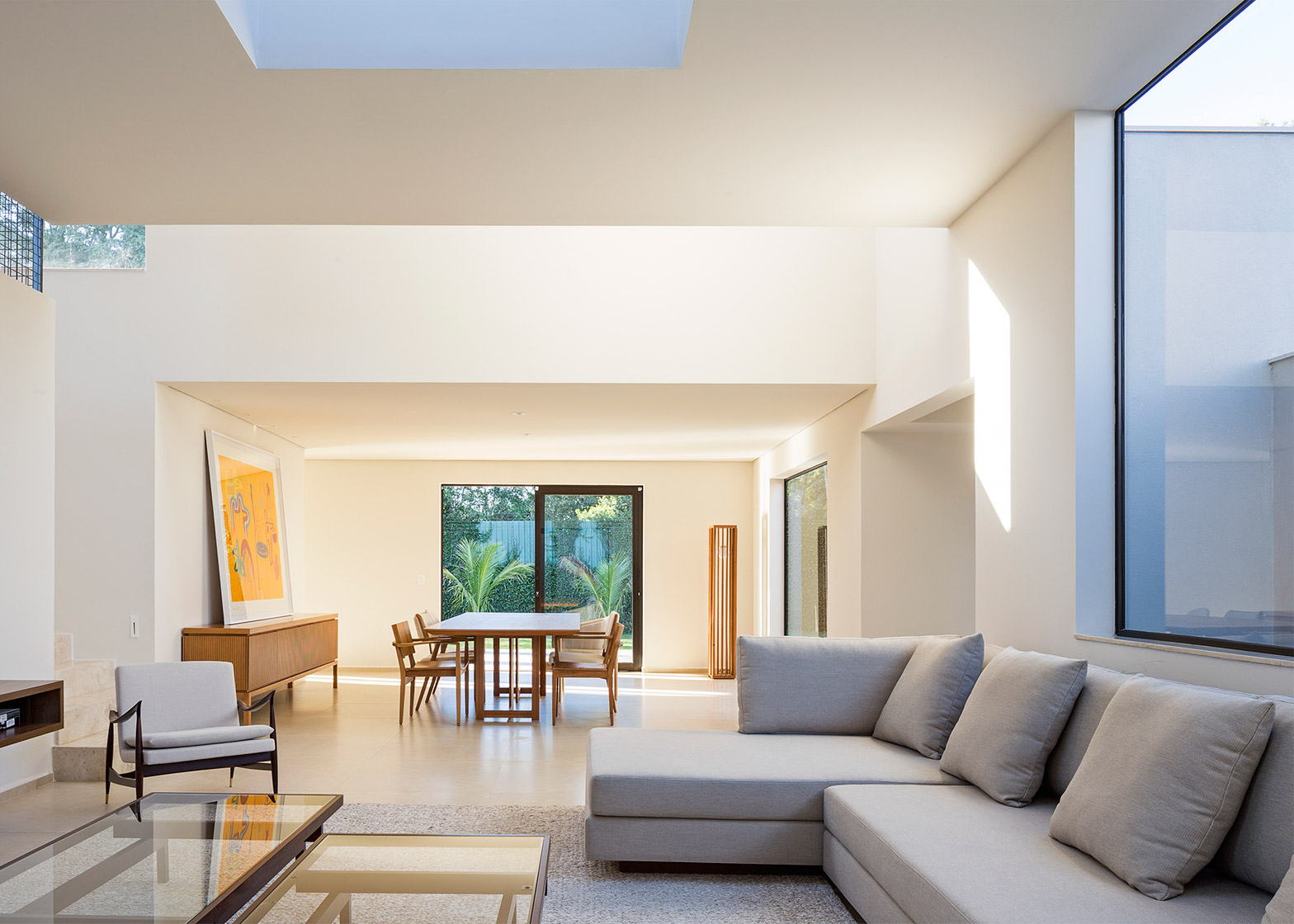
"Both blocks have similar dimensions on plan, however a sequence of different ceiling heights insinuate the intended uses of each space," the architects explained. "The external form is a direct result of this operation. The articulation of different ceiling heights that suggest the use and the importance of each room refer to Müller House."
The paineira tree's position influenced the plan and orientation of the property, which follows an east-west axis parallel to the adjacent street.
The house's entrance is located between the two blocks and frames a view straight through to a garden at the rear. The tree's location at one end of the building means it is glimpsed through some of the windows.
"Upon entering the residence, the tree is not immediately reviewed," the architects explained in a project description.
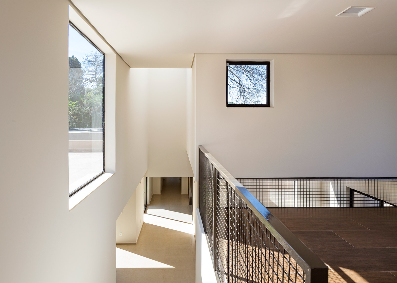
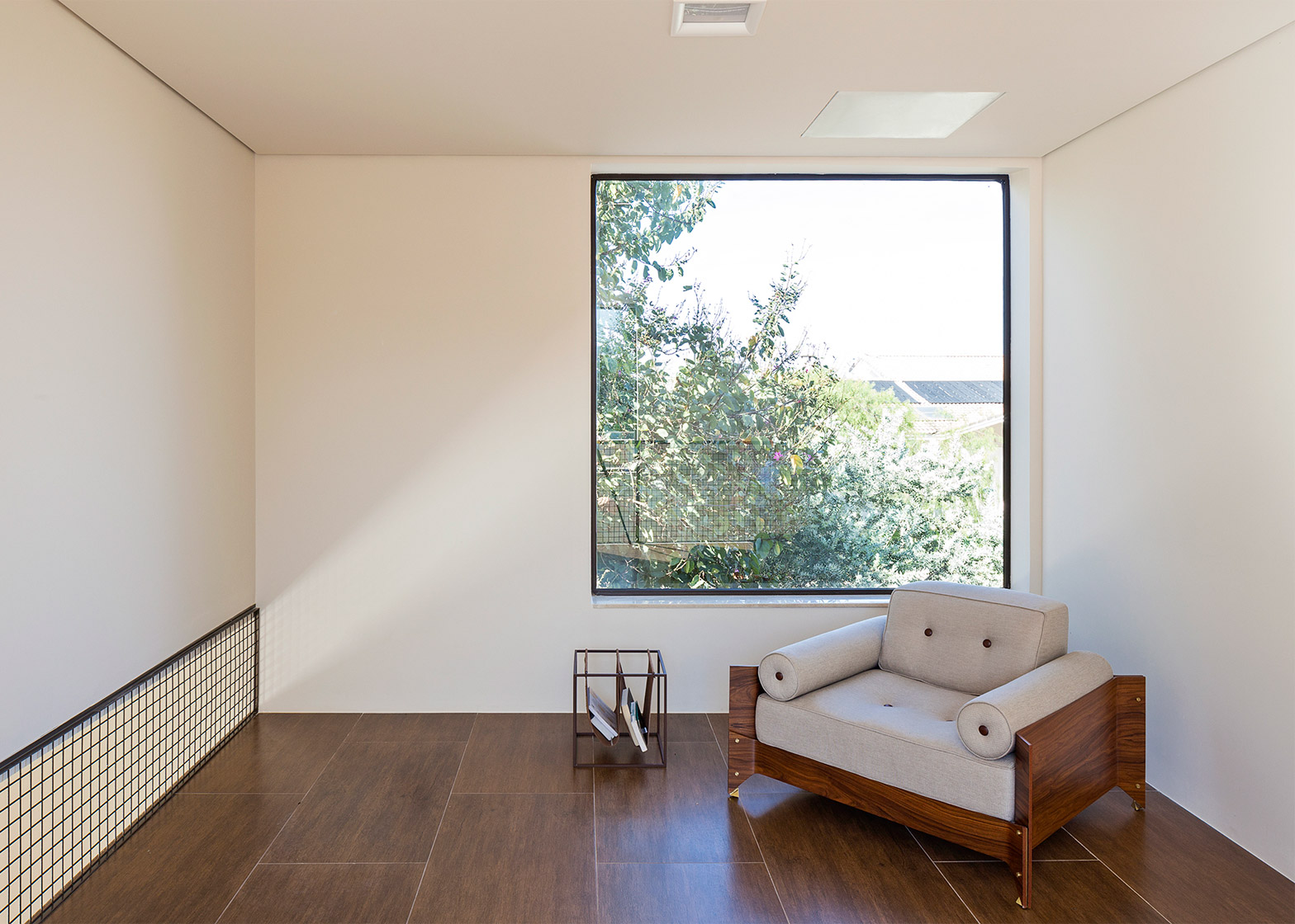
"Various openings in walls and ceiling expose the paineira in small bits, which helps mediate the relationship between inside and out as a whole."
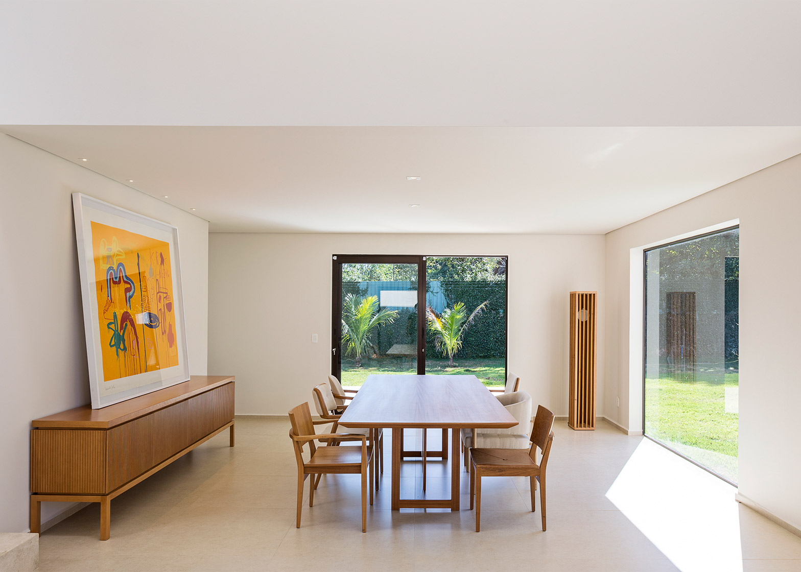
The most open area at the western end of the building contains the large living room, including a dining area that opens onto the garden and a lounge topped with a rectangular skylight.
A staircase at the end of the central axis connects this main communal space with a mezzanine room situated in the tallest volume.
A metal grille forms a balustrade along one edge of the mezzanine and is used to fill in a gap above the floor that overlooks the living room.
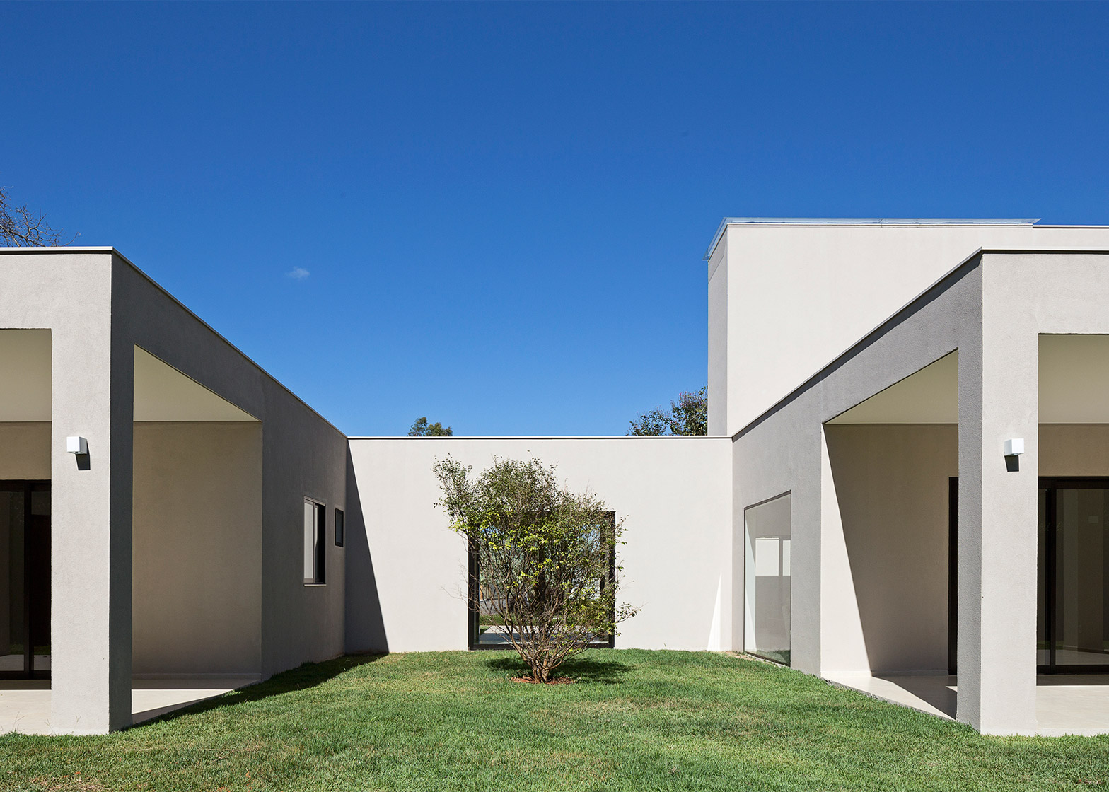
At the opposite end of the building, the bedrooms are arranged around a square space that is rotated 45 degrees to the main axis.
This creates a distinctively angled volume when viewed from the garden, which intersects with the rooms on either side.
A window at the base of the hallway frames a view of the grass between the external walls, while a skylight set into the apex of the roof illuminates the circulation area from above.
Textured paint with a muted tone is applied to all of the external surfaces, lending the different volumes a homogeneity that emphasises the effects of light and shadow on their surfaces.
A lighter variation of the same colour was used throughout the interior, creating a similar effect and focusing attention on the views of the garden through the various openings.
The work of Adolf Loos is often cited as a source of inspiration by contemporary architects and designers.
Other examples include a brick extension in London with a multi-hued interior based on Loos' experiments with colour and a house in Cologne where the upper floor features rooms with varying ceiling heights.
Photography is by Haruo Mikami.
Project credits:
Authors: Daniel Mangabeira, Henrique Coutinho and Matheus Seco
Coauthors: Bruno Pessoa (interiors), Rodrigo Scheel (architecture)
Collaboration: Victor Machado, Tatiana Lopes and Guilherme Mahana

