"Somewhere between the two is a brilliant stadium"
Comments update: readers are reacting to Japan's selecting of Kengo Kuma's wooden design for the 2020 Tokyo Olympic stadium and Zaha Hadid's controversial decision to speak out against it.
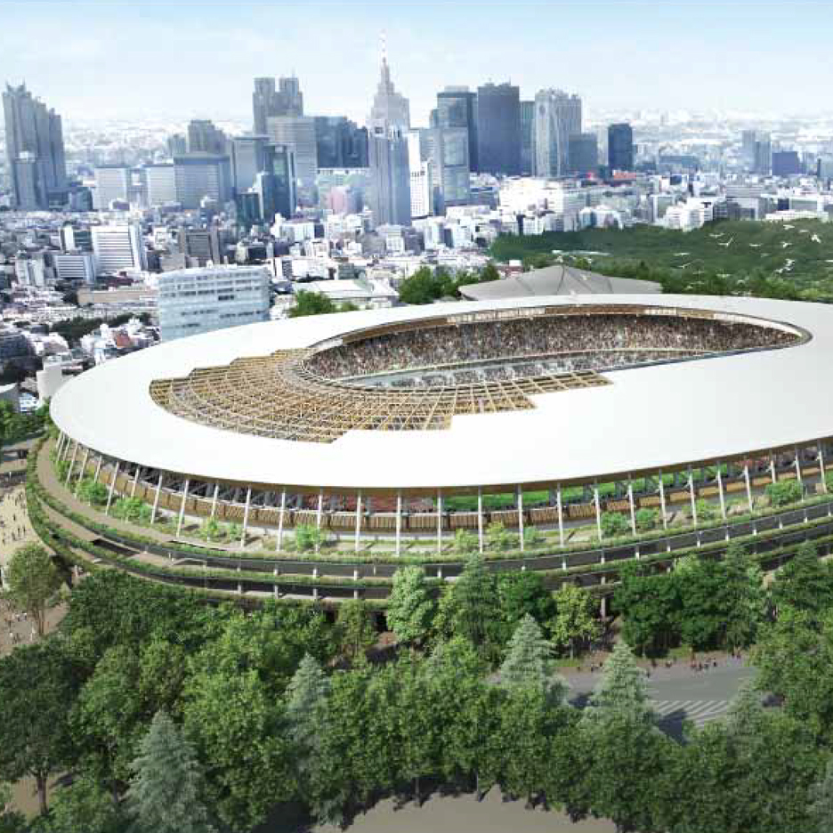
Kuma karma: Kengo Kuma's latticed wood design, which saw off competition from fellow Japanese architect Toyo Ito, has been praised by some commenters and described as boring by others.
"I know Hadid's stadium was over budget but it was something special," wrote Jordan, referring to the Hadid design that was scrapped by the government in July. "Japan could have shown it off, but the selected stadium is, in a word, ordinary."
"Japan lacks ambition," added a guest commenter. "The nation has revealed itself to be conformist."
Not so, countered James Maxwell who thought Kuma should have won the competition in the first place. Regular contributor JayCee said the Japanese architect's proposal better expressed the country's architectural heritage. Read the comments on this story »

Starchitect Wars: Hadid reacted to Kuma's win by accusing Japanese authorities and architects of colluding against her competition-winning design. She went on to say Kuma's scheme shared "remarkable similarities" to hers. Readers didn't entirely agree.
"To the regular eye there aren't obvious similarities, so she just looks foolish for calling them out," pointed out Roberto Sideris. "The 'stadium layout and our seating bowl configuration' means nothing without some good plans as back-up."
Others took the chance to lambast Kuma's "unfinished" entry, accusing it of suffering larger-scale issues than Hadid's design.
"Kuma's design is bulky," said James Coulee. "It seems to smash the scale of its built surroundings."
"Somewhere between the two there is probably a brilliant stadium," added ellieban. Read the comments on this story »

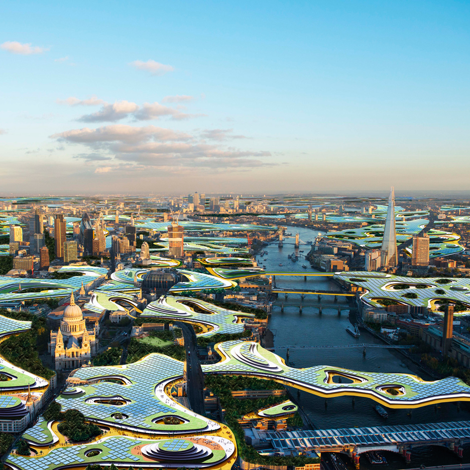
Dark days: LA-based architect Clive Wilkinson provoked a backlash with his conceptual plans for a huge shared office that would hover above London, reducing the need for people to commute into the city for work.
"I would prefer to spend 12 hours commuting every day if it meant I didn't have to live in complete darkness," said Dave Brubeck who went on to describe the idea as simplistically stupid.
"I don't mind the playfulness of the proposal," said a commenter calling themselves Archi-Nerd, "I just wish it enhanced the existing city instead of shrouding it in eternal darkness."
Others likened the design to the experimental proposals of the 1960s. One reader even slammed fellow commenters for not being able to see "beyond banal pragmatism." Read the comments on this story »

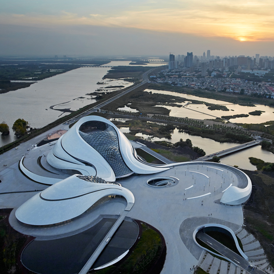
Bravo: readers almost ran out of superlatives to describe their appreciation for MAD's opera house in the Chinese city of Harbin.
"This project is absolutely spectacular," wrote ABruce of the Harbin Opera House, which was also labelled as stunning, amazing and beautiful.
But a note of criticism came from one commenter concerned with the building's position in relation to its surroundings.
"The opera house is not easily accessible by pedestrians," said April Mei. "Its placement was an official's decision [and] the architects completely ignored the surroundings and any local references, which has created a self-important building outside of any context." Read the comments on this story »