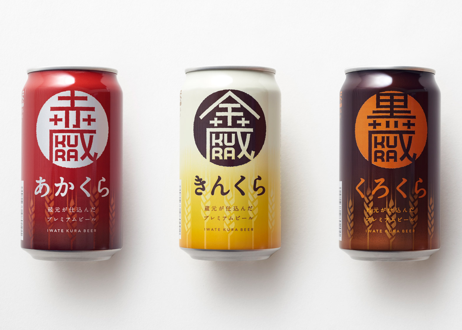
Japanese design studio Nendo has combined Japanese and Latin characters to create a crest-style logo and colour-coded packaging for Iwate Kura beer.
The craft beer was launched to help support the Sekinoichi sake brewery in Iwate, which was devastated by the 2011 earthquake and tsunami.
Iwate Kura beer comes in three versions: a pale ale, dark pilsner and black stout. To differentiate the types, the studio designed three variants of packaging that use colours to represent each of the beers.
"Taking inspiration from the unique combination of beer and sake brewery, which is called a 'kura' in Japanese, the products were named Kin Kura, Aka Kura, and Kuro Kura," said Nendo.
The studio combined the Japanese characters for red, gold and black with the English characters for Kura, to create a logo that's "reminiscent of a family crest". In each case, the symbol sits in a circular graphic that is coloured to contrast with the gradient of the can.
For the Kin pale ale, the studio designed yellow packaging that fades to to white at the top. The Aka dark pilsner is red, and the Kuro stout is in a brown and orange can. The packaging also features stylised images of hops that circle the bottom half of the can.
This is not the first time the studio has created beer packaging. In 2013, it designed bean-shaped stickers for a coffee-flavoured beer also produced by Sekinoichi.
Nendo has also designed bottles for a range of Japanese cosmetics, designing receptacles that could be stacked like blocks of stone.
Other packaging designed by the studio includes a totem-shaped perfume bottle for Kenzo, and branding for a range of skincare products that featured grey and white crosses to reference its medicinal properties.
Photography is by Akihiro Yoshida.

