LA-based studio West of West has used white surfaces and plywood finishes in a new Garrett Leight eyewear store in San Francisco to reinforce the brand's Californian identity (+ slideshow).
Called GLCO San Francisco, West of West designed the project for eyewear brand Garrett Leight, which was established in 2011 in Venice Beach, California.
All of the company's glasses frames are named after a street in its hometown.
The new boutique encompasses 8,000 square feet (743 square metres) and is located in Hayes Valley, a trendy neighbourhood in downtown San Francisco.
Reinforcing the eyewear company's Californian heritage was central to the design.
"For us, contemporary Californian interiors are about finding ways to introduce warm, natural materials into the space in a simple and effortless way," said West of West.
Plywood fittings are paired with solid white surfaces, a combination the designers described as "clean but not hermetic".
"The colour of the plywood faces helps warm up the space and balance out the white surfaces," the designers told Dezeen. "We also found that the edge grain of the plywood was an identifiable texture that gave us a slightly deeper hue to complete the palette."
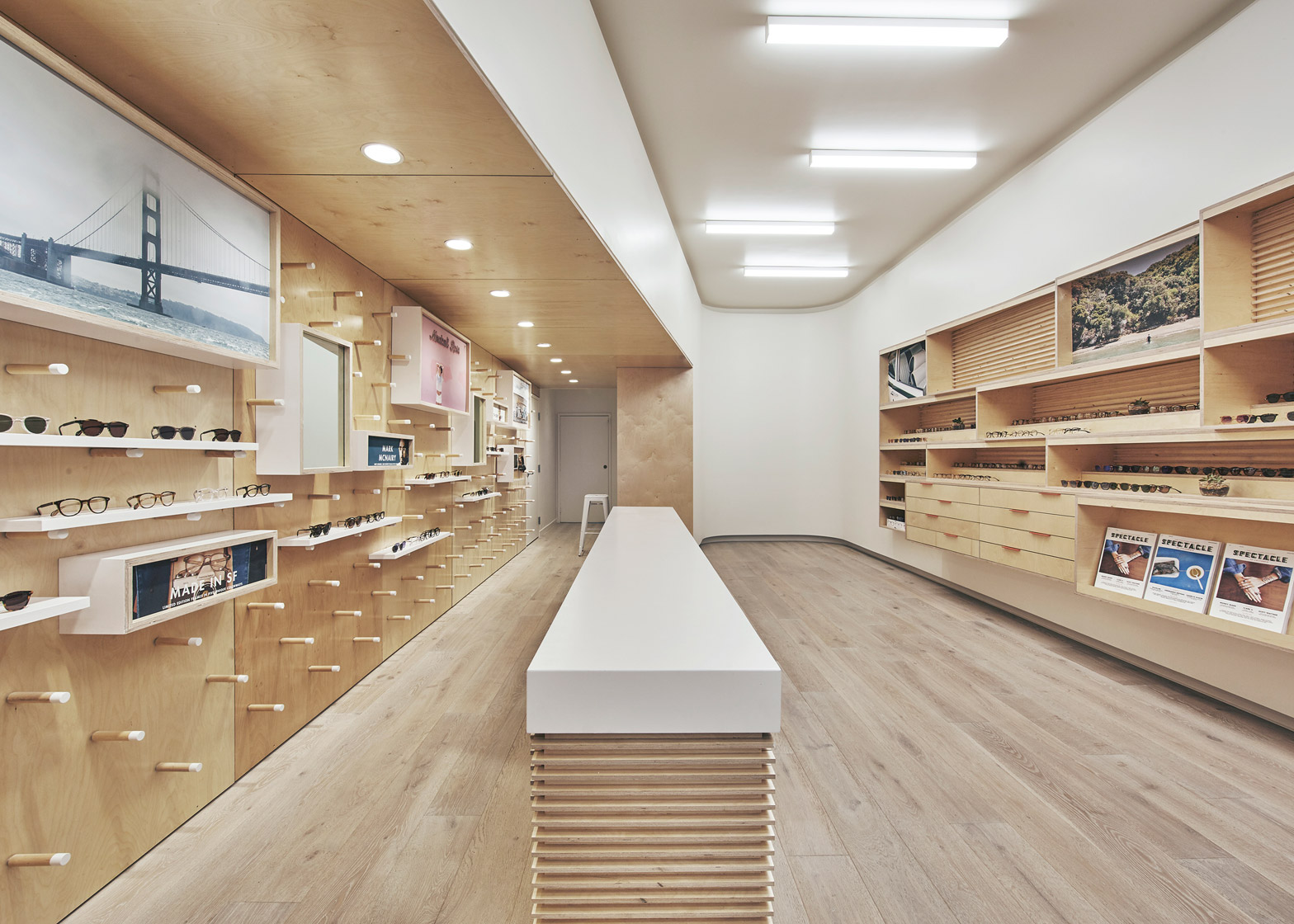
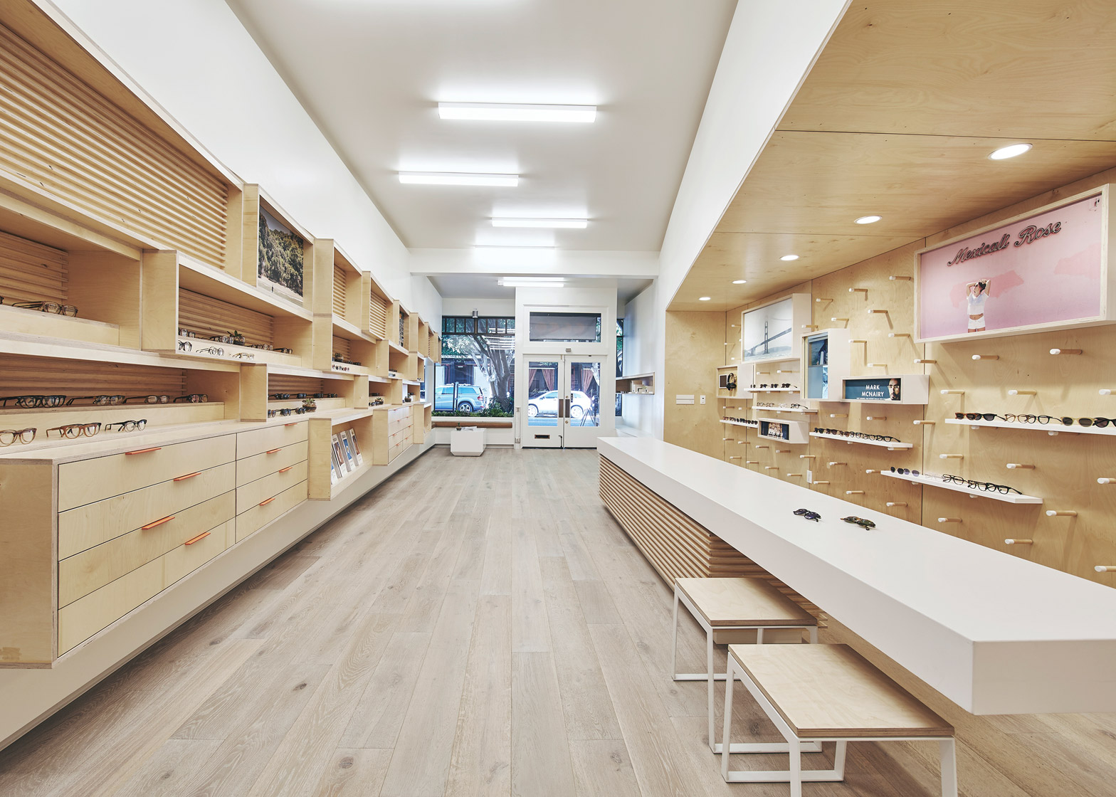
A thick wooden table runs down the centre of the slender boutique, dividing the space into two primary zones.
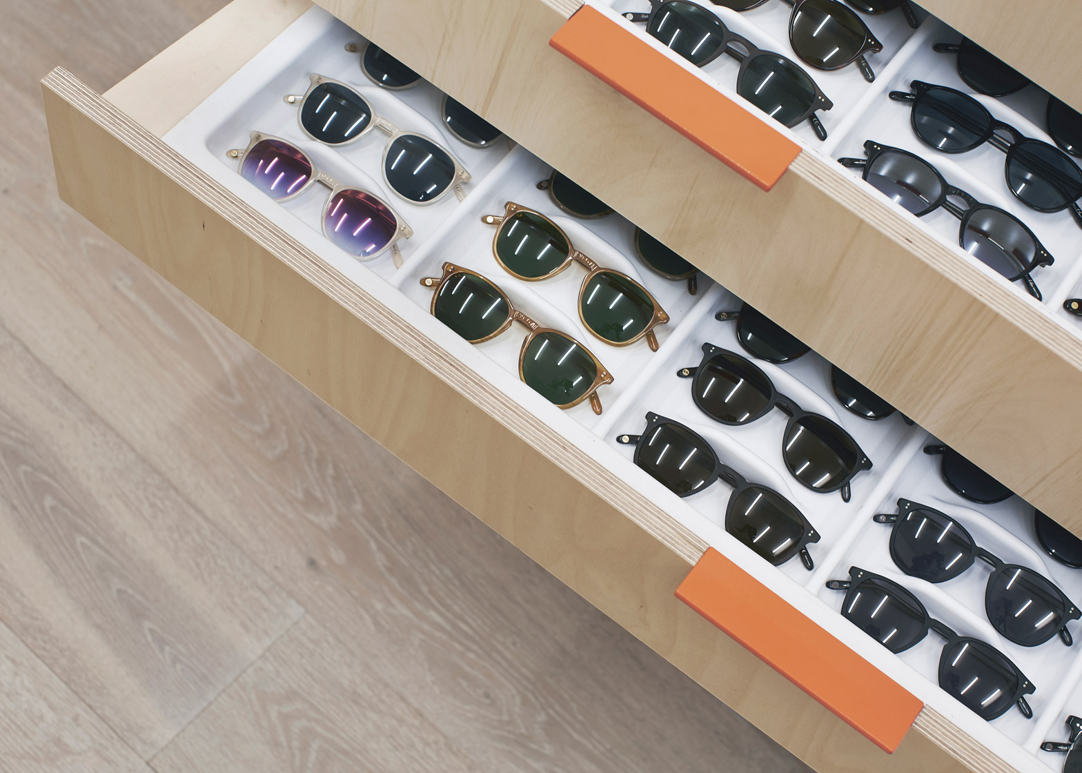
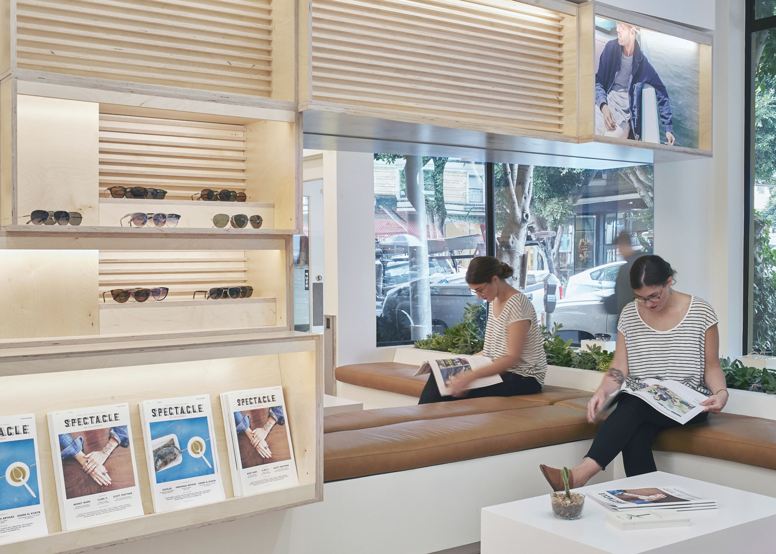
On one side, the architects created wooden casework that stretches 35 feet (10 metres). The unit features shelving and drawers, along with wooden frames that form shallow boxes.
"In response to the substantial depth of the space, and taking inspiration from the classic San Francisco bay window, West of West conceived the main display wall as a series of canted, modular boxes," said the firm.
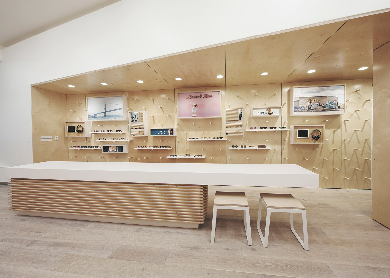
Opposite this unit is a second display area, which sits under a dropped ceiling sheathed in plywood. The ceiling gradually widens at an angle from the front to the back of the store, forming a cove.
Designed to be highly flexible, the cove contains shelving, wooden pegs, and picture boxes that protrude from the wall. The boxes showcase videos, photographs and other imagery that communicates the ethos of the brand.
All eyewear fittings and sales take place at the central table, a portion of which cantilevers over the shop's light wooden floor.
In the front of the boutique, a casual seating area is stocked with reading material, and a large mirror reflects activities taking place outside.
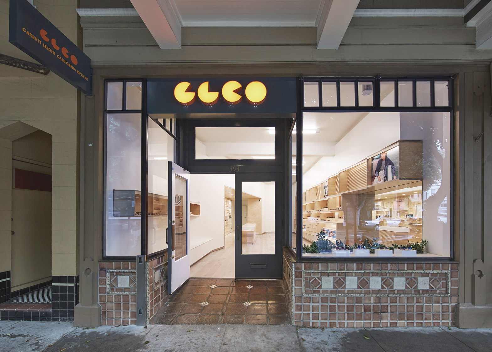
On view in the shop window are spectacles atop small white boxes and a planter filled with succulents.
The architect left tile cladding on the shop's exterior untouched. "A nod to the history of the city, the original building facade was kept intact to match the adjacent character along Hayes Street," said the firm.
Founded in 2010, West of West is an architecture and design studio that creates objects and spaces. It currently has projects in San Francisco and New York.
Other recent eyewear boutiques include a Seattle shop by Best Practice Architecture and an Amsterdam store by Occult Studio.
Photography is by Michael David Rose.
Project credits:
Architect: West of West
Client: Garrett Leight California Optical
Lighting designer: Sean O'Connor
Lighting fabrication: Maneuverworks
Construction: Buck O'Neill Builders

